@vincegammer - OK, here we go.
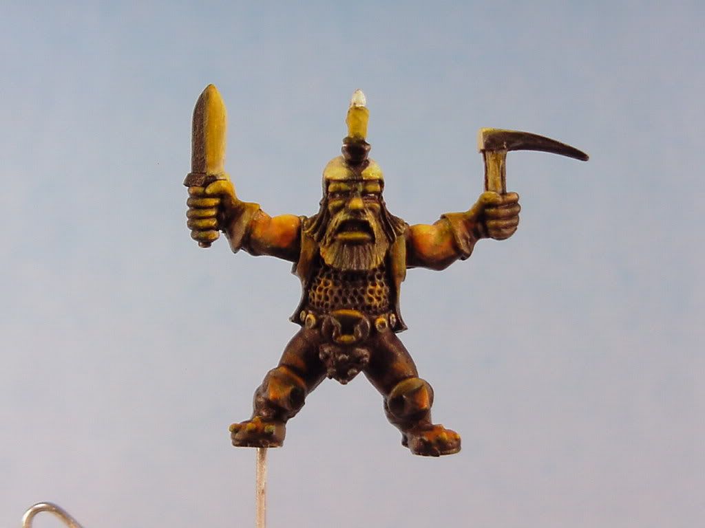
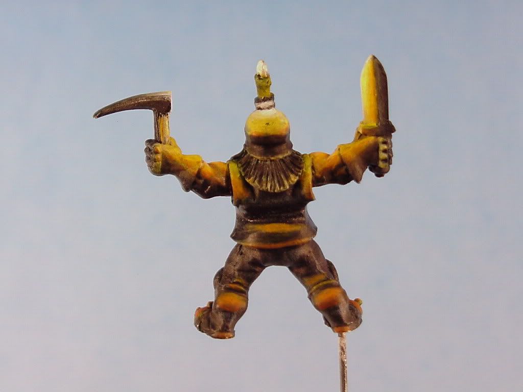
What I did here is to show a before and after (done very roughly). Left is before and the right is after. The colorscale somewhat corroberates with the Rembrandt liink. As you get further from the light source, it shift\'s toward orange/brown and gets darker. I have reversed mysel and included a secoundary lightsource. It is indicated by the green lines and the letter \'S\'. The small square containg about the tone of grey to use for the secoundary lightsource.
Sorry to get the numbers jumbled up but the pink lines show the progression from light to twilight to secoundary light source.
1 - light
2 - getting towards shadow
3 - twilight, black
4 - secoundary lightsource.
The top pic where the pink lines are, the progression goes from left to right. Some of this may be obvious but I just want to make sure things are clear.
The blue lines - s2 - are where the shadows are lightned. For the most part, shadows are lighter the closer you get to the lightsource.As you get closer to the lightsource and the shadows get lighter it is crucial to be very crisp with the edges of the shadows (unless the area is round/dome shaped and the shadow would have no real edge)
The candle is translucent and will be rather light. The bottom of the candle itself should be a touch darker than I have indicated.
The main thing I did here is to lighten and saturate the \'lit\' areas. Put the secoundary lightsource color in the shaded areas and to darken the twilight areas...........Upped the contrast both in light and dark and color.
Give that a go and repost.
{edit} There are some areas, the cheeks, the lower lip, the moustache, the bottom of the beard, top of the buckle, the top of the shin guard, the knees, the two spots to the right and left of the beard where I basically cheated. As long as it\'s not too far out of the line of sight of the lightsource I will sometimes highlight small areas like these to simply \'kick up the depth\'. This is definately optional and a thing of personal taste.


