Hi Shawn Classroom #1 for OSL... TAB

Shawn R. L.

New member
@TAB - SUCESS!!! I finally got Photoshop to cooperate!! I will post the pic\'s mabey today or so and have some comments with them.
 

Shawn R. L.

New member
Hi Tracy. This is a real slow loading picture set. I dont know why. I put the comments under each picture set.


canonNEW1.jpg


A, B, and C are all areas that need to be lightened, the areas within the green borders. Make them about the brightness of the front leg of the telescope.
Image D needs the reverse. Darken the areas that are indicated by the green borders.

CANNONNEW2.jpg


Images E and F show areas that need to be lightened about the same as A,B and C. Except the area on the mini in F on the top of his right arm. Refer back to the OSL article. I think I termed this area as \'twilight\'. The area between the lit side and the side with the secoundary light source. This is basically a fuzzy stripe that runs the length of that border. On that mini I could see the area real well so it\'s the only one I commented on and pointed to but they all will have some of those areas. Mabey on the top and bottoms of the helmets, top\'s and bottoms of the arms, the length of the ramrod. One thing I will say at this point is that when doing OSL you will need to lose some of the basic way we all have of shading, which is usually from the top, even if it is subtle. With OSL, at least in the case of it being in a black/night setting, the ONLY sources of light are the primary lightsource and the secoundary light source. The primary isnt necessarily from above, yours is from teh front and low. The secoundary I usually have from above as normal.
Also on the mini in E and F do the little lenses like gems with the \'gleam\' nearer the center.

On G and H, these areas are to be done only in grey. This is the secoundary light source. In the lower left of G is a black,grey and white square. The black and white are to give a comparison of the two extremes and the grey is what you should use in the green bordered areas. Blend these areas as normal with the black areas.

Image I. shows mostly the areas where you need to lighten things up a bit. Lighten the barrell of the telescope up a bit but not quite as much as the front leg of the tripod being that the barrell of the telescope is at a low angle to the lightsource. Some of the smaller areas that are more perpendicular to the lightsource, make them as bright as the front leg of the tripod.\'
The two lenses of the telescope, do them as you would normally do a gem BUT do them sideways with the dark side and the \'gleam\' towards the gun.


cannonnew3.jpg


Images 1 and 2 need pretty much what is mentioned above. 1 refers to lightening and two refers to the secoundary lightsource. One difference is that in image 1, the shell needs to be a bit darker, blending from the tip back about half way. The arrow shows which color and tone to use.

Whew!! I think that\'s it for the moment. WIP\'s WIP\'s WIP\'s baby.
 

vincegamer

New member
Originally posted by Shawn R. L.
The primary isnt necessarily from above, yours is from teh front and low. The secoundary I usually have from above as normal.
I\'ll try to post pics soon. In the mean time, what do I do when the primary lightsource is from directly above? For my mini the light source is sitting on top of the mini\'s head, so any \"secondary\" light source I guess ought to be from underneath if that makes any sense.
 

Shawn R. L.

New member
@vincegammer - in that case there would be no secoundary lightsource, unless the primary is very tiny or in such a position that it casts little light on much other than the top of the head.

There a few ways to approach OSL. There is A. what is real. B. what simply looks good. C. how much I feel like doing. All can be done to good effect but the end result will be a bit different. I tend to bend the \'rules\' to acheve a stronger end result and to keep things interesting.
 

vincegamer

New member
The light source is very small, but I\'m not going to let that get in the way. Besides, in total darkness, if that were the only light it would seem quite bright to look directly at it.

It is a candle affixed to his helmet.

(Ever taken the end off a mag light? Sort of makes it like a very bright candle that way.) What I have done is gone into a dark room, put a maglight bulb just on top of the candle, and photographed him. I forgot the disk, so I\'ll have to post pics tomorrow.
An extremely bright light hits his head, shoulders, etc. At this point I have painted it black and then done a white highlight.
Do I need to carefully blend the highlighting at this stage? or is rough blending okay since I plan to cover it with color?
 

Shawn R. L.

New member
Originally posted by vincegamer
The light source is very small, but I\'m not going to let that get in the way. Besides, in total darkness, if that were the only light it would seem quite bright to look directly at it.

It is a candle affixed to his helmet.

(Ever taken the end off a mag light? Sort of makes it like a very bright candle that way.) What I have done is gone into a dark room, put a maglight bulb just on top of the candle, and photographed him. I forgot the disk, so I\'ll have to post pics tomorrow.
An extremely bright light hits his head, shoulders, etc. At this point I have painted it black and then done a white highlight.
Do I need to carefully blend the highlighting at this stage? or is rough blending okay since I plan to cover it with color?


Even though I havent done it that way, it sounds like it is good and should be the most accurate way to see where the light will actually fall. I\'m assuming you are looking at the photos you shot and painting where the light strikes.

A good blend is always helpful. Since the light source is a candle and dosent have alot of candel power (no pun intended) the cast light will, in a manner of speaking, quickly run out of gas. Go ahead and paint all the areas where the light will hit but when you put the colors over the white (wait till it dries real good) have the colors get dimmer, duller, and shift them a BIT towards the red.

For your mini this link is a perfect color chart for the progression from the lightsource to the darkness. WARM. Man, ol Rembrandt could really whip up a storm.
http://plusinfo.jeonju.ac.kr/photos/Art/Philosopher%20in%20Meditation%20(Rembrandt).jpg
 

TAB Studio

New member
Thank you Banshee :flip:

Shawn I copied the info and printed it out I will get started on it , Thank you as well for your time in this.
 

Shawn R. L.

New member
Originally posted by TAB Studio
Thank you Banshee :flip:

Shawn I copied the info and printed it out I will get started on it , Thank you as well for your time in this.

I\'m having fun, hope you are too.:)
 

Shawn R. L.

New member
@vincegammer - The Rembrandt link I put in...I wasnt meaning the figures in the painting but the whole painting. The window being the lightsource and how the color,tone,hue changes as it crosses the room.
 

vincegamer

New member
I understood. Looking carefully there\'s a secondary light source in the bottom right where the guy appears to be making something on a forge.

Anyway, here are the pics.
It\'s too difficult for me to get pics up so I can\'t do a step then post a photo and wait for comment. I have here a series of photos showing the steps I\'ve done so far. Feel free to comment on any intermediate steps. It will help me learn.
I apologize also for picture quality. These are shapshots in natural light, and I have lost my blue gradient background. I\'ll take better pics later in the process, but I\'m under time constraints.

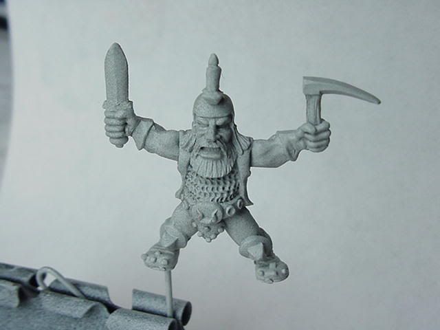
So, enough apologies. Here is the mini primed.

MVC-034S.jpg


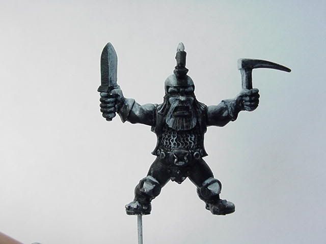
Here I have painted it black and then painted white highlights.

MVC-036S.jpg

Here I have laid down the first, darkest color. I plan to highlight it up as normal from this base.

MVC-038S.jpg


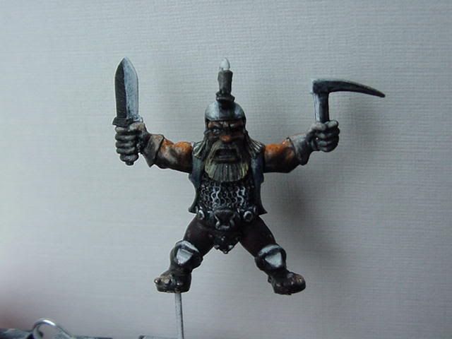
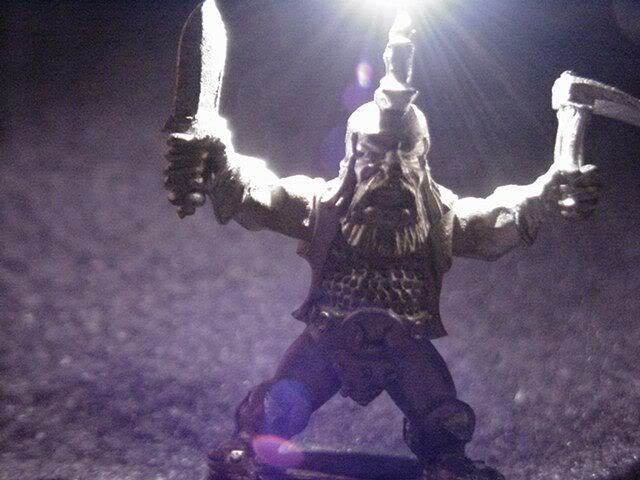
And finally, here\'s the picture I mentioned where I held the light right on top of the candle in a dark room.
dwarftest2.jpg

(I have another pic with the candle held higher where the knee spikes are lit, which is why I lit them in my picture above. I thought he was getting boring otherwise, though I believe I will change it so only the tips are bright.)
 

Shawn R. L.

New member
@vincegammer - I\'m guessing that the top few photos are underexposed so it\'s kinda hard to tell what the true tone is. Your light placement - the lit areas - look spot on. Lighten the \'lit\' areas IF the exposure of the photos is correct. If they are underexposed then not. Try to get accurate exposure. It\'s cruical from my end. The background dosent NEED to be a blue to white gradiation, just something whiteish and non distracting.
 

vincegamer

New member
Okay, I\'ll try to take a better photo.
In the mean time, can you give me a suggestion as to how to paint the chainmail?
I\'m at a loss. Do I just do dark gray then lightly touch the top edges of the light areas white?
I am going to have a similar issue with the helmet - I\'ll try to provide an overhead and back shot.
 

Shawn R. L.

New member
Originally posted by vincegamer
Okay, I\'ll try to take a better photo.
In the mean time, can you give me a suggestion as to how to paint the chainmail?
I\'m at a loss. Do I just do dark gray then lightly touch the top edges of the light areas white?
I am going to have a similar issue with the helmet - I\'ll try to provide an overhead and back shot.

Chainmail is one thing where drybrushing would come in real handy. As to making each link \'correct\' I wouldnt put myself through that much trouble. At the scale these things are a thing occurs which I call pixelation. Some of the details are so small and the painting of each detail, will to the eye, unless aided with a magnifying glass, simply merge into one effect. It\'s alot of work with little or no payoff. What I would do is to do it very lightly and only stroke from the top down. And have the top part of the section of chainmail to be \'lit\' be lighter at the top than at the bottom.
 

vincegamer

New member
Found my blue gradient background.
Okay, time constraints have loosened a little bit but I don\'t want to slow down because I would like to do a custom base for this guy as well.

I have taken better pics with artificial light and all.
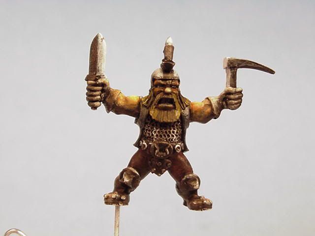
Here he is from the front.
MVC-039S.jpg

I thought he looked too light so since taking this picture I blackened the center of his beard more and reddened his nose.
As you can see I have reduced the shine on the knee spikes, though they are still rather rough.
My color scheme: Gloves & boots dark brown. Pants dark red, almost black. Vest blue like denem. I\'ll accept suggestions on color sheme as well. (maybe I should make the vest match the boots and gloves?)

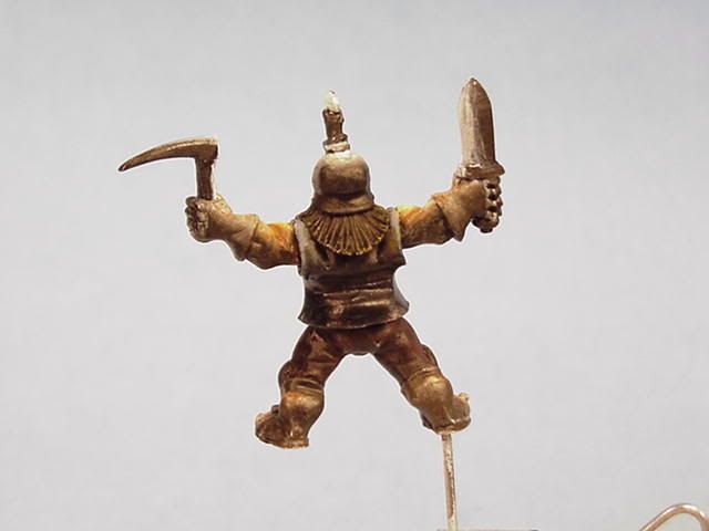
Here he is from the back
MVC-040S.jpg
I know his pants look too bright here, but a couple black glazes should tone them down. The vest is only painted around his shoulders. The light shines off the lower part, but dullcote will stop that. (anyone ever paint over dullcote? because bits of him keep rubbing off and I\'m thinking of dulcoting him before going further)
The problem with the back is that nearly all of it will be in shadow. Oh, the tops of his boots get hit by light here.

Finally, here he is from the top down.
OSLa.jpg
You can see that the toes and backs of his boots will get lit up. You can also see that most of his hair will not - should I just paint his hair black but for the very tips?

Oh, in case you are wondering I have not done anything to his weapons but the first white on black step 1 highlight.
 

Shawn R. L.

New member
Of course not. Tis open to all.

I have downloaded your pix and will try to put some pointers on and with the pix. One thing I would request in shooting them, light them from as many angles as possible or use a diffuser. Since we are painting in the shadows any actual cast shadows can be confusing.
 

vincegamer

New member
Don\'t have a diffuser. That would then require me to get brighter lamps and becomes a sequence.

These pics were taken with 5 different light sources. Technically it could be considered 1. It\'s a floor lamp with 5 bulbs on the ends of 5 flexible pipes, so I arrange them basically in a 5-pointed star pattern with the camera in the center.
I\'ll try to take a pic of my photography set-up.
 

Shawn R. L.

New member
Originally posted by vincegamer
Don\'t have a diffuser. That would then require me to get brighter lamps and becomes a sequence.

These pics were taken with 5 different light sources. Technically it could be considered 1. It\'s a floor lamp with 5 bulbs on the ends of 5 flexible pipes, so I arrange them basically in a 5-pointed star pattern with the camera in the center.
I\'ll try to take a pic of my photography set-up.

Thats good to know. Sound\'s like what you have is a good setup. Make sure the 5 lights are seperated somewhat, not too close to the camera. At this point what I would say is to refer to the Rembrande painting for color and tone comparison. You dont have to be a slave to it but try to get within the ballpark. The tops of the arms look OK, the lower half of the mini, the \'lit\' areas need to be lighter at this point. There will be some back and forth with some of this. I\'m doing that right now with the Wolfen I posted in the WIP thread. First you paint it so that the light is simply on, then you go back and with different tone\'s, hue\'s and such and really tighten up what\'s happening with the light. As I said above, I will try to in the next day or so repost the pic\'s you posted with some pointers on them.


{edit} - As an afterthought, you might try lighting him from either side and no top and bottom light. As I looked at your pic\'s again I think what\'s throwing me is that what you have already painted is working so to me it\'s hard to tell what is painted and what is comming from your light setup. If it\'s just comming from the sides then I MIGHT be able to tell better what is real and what is painted. Trickey business.
 

Dark Seraphim

New member
Avatars Leg\'s OSL

How would I go about painting the OSL from the avatars legs? The crevas where the lava is, is so deep and doesn\'t leave much room for OSL too be done, but at the edges of the armor itself.

Any thoughts or ideas you have would be appreciated.
 
Back To Top
Top