Hi Shawn Classroom #1 for OSL... TAB

Hinton

New member
Hey, Shawn.

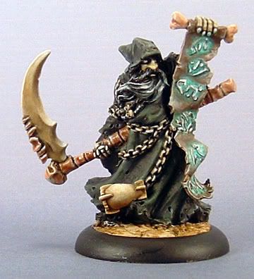
I\'m thinking I\'m going to call the directed lighting/OSL (whatever you want to call it) of the clothing, cloak, etc. good for the most part unless you think that there\'s something missing or off. I\'m going to move onto the NMM parts (sword, belt buckle).

Of course, any advice on how to do NMM OSL would be greatly appreciated; especially considering that I haven\'t done any NMM yet.

wip4bb3.jpg
 

Shawn R. L.

New member
Originally posted by MClimbin
Hey Shawn,

Well, I\'ve had tons of other things to do instead of the mini that I showed you in my last post (about 8 pages ago...), but here is something that I\'m working on. I\'m having a hard time getting the glow to work. I think it looks ok, but it doesn\'t quite work the way I want. Anyway, here is a pic:

Darkrasp1.jpg


I\'d like to know what you think and if you have any suggestions on how to make it better. When you get a keyboard, by the way. :)

Michael

All righty then. Got to the library where there is an actual keyboard! Hurrah for the library!

I\'m assuming you are talking about the rune\'s lighting up. You\'re very close. IF you\'re willing to go to the trouble it\'s not that hard do remidy the problem. The problem you\'re getting is from the 3D quality of the letters. They are simply casting shadows which is defeating what your doing. Your painting of the OSL effect is pretty close to what it needs to be. You now have a photo of what the letter are. Take a chisle or small file and file the letters all the way off. Mask off the rest of the mini, prime the scroll and repaint just as you have done. Some of the highlights on the EDGES of the scroll could use to be darker. Try that and re-post.
 

Shawn R. L.

New member
Originally posted by Hinton
Hey, Shawn.

I\'m thinking I\'m going to call the directed lighting/OSL (whatever you want to call it) of the clothing, cloak, etc. good for the most part unless you think that there\'s something missing or off. I\'m going to move onto the NMM parts (sword, belt buckle).

Of course, any advice on how to do NMM OSL would be greatly appreciated; especially considering that I haven\'t done any NMM yet.

wip4bb3.jpg

The choice is yours. You dont need to make yourself miserable chasing this OSL thing. If you\'re done then that\'s completely up to you.

It appears that the effect is working. It\'s hard to really tell with the neutral background. If you wish, shoot it with a black background and repost. At this point the only part that dosent seem to be working is the num-num\'s (bazoobs, knockers, thingies, love pillows, winnabago\'s, left and right, Wally and the Beave, cones, ..........ya know what I mean?) The flesh appears to be un shaded. As far as NMM goes, just do as you normally would but use a darker pallete and have it get a bit lighter towards the lightsource. Treat NMM as you would a gem. Smooth dramatic transitions and DONT use pure white anywhere except a few choice places (corners and such) to put pure white dot. Just like you would with a gem.
 

Shawn R. L.

New member
Originally posted by Talion
Hi Shawn,

Well here is the mini I want to do OSL on. It\'s a snotling holding a lantern. I\'ve painted him in base colours so far, and put white where I think the light will fall.

I am out of my comfort zone with this, so all the help you can give would be appreciated.

WIP2.jpg


WIP3.jpg


WIP4.jpg


WIP5.jpg


ignore the horrible background the background on the photographs made it even harder to see than normal.

Looks like a cool mini. Is it a \'greens\'?

At this point, paint the white areas pure yellow and everything else as you normally would except lean everything toward darker and duller. Add just a bit of black to your colors that are to be in the \'non lit\' areas to knock a little of the life out of them. The bars/slats in the lantern, for now, paint orange. You might need to undrecoat them with white first.

Try all that and repost.
 

Hinton

New member
Originally posted by Shawn R. L.

It appears that the effect is working. It\'s hard to really tell with the neutral background. If you wish, shoot it with a black background and repost.

Ask and receive:

wip5wn2.jpg


Originally posted by Shawn R. L.
At this point the only part that dosent seem to be working is the num-num\'s (bazoobs, knockers, thingies, love pillows, winnabago\'s, left and right, Wally and the Beave, cones, ..........ya know what I mean?)

Ummm...no. What are these \"num-num\'s\" that you refer to? :p

I remember that I did put in a base shade color, but then never went back and finished it. Good catch; I\'ll get it fixed. Thanks.

Originally posted by Shawn R. L.
As far as NMM goes, just do as you normally (normally? I\'ve never even tried it! There isn\'t a \"normal\" for me. :) ) would but use a darker pallete and have it get a bit lighter towards the lightsource. Treat NMM as you would a gem. Smooth dramatic transitions and DONT use pure white anywhere except a few choice places (corners and such) to put pure white dot. Just like you would with a gem.

I\'ll do my best.

Thanks for the help.
 

Talion

New member
Ok, I\'ve decided to not start highlighting the Lantern yet, thought I\'d get the skin tones done before moving on.

Here he is now.

WIP6.jpg


WIP7.jpg


Excuse the crappy photos they never turn out good. Anyway I\'ve highlight the skin to a certain degree, better than the photo\'s show, but painted the areas yellow as you said, what\'s next.


P.S. He\'s from the Warhammer Quest Expansion Lair of the Orc Warlord.

Cheers
 

Shawn R. L.

New member
@Hinton. Looks like the effect is working fairly well. You might want to make the line between light and dark running down the legs a bit more distinct. NOT sharp but sharper than it is now..........same for the num-num\'s.:cool:

NMM? Dont worry about it. Just paint the sword smoothly and that should suffice. Just remember which end the light is comming from and shade appropriately.
 

Shawn R. L.

New member
@Tallion - GREAT. You\'re off to a strong start. Monitors can differ greatly so if I\'m off in suggesting this, disregard it. The skin on the unlit areas looks very colorful. Not too bright (tone) but too much color (hue) You want this area to be not grey but dull. Dull green with a speck. The lightness and darkness you have is real good. Try green, a TOUCH of black and white.

The alterations I\'m talking about here are NOT huge. BUT if you can get these subtle shifts done, it can take the effect from cute to GLOWING.

The lit areas. Take the yellow you used and add just a speck of green. You want to end up with a bright, yellowish lime green. Dont add white, this will keep the colors stronger.
 

demonherald

New member
Well took a while to sort things out but hopefully settling down to some sort of normality in my life (will I ever know what that is???)

anyway here\'s azrael as he is now.Also included his little helmet bearer chappy.

The thing I am most curious about is the Gun Barrel and other areas at the outer sides of the Light Halo. These are NMM so I\'m guessing they would reflect the light slightly stronger than the other areas being metal ??? You mentioned earlier a little trick??
anyway here goes.


azraelcomp-6.jpg


azraelcomp-15.jpg


cheers


azraelcomp-17.jpg
 

demonherald

New member
also Shwan got these ones going and just wondered your thoughts on these so Far,..
Sorry for the glut of stuff just making the most of limited net time....
thanks again.

assaultchap-1.jpg


assaultchap-4.jpg


dragyri.jpg
 

Talion

New member
Ok

I muddied up the Greens to give it a blander feel, and I\'ve turned the yellow in to a limey colour, I did the same with the basecoat of the band on his wrist.

Whats next?

WIP8.jpg


WIP9.jpg


Cheers
 

Shawn R. L.

New member
@demonhearald - You are well on your way to REALLY doing OSL very well. Be fore I get to the NMM trick, the two things that need help are the sword and the scroll work on the banner. You can retain some of the variation in tones on the sword but due to the fact that it is PRODUCING light there will be no NMM on the sword (unless you have the tip of the sword glowing and it getting gradually dimmer as it goes down the blade and I\'ll let you work out the details if that\'s the case. You appear quite able to handle yourself). Whatever parts of the sword you choose to have be the light source paint PURE white with some very light bands/swirls that you have now. I know you have done a nice job on the sword already and it\'s hard to part with a well done part but instead of seeing it as \'gone\' view it as different. Though different it can still be very cool.

Since the freehand on the side of the banner closest to the sword is so close to the sword go ahead and paint the freehand fillagree white. I cant see the picture right at this writing but if the fillagree on the right side of the banner is white, take it down a notch or two since it\'s in the shadow.

Your other two pieces look great. What you need to do at this point is too again, paint the source of the light pure white and towards the areas that are furthest from the light and yet still lit a darker (not duller) shade of the purple on the one and blue on the other.
 

Shawn R. L.

New member
Originally posted by Talion
Ok

I muddied up the Greens to give it a blander feel, and I\'ve turned the yellow in to a limey colour, I did the same with the basecoat of the band on his wrist.
Whats next?
Cheers

This is a cool fig and it\'s working well. It\'s starting to glow.

ONLY ON THE SHADOW SIDE - shade with black and black/green.

The lamp - There is the top, bottom and the four corner posts and the small bars across the glass. Paint the small bars orange and outline the top,bottom and the corner posts where they meet the glass.

Next time you post try to get a bit more light on the fig and a black background.
 

demonherald

New member
cheers Shawn much appreciated will do as you said.
At this stage the changes aren\'t showing up too well on the photo the sword itself is pretty much all white in the flesh the swirls are an attempt to show a sort of electrically charged element but see what you mean looking at it needs to stand out a bit more.
The fillagree is a bit of a bitch but in all fairness I uite like it as it stands although it seems to have dissappeared on the pic it is still visible. I will pick out some of it a little bit more.

cheers for the comments on the others.
I will go round the blue one with the darker blue The chaplain is classed as finished for now as he was a practise for another one I will be doing at a later date but will bear that in mind when I do that one.

Again much appreciated of the help and will try and get time to post further pics when I\'ve had a fiddle with the paint.
 

Shawn R. L.

New member
The \'trick\' I was referring to with the NMM and actually many other parts is to put a dot of pure white on corners, the forhead, elsewhere where appropriate. This is the same as you would do on a gem. \"Aim\" the white dot to correspond to where the light is comming from. Should be a 5 minute job.
 

demonherald

New member
ahh I like that.. I was thinking something a little along them lines but lost it by trying to do too much of the blue (my first pic on here) Now I seem to be getting more into this effect I seem to be thinking the darker areas and shadows are AS if not MORE important than the lighted areas..
Really has been an inspiration this thread a bit too much as I am looking at every model I do now and wondering what could I make glow on this one????:beer:

Oh well back to the practising ..keep up the good work Sir.....
 
Back To Top
Top