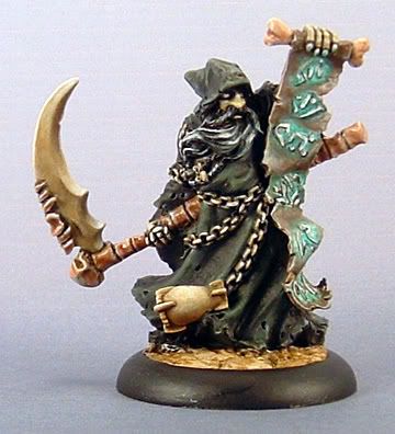
Hi Shawn Classroom #1 for OSL... TAB

Shawn R. L.

New member
@Hinton - So far so good. Start working the rest of the mini, again using the white picures for reference. Remember - contrast.

What is the source of the light? The sword?
 

Shawn R. L.

New member
Originally posted by Talion
Hi Shawn - I\'m going to attempt my first go at OSL.
Quick question before I start, should I paint the miniature up to a finished mini before I start doing the OSL or do the OSL as I paint the mini?
Cheers

This whole thing of teaching is new to me, so how I say to do things is a process in development.

Try painting all the areas with the colors you intend them to be but DONT shade or highlight. Also, indicate what the lightsource is to be.
 

Hinton

New member
Originally posted by Shawn R. L.
@Hinton - So far so good. Start working the rest of the mini, again using the white picures for reference. Remember - contrast.

What is the source of the light? The sword?

Thanks.

The source light is lantern light coming from a low window to her right. I\'m working on the scene at the moment, so once I have some of it together, I\'ll post a pic to give you a general idea of what I\'m doing.
 

Hinton

New member
I could\'ve sworn that I posted the pics of the scene. Well, here they are (the mini is just a stand-in):


scene1dk4.jpg


scene2rf2.jpg


This is far from done. The ground will be dirt with a few background elements. The blocks are made from Hirst Arts\' Castlemolds.
 

Shawn R. L.

New member
That should work fine. Some small rocks on the ground can help things as they will cast long shadows and that accentuates the \'movement\' and direction of the light.
 

Talion

New member
Cheers Shawn........I\'m in the middle of painting something else at the moment, but I\'ll paint the mini to a fairly basic stage then I\'ll post some pics for hlep.

Cheers
 

Hinton

New member
Hey, Shawn. Just posting a couple of progress pics. For some reason, the pics came out kind of grainy. I took half a dozen pictures and they all turned out the same way. I think it might have something to do with the colors on the mini, but it could be that the camera I\'m borrowing is going out.

On the back, I\'ve tried to bring up the highlights on the right while dulling the ones to the left. I\'ve also moved the highlights to a yellow color in order to more accurately reflect the lantern light.

Most of the front is still just basecoats and blocking in shades and highlights.

013zz1.jpg


014eo7.jpg
 

Shawn R. L.

New member
@Hinton - Looking good. The yellow/blue will give a warmer effect to the light. You\'re on the right track.

Now, see if I can explain myself without writing War and Peace. What I\'m going to suggest is a somewhat small, subtle thing but it has a big effect. The area where you transition from the lit, yellow green area and the blue area which is NOT in deep shadow - the back of the head, the peak of a fold. These areas will get a small amount of a cool green. The color I\'m talking about is a forest green. Think pine trees. A bluish green that is a bit muted in hue.

I\'m not talking about one side or the other but the area where the two colors/tones meet.

****Take this new color (forest green) and put a stripe down the border and blend it in each direction.

****The back of the head, since it\'s a broader area where the transition is over a broader area will be wider than the very narrow area of a fold on the cape.

****The area of forest green will be wider and blend over a greater area than a thin fold where the forest green area will be a very thin line....mmmmm k?

Now, the part that could be trickey to explain.....you want to do this \'border painting\' on only one side of the lit area (in most cases).

****You have a fold that is lit from the right. You will have a border area on the left and right side of the lit area. One border is where the fold rolls over into the darker side and the other is caused by the shadow being cast from the fold next to it.

****Only put the forest green on the border that is AWAY from the light source, where the fold rolls over to the darker side. Not the one created by the shadow of the fold that is nearer the lightsource.

****The reason being that the edge created by the fold rolling over to the dark side is more gradual and you get a more of a mixing of the color of the light and the color of the cloak but since it\'s gradually going away from the warm light the color of the cloak will begin to take over and be more prominant.

****The border being created by the shadow cast from whatever is near it is very abrupt, with no transition. If you want to get trickey you can put a VERY thin line of the green in this area.....very thin. It can give the light more of a full spectrum feel and make it just a touch brighter.

If this isnt clear just send me obscene amounts of money and all will be clear. NO NO, just kidding. Try the effect, see what happens and repost.
 

Hinton

New member
Originally posted by Shawn R. L.

Just saw that one earlier today. FANTASTIC! Look and learn.

I saw that one, too and gave it a vote (and yeah, I\'m jealous :D ).

I\'m working on applying what you\'ve said and it\'s looking pretty good (to me, anyway). I\'ll work on it some more and post some new pics in the next day or so.

I really do appreciate the help, Shawn. Thanks.
 

Shawn R. L.

New member
Originally posted by Hinton
I\'m working on applying what you\'ve said and it\'s looking pretty good (to me, anyway). I\'ll work on it some more and post some new pics in the next day or so.

I really do appreciate the help, Shawn. Thanks.

It\'s fun for me being able to pass along what I\'ve learned. I like sharing the joy I find in art.
 

Hinton

New member
Originally posted by Shawn R. L.
Reply when I get to a real keyboard....uggg

Still \"point and click\" keyboard? \"uggg\" is right.

No worries. If I\'ve managed to completely screw something up, I\'m sure it\'s fixable (I hope).
 

MClimbin

New member
Advice?

Hey Shawn,

Well, I\'ve had tons of other things to do instead of the mini that I showed you in my last post (about 8 pages ago...), but here is something that I\'m working on. I\'m having a hard time getting the glow to work. I think it looks ok, but it doesn\'t quite work the way I want. Anyway, here is a pic:

Darkrasp1.jpg


I\'d like to know what you think and if you have any suggestions on how to make it better. When you get a keyboard, by the way. :)

Michael
 

Talion

New member
BogOff The Snotling

Hi Shawn,

Well here is the mini I want to do OSL on. It\'s a snotling holding a lantern. I\'ve painted him in base colours so far, and put white where I think the light will fall.

I am out of my comfort zone with this, so all the help you can give would be appreciated.

WIP2.jpg


WIP3.jpg


WIP4.jpg


WIP5.jpg


ignore the horrible background the background on the photographs made it even harder to see than normal.
 
Back To Top
Top