Hi Shawn Classroom #1 for OSL... TAB

TokenArtGuy

New member
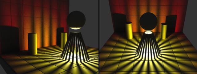
I hope these images help illustrate what is happening in your scene:
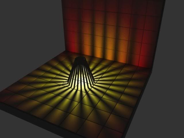
OSL_SceneExample_01.jpg


OSL_SceneExample_2-3comp.jpg


I built this scene in Maya with gray objects representing your scene and the models within it. There is a light in the center of the pyre like shape, the light color goes from white to yellow to orange to red as it gets further from the light source. There is a little bit of background ambient light to give a little definition to the scene objects (this is similar to the gray highlights that Mr. Shawn was talking about painting onto areas outside of the direct light).

I raised up blocks in the floor and wall to simulate your stone bricks (though they look more like tiles in mine as I\'m a little lazy). Notice the edges of the tiles facing the light source are reflecting a brighter edge. As you can see the light projects in a sphere from something inside the pyre, casting shadows in all directions. Technically the knights you have in the background should have shadow stripes on them, though it might read really strange (especially when the knights are out of the display base).

I hope that I\'m not over complicating matters with this illustration. It\'s the only way I know how to accurately illustrate the concept.

Anyhow, I hope this helps.
 

J2FcM

New member
Here\'s my weathered future gladiator... Does that look right? In person I think it looks worse -- the OSL. I oughta fix that AWFUL background...


1770466175_531bc4de51_m.jpg

smaller is better...

1770466175_531bc4de51.jpg
 

Shawn R. L.

New member
@ J2FcM ( what does that tag mean?) You\'re not too far off. What would help here is to, around the eye which is now black, paint with a less brilliant blue with a little white in it. Something like #549 on the chart linked below - it\'s about 2/3 of the way down and it\'s the color BELOW the number. Replace the cast light with this color. Take the color you used for the eye (what color did you use?) and lighten it more, blend it to the center of the eye going out about 2/3 of the way to the edge then simply put a pure white dot in the middle.

http://www.theawristocrat.com/pantone.php
 

J2FcM

New member
thankyouverymuchsir!

I used Hawk Turqoise... Some scaly green added a bit, then some hawk turq. with white. The OSL was hawk turq. then hawk turq+white then plain old hawk turq to tone it back down.

J2FcM is the magical mindset I use to spell my true name out in forum land. Makes no sense to others, but perfect sense to me. J (then an E), then 2 F\'s, a middle name (c) and a last name (M).

Pretty bizzaro.

oh and edit this! are you saying take a color like 549 - shadow grey plus hawk turq.??? and paint it around his right eye? The patchy McMetal eye? All around or just on the left part that I \"got glowing\"?
and then just make the center eye whiter n brighter?

hope it makes sense, I\'m still a lil drunk
 

Shawn R. L.

New member
Paint it AROUND the glowing eye and blend it to black as it gets further away. Also, the cast highlights, use the duller blue for those.

Mmm-k??
 

Beelzebrush

New member
OI!

Darklord... this Iron Painter OSL theme is supposed to be a contest between me versus you .... not me versus half of cmon lol
 

darklord

New member
yeah but mate, for me to have any chance at all i need all the help i can get!! your a far better painter than me so a little help wont make much difference now will it?
 

fortunesfool

New member
Shawn, I haven\'t given up. I\'m just in the process of building a defuser for the picture.

That and taking care of my wife who is about to pop within the next 3 weeks.

Will get back soon.
 

fortunesfool

New member
Thanks for the congrats. I don\'t expect to be overly busy. I\'m kinda used to kids by now as this is our third.

The light defuser (whatever the heck you want to call it) is in the process of the final stages of being sown by my wife as we speak now. It was fairly cheap to make. 4 Wire clothes hangers and about a 1/4 of a meter of thin white muslin.

I promise to get back soon. I just have to get a dullcote on the bad boy as well as the shiny bits have been annoying me.
 

Shawn R. L.

New member
A diffuser dosent take anything fancy to have a good effect. Mine looks like a collision between a cardboard box, some typing paper and wire!......works great though.
 

Shawn R. L.

New member
@darklord - after looking at the 3-D model (way cool) one thing I noticed was that the light on the wall is far more warm than that on the floor. I would keep some kind of consistancy between the two. Unless the wall is really red and the floor is white, you wouldn\'t get that much difference. This is one of the more subtle things yet, also one that ties the whole light effect together. Consistancy of the overall color and tone of the cast light. Kind of hard to explain but try to keep it in mind. This one I thought shows the overall tone and coloring I\'m talking about -


http://www.coolminiornot.com/82809
 

darklord

New member
yeah i noticed that too shawn (must be learning something!!) i have done the floor more subtle (mainly orange through red fading to black) so it ties in with the pyre and the knights, so i was intended having a very subtle and dark red fading up the wall and fading the shadows too. I was conscious not to do them too bright as the fire would look to intense in my eyes.
 

TokenArtGuy

New member
@ Darklord: The 3D model is using a light that simulates a bull\'s eye type of target where the light at the center is white then blends to yellow, then orange, then red. You might see this type of trick done in classic watercolors. I used much higher color saturation in order to illustrate this type of color falloff effect as well as how the logs on the fire mess with your lighting effect :).

In your scene you might need to brighten things up a lot over my example. It will depend a lot on how dramatic you want your lighting to be.

This goes to show you though that when painting a scene or effect sometimes you will have to fudge color placement so that it \"looks\" better. Often what is real doesn\'t look it and vice versa. Movie effects do this all the time to make something believeable. So the short reply is post what you\'ve done for critiques and use my illustrations as simple guides only. :D

Good luck and let me know there\'s anything else I can help with.

P.S. I hope that made sense, woke up at 3:40 am this morning and I\'m still a little off kilter.
 

Shawn R. L.

New member
Originally posted by TokenArtGuy
@ Darklord:
This goes to show you though that when painting a scene or effect sometimes you will have to fudge color placement so that it \"looks\" better. Often what is real doesn\'t look it and vice versa.

Glad you added that. I fudge stuff all the time to enhance the drama of the light and warmth. The trick is is to get away with it without it looking overdone.
 

darklord

New member
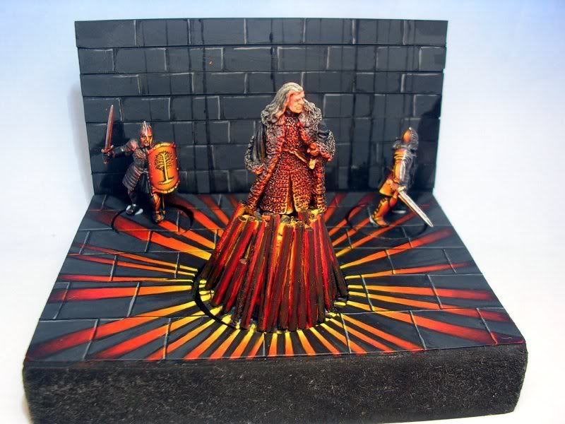
yeah thanks tokenartguy, i did in fact have to bend the rules a little with the pyre to get the look right. anyway here is the latest update. there are points on the base to tidy up, but hopefully it looks ok in general?

oslwip-7.jpg
 

TokenArtGuy

New member
@Darklord: The base and pyre are coming along nicely. The logs in particular are much better.

One thing that I would consider doing, if you aren\'t already, is to push the darkness of the paving stones that aren\'t in direct light. At the end of your light beams furthest away from the pyre they turn dark. Your paving stones should probably be close to that color, especially if they are the same distance away from the pyre.

Keep up the good work!
 

darklord

New member
yeah i intend to darken them and maybe dull down the light slightly. the flash was on in this photo (was just a quickie) so that brightened them a bit but it does look a bit cartoony at the moment!!
going to build up the darkness with same black washes and maybe redden the light beams with a bit of red to tie them in with the wood more
 
Back To Top
Top