Hi Shawn Classroom #1 for OSL... TAB

Shawn R. L.

New member
@darklord - One thing I would change is get rid of the black outlining on the orange \'stripes\' and also, blur the edges the further away from the light source they get....Looks real good so far!
 

darklord

New member
yeah, got that underway shawn, didnt really show up till i saw the photo, i went over the whole base with some thinned black (including the light) then some thin red as i felt the light was too bright. still more washes to do but already looks better for those two touches
 

Shawn R. L.

New member
There are a lot of subtle things that really affect the end product - too many to list, or remember. Think about what\'s happening and be bold enough to try \'what if\'.
 

TokenArtGuy

New member
Agreed.

The best advice my watercolor instructor once gave me was, \"be bold.\" Which was to say, “Push your colors, contrast and darks. Even beyond what you feel comfortable with.”

Or something like that ;).
 

uberdark

New member
so i am nearing completion on this piece and need to get the ground figured out. if you shawn or token art guy could help with how the osl should be on the base i would appreciate it. i am going for the two light sources from the hands. i am sorry for the washed out pics but i am in a hurry to get to bed. thanks both of ya guys. :) :D :)

newpyretroll2.jpg

newpyretroll6.jpg

newpyretroll4.jpg

newpyretroll5.jpg
 

Shawn R. L.

New member
Sometimes when there are multiple lightsources that are the same color and aren\'t too far apart, I handle it as though it were one long light source bridging the two. Two separate ones can be done but it can get a bit complicated and the result isnt that much better.

Your photo from the top shows almost everything you need to know. The light, more or less, is coming straight down so, using the bulls eye again paint it STARTING with a light warm tan and going to a medium cool gray as you go out. Go from 5855 in the light area and blend to 5415. Keep the shadows under the rocks black. Dont get the warmth of the light under the fire, shining on the rock, get too saturated.

PMS color chart.
http://www.theawristocrat.com/pantone.php
 

Shawn R. L.

New member
Originally posted by TokenArtGuy
Agreed.

The best advice my watercolor instructor once gave me was, \"be bold.\" Which was to say, “Push your colors, contrast and darks. Even beyond what you feel comfortable with.”

Or something like that ;).

Sounds crazy but one lesson a teacher in college taught was to take a painting, do ANY idea that came to you and push it to the point where you would actually wreck it. It made me realise that the limits were very broad and not to be afraid to try something different. Wonderful things can be found beyond what is \'safe\'.
 

uberdark

New member
thanks shawn..... i will try this sometime today.

token art guy: how about one of those pretty pictures for me that you did for darklord? *whimpers* *puppy dog eyes*

:innocent:
 

fortunesfool

New member
Okay. Well here is everything. Although, now that I look at the pics, I realize that I need to brush off some of the strings from the dullcote just to tidy things up.


gallery_1023_25_236649.jpg

gallery_1023_25_55880.jpg


Here\'s a picture of light baffle with the black, blue, and white backgrounds.


gallery_1023_25_16000.jpg
 

TokenArtGuy

New member
@uberdark: I\'ll do my best to get an example done for you today.

@Darklord: Looking very good. I\'d push the darks in between the light rays a little more and especially around the edge of the display and on the walls. You might also want to lighten up the red that runs off the edges, it will read better going up the walls. If you run the red a little further up the walls it should read better and add some more interest to your background. In my opinion anyhow, what do you think Shawn?
 

TokenArtGuy

New member
@Uberdark:
First off I know you all are going to say, \"What, no fire?!?\"

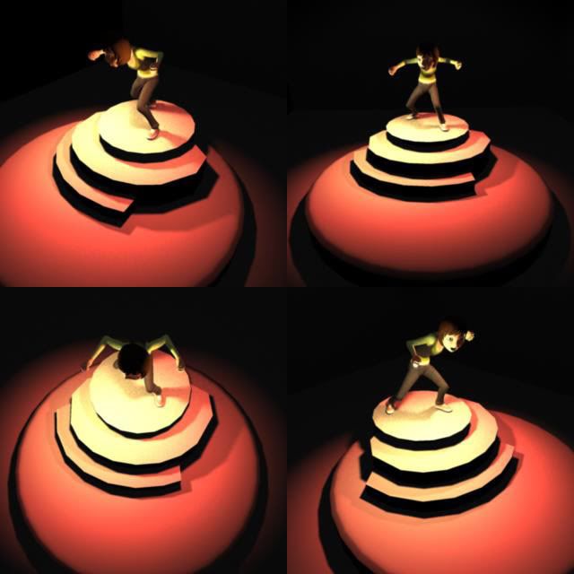
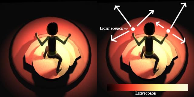
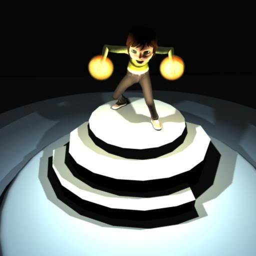
Ok, so I made a mock up of your scene. The model is John Doublestein\'s AndyRig and is made for SCAD students (which incidentally is where I went to college). I placed the lights in front of her balled fists of furry as I didn\'t want to take the time making a totally accurate light source that ran the length of her forearm.

Hopefully this helps with your shadow quandary:

OSL_newpyretroll_example1.jpg


OSL_newpyretroll_example2.jpg


The dual light source is going to cause problems like Shawn said. They will lighten up the cast shadows that the figure is casting. I suspect that you will have to play around with the shadows so that they look good as accurate ones may read funny.

Let me know if I need to illustrate this differently.

Good luck!
 

Shawn R. L.

New member
@ darklord - the glow of the light is working well, the colors are off. The cast light is the same saturation as the light source. While being warm, the cast light would be more of a shade of grey than a pure color. This is one of those backwards things in doing OSL. By reducing the color in some areas, it will strongly make the light source look brighter and much warmer. I think That\'s what I was getting at many posts ago with how saturated the color on the fig is. The tone - the light and dark work fairly well, the colors are too saturated on the fig.
 

uberdark

New member
so what would you guys reccomend i use to shade and highlight then. the red,yellows and oranges or the blues and bleached bone highlights shawn reccomended?

please let me know

thanks again.

john
 

TokenArtGuy

New member
@Uberdark: Depends on what mood you are looking for. I tend to over saturate the examples I build for you fantastic people so that it is easier to see the color transitions. If I was better at reading and comprehension I would have chose colors closer to what Shawn said so as to illustrate what he was saying. :D

If you paint it under saturated like Mr. Shawn said, then if you decide you don’t like it you could easily add more saturated colors on top.

Then again you have a big blue guy, you have the option to blow out the color saturation and go for something different. Whatever you decide the cast light shouldn\'t be as bright as the actual flames though.

Like I said earlier I\'m just trying to illustrate a possible option. Using the 3D models and lights are to help see where the light is going as it would be hard to actually shine a flashlight from where some of these light sources are coming from. In your case you would end up with a double shadow, or you could simplify it down to one like Mr. Shawn said. Do what looks best and reads easiest.

You might want to push some darkness onto the guy\'s back where the light might not reach so well, it would give some extra punch to your flaming arms.
 

uberdark

New member
after giving it some thought i think i am gonna go with the orange saturation. i believe that if i use the contrasting color of orange with blue and emphasize the warmer colors it will help to actually pull the viewers eye to the piece as a whole. if everything has orangish hues and one blueish hue in the middle it would only be natural to follow it to the epicenter.

thanks again guys.

you both rock.
 

TokenArtGuy

New member
@Uberdark:
I changed the light color to match the PMS 5415 and 5855 colors. The shadows are darker and more defined as well.

OSL_newpyretroll_example3.jpg


OSL_newpyretroll_example4.jpg


Let me know if any of this is helping you guys. I can certianly change tactics if this doesn\'t do it for you.

-Mark
 

uberdark

New member
got most of the job done except for the head. what do you guys think of the paint job on the base. i went with shawn\'s idea mainly because the orange yellow highlights looked like shiite.


newpyretrollnov1.jpg

newpyretrollnov2.jpg

newpyretrollnov.jpg
 
Back To Top
Top