Hi Shawn Classroom #1 for OSL... TAB

Shawn R. L.

New member
@emothepainterguy - Good piece. Tips?? The eyes could use a much lighter, if not white center and the hand, wrist and forarm with the lightning could use some much more whitish highlighting facing the lightning.

@tinweasel - Looks real good. Here\'s a few necron I have done with the ol OSL trick. One thing I did do that REALLY helped the crystal light up is to drill it out and paint the hollowed out center. You could use some green highlighting on the rest of the mini.

http://www.coolminiornot.com/144603
http://www.coolminiornot.com/129433


Your Gandalf - Post some WIP\'s. I have been looking at your thread and didnt want to butt in as it looked like you were doing fine on your own. Willing to help though.
 

Tinweasel

New member
Originally posted by Shawn R. L. Looks real good. Here\'s a few necron I have done with the ol OSL trick. One thing I did do that REALLY helped the crystal light up is to drill it out and paint the hollowed out center. You could use some green highlighting on the rest of the mini.
Thanks for the compliment! Actually, the neon plastic rod in the pic is hollowed out with a bright white interior - the brightness is a little more striking when seen on the figure itself. So far as the green highlighting/lighting reflected off the rest of the miniature, I decided to keep it fairly subtle - there\'s a few areas that could probably do with being a bit brighter with reflected green light (around the coils of the flayer, for example) but I think the reflected light shows up pretty well on his throat/neck, face, abdominal cables, and especially on his \"vertebrae.\"

Your painting of the Destroyer is pretty cool - I\'m thinking you ran into the same problem I did, though, in trying to match a color of paint for the lighting effects with the final appearance of the neon rod - I finally settled on a mixture of GW Striking Scorpion, Green Ink, and a hint of Skull White, but I\'m thinking in some areas on my Warrior it really ought to have a little more white in the mix. I\'m assuming that on your Destroyer the sectioned carapace is painted on? Very realistic, if so... what did you use for the vent partitions on his underbelly \"exhausts,\" out of curiosity?

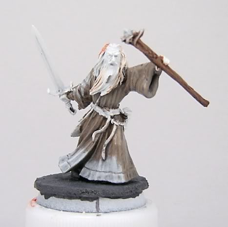
I\'ll likely be posting some WIP pictures of Gandalf fairly soon - had a chance to do some work on him today and I think the white light on his robes is done... but I\'m a bit iffy about the coloration and whether I should tint it back a little more greyish. I\'ll maybe see what happens when I add in the orange glow or something.
 

Tinweasel

New member
Something\'s just not sitting quite right with me about him appearance-wise thus far and I can\'t quite put my finger on it:
gw_gandalf_wip8.jpg


He\'s still very much a WIP, but for some reason the color looks \"off\" on both the white light and the \"firelight\" glow. Any ideas/suggestions?
 

Shawn R. L.

New member
@ - Tinweasel - The Necrons look REAL good. Personal taste but I would add some white highlites to the \'grill\'s\' behind the main crystal and some light on the top of the arms, face, small parts of the gun etc. One of the hard things I had in doing the Necron OSL style is that there was so little to work with so I had to make the most of those little areas......that said, they are still good looking as is.

Your Gandalf is still at too early of a stage to really direct you. You seem to know how to paint well and have a grasp on OSL so give it a go and post some WIP\'s further on.
 

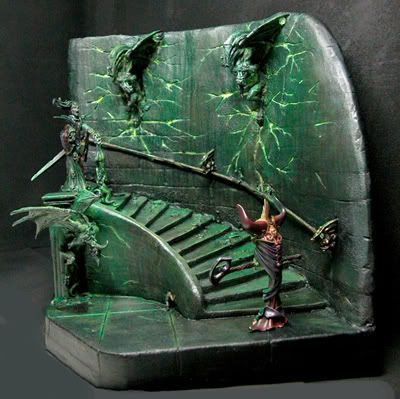
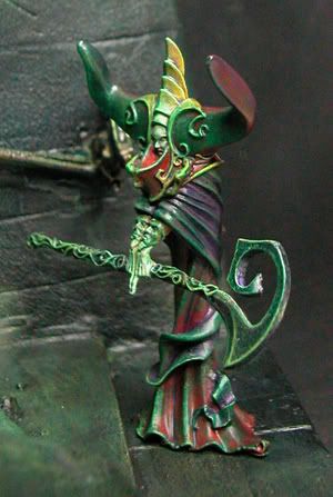
TAB Studio

New member
1ipc7sm.jpg

1ipc7her.jpg


Thanks shawn as I paint I think \"what would shawn say?\"
Cheers
TAB:D
progress pics and explanations at the blog in sig if you want more info
 

Evil Bones

New member
tab great diaroma...
like the setting better without the figures in it.
could imagine haveing a DM in a D&D game say you enter a magicians tower.
pulls this piece out and sets it on the table....all the gamers jaws drop and then they soil themselves wondering if they are dead yet.
once again great piece off work!
cheers:beer::beer:
 

Tinweasel

New member
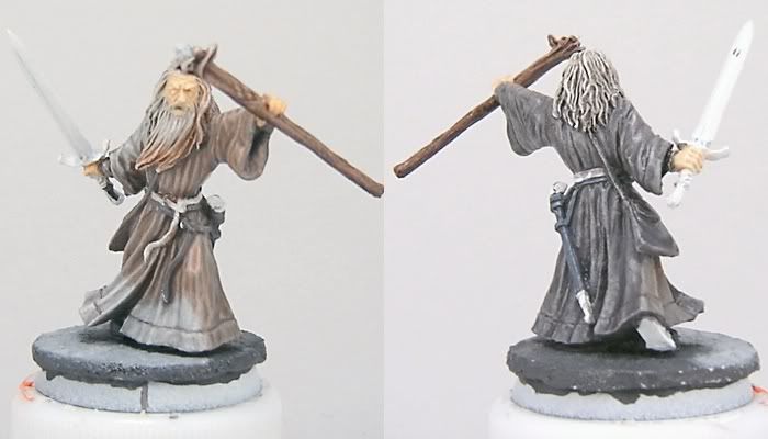
Been doing some work on it, and hopefully it\'s a little more obvious where I\'m going with it. I\'m hoping I haven\'t overexaggerated the base of the staff head blocking the light from the crystal, but I figgered even if I was overly exact with the white light, the orange light would compensate. I\'m not sure about the back - it looks a lot darker/blacker on my end, but it\'s also fairly glossy from my thinner mixture... would appreciate feedback, though. I\'m wondering about the color of the fire glow and of the light from the crystal, specifically.
gw_gandalf_wip10.jpg


I\'m using the material base color as a basis for the lit materials and then going nuts with adding in the color for the lighting effects.
 

Shawn R. L.

New member
Three things I would need to know

Is the sword glowing and if so, what color is it glowing?

What color is the crystal glowing?
 

Tinweasel

New member
Originally posted by Shawn R. L.
Three things I would need to know:

Is the sword glowing and if so, what color is it glowing?

What color is the crystal glowing?
Easy enough - the sword is currently unpainted and will not be glowing, but I do plan on having it lit by the light from the crystal.

The crystal is glowing white, and then everything front-facing from the direction of the line on the base is firelit by the flames from the imaginary Balrog.

At this point, the flesh is simply basecoated - I know the left hand will be darker and the part on the front of the staff lit by fire. The right hand will be lit by the light from the crystal ideally. Likewise, the crystal lit part of the base is done, but the rest is unfinished.

Not sure if you can tell from the rear picture, but the \"spine\" from the staff below the crystal juts out to the right side and below a little directly between the crystal and Gandalf, so I\'ve got kinda a crescent shape cutting across his middle (half his beard and right torso down to about his knees) and then stopping on his left side due to the staff itself blocking the glow as well as the abrupt backwards sweep of his robes from his forward left knee.

Something about his beard looks off to me, and I\'m not sure if it\'s because I need to add a little more white into the mix or shade the firelit areas with a hint of lighter grey or what...
 

Shawn R. L.

New member
I\'m familiar with the scene in the movie you\'re trying to do. If you aren\'t going to have the Barlog then having the orange glow will simply get in the way and be confusing. I wont push that point but without the source of the orange light it simply wont make sense. If you decide you want to have the orange glow I will still try to help you.

Before I comment further I\'ll see which direction you want to go.
 

Tinweasel

New member
Well, I\'ve kinda gone into it with the intention of doing everything from the initial \"You shall not pass!\" bridge scene - minus the Balrog (which I don\'t own.) Conversion so the pose matches a bit better, a bridge for him to stand on that\'s a WIP yet, and the lighting on his front face as if from two sources.

Any suggestions on getting the firelit appearance down would be good, as it\'s not really something I\'ve seen done yet in any of the miniatures I\'ve come across. (I\'m sure they\'re out there, but most of the stuff I\'ve looked at for reference is nearby lava flows, glowing lights, direct nearby sources of flame, etc.) Ambient lighting from a very large, erratic fire source from a healthy distance, though... I really could\'ve picked an easier subject to try out involved OSL for a first attempt, really.

Help/suggestions on the light from the staff crystal would be good, too, but I\'m finding the orange tinting to be trickier than painting a bright white light - unless the current effect looks kinda crappy, in which case it\'s all moot.

(Obviously I won\'t be finishing this before tomorrow to enter it in the local GW store painting competition, as was my original intent...)
 

Shawn R. L.

New member
From what you said it sounds like you are going to go with the two light sources.

The way I would suggest doing this is to do one lighting effect at a time. Start with the firelight. I would simply go with a the firelight comming from the front and above. For the time being, ignore the staff and it\'s crystal. Paint everything (except the crystal) on the side facing the Barlog burnt sienna ( a reddish brown, rust color). Paint everything that isnt facing the Barlog dark grey.

One thing that might help this piece is to mount it on an oversized base so you can show a cast shadow from the fire. This will \'explain\' the firelight to some extent.
 

Tinweasel

New member
Originally posted by Shawn R. L.I would simply go with the firelight coming from the front and above. For the time being, ignore the staff and it\'s crystal. Paint everything (except the crystal) on the side facing the Balrog burnt sienna ( a reddish brown, rust color). Paint everything that isnt facing the Balrog dark grey.

One thing that might help this piece is to mount it on an oversized base so you can show a cast shadow from the fire. This will \'explain\' the firelight to some extent.
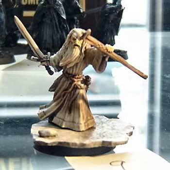
Well, I ended staying up (like an idiot) all night Thursday in a serious tactical error of judgment (thus pissing off my wife - as I said, a serious tactical error of judgment)... the positive outcome, I guess, would be that I ended up finishing the figure in time to get it submitted for the GW LotR painting competition. It was well received by the manager, who was the one who asked me to try painting my entry with source lighting.

Before I read your last reply, Shawn, I actually was forced to redo the base again. I tried to fix his foot which wasn\'t flush with the base and the figure was simply pinned and glued - I tried dissolving the glue from the underside, which worked to a certain extent, but when I started to separate the figure from the rest it basically shredded the base.

I made a new, wider one out of the same material, and although not as obvious in the pic I\'ve got due to poor lighting/photo conditions, I\'ve got three \"light sources\" painted on there - the white from his staff crystal, the ruddy glow brushed on the raised grey stone color backwards, and the area blocked from both supposed light sources by Gandalf himself, which is darkly shaded grey stone getting blacker as it moves towards Gandalf\'s back.

I apologize in advance for the picture, but I ended up taking one in the GW shop after the figure\'s already in the case and entered into the competition - the case has some serious orange-tinted lighting and is backlit by the outdoors from a window behind. Not exactly the most ideal photo setup:
gw_gandalf_wip11.jpg


I more or less have been painting him the way you suggested: I started with the light from the staff, though, and blocked out all those areas of color; I took his robe, belt, beard, etc. base color, worked in GW Hobgoblin Orange paint and orange ink, and painted up highlights in all areas not lit by the staff with the light source directly in front of him at a largish angle; anything not lit by either light source was done in highlighted and shaded base colors, with the shadows deepening in color the further back/deeper in they went.

I added the stone on the base to give an obvious shadow and light source direction from the staff crystal, I lightened up all the white shadowed areas as I think they were a little dark, I lightened up the shading in his beard, and I tried using OSL shading with the metallics of his sword - all blade areas generally facing the crystal were painted silver/white blended up to light edge highlights, all areas generally facing the Balrog were painted with silver + brown ink + orange, and all areas facing away were shaded with brown/black inks.
 
So I\'ve watched this thread for a long time, and thought I\'d post what I\'ve done with OSL and get comments, opinions, suggestions, etc. etc.

Was trying to go for a more red glow to this Space Marine\'s lens. I think the effect came across pretty well, but if you have any comments or suggestions about how to enhance it let me know. (Just ignore the rest of the mini\'s quality. It\'s being reworked. :p )

520297405_8c0798a813.jpg
 

vincegamer

New member
That eye is fantastic!
Mine didn\'t come out so well.
What could I do to improve it?
(Keep in mind this is a familiar, so it\'s only about 10mm high)

img469e263203111.jpg
 

Roger Bunting

New member
I think it\'s a pretty good job, Vince. The familiar is kinda cute and freeky at the same time. Now you need to expand the vampire animal range with a model of Count Duckula.
 

fortunesfool

New member
Hey Shawn. I know this is a bit of threadomancy but I was wondering if you\'re invite of OSL help was still available. I\'ve got a dwarf that is just screaming to be lit up.

It needs to be finished in about 30 days. I promise to work on it and provide pictures atleast twice a week.

So what do you say?
 
Back To Top
Top