You are using an out of date browser. It may not display this or other websites correctly.
You should upgrade or use an alternative browser.
You should upgrade or use an alternative browser.
Hi Shawn Classroom #1 for OSL... TAB
- Thread starter TAB Studio
- Start date
OK this is my new try hope you can see it well i do the flame lighter, and the body darker, and more orange. i think there is an improvement, but as i say in the first post ani idea is welcome.
This mini is for a local paint competition and the ending date is the saturday so every commet is welcome.

This mini is for a local paint competition and the ending date is the saturday so every commet is welcome.

Shawn R. L.
New member
The flame is much better. The colors on the little figure (the glow from the flame) need to be not so colorful - duller.
Shawn R. L.
New member
Wish I could have been more helpful. haven\'t been feeling too well lately.
TheLeviathan
New member
Well, time for a real eyesore now. Both my painting and my photography! (this was taken with a friend\'s camera, I\'m only half responsible...right?? : /)
Edit: Ok, soon as I find some webspace to put this on. GAH!
Edit: Ok, soon as I find some webspace to put this on. GAH!
Shawn R. L.
New member
Shawn R. L.
New member
Let\'s get it started!!
TheLeviathan
New member
Here they are. The pics aren\'t great, and they make the sword look pretty poorly blended, but here goes anyway.


I\'m finding the background very distracting myself  Dunno about you Shawn
I know it\'s something Eldar, but with the closesup and the background, I\'m not sure what it IS exactly we\'re looking AT, so I would imagine trying to decide where to OSL would be quite difficult
May I suggest simply placing some mid-tone blank paper or card behind next time you take a pic?
I know it\'s something Eldar, but with the closesup and the background, I\'m not sure what it IS exactly we\'re looking AT, so I would imagine trying to decide where to OSL would be quite difficult
May I suggest simply placing some mid-tone blank paper or card behind next time you take a pic?
TheLeviathan
New member
*chuckle*
Sadly, those pictures where a one time deal for now. I borrowed a camera from a buddy of mine to take them, he\'s a few states away now.
I\'ll take more as soon as I\'m able.
What the pictures are of is an eldar walker, from the back. Those are the backsides of his star cannons. I wanted to make them emit light on themselves and the nearby frilly things that come off the back of the model.
More pics as soon as I\'m able, though not sure how soon that\'ll be.
Shawn R. L.
New member
@TheLeviathan - I\'m going to have to confess ignorance. I\'m not familiar with that model and am not sure what the light source is supposed to be.
@cabalier - Congradulations!!!
@cabalier - Congradulations!!!
Shawn R. L.
New member
The flame looks fine - dont touch it. The fig he\'s holding needs to be darkened a bit. On the side that is facing the flame put a wash over it. The light\'s are too light and the red\'s are too red.
It appears that the top of the little fig is white. Try to make that into a grey. Like I always say in this thread - have the lightsource be the ONLY place where there is white.
On the front left -chest? - area of the dreadnot, drybrush on some rust color. This will cause the light to extend to that area. If there are areas of the arm that are visable IN A STRAIGHT LINE from the lightsource, highlight those also with rust.
Next time you post a pic try to have more than one light lighting up the fig. One on the left and the right and one above NOT on the same plane as the fig. Have the lights and the camera on the same plane.
emopainterguy
New member
Hey Shawn, I just wanted to thank you again for your help on my GD entry, I think I mentioned I made first cut. I thought I\'d post the \"finished\" product here for you in case you hadnt seen it yet.
Thanks again.

Of course any tips on improving it would be greatly appreciated still
Thanks again.

Of course any tips on improving it would be greatly appreciated still
Tinweasel
New member
First I\'ve seen of this thread, oddly enough, and I was wondering if I could get some feedback on something I just painted as (a) \"test figure(s)\" for OSL for a Necron army I just started painting. I\'m nearly done converting the Lord and will probably go to town on him with nifty effects out of fairness\' sake... so picture a similar scheme to this, only with more badassery:
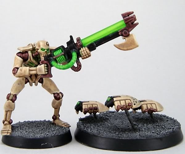
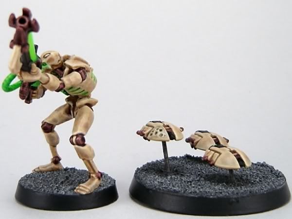
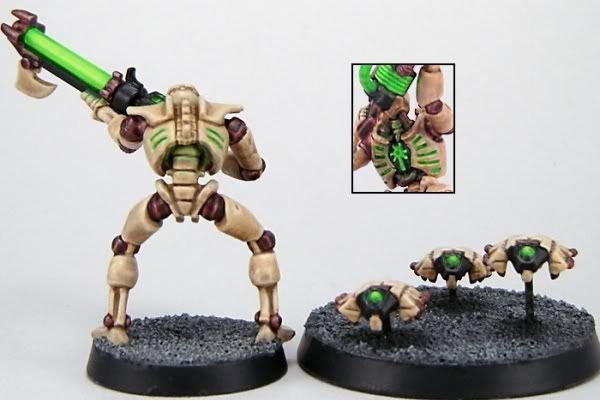
I\'m also working on a Gandalf the Grey on the bridge on Khazad-Dum facing off against the Balrog. I\'m not painting a Balrog, but I am definitely doing Gandalf with the ambient/Balrog flame lighting and his staff held aloft with the white light from the crystal - ideally I\'d like to do a custom bridge display base that\'d show more of the orange light from the Balrog\'s flame.
I guess so far as this thread goes, at what point would it be appropriate to post something for feedback? I\'m just starting the blending to highlights on his robes now having settled on an appropriate greyish-purplish-red basecolor for his outfit. (Looking at daylight pictures of him from the movie, he\'s not strictly grey as his robes have got more of a bluish-purplish tinge, so I figgered I\'d start there and work my way up to highlights and then do shading in the off areas working in some orange.)


