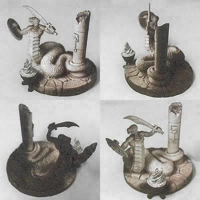
Hi Shawn Classroom #1 for OSL... TAB

Shawn R. L.

New member
OK. Might have a hectic few days comming up (Ill parents) but I will get back to you. Look back 2-3 pages in this thread and look at the pic I posted of a Rembrant painting. That is somewhat the color/tone scheme I will be showing you.
 

Shawn R. L.

New member
vermeer.jpg


This is a good example of how having dull and dark as part of a piece can REALLY accentuate the light and color. The dark and dull gives your eye a point of reference that is far from the color and light. It\'s that distance between the two that really kicks things into high gear.
 

Shawn R. L.

New member
Originally posted by Modderrhu
Okay, so the airbrush worked like a charm. :) It has made an incredible light map.
e99bb9e0.jpg


Now to try and find a colour scheme...

Fantastic!!! The flame itself looks like it needs to be more white. Could be the photo or my monitor though. What colorscheme are you wanting to go with?
 

Modderrhu

New member
Originally posted by Shawn R.L.
Fantastic!!! The flame itself looks like it needs to be more white. Could be the photo or my monitor though. What colorscheme are you wanting to go with?
Yeah, I brushed the primer on the flame. Just a very thin coat, so the metal is showing through. Then washed white, to get the white into the recesses where the flame would be brightest. Besides, they\'re crappy pics with a crappy camera.

As for colours, I was thinking of using the green-purple-orange triad. Green and purple patterning on the snake\'s back scales, bone yellow on the belly scales. My concerns are that the light is going to be a warm, yellow light, and I\'m puzzling on how to represent purple under yellow light. I\'m just plain undecided for the stone; a blue-grey granite, neutral grey or sandstone, I can\'t make up my mind.

Perhaps what\'s really bugging me about this warm/cold thing, is that mixing warm and cold on a mini (except for details) can ruin the entire atmosphere. The atmosphere of this mini should definitely be warm.
 

Shawn R. L.

New member
Originally posted by Modderrhu
Originally posted by Shawn R.L.
Fantastic!!! The flame itself looks like it needs to be more white. Could be the photo or my monitor though. What colorscheme are you wanting to go with?
Yeah, I painted the primer on the flame. Just a very thin coat, so the metal is showing through. Then washed white, to get the white into the recesses where the flame would be brightest. Besides, they\'re crappy pics with a crappy camera.

As for colours, I was thinking of using the green-purple-orange triad. Green and purple patterning on the snake\'s back scales, bone yellow on the belly scales. My concerns are that the light is going to be a warm, yellow light, and I\'m puzzling on how to represent purple under yellow light. I\'m just plain undecided for the stone; a blue-grey granite, neutral grey or sandstone, I can\'t make up my mind.

Perhaps what\'s really bugging me about this warm/cold thing, is that mixing warm and cold on a mini (except for details) can ruin the entire atmosphere. The atmosphere of this mini should definitely be warm.

If you want to mix warm and cold you might try having a warm light and a cold secoundary light source.
As to the other colors what you might try is how I coached (cant remember his name but he did the dwarf with the light on his head) simply forget the end colors at this point and do a coloring from white-yellow-orange-reddish-warm brown as per the old paintings I have posted. Get it all smoothed out. Then put transparent washes of the \'real\' colors over it and that should give you an idea as to what the \'lit\' colors should be. Actually, a simpler way might be to do the warm gradiation on a piece of white paper and put the transparent colors over that, use that for reference and paint the resulting colors on the actual mini. Same thing for the dark side.

You might try looking at these links......if they work.


http://www.geocities.com/Hollywood/Land/9730/lotr/galadriel6.jpg

http://images.google.com/imgres?imgurl=http://www.jigboxx.com/jps/su/su05095.jpg&imgrefurl=http://www.jigboxx.com/jps/su05095.html&h=270&w=360&sz=31&hl=en&start=3&tbnid=AslEGcgjYxDu4M:&tbnh=91&tbnw=121&prev=/images%3Fq%3D%2522Hildebrandt%2Bbrothers%2522%26svnum%3D10%26hl%3Den%26lr%3D%26sa%3DX

http://images.google.com/imgres?imgurl=http://members.tripod.com/~zyron13/images/storyteller.jpg&imgrefurl=http://members.tripod.com/~zyron13/story.html&h=216&w=300&sz=61&hl=en&start=36&tbnid=1mblWIpBafbTqM:&tbnh=79&tbnw=111&prev=/images%3Fq%3D%2522Hildebrandt%2Bbrothers%2522%26start%3D20%26ndsp%3D20%26svnum%3D10%26hl%3Den%26lr%3D%26sa%3DN
 

Shawn R. L.

New member
Here\'s another link. One thing to notice in some of them is, and this isnt a critisism, that the warmth of the light takes over the colors. With OSL there are MANY directions it can be taken. The Hildbrandts were MASTERS at it. Some of the others shows the light effect without slanting it warm or cool. When they did warm it was REALLY warm and when it wasnt it was crystal clear-white. I havent seen much of their stuff inbetween.
 

Modderrhu

New member
I looked at pics, and looked, but in the context of the pics, it was hard to see what colours were actually there. So...

Rules, I like to have some rules, mainly \'cos I\'m an inexperienced git. So I took out all my paint pots and held them in front of my mom with two lit candles. I know the colours in my pots, so getting my mom to check was probably more accurate.

My initial thoughts were that light from a fire is \'low\' energy light, so lacks blue. Greens would also suffer somewhat... any high frequency wavelengths, for that matter. So, based on my mom\'s descriptions of the colours;

red purples - became more red, almost maroon
purples - became reddish purples
blue purples - became more purple
blues - seemed to just darken
blue greens - just became a little more green, but retaining an obvious bluish tone
yellow greens - remained as is
yellows - remained as is
orange - remained as is
reds - seemed to brighten and intensify, GW Blood Red looking slightly more orange

Greys - now here\'s an interesting one!
Charcoal - became a very dark golden brown
lighter greys - GW Codex Grey and lighter became sandy, with a very light grey turning beige.
white - became beige

Browns remained pretty much unchanged, except for a slight tendency of neutral browns to become more yellow.

This seems to support the idea that the colour under yellow light is the same colour, with some blue removed, and a bit less green removed. (It makes more sense when using the RGB colour model, as used for light and not pigment)

Does this agree with your experience, Shawn?
 

Shawn R. L.

New member
Mabey the link was counter productive. I\'m always so stunned by the intensity of the light they do that I couldnt resist putting it up. You\'re right though, the colored light they do tends to overrun the colors inherent in the object being lit.

The color\'s you listed are pretty good. Here it depends on what direction you want to go. The color list you have will give a \'brighter\' cheerier light. In the other direction, as you mix the colors, sometimes they can dull a bit, just a bit, this can give a more realistic look. Not so much bang. They are both legit and good, just different.

Take the same color list you have and add a touch of black and white to each color and do the dark side. The black does two things. One, it darkens it (duuhhh) and the secound is that it dulls it. The back side does have some light, but way less and thus the colors will darken and get duller. The white - just a touch - will prop them up a bit and keep them from going to mud or black.

An interesting trick would be to do the dark side in just shades of grey - no color. This would REALLY make the colors on the lit side pop.

Post WIP\'s.

Over and out.
 

Modderrhu

New member
Originally posted by Shawn R. L.
An interesting trick would be to do the dark side in just shades of grey - no color. This would REALLY make the colors on the lit side pop.
Okaaaay, so it\'s pretty much on the right track then. :D I\'ve been wanting to give the effect that the brazier is the only light source, so your trick here is food for thought indeed. I\'ll add a little colour to the greys, just to prevent the dark side from losing too much visual interest. Thanks a stack, Shawn, much appreciated. :)

Right, now to forge ahead with confidence... yeah, right. lol

BTW, >>here<< is an image that intrigued me, and prompted the experiment, \'cos the blues seemed so blue, but just right.
 

Shawn R. L.

New member
OSL is VERY flexible. The basic trick is to make something look lit..........no problem. Where the almost infinate variables come in are -

A - how bright is the light?
B - is it warm or cool?
C - How \'big\' is the light effect. How far away does the light reach.
D - What is the ambient light?
E - Is there an ambient light?
F - an almost infinate combination of the above.


This is kind of a good news bad news thing. Once you get the hang of what\'s happening you can do ALOT of different things. At the start it can be real confusing.

I\'ll ask you to define just a few things and use those as a roadmap.

A - How bright is the light source?
B - Is it warm or cold light or simply white? How warm or cold is the feeling you want to project?
C - The secoundary light source (ambient light).........do you want a secoundary light source? How bright is it and is it warm or cool?
Decide what you want and that will awnser alot of questions.
As to the pic link, it \'s lit with a somewhat white light. The warmth of the picture comes from the fact that alot of the things being lit are things with warm colors to begin with.

Hope this helps.................talk to me baby!
 

Modderrhu

New member
Originally posted by Shawn R. L.
A - how bright is the light?
B - is it warm or cool?
C - How \'big\' is the light effect. How far away does the light reach.
D - What is the ambient light?
E - Is there an ambient light?
F - an almost infinate combination of the above.
Good questions! They might be easy to answer, but it\'s always good to formalise what one is trying to achieve. Saved for future reference. :)
Originally posted by Shawn R. L.
A - How bright is the light source?
B - Is it warm or cold light or simply white? How warm or cold is the feeling you want to project?
C - The secoundary light source (ambient light).........do you want a secoundary light source? How bright is it and is it warm or cool?
A - being a brazier, it should be fairly bright. That will make for a good tonal contrast between light and dark. The only thing that\'s bugging me about this, is that the light radius ought to be fairly large - I want it small. It looks good in my head (not much does), so I\'ll go for a small radius anyway
B - Oh, it\'s warm. Definitely warm. A nice orangey/yellow light from a fire.
C - No second light source, just the brazier.

Again thanks, Shawn. I\'ll get started tonight, since I have a better idea how to achieve what I want.
 

SirJD

New member
Hi Shawn,
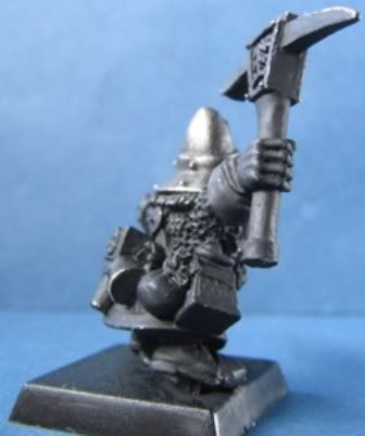
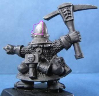
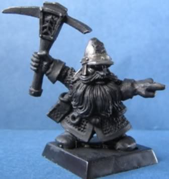
After reading through the thread and seeing some of the great results, I would like to try and learn OSL, if that’s ok. I tried on my own, but I’m not sure I’m getting the hang of it. I would like to try and paint the dwarf (pics below) with the OSL coming from the lamp at his side, as if he is underground. In the pics below you can see I started work on the helmet, I painted the highlights where I thought the light would shine and I shaded where I thought the shadows should be, although I don’t think I have it right. In picture 2 the purple area is not a highlight, its just the my light shining on the helmet. I was thinking of a more ambient light from the lamp, rather than a really harsh, bright one, and it would be the only light source.

Eagerly awaiting your reply,
SirJD


WIP003.jpg


WIP0002.jpg


WIP001.jpg
 

Shawn R. L.

New member
@ SirJD - This could be a really cool one. It\'s up to you which direction you want to go in but I have some definate ideas that I think might turn this one into a real winner.

Step one. Paint it black and the windows of the lantern pure white. Without making it look like a plaster job, get enough white on till it looks very white. Post WIP\'s
 
Back To Top
Top