Need a mentor to point me in the right direction

Torn blue sky

New member
If you're going for the zen light dealio, Ice, i'd recommend doing away with the 'Evy Metal pictures and find one you like on CMoN. The GW painters use line highlighting by large so it's not worth looking at.
A simple thing to keep in mind if you're going for line highlights though, is to highlight the edges that are at the topmost of a piece, blend "up" as it were so the line highlight looks more 'natural' , for want of a better word.
For instance, a knee pad would have only the top part of it line highlighted, but so would the top of the grieves under the knee pad and around the back, rinse repeat with every other part.

I have to say most the answers I found, I did by myself by studying the pictures and thinking about how they did it, absorbing where the highlights would be. Remember, success is 99% failure!
 

-Ice

New member
Ah, finally got some pictures!

Please view the entire album here for more pics! Comments welcome!

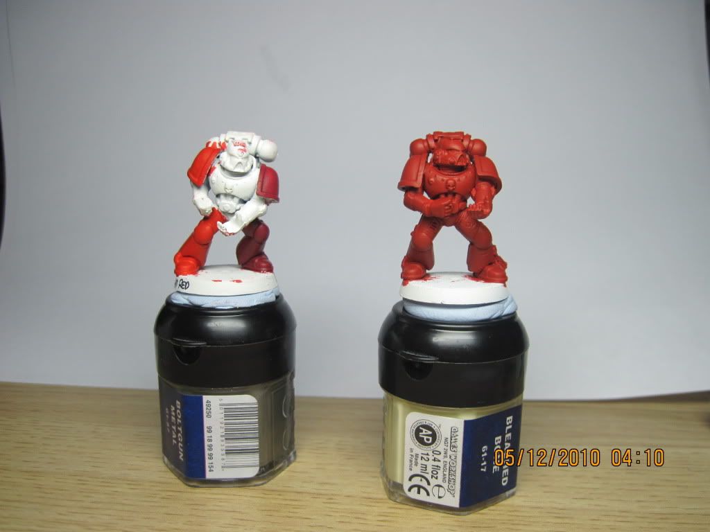
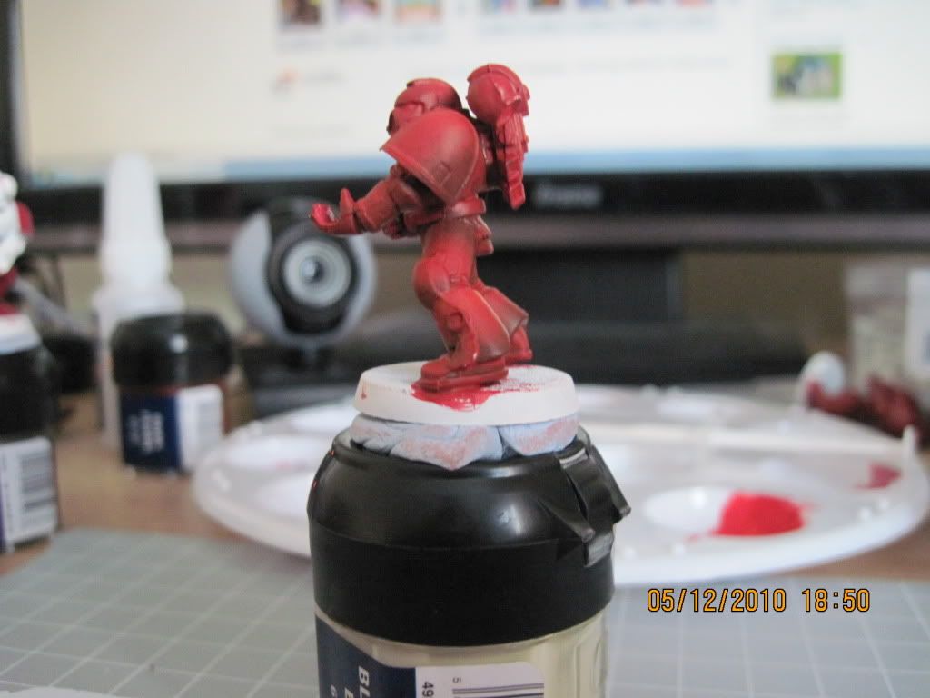
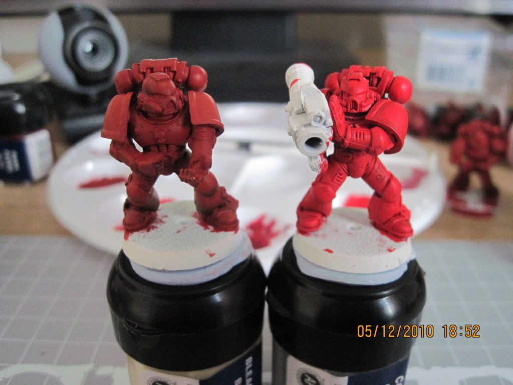
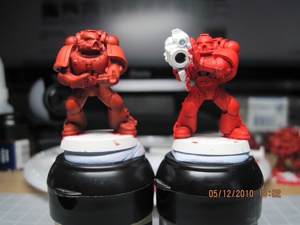
Two of my test figures. The one on the left has a Blood Red basecoat on the left shoulder (actually, that would be the mini's right shoulder) and a basecoat of Red Gore on the right shoulder, all 1:1 dilution with water. The mini on the right is basecoated with 25/25/50 Blood Red/Mechrite Red/water.
Painting2017.jpg


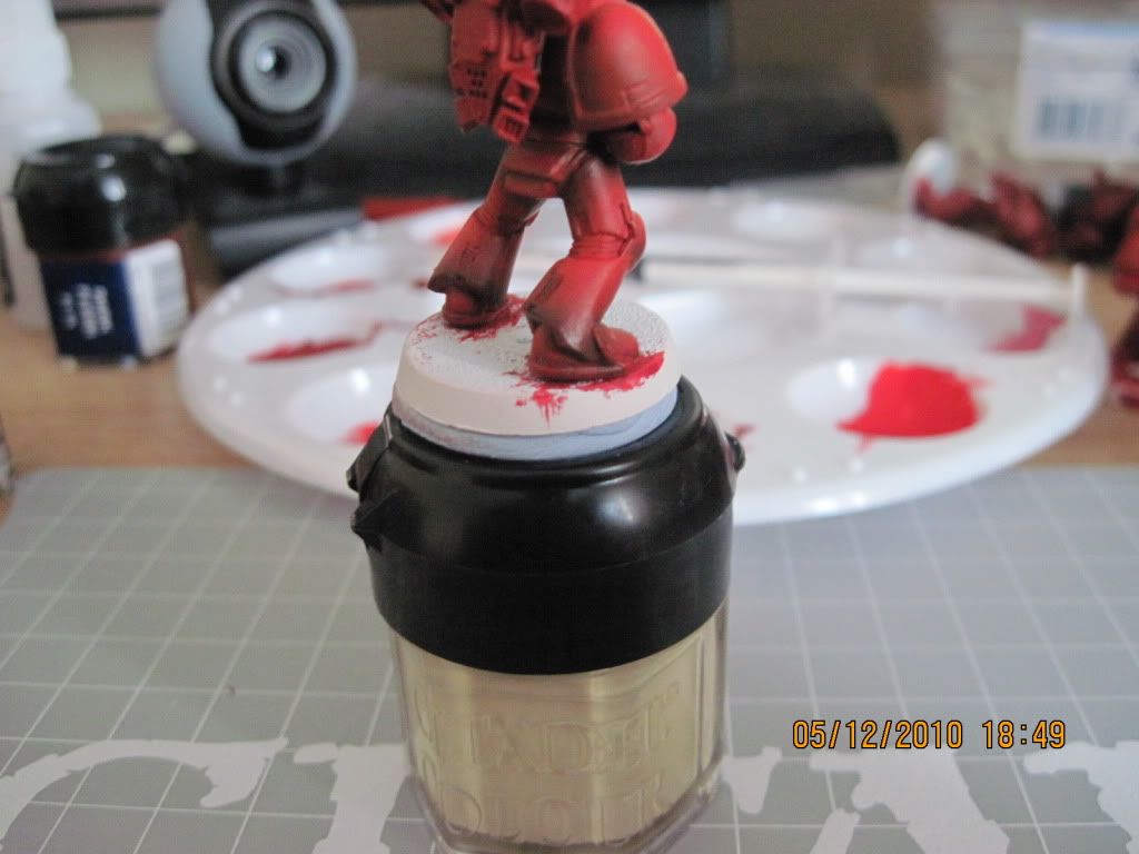
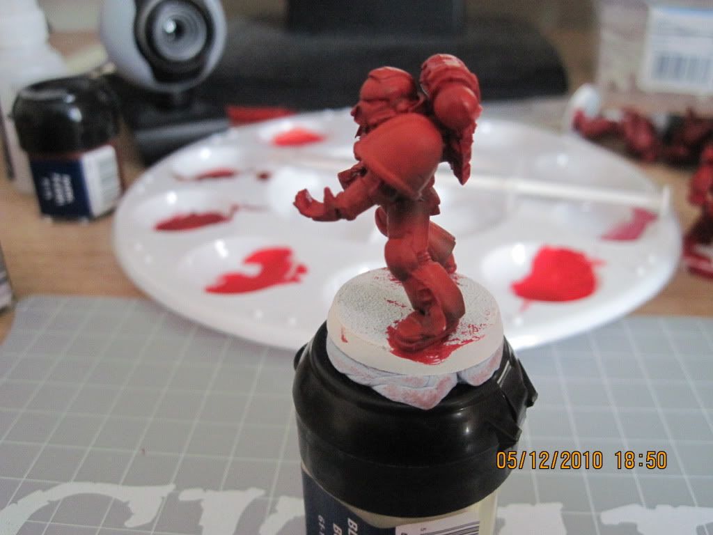
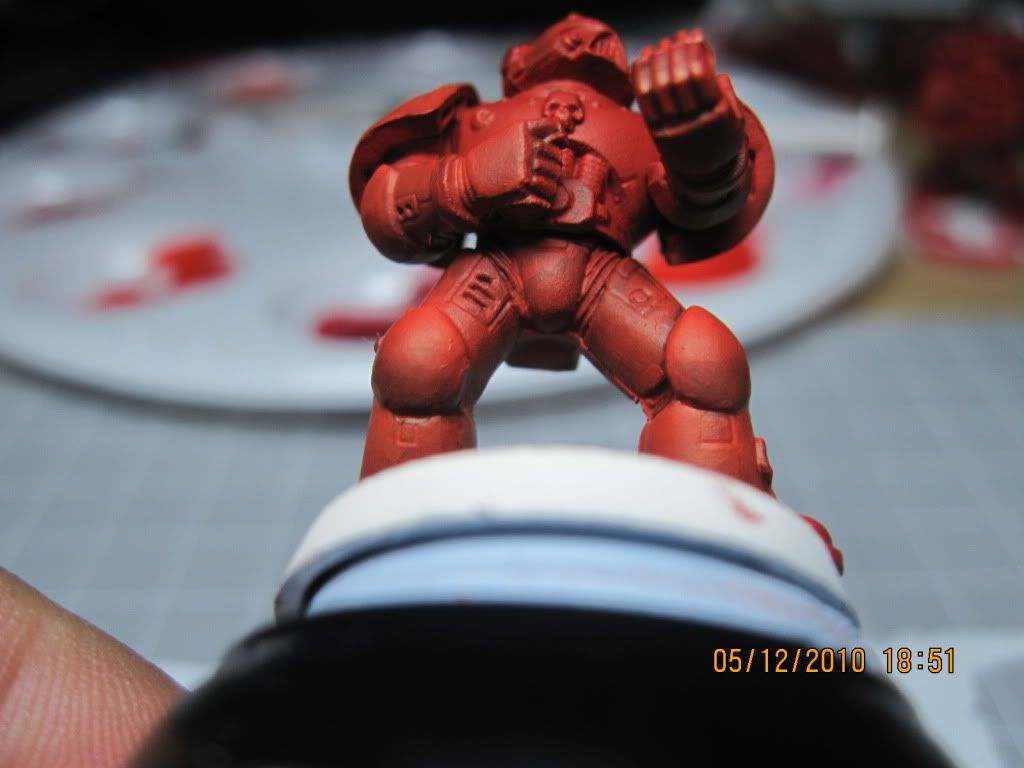
A picture of the "shadows" on the leg. Basically it's on the bottom third of the lower leg, upper third of the upper leg, and lower/back third of the shoulder pad.
Painting2018.jpg


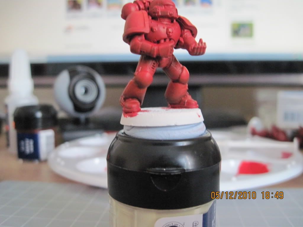
Front view of my "shadow", which is on the bottom third of the lower leg and bottom half of the knee pad.
Painting2019.jpg


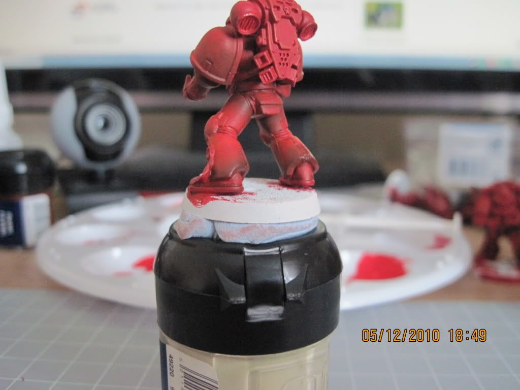
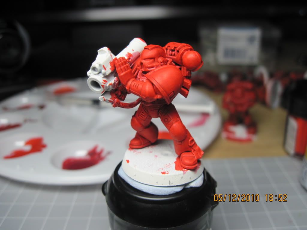
The left side view of the same mini with shadows on the lower and upper leg and shoulder pad.
Painting2020.jpg


A better view of the shoulder pad "shadow"
Painting2021.jpg


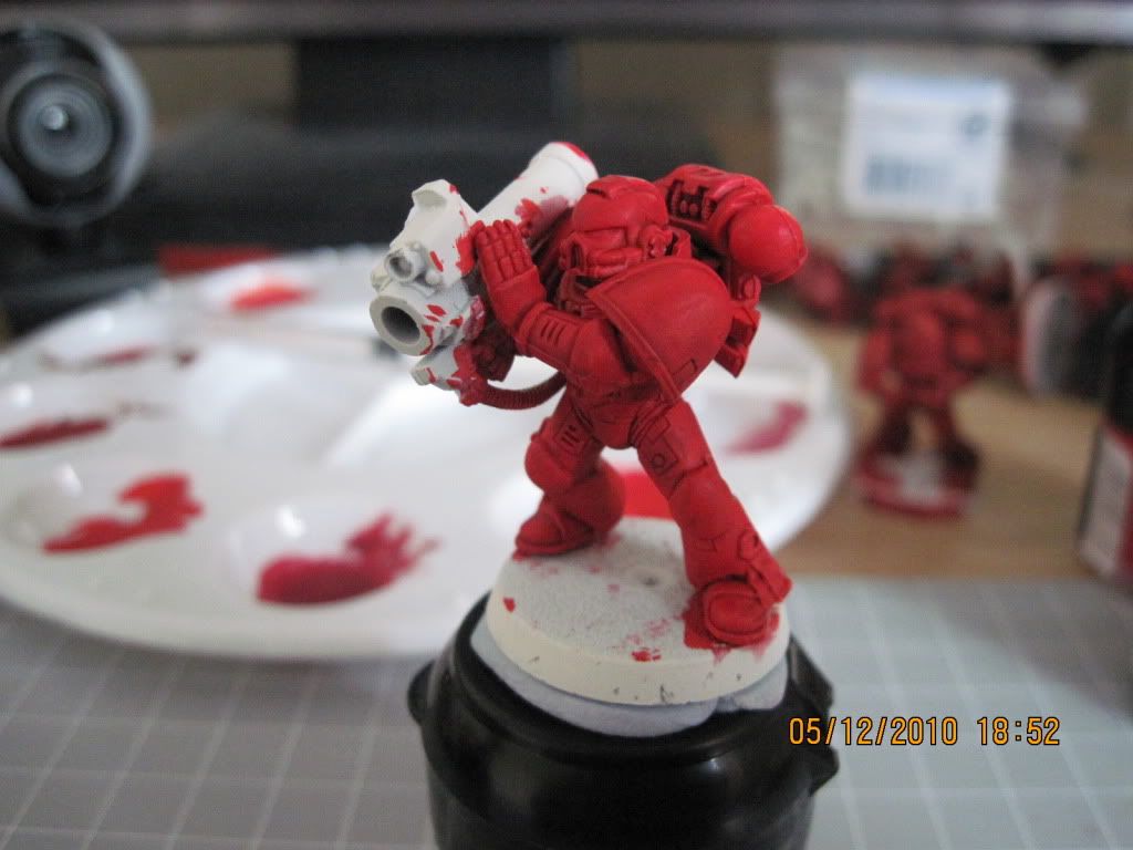
A view on "natural light" (desktop lamp off, no flash).
Painting2022.jpg


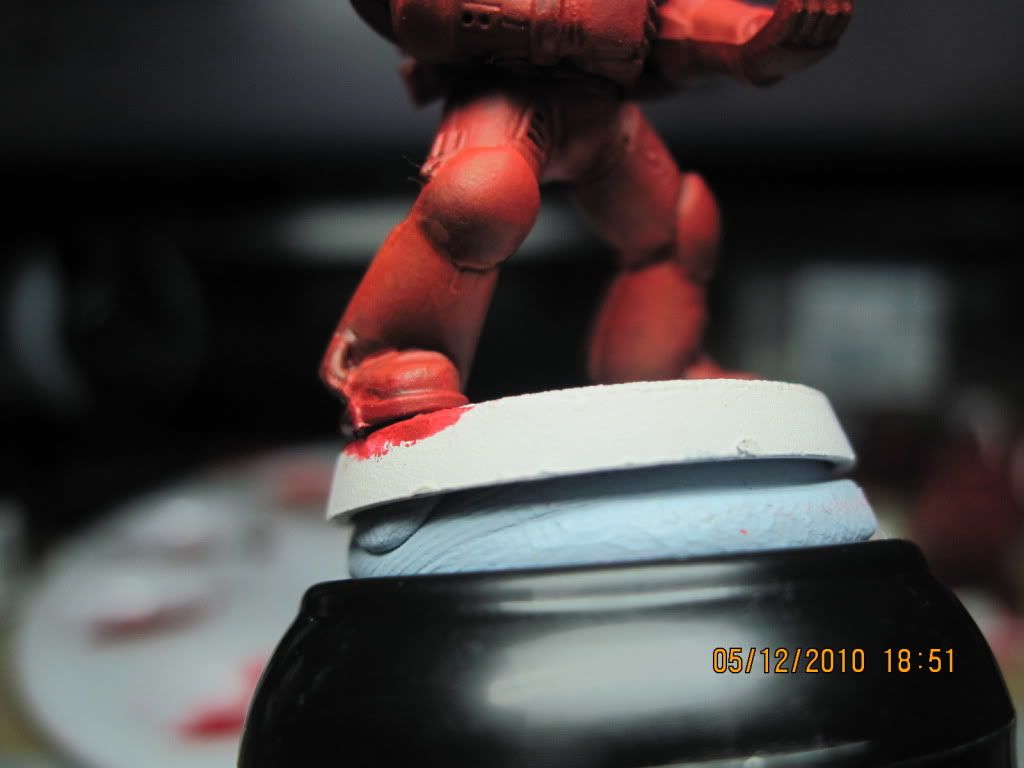
A closer look at the leg shadow.
Painting2025.jpg


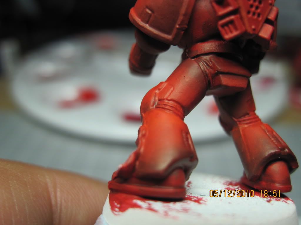
I'm quite happy with my blending here, even though I'm not so sure I'm applying the "shadows" in the right place. At this point, it looks more like the armor is simply "dirty".
Painting2027.jpg


Holding the mini this way clearly shows where the shadows are, as far as the knee pads and upper leg is concerned.
Painting2029.jpg


This is another test mini using the "Space Hulk" paint recipe --- basically basecoat of Blood Red (1:1) and wash of Baal Red.
Painting2030.jpg


Another picture without the desk lamp.
Painting2031.jpg


Both minis side-by-side. As you can see, the "Space Hulk" recipe is much brighter which is somewhat the effect I'm looking for.
Painting2033.jpg


Painting2035.jpg


Stew, thanks for the kind words. I think my problem at the moment is that I tend to view a picture "as a whole" rather than notice "ah, that's a shadow right there, and I see he blended the shading on that spot there". In any case, I don't really dig line highlights that much but I do know where I can use them (the bolter, for example). I was just amazed at the 'Eavy Metal pics I see with line highlights on the upper AND lower edges of the shoulder pad. It's insane!

Another problem I have with copying a pic is that I'm not doing a display piece. Sure, I've been saying I want quality-painted minis but I do realize that I don't have time to display-piece-quality every Space Marine in my army --- plus I'm dying to play this game --- so I'm settling my sights lower and into the "local GW store display piece" quality. In simpler terms, better-than-your-average-TTQ. Anyway, the problem therefore is that I'm doing a TTQ marine and I've yet to find a Space Marine pic that I like --- most pictures are of sargeants and HQ units on modded poses. Still, I've only been looking at the "top" pages so there may be some imbedded in some obscure corner of CMON.


Torn, I'm a bit partial regarding which highlight I want to do to be hones. I like the 'Eavy Metal pics because they are bright and shiny and they are everywhere, so if I set THAT as my goal, there are lots of pics to copy from and rate myself against. However, I do not plan to do as much line highlighting as they do. I think it's more of the "brightly-colored" minis that I'm after as far as 'Eavy Metal goes.

With regards to your definition of line highlight, see my pics above... is that what you meant regarding a "natural" look?


Thanks for the patience guys and constuctive comments are greatly wanted and appreciated. While I do expect the "cool mini! nice work!" replies, please do include advice/suggestions on how I can make it better.

Cheers!
 

cleen X

New member
Thats some pretty good blending for a first attempt! Some of the shadows are placed a little wrong or strange but don't care about that to much, the blending is pretty smooth and much better than my first attempt! Now pratice, pratice, pratice is whats gonna do it for you ;-) The more you pratice the better you'll get!
 

-Ice

New member
Thanks cleen! Like I said, I'm pretty happy with the blending (though it sure could use more practice!) and it's nice and quick enough that I can say I can do it for the entire army, however, I'm still a bit confused as to where/how to apply shadows. For things such as the arms and upper leg, it's a no-brainer, just shadow the underside of the arm and the upper part of the upper leg (the part closest to the torso) but what about the lower leg?

If I follow my zenithal highlight, that would mean the entire left lower leg would be in shadow
Painting2019a.jpg


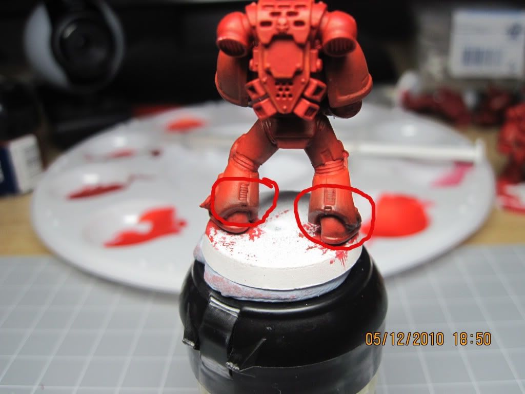
and what about the back of the lower leg? Highlights even on the lowet part of the leg?
Painting2023a.jpg
 

Torn blue sky

New member
If you think about it, the backs of the legs at the bottom of the grieves at the back are more protruded, so the bottom of the back would be lighter and darker toward the back of the knee.
 

-Ice

New member
Hmmm... I do agree with you there Torn, but am I right then, that the front of that leg would be totally in shadow?

In other leg configurations wherein the knee is more forward, I can imagine the top of the lower leg to be in light so only the lower half of the lower leg to be in shadow, but that would also mean that at the back, the upper half of the leg would be in shadow. I'm curious as to how to do this on a leg --- the front having the lower half in shadow, the back having the upper half in shadow --- so how do I do the "transition" at the side of the leg?
 

Torn blue sky

New member
No, the way you've done the front is good. Remember that light (even from a direct light source like the sun) has many different properties. For instance, a focused light will give very harsh shadows, a light source like the sun will bounce all over the shot, and while still creating shadows, they won't be as harsh and more colour will shine through. Ya seeee! Gotta fink innit!

The transition to the side is the tricky bit that comes with meddling with it tbh, You're basically trying to light a 3D model with a 2D light source. The shadows would be where i'd said for this particular marine, but as poses chance, so do the shadows, naturally.
 
Last edited:

-Ice

New member
Ah, thanks for the reassurance on my shadow application. I have to admit, the front of the lower leg is kinda easy to figure out, it's the back of the leg I'm not too sure how to shadow. The fact that most pictures only show the front of a figure doesn't help either :)

Yes, I do agree that the transition may be tricky... I was wondering maybe I could just make a shadow that starts from the central part of the leg (under the torso) but does not reach all the way around to the opposite side --- so the front shadow and the back shadow do not meet at the outer part of the leg?

With different leg poses, sometimes one set just slightly differently angled than another, or maybe the same leg poses but with different armor (one with knee pads, another without) makes all this shadow business rather troublesome. Like I said earlier, I tend to view pictures "as a whole" and now I have to scrutinize my shadows... ah....
 

Torn blue sky

New member
One way to do it is make a shadow that either tapers off or blends back to light. Again, it's down to whatever works best with the way it's posed really. As also pointed out, eventually you'll be able to figure it out "in your head" you'll find a lot of people sit down and just stare at a mini before painting it to get a grasp of what needs to be done, and how. If in doubt, I recommend going with the light idea.
 

-Ice

New member
I can kinda figure it out in my head but the way I picture it, if I just use ONE source of light, a lot of the mini would be in shadow.

I guess my new idea would be --- take zenithal highlighting but apply it ALL AROUND the mini. For example, if the light source was positioned 2 inches away at a 60-degrees-from-horizontal angle, I would take my mini and look at it from the front, do shadows as I see them, then take the mini again, rotate it, do shadows, and so on and so forth so that the end effect is that no matter where you look at the mini, it will more-or-less look like it was lighted from 60-degrees.
 

Stewsayer

New member
I can kinda figure it out in my head but the way I picture it, if I just use ONE source of light, a lot of the mini would be in shadow.

I guess my new idea would be --- take zenithal highlighting but apply it ALL AROUND the mini. For example, if the light source was positioned 2 inches away at a 60-degrees-from-horizontal angle, I would take my mini and look at it from the front, do shadows as I see them, then take the mini again, rotate it, do shadows, and so on and so forth so that the end effect is that no matter where you look at the mini, it will more-or-less look like it was lighted from 60-degrees.

Ice,

This sounds like a good idea. Something you could try is base coating the mini in your red mix. Then giving it a light dusting with white primer from your 60 degree angle all round, just a short puff from each side. The primer will catch the raised areas where you highlights need to end up. Then you blend back up over it with your highlight colours and locate your shadows opposite.

The way I try to work zenithal or directional lighting in is by adjusting the balance of highlights vs midtones vs shadows. This is dependant on whether the area of the model is in shadow, direct light or somewhere in between. So on your marine (lit from above) the upper legs would be predominately shadow tones and mid tones and maybe just a hint of highlights. The helmet would be mainly highlights and midtones though it would still probably have the deepest shadow tone in some places.

On the rat ogre I just uploaded in my WIP thread I tried to set this up right from the get go by changing my base coat colour. The whole model was airbrushed Scorched brown. From about midway up the thighs I airbrushed over that with bestial brown. Then from the bottom of the shoulder blades up with vermin brown.

Thats how I approach it anyway. I could have it all wrong. Hope it helps.
 
Back To Top
Top