- Forums
- CoolMiniOrNot
- Work in Progress and Project logs
- WIP: Moriar the Chosen, Blood Angels DC Dread (Re Post)
You are using an out of date browser. It may not display this or other websites correctly.
You should upgrade or use an alternative browser.
You should upgrade or use an alternative browser.
WIP: Moriar the Chosen, Blood Angels DC Dread (Re Post)
- Thread starter IronKobra
- Start date
IronKobra
New member
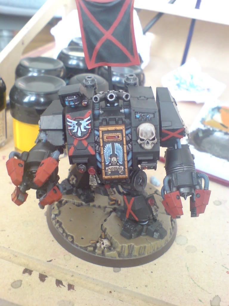
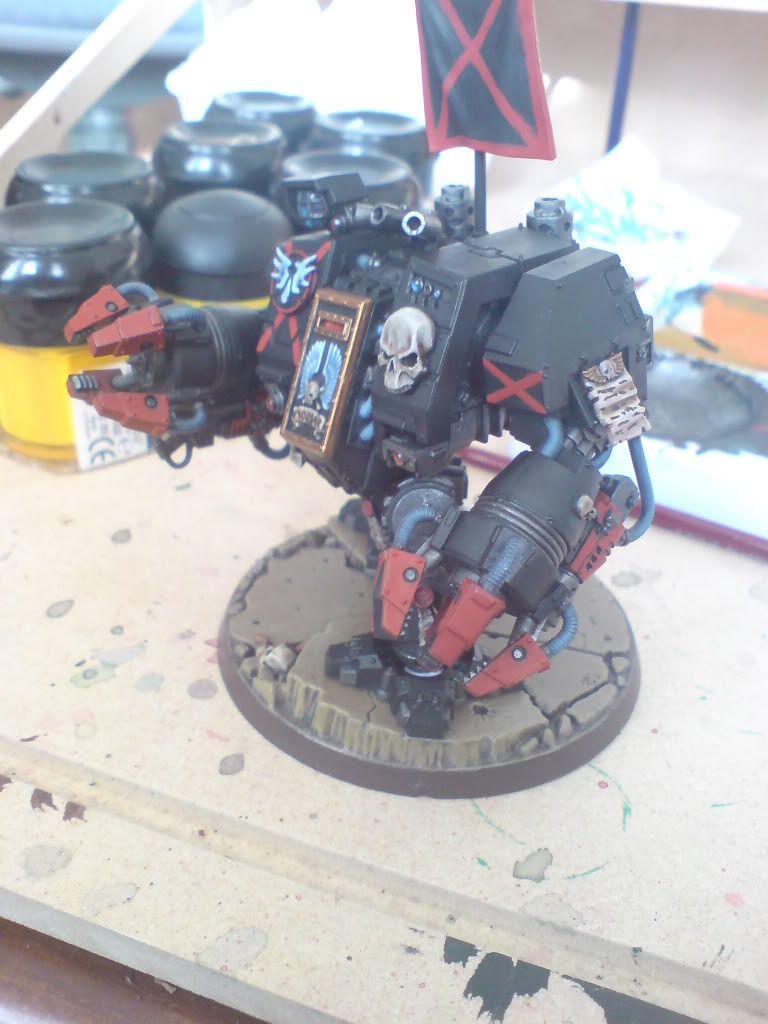
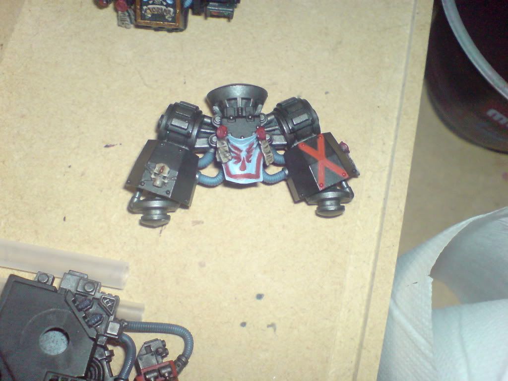
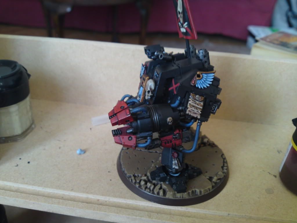
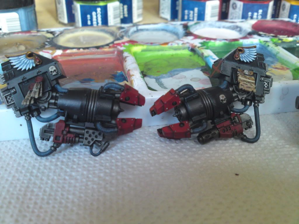
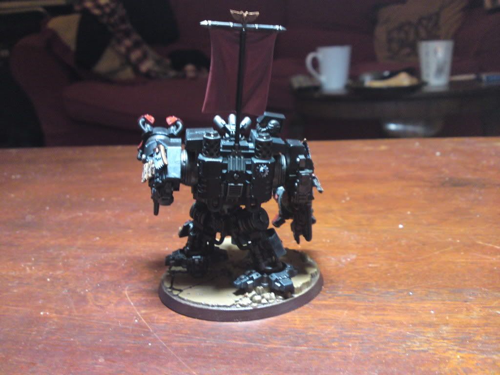
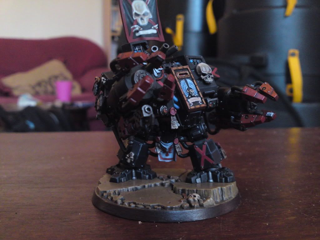
Little more on my custom Moriar! I thought his arms were a little plain, so added some of the new DC wong pieces to the shoulder area and continued with a little more painting. Cleaned up the freehand on his tabbard between the legs. More to come soon.
PICS! Please excuse the quality...still just using my phone cam.
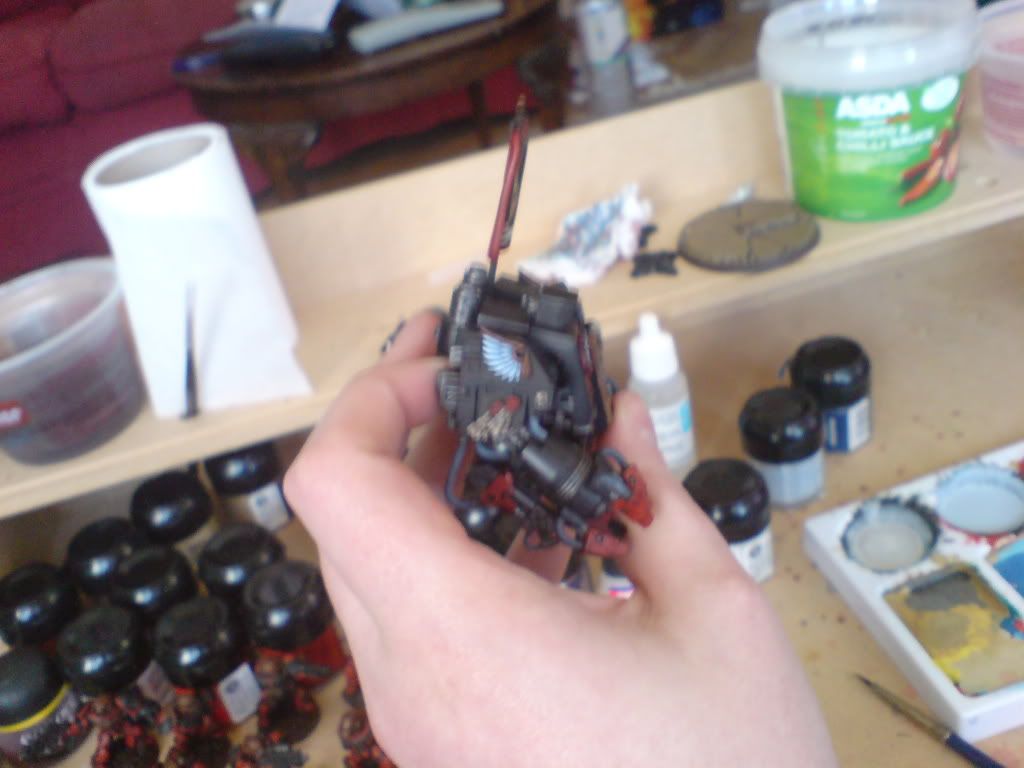
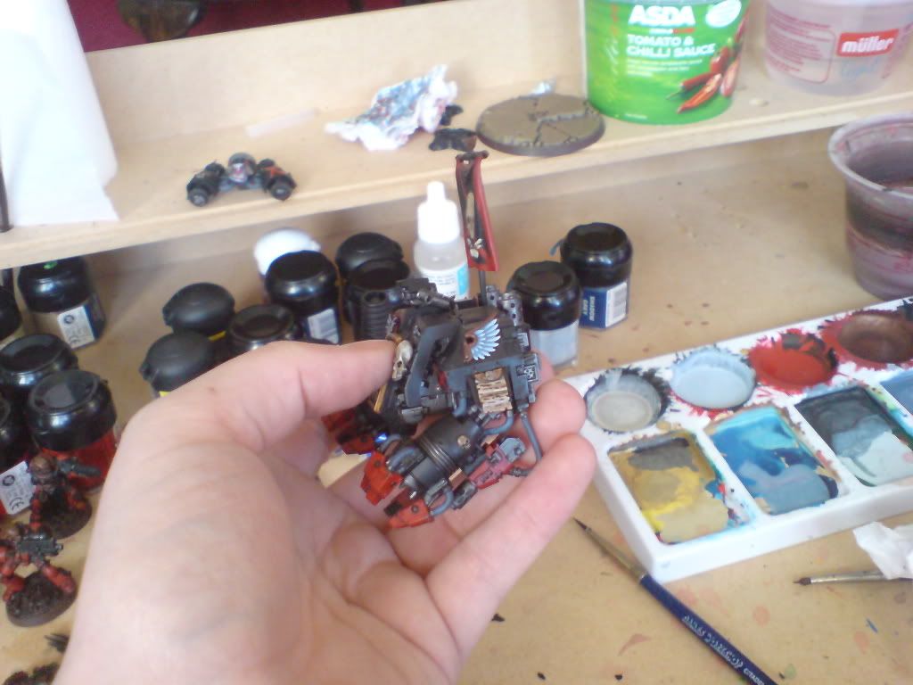
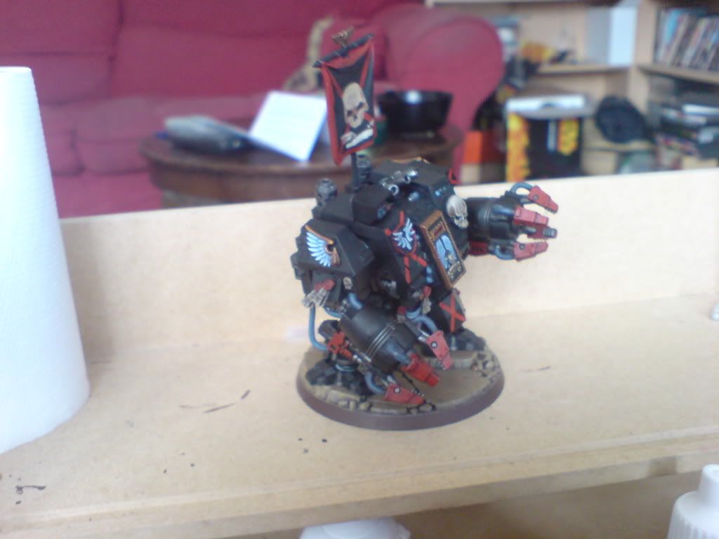
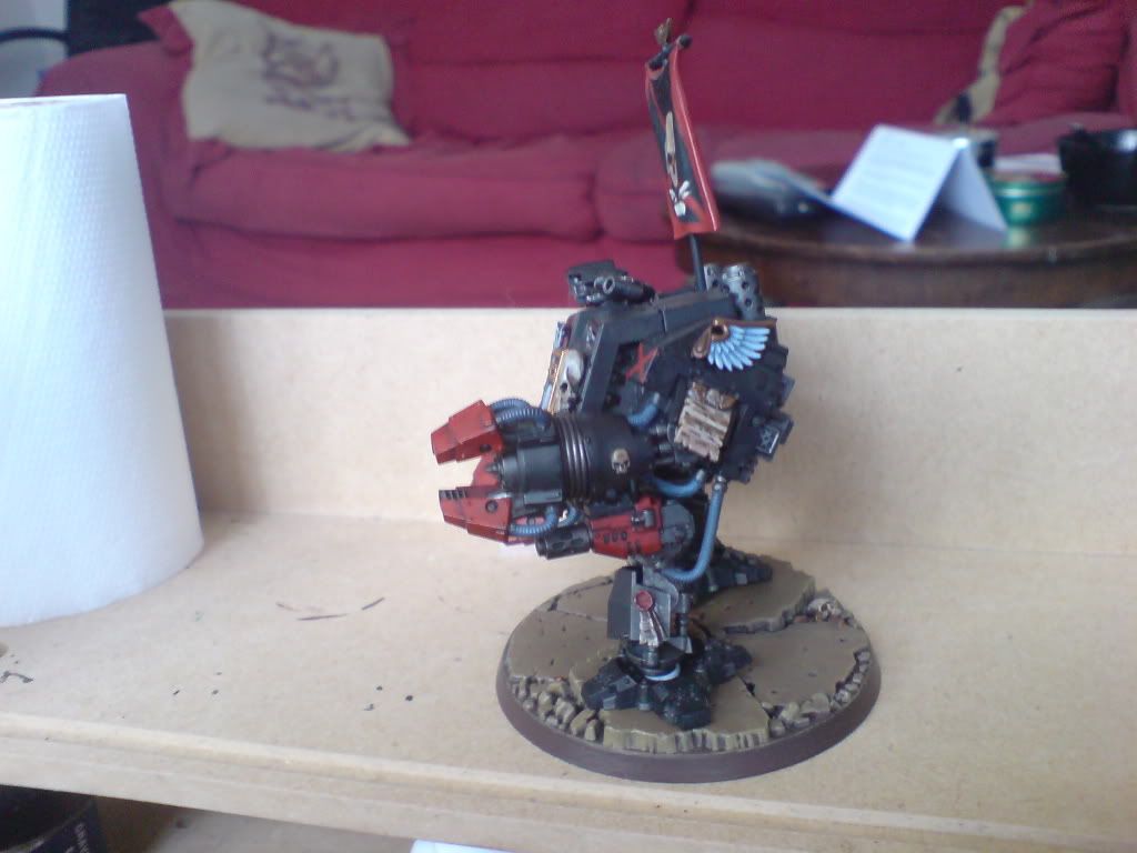
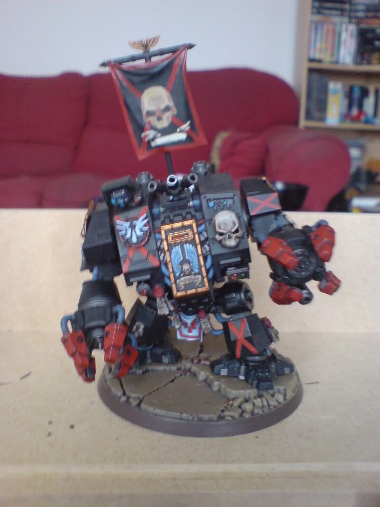
PICS! Please excuse the quality...still just using my phone cam.


IronKobra
New member
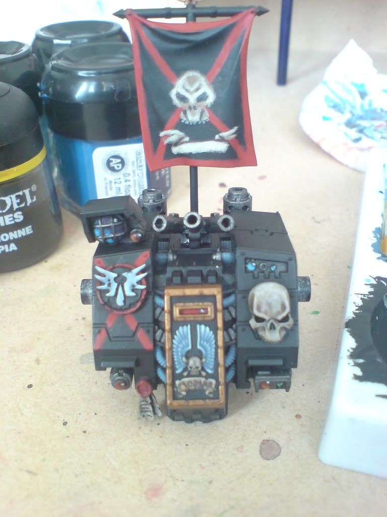
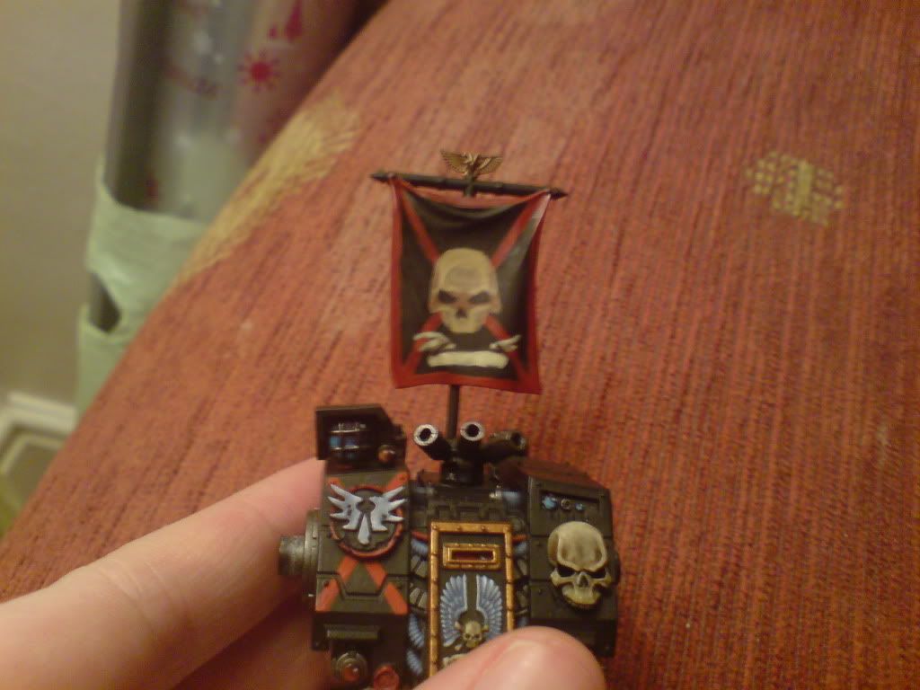
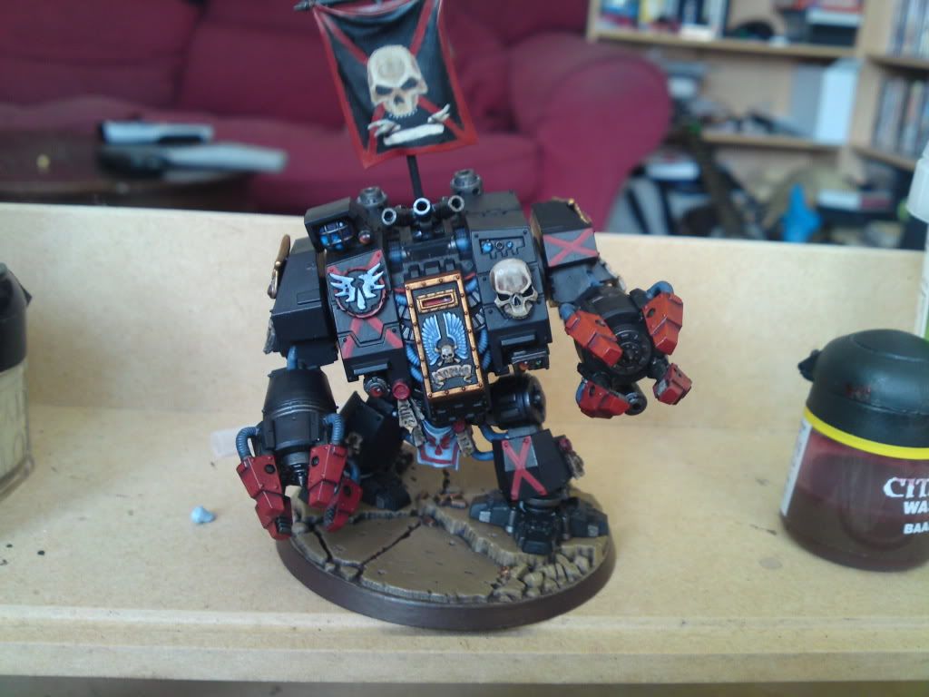
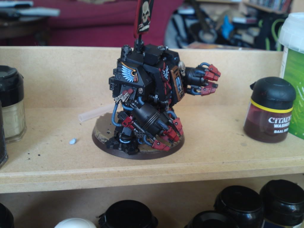
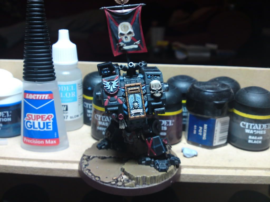
Ok, this doesn't appear to be much of an update but there is a small progression and some better pics. What I have done since last updates was I have covered all the black areas in a 1:1 mix of chaos black and regal blue...
So if you look closely, you will see an extremely slight blue tint to the armour. This was taken from the recent Legion of the Damned master class in white dward...I think it will look ace on this if i get it right. Also worked on the banner, mainly the skull, bringing the highlights to bleached bone and also the red crosses on the armour have a very subtle orange/red highlight. If it is painted on the armour it won't have such a sharp highlight relalistically.
Anyway, pictures:


Torn blue sky
New member
Seems to be coming on in leaps and bounds, seems like you're always going back on yourself and constantly improving things; which is good!
Good luck with the black, it's by far the trickiest colour to work with by my reckoning. Although it looks great if you pull it off right!
Good luck with the black, it's by far the trickiest colour to work with by my reckoning. Although it looks great if you pull it off right!
freakinacage
New member
starting to look really spiffy
IronKobra
New member
Yeah I definately agree! Wish I had started with it now to be honest rather than leaving the primer as it was for so long. Will see how it goes once I get to highlighting (which I have never been good at)...I'm tempted to start a second now I have a better idea of how to approach it. Or strip him down and start from primer again. But I'm really happy with how the idea is coming after the original idea hit me upon seeing the ironclad release.
IronKobra
New member
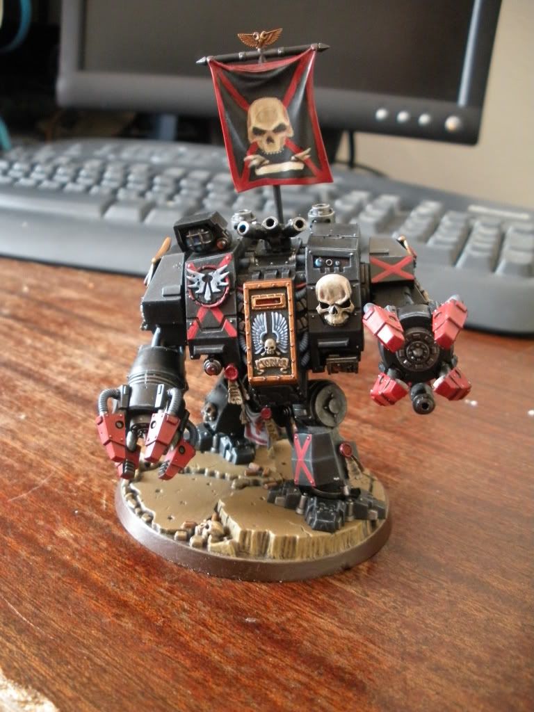
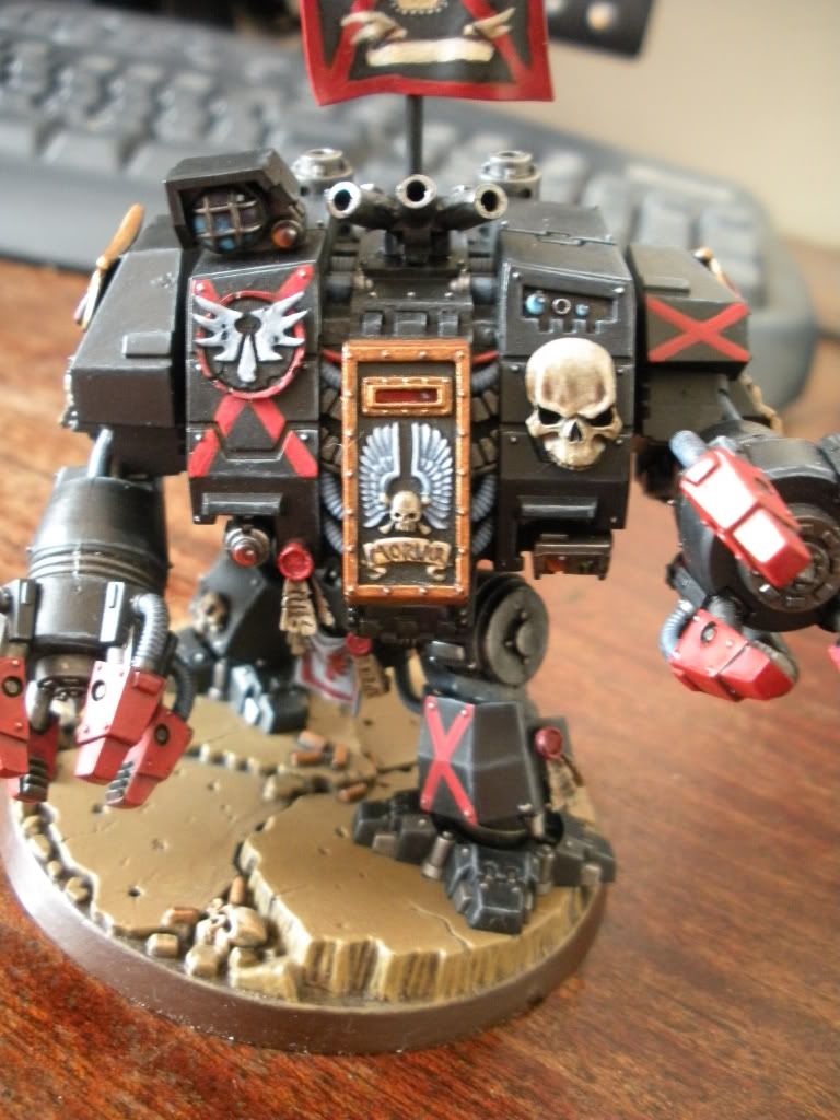
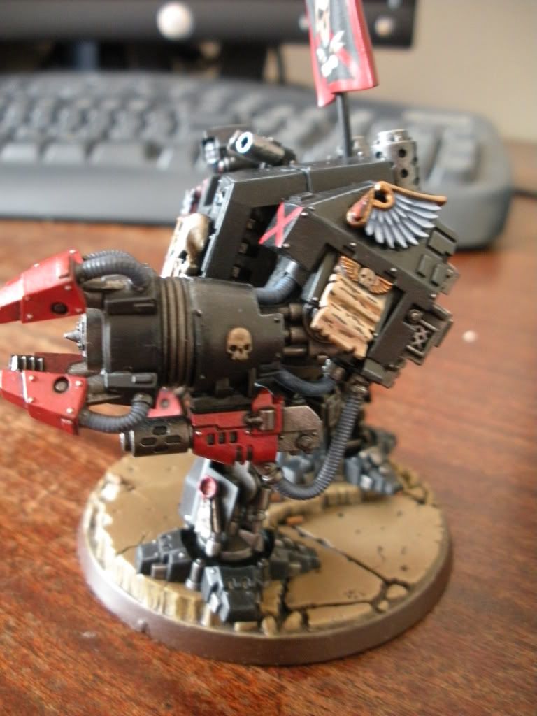
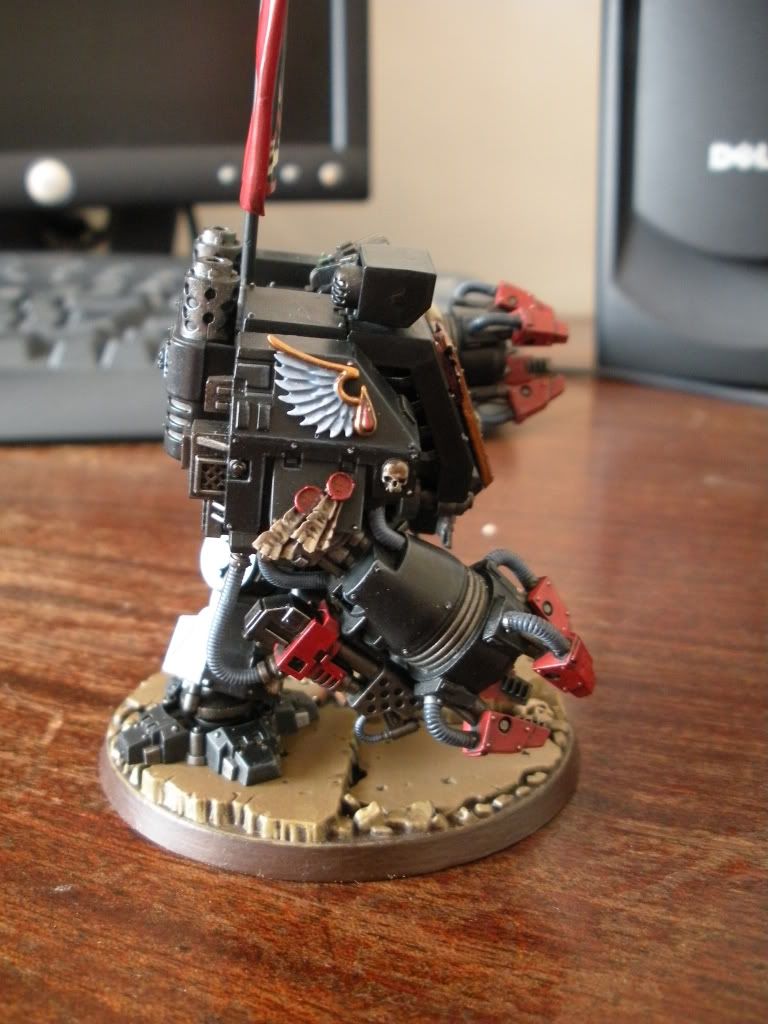
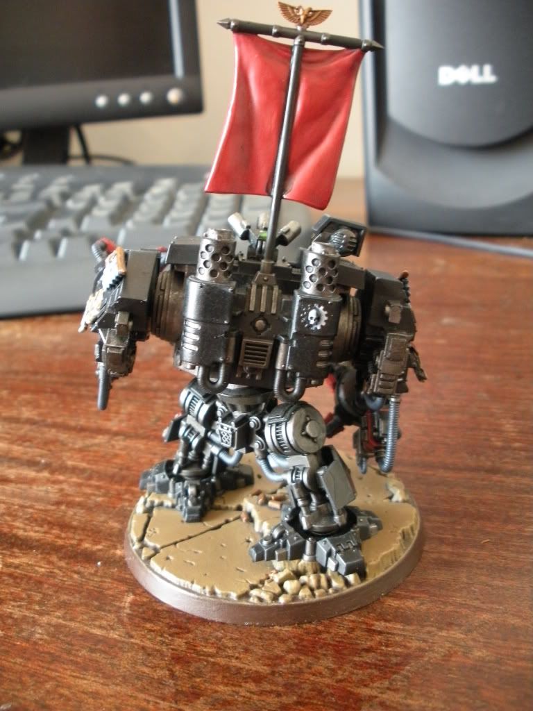
Finally the highlighting has begun on this long going project! Normally one model wouldn't take so long, but around so many other commitments it has been a bit of a long haul. He is still not finished... Need to finish highlighting him really, and tone down any parts I was a little over zealous on...and finish the banner. Here are the pics:


IronKobra
New member
Ok guys, FINALLy have an update on this...I got sick of only painting when the sun was feeling generous so I bought a daylight style lamp and focused myself on really getting some of this nailed today...And that I did! From the last updates I have worked on some of the highlights...Really that is all I have left to do.
I worked up the skulls on the more definate edges and also the wing motifs up to pure white. I also re pained the scrool on his sarcoughagus ready for the script work. This was done with a stone base, washes of mud and baal, then works up with various mixes of stone and bone, up to pure white.
I also worked on the banner. Including the skull, again up to the defining edges in white, the highest folds were highlighted from black to very dark grey, and the red parts were glazed in the deeper folds with a dark red mix of scab, mechrite and a dab on black. The higher folds were glazed with mixes of mechrite and blood reds, with touched of khaki added.
And...hmm, oh yeah the purity seals, wax parts were about scab red before today, highlighted up to blood, the blazing orange, then a mix of orange and white. And the final mix I used on the lowest bits of any red gems on the model...
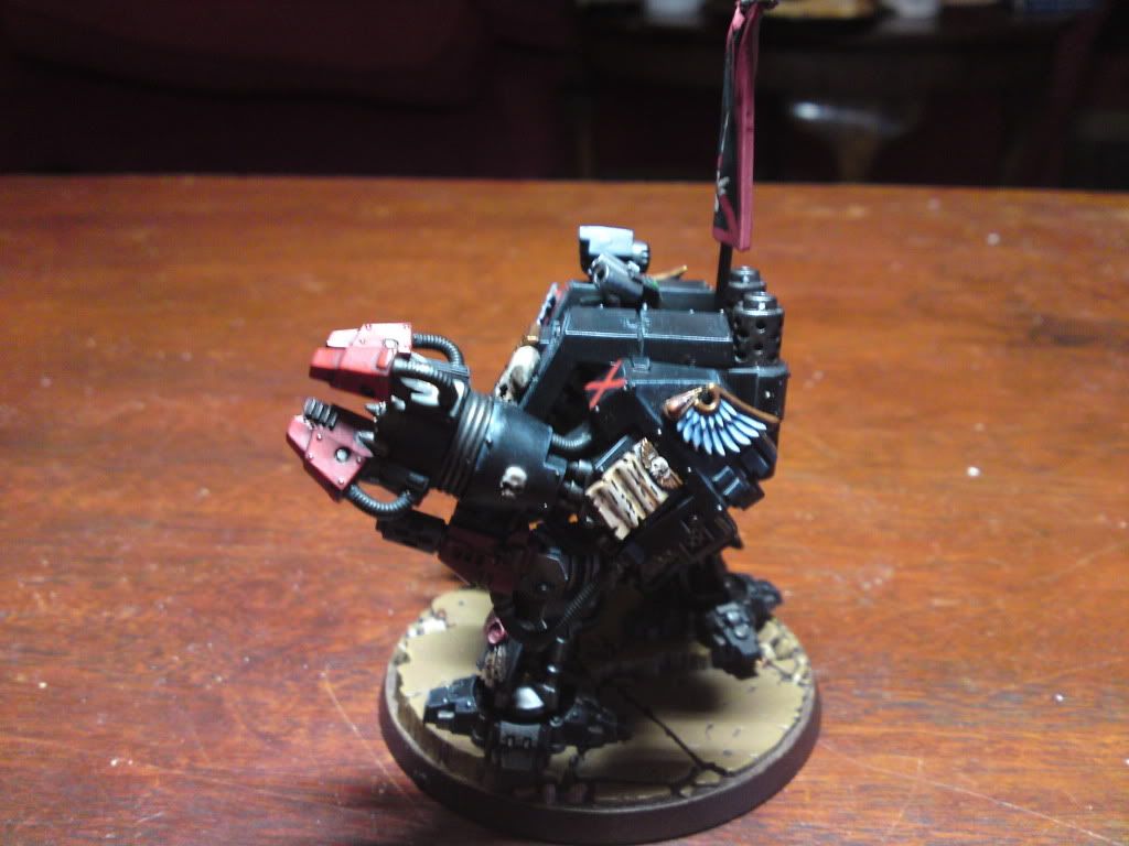
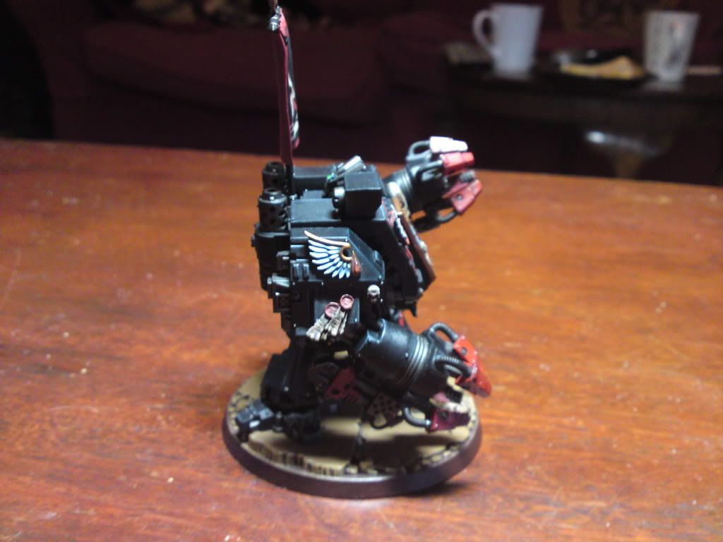
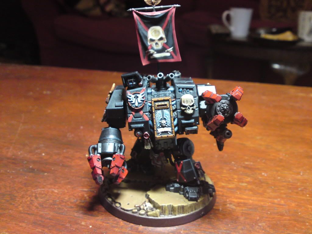
Phew...More done today than I expected. Tomorrow I hope to get into the final highlights of all of the gold and silver areas and also the 'fingers' and guns on his arms.
I worked up the skulls on the more definate edges and also the wing motifs up to pure white. I also re pained the scrool on his sarcoughagus ready for the script work. This was done with a stone base, washes of mud and baal, then works up with various mixes of stone and bone, up to pure white.

I also worked on the banner. Including the skull, again up to the defining edges in white, the highest folds were highlighted from black to very dark grey, and the red parts were glazed in the deeper folds with a dark red mix of scab, mechrite and a dab on black. The higher folds were glazed with mixes of mechrite and blood reds, with touched of khaki added.


And...hmm, oh yeah the purity seals, wax parts were about scab red before today, highlighted up to blood, the blazing orange, then a mix of orange and white. And the final mix I used on the lowest bits of any red gems on the model...


Phew...More done today than I expected. Tomorrow I hope to get into the final highlights of all of the gold and silver areas and also the 'fingers' and guns on his arms.
IronKobra
New member
Hahaha, yeah I'm really determined to have this finished before the month is out...With my new lamp I should be able to do it. Hour here, hour there to tidy up a little bit at a time I should be done. I want it done before the new BA dread kit comes out and I can proudly present the conversion before there are hundreds of versions of Moriar flying around!
I would have loved to finish him sooner but I have had so many other commitments and procrastination and also the bad habit of starting a new model/models before I finish what have been working on D'oh!
I would have loved to finish him sooner but I have had so many other commitments and procrastination and also the bad habit of starting a new model/models before I finish what have been working on D'oh!
IronKobra
New member
OK took a couple of pics when the sun was coming through my living room window at 8am the other day to give a better imagine of how he looks now to the last ones I posted. Just for kicks! I will fix his gems at the weekend and do the extreme highlights
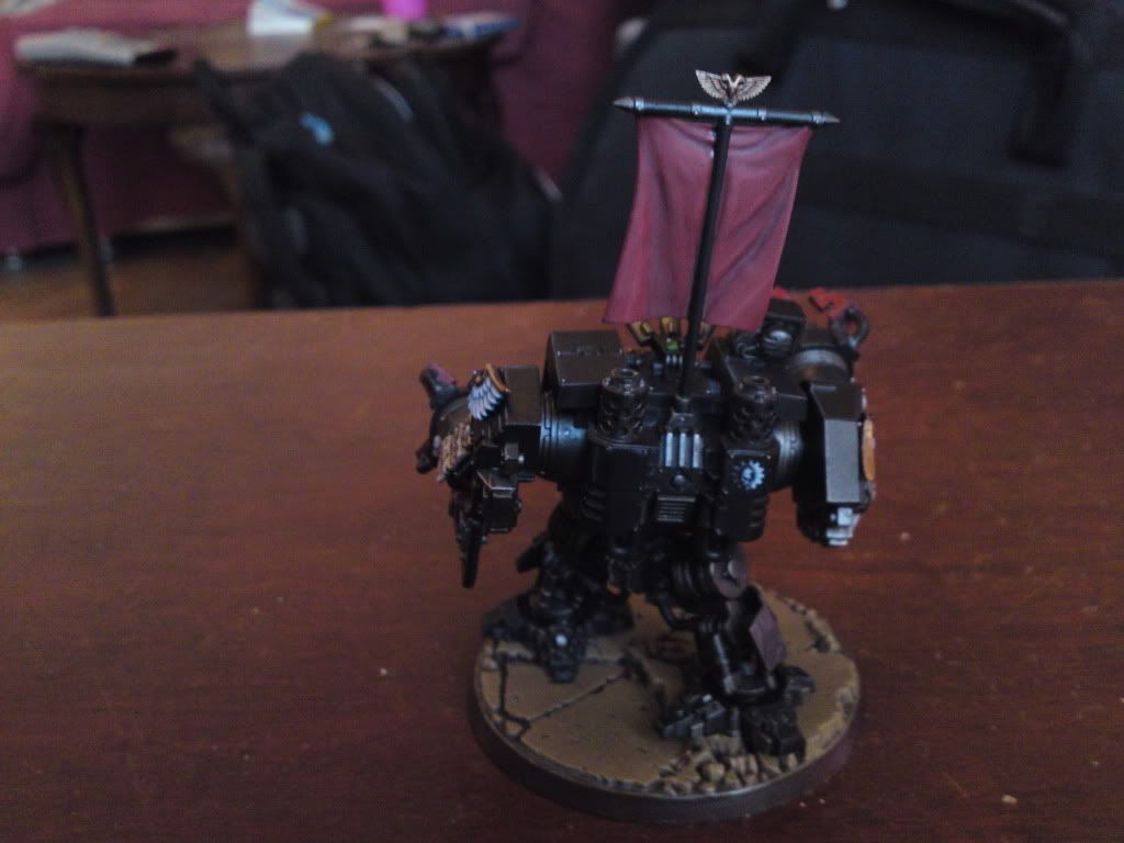
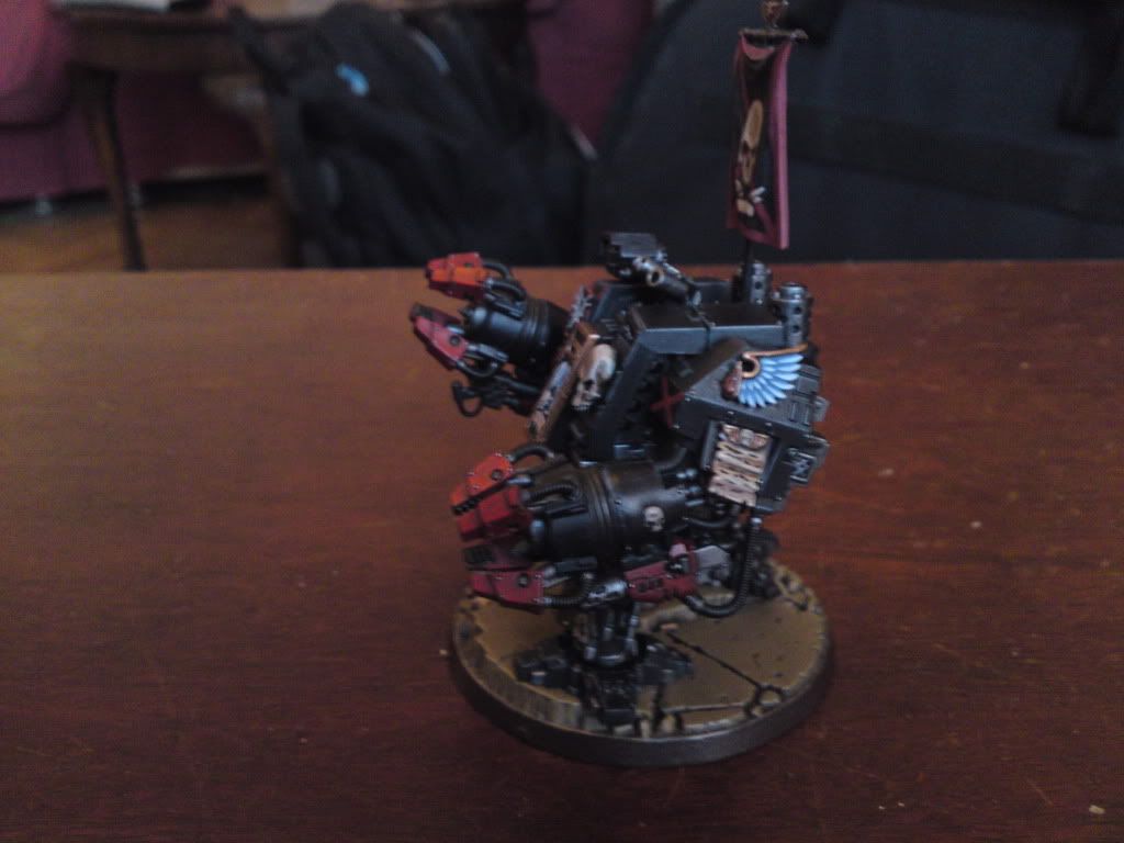
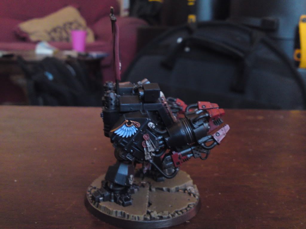
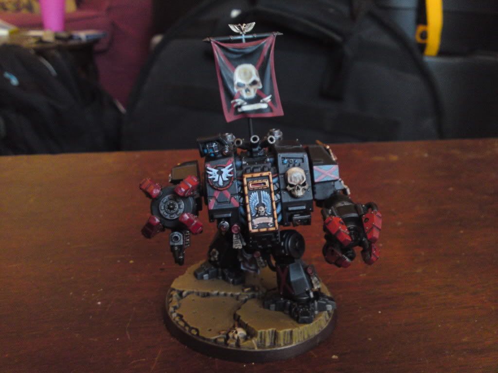
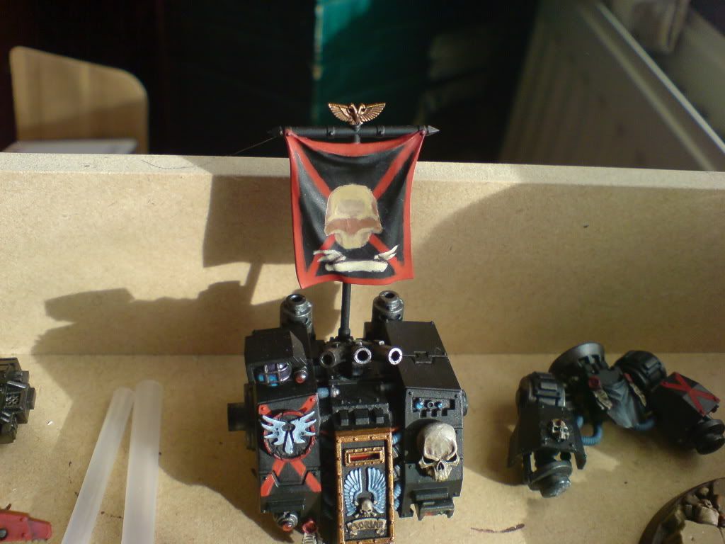
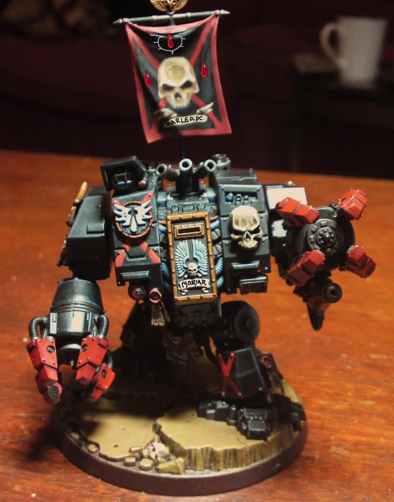
And here is one of the ideas I had for his banner. My girlfriend said this is the one she liked the most...What do you guys think?
And just for a laugh here is the state of my project tray:
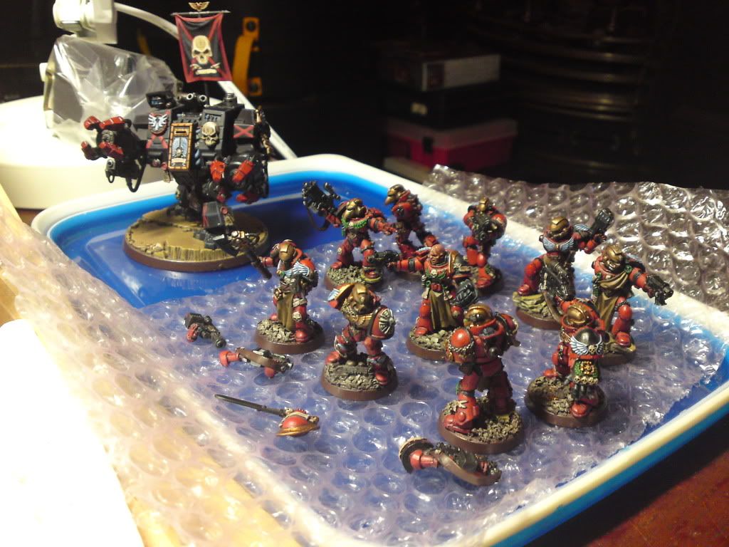
Must...Finish...Before...5th of Feb!


And here is one of the ideas I had for his banner. My girlfriend said this is the one she liked the most...What do you guys think?

And just for a laugh here is the state of my project tray:

Must...Finish...Before...5th of Feb!

