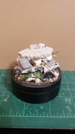
TheLost WIP

TheLost

New member
Glad you're still at it mate. That base looks really dynamic, I can see some bounty hunter leaping from it :)

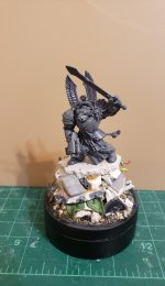
Thanks :) Right now I'm trying to decide between a warhammer 40k Dark Vengeance terminator, a Space Marine Infiltrator, or a kneeling space marine firing a missile launcher lol
 

CyAniDe

New member
Love the base. Whish I'ld be creative enough for basing ... really my weakspot. Thanks for showing, maybe I'll just start to try "copy" and maybe finally learn it that way :) So WIPs are really useful for me xD
 

TheLost

New member
Love the base. Whish I'ld be creative enough for basing ... really my weakspot. Thanks for showing, maybe I'll just start to try "copy" and maybe finally learn it that way :) So WIPs are really useful for me xD

Thank you :)
And by all means, take whatever inspiration you can from my pictures! Basing is my favorite part of the hobby.. I like trying to create a story, or at least capture an atmosphere.. if that makes sense.

Here's some important things I've learned when it comes to basing:

No dead space - try to avoid empty spaces on your base.. use as much detail as you can, wherever you can. The more the better, but not too much.. find the right balance for your preferences.

Texture - the more texture the better..it adds visual appeal and keeps things interesting

Angles/Composition lines - use different heights and angles for different elements in the base, and use these elements to frame your model

Base Size - the size of your base should be big enough to not overwhelm the model, but also give you enough space to build up your story/elements - essentially it's like capturing snapshot of a larger scene (like a movie set - if a movie scene is being shot in a house, they build a room right? not the whole house..your brain automatically fills in the rest of the information that the room is in a "house." A mini base is similar to that)

Randomness - don't be too concerned on making everything make sense, or straight, or perfectly positioned.


Hope that makes some sense..let me know if you have any questions :)
 

CyAniDe

New member
Thanks a lot for the great tips. Yep I know a lot of these concepts but really struggle to implement them :/

Size is the first problem. I usually go to big and quickly run into the second problem there -> dead space... I often have no idea how to litter up all this space ^^
If I go to small I can't really express my idea.
That's what I'm struggling with the most.

Usually I start thinking about what type of location I want my mini to be in. A forest, a street in a city, in a ruin, on a mountain ...
Then I look at reference. Problem with reference is that in reality or illustrations space isn't a problem. In painting you can express a forest with a path surrounded by dozens of trees and plants. If I want to translate that to a smaller base (fitting to the mini) I have to reduce the space. So when the mini for example walks a forest trail, the trail itself would probably to big for the base not to mention surrounding trees. So I struggle to translate what defines a forest on a really small space. A cut-out of a muddy trail with some leaves and mushrooms on the ground would probably be what I'ld end up with following this example. ^^ But that could be anywhere. Forest is just one example, mountain is even worse^^
I don't really know how to cook down a scene to its core. What really defines it and makes it recogniseable even on a small "cut-out" piece.


Also struggle with filling in details and randomness. I think I overthink where to put things and how they could have ended up there.
So yeah:
Randomness - don't be too concerned on making everything make sense, or straight, or perfectly positioned.

And last but not least I hate mixing putty, making a mess with it and waiting hours for it to dry xD
I usually sink dozens of hours into painting a mini but I usually want the base to be finished in just a couple of hours max^^
Maybe I just need some sucess moments to start enjoying building bases and display plinths xD
Since I suck at it, it feels more like a chore to me.

That's why I start to think it is probably better to try to draw inspiration from (or outright copy) other mini bases/plinths/dioramas instead of illustrations (like magic the gathering lands).
 
Last edited:

TheLost

New member
Thanks a lot for the great tips. Yep I know a lot of these concepts but really struggle to implement them :/

Size is the first problem. I usually go to big and quickly run into the second problem there -> dead space... I often have no idea how to litter up all this space ^^
If I go to small I can't really express my idea.
That's what I'm struggling with the most.

Usually I start thinking about what type of location I want my mini to be in. A forest, a street in a city, in a ruin, on a mountain ...
Then I look at reference. Problem with reference is that in reality or illustrations space isn't a problem. In painting you can express a forest with a path surrounded by dozens of trees and plants. If I want to translate that to a smaller base (fitting to the mini) I have to reduce the space. So when the mini for example walks a forest trail, the trail itself would probably to big for the base not to mention surrounding trees. So I struggle to translate what defines a forest on a really small space. A cut-out of a muddy trail with some leaves and mushrooms on the ground would probably be what I'ld end up with following this example. ^^ But that could be anywhere. Forest is just one example, mountain is even worse^^
I don't really know how to cook down a scene to its core. What really defines it and makes it recogniseable even on a small "cut-out" piece.


Also struggle with filling in details and randomness. I think I overthink where to put things and how they could have ended up there.
So yeah:


And last but not least I hate mixing putty, making a mess with it and waiting hours for it to dry xD
I usually sink dozens of hours into painting a mini but I usually want the base to be finished in just a couple of hours max^^
Maybe I just need some sucess moments to start enjoying building bases and display plinths xD
Since I suck at it, it feels more like a chore to me.

That's why I start to think it is probably better to try to draw inspiration from (or outright copy) other mini bases/plinths/dioramas instead of illustrations (like magic the gathering lands).

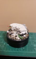
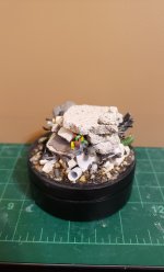
Sounds like you're running into the same problems I used to have.. in some ways, determining base size is still problematic for me too. Sometimes using a backdrop on your plinth and painting a scene on it can help express your idea on the location you're trying to capture. As for filling the space, you can use elements that help tell a story, or at least allow your viewer to make up a story themselves.. and it doesn't take much.

Good bases do take time.. remember.. nature is random, and so are things like "battlefield" bases. If you're looking for a great resource for base examples, I would use pinterest. I've gotten so much from there.
 

TheLost

New member
Aaaaaannnnndddddd..... A bonus post!! Another base I finished recently... I really liked how I was finally able to make a "battle" base look chaotic. Also REALLY like how the angle of the plaster pieces emphasize the "CHARGE!!!" motion of the model. Really great surprise when that composition worked out.

DA1.jpg DA2.jpg DA3.jpg DA4.jpg
 

CyAniDe

New member
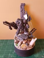
Yep Terminator 100%.
Captain would be my second choice but the terminator fits better into the composition in my opinion. The arm, leg and head follow the same diagonal direction as the chain. The standing pose also benefits as a "contrast" to the more chaotic surroundings.

Also thanks a lot for the tips.
If you're looking for a great resource for base examples, I would use pinterest. I've gotten so much from there.
Are there pictures of Bases ? or illustrations? I usually used it to look up illustrations for NMMs for example.
 
Last edited:

TheLost

New member
Yep Terminator 100%.
Captain would be my second choice but the terminator fits better into the composition in my opinion. The arm, leg and head follow the same diagonal direction as the chain. The standing pose also benefits as a "contrast" to the more chaotic surroundings.

Also thanks a lot for the tips.

Are there pictures of Bases ? or illustrations? I usually used it to look up illustrations for NMMs for example.

my sentiments on the terminator exactly!

yes, on pinterest you can find pictures of bases, illustrations, tutorials..all sorts of stuff!
 

TheLost

New member
Added a lightning effect to the terminator's sword! Really happy with it, considering it's my first time trying it!

lightning (2).jpg
 

TheLost

New member
Thanks mouskiller!!

Ended up choosing the other terminator for this new base.. [FONT=&quot]I really like the composure of the model compared to the base. When I look at the terminator, it looks like he heard something off in the distance and is readying his weapons for combat. I'm gonna add lightning to the fist too.

[/FONT]
20220216_120119.jpg
 

TheLost

New member
Well, it's been too many years since I've picked up a brush, but I started painting again... and it's not really looking good lol... here's a base I'm working on. The lighting wasn't great.. was going for a weathered/damaged metal floor look. There's still more to paint on it.

20220421_211546.jpg
 

delta 408

New member
Am also starting to paint again after years of painter's block. As for your base, it looks like it's coming together well at this point. The rust effect you're doing is my favorite bit.

Cheers!
 

TheLost

New member
Am also starting to paint again after years of painter's block. As for your base, it looks like it's coming together well at this point. The rust effect you're doing is my favorite bit.

Cheers!

Thanks! It didn't come out exactly how I wanted, but it will work for a "get back into it" model lol..
Not sure why/how all the cracks showed up, but I think it helped achieve the worn/weathered look. I think next time I need to put less chipping medium, maybe add a sealer between the rust and the chipping medium layers.
 
Back To Top
Top