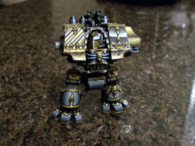
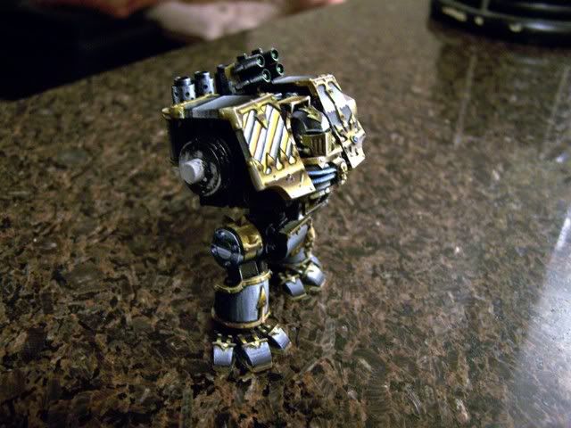
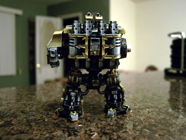
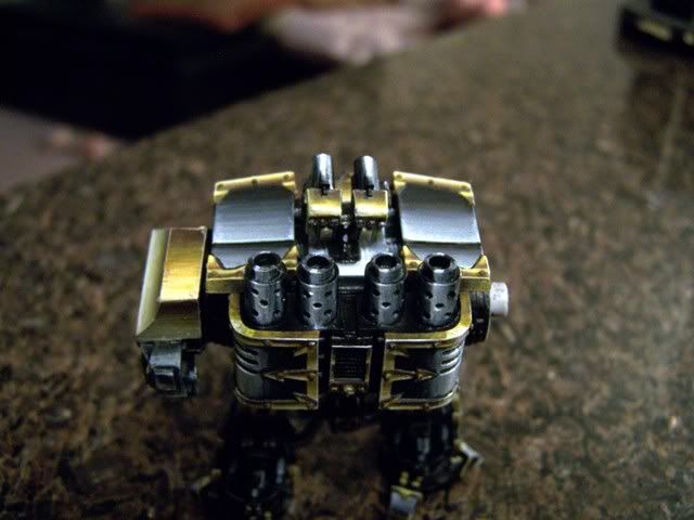
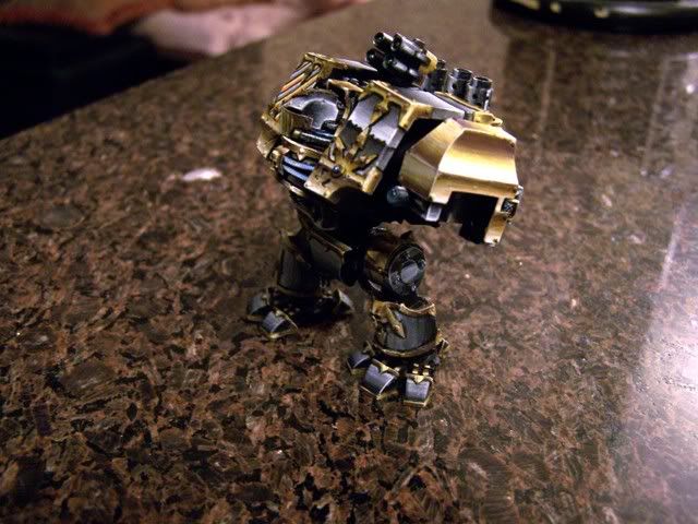
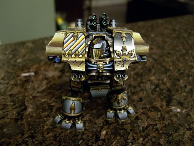
i think im insane W.I.P. NMM IRON WARRIORS DREAD

thekid420

New member
the problem with that is i studied the model and how the light reflects on the surfaces and because they are angled they have a highlight where i put them....

take a shinny tube or a glossy pen hold it straight up look an see how the reflection is completely vertical now, with the same light source coming from the same direction turn the pen on an angle and you will se that indeed the light reflects on the same angle that it is tilted....

i thought about doing a horrizon line on them but it just wont look right
 

thekid420

New member
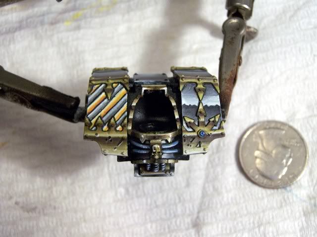
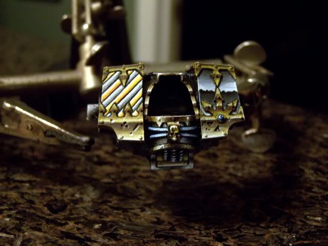
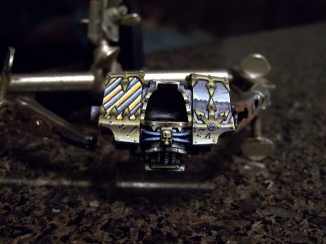
well heres night 4

did some work,

wow what a pain tring to get those small areas

and i had major difficulty trying to get the hoses nmm but i gave it my best any tips on those would be greatly appretiated

91008037.jpg

91008039.jpg

91008040.jpg
 

Monkeysplitters

New member
It looks good. I would suggest moving on.
In my experience if I linger too long on one area trying to get it perfect (which is impossible considering even the world class painters fail to get perfect 10s on their most brilliant submissions) I find myself getting bogged down in it.

NMM is can be extremely difficult on a larger model (like your trying) especially when you attempt SENMM (at least I know I get extremely frustrated) So Id suggest getting started on the head or weapons and giving yourself a break.

This is all on the assumption that you are getting frustrated. If not disregard all my ramblings and continue the good work.
 

Silphid

New member
Very interesting result indeed! You are off to a great start and hopefully my opinion may help you go a bit further in your NMM quest. I am no NMM expert, but I found NMM is about 2 things: Light placement and color blend.

I have to respectfully disagree with Monkeysplitters. You don\'t need to get it absolutely perfect, but perfect for you. That is, better than you thought you could do. It\'s by being totally anal on a model and going back to fix things now that you ensure you learn how to fix it, not by moving on. Perfection isn\'t about getting a 10 on CMON, for one thing CMON is a popularity vote on a picture of a model, and no one could ever get a 10 because of a lot of griefers who enjoy voting 1\'s to bring scores down. Just remember because a model scored 9.8 on CMON does not make it necessarily better than a 9.5.

To improve this, I\'d first look at smoothening your color blends. It\'s pretty good but the smoother the better. Diluting your paint more would help, and applying a glaze of a neutral gray , 1 part paint 10 parts water could help blur the lines we see up close.

For light placement, it\'s a bit inconsistant. Take the lower right gold portion with chaos star. You go from dark to bright to dark over 4 times on that panel. Usually on SENMM, on a given flat surface, you should only see 1 such transition, 1 horizon. Have a look here: http://www.coolminiornot.com/89285

Notice on the front panels how light goes from dark to bright towards the bottom? And no actual horizon lines are shown. That\'s because the panel is pointing upwards, and wouldn\'t get to reflect he horizon line. If you are mindful of what angle your panels are at, applying horizon lines becomes easier. If a panel is perfectly perpendicular to the ground, than a horizon line should be right in the middle of it. On a panel like the front of a dread, aiming slightowards upwards, your horizon line should be placed more towards the bottom part of the panel, because this panel is reflecting more sky than earth, it\'S aiming upwards. When the panel is pointing too much at the sky, you shouldn\'T get a horizon line at all, as only sky is reflected. You simply reflect the sky, with dark at teh top and bright at the bottom, just like it is before you make that dark horison line.

To emphasize the shine, we tend to place horizon lines even when there should not be, but keep it at one! I find it simpler to lay out all my horizon lines on surfaces and then blend from there.

For your hoses, I would paint them SENMM like the steel you\'Ve done. That means in the middle of the coil, a dark horizon line, then shade towards bright below, and dark above the line. When I painted the cables on my Dreadnought, I used my brush sideways, stroking along the length of the cable, to only apply a thin line running across the length of the of it. I start with a dark line and then a bright one to make my horizon line, then apply paler and darker lines above and below to create the blend. Mine was about 8 different colored lines, blurred a bit with a glaze. Go back with your darkest grey (not black!) and painstakingly line every coil of the cable for the final result. Don\'t be mistaken though, I have to fix and adjust and start over many times to get them to look good, it\'s a lot of work those cables.

I haven\'T touched NMM in years so I\'m rusty on the subject, but hopefully this will give you a hand for now. Don\'t give up, you\'Re doing great, it\'s a matter of hard work to improve the blends and spending the time to fix it all. That dread I did took me 300 some hours, imagine how yours will look if you spend that much time!

Vincent Hudon
Silphid
 

Recoil889

New member
Thekid420, What Vincent just shared with you is a piece of gospel. Excellent advice from a truely world class painter. Keep chuggin along with your dread, its looking fantastic.
 

thekid420

New member
wow i really appreciate all the comments and help i did some more work this weekend, just a thought i was thinking ouf getting rid of the horrizon line all together allthough i do like it very much....

its a tough decision and im still learning about glazes and its quite difficult to get blends on the greys and whites because they are chaulky...... ughh sometimes i get frustrtated but that means i just go smoke a cig and cry on the inside lol

:cussing:

heres some weekend progress i am really happy with the helmet it came out exactly the way i wanted it to which is a first lol

ALLOYSIGN007.jpg

ALLOYSIGN006.jpg

ALLOYSIGN005.jpg

ALLOYSIGN004.jpg

ALLOYSIGN002.jpg


again thanks for everyones help it really means alot, especially when i get upset and feel like giving up, a little reassurance goes a long way believe me lol

thanks guys
 

nightsword

New member
That gold looks great. I think it\'s better than the silver tbh. IMO, I would get rid of the horizon line and copy your silver attempt going from dark at the top to white at the bottom. If the body is going in the position you have it now, it\'s kinda in the wrong place anyway. On a tilted object, the horizon line shouldn\'t be the middle, it should be nearer the bottom. You also haven\'t included it on the other silver areas (the helmet is in line with it), so IMO it\'d be best to remove it.

For the chalkiness, you could use the \"coloured water trick\" (essentially a glaze)to smoothover the silver areas.

Check this out:

http://www.bolterandchainsword.com/index.php?showtopic=105449

The rest of it is spectacular.

Hope this helps buddy.
 

thekid420

New member
Thanks monkey splitters it just doesnt seem to look as realistic with the horizon line im gonna get rid of it tonight i think lol
 

DaN

New member
Sorry matey - the gold NMM DOES look good - I think I skipped the part where you did it and only saw the base colour :)

Could be smoother - but looks very effective overall :D

Nicely done
 

thekid420

New member
i think hes being modest in his abilities haha

i keep looking at his work scratching my head and wondering how long after he finished did he spend in an asylum.....lol

it is a really difficult way to paint but i do enjoy it, furthermore you have to be a complete nutjob...... :eek::bouncy:

heres last nights fixerupper on the front panel i got rid of that ugly horrizon line
i also did the other shoulder

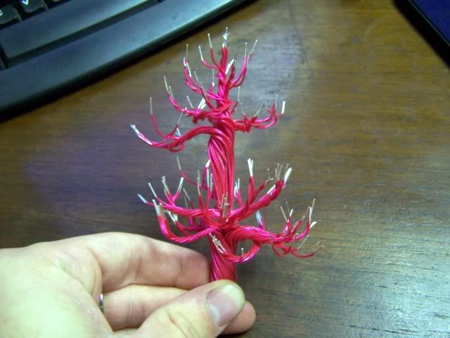
i hand made a tall tree out of idividual wires ut about 4 to 5 inches long each.
i made two teirs if them to scale up a bit.
im thinking of taking green stuff and sculpting a really gnarly knot in the bottom trunk and undercoating it black. possibly some really eerie painting on it for the base. what do you guys think?

ALLOYSIGN004-1.jpg


ALLOYSIGN005-1.jpg


thanks guys
 

Monkeysplitters

New member
I dont know about that tree. A CSM dread and any kinda tree doesnt mesh to well in my mind. Ill be interested to see how it looks though.

Question: What are you going to do with the gold areas? you gonna keep those with a horizon line?
 

thekid420

New member
io think im gonna keep the gold areas the same i think im getting frustrated going back and changing everything lol....

it looks good to me for now so ill leave it be

im really quite pleased the way its turning out though considering this is really a practice run on nmm
 

thekid420

New member
i dont know what to do for a base im having a hard time picking an idea

and i know that if i dont do a decent one its going to take away from the actual model itself

any ideas i thought maybe an industrial scene of some sort but i never was that
good at basing
 

thekid420

New member
ok i got it set in my mind im goin industrial chaos scene base i think your gonna like what i came up with ill post pics of it tomorrow afternoon sometime before i base coat it.....

a.k.a. lots of detail and a little bit of scroll saw work
 

Monkeysplitters

New member
Id say keep the base simple to start with, cause its easier (imo) to add more things later then thin out the clutter later.

You got any of the GW ruins lying around? cause I think some of those would compliment your mini nicely.
 

Monkeysplitters

New member
Also I was just lookn, since your keepin the gold as is (which looks good) what did u end out that last highlight with? cause I still think you should bring it up to pure white. That is, a minimal amount, but it will flow better as ur steel is a pure white highlight at the end (or so it appears to me).
 

thekid420

New member
it is pure white on most of it some of it is so small u cant get the white in there without making it look like a solid line you know what i mean? im still learning of course lol
 
Back To Top
Top