ste022 WIPs

ste022

New member
I can't see the attached images! You are attaching them using the CMON image attachment process? I hope CMON isn't on another image purge spree...

Not sure, I can see them. I've tried logging out and can still see them, I've not long posted maybe there is a delay.
 

gorb

New member
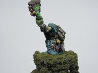
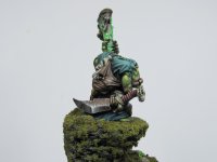
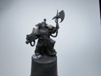
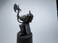
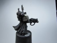
The marine looks friggin' amazing, I'd love to see more pics of him and his base.
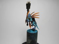
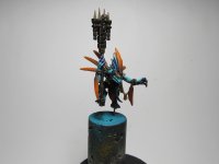
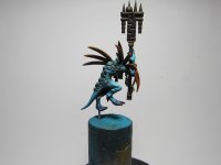
The second mini has a solid start, love the blue / brown combo you picked.
 

ste022

New member
The marine looks friggin' amazing, I'd love to see more pics of him and his base.
The second mini has a solid start, love the blue / brown combo you picked.

Thanks haven't had time to take proper pics yet, I have to clear my bench to get my backdrop in place and it looks like a grenade has gone off at the minute. I'm really out of my comfort zone with the Skink I rarely paint anything bright/vibrant so it's a fun challenge, the feathers will be orange they look brown because of the blue basecoat showing through.
 
Last edited:

ste022

New member
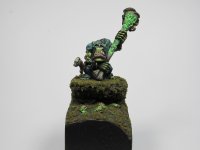
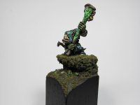
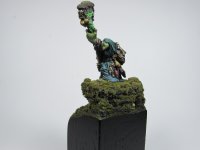
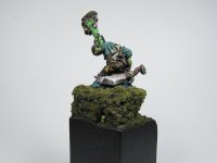
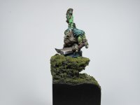
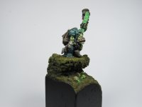
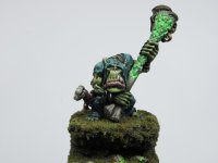
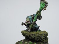
Basically done!

This is basically done now, I just haven't made up my mind whether or not to add some gloss to the rocks. I'm pretty happy with how the moss went as I've never tried it before. Fixing him to the base was absolute chaos, I stuck him down at the wrong angle and had to break him off and re-glue managing to get super glue on his bone staff in the process.
 

Attachments

  • IMG_1937.JPG
    IMG_1937.JPG
    1.6 MB · Views: 69
  • IMG_1938.JPG
    IMG_1938.JPG
    1.7 MB · Views: 69
  • IMG_1941.JPG
    IMG_1941.JPG
    1.6 MB · Views: 70
  • IMG_1943.JPG
    IMG_1943.JPG
    1.6 MB · Views: 68
  • IMG_1944.JPG
    IMG_1944.JPG
    1.6 MB · Views: 68
  • IMG_1945.JPG
    IMG_1945.JPG
    1.5 MB · Views: 70
  • IMG_1946.JPG
    IMG_1946.JPG
    1.7 MB · Views: 65
  • IMG_1948.jpg
    IMG_1948.jpg
    636.3 KB · Views: 64
  • IMG_1949.jpg
    IMG_1949.jpg
    626.4 KB · Views: 68
  • IMG_1950.JPG
    IMG_1950.JPG
    1.6 MB · Views: 65

ste022

New member
Skink Starpriest WIP

A bit more progress. I don't know why but I'm incapable of painting anything bright and cheerful, I've used only super vibrant tones and tried my best to keep this project bright and still ended up with a dark and moody miniature.
 

Attachments

  • IMG_1957.JPG
    IMG_1957.JPG
    1.5 MB · Views: 56
  • IMG_1958.JPG
    IMG_1958.JPG
    1.5 MB · Views: 56
  • IMG_1959.JPG
    IMG_1959.JPG
    1.6 MB · Views: 55

gorb

New member
I reckon this looks awesome. I see what you mean with the darker look, even in the presence of the saturated colors.
My two cents: I see a lot of saturated colors, but no bright colors. I think yellow is the brightest hue we can safely mix without de-saturating it too much, so the eyes especially can be pushed a bit brighter, as well as the orange feathers.
The blue skin and the armor scales on his back can probably have some specular highlights with white / off white added. What do you think?

The other dark think is the dark gold scepter (? I don't know what that is), this could maybe do with a lighter version of gold.

The last thing I see is that you are taking the photos in front of a white / light background. Have you tried a black / dark background? That should make the colors pop more, I think.

All of that said, this looks awesome! I wish I could get the smooth finish you are getting.
 

ste022

New member
The comment on the brightness is a bit of an in-joke. Friends always poke fun at me saying I could paint a mini with only a pot of white and end up with it looking grimdark, I'm naturally drawn to dark muted colours and use lots of oils in my shading. It should end up much brighter, the feathers will get blended towards yellow and I'll significantly boost the highlights overall as I go. The idea about the highlights on the scales is a good one, I held back on the highlights because the skin wasn't done yet and I needed the scales to be darker but I'll tinker with them at the end. The gold is just a base coat of 25% gloss black and 75% old gold which is why it's so dark, I frequently use satin or matt varnish (Vallejo premium color) as I'm going so I always leave the metallics till last over wise the varnish ruins them.

I use the white background for quick photos because I can use my cameras "auto" setting, to use my dark grey backdrop I need more lights set up and have to tinker with camera settings in "manual" mode.

As for the smoothness I do most of the heavy lifting with my airbrush (badger Krome 0.22mm needle) and then use thinned paint afterwards, usually 2:1 water : paint plus a bit of glaze medium and flow enhancer.

Thank you for your input it's much appreciated. I've grown quite tired of posting on social media as you just get a bunch of likes and no communication or sense of community, I miss the good old days on this forum and am very glad to have re-discovered it.
 
Last edited:

gorb

New member
The comment on the brightness is a bit of an in-joke.
Ah, I get it :)

I use the white background for quick photos because I can use my cameras "auto" setting, to use my dark grey backdrop I need more lights set up and have to tinker with camera settings in "manual" mode.
Sure, I have lots of trouble getting lighting right (or at least, good enough!) when doing dark backgrounds. The white background definitely makes that easier.

As for the smoothness I do most of the heavy lifting with my airbrush (badger Krome 0.22mm needle) and then use thinned paint afterwards, usually 2:1 water : paint plus a bit of glaze medium and flow enhancer.
Great tip, thanks! I have an Iwata Revolution, it's got a much larger needle - 0.35mm I think - I'd love to get something smaller for a bit more control. The glaze medium + flow improver is a good idea, I'll try this out.

Thank you for your input it's much appreciated. I've grown quite tired of posting on social media as you just get a bunch of likes and no communication or sense of community, I miss the good old days on this forum and am very glad to have re-discovered it.
Cheers. I have the same frustration with social media. It's a very disconnected medium. Forums like this can be a blessing and a curse though; if you post C&C on someone's work there is always a chance that it gets misinterpreted (it's happened to most of us, I reckon)
but that is always going to be the case I guess.

In the end, being able to talk & duscuss stuff with people (and not just "like and move on") is what makes forums like these great. We have to hold on to that.
 

ste022

New member
Great tip, thanks! I have an Iwata Revolution, it's got a much larger needle - 0.35mm I think - I'd love to get something smaller for a bit more control. The glaze medium + flow improver is a good idea, I'll try this out.

The Krome and Sotar from Badger are both amazing and are half the price of the equivalent Iwata with parts at a fraction of the cost, Badger are very underrated IMO. I've previously owned an Iwata Eclipse and a HP-BS and don't regret selling them on.
 

ste022

New member
Castellan WIP #1

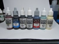
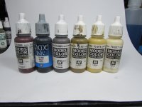
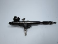
I bought him on the day of release, just getting round to working on him. The 4th photo shows colours used for the armour, the 5th colours for the Shoulder Pouldrons and the last photo shows my new toy a Badger Sotar 20/20 from https://barwellbodyworks-shop.com. If anyone is in the market for a detail brush the Sotar is fantastic it's very comfortable to hold and it's the most precise and responsive AB I've ever used, with super fine atomisation.
 

Attachments

  • IMG_1983.JPG
    IMG_1983.JPG
    273.7 KB · Views: 25
  • IMG_1984.JPG
    IMG_1984.JPG
    263.1 KB · Views: 25
  • IMG_1985.JPG
    IMG_1985.JPG
    268 KB · Views: 26
  • IMG_1988.JPG
    IMG_1988.JPG
    437.2 KB · Views: 26
  • IMG_1987.JPG
    IMG_1987.JPG
    415.7 KB · Views: 26
  • IMG_1986.JPG
    IMG_1986.JPG
    257.1 KB · Views: 26
Back To Top
Top