Scattered projects

Arne

New member
I had to work for a few days and it was difficult to get back on this project after that. These are my first serious attempts at some sort of larger finished figure sculpts.

I've added some more volumes to build on. My plan is to rough the surfaces up a little with sandpaper, then add a final skin layer on top, then knead and budge that into shape. Not sure if roughing up is necessary though.

I ran into problems earlier. Adding really small pieces of GS onto cured GS, then trying to sculpt that, worked poorly (fell off, visible seams etc). I think it's better to cut off a large chunk then sculpt a new chunk into shape, rather than adding small parts on top of each other.

Another problem that I had is the armature and pose distorting, and for some reason the knees lowered themselves. Will have to measure and fix. Maybe the armature just sank into the cork. Should've made little stopping blobs.

Also realized that I should've left more armature sticking out, so I have something to hold on when I cut them up. I don't think it's practical to sculpt the arms when attached to the figure, covering the body.

sculpting_wip2.jpg


If I finish these, is there a casting service that I can use? How much does that usually cost?
 
Last edited:

Arne

New member
Worked some on actual detail sculpting today. I feel very slow. All my edges are round and blobby too. I guess I can sandpaper and use the knife a little to smoothen and sharpen some of the problem areas though.

sculpting_wip3.jpg


I messed up the leg on the leftmost figure. It ended up looking like a sausage when I put the skin on, I guess because the GS was pushed off the convex areas, into the concave. I'll have to cut the stuff off and try again. The problem is made more difficult by the fact that I need to do lots of seams. I need to get the shape right, AND avoid nudging it around when doing the seams (stripes similar to those in hair). It would be nice if I could do the concave seams after the stuff is cured, but I don't know how. Maybe I can let it half cure, so the major shape won't be too distorted. Another idea is to sculpt an underlying shape, then roll thin little stripes and push on, but I've had little luck with attaching little dots of GS. I think I might need to mix some soap water and dab of skin fat from the areas before.

Pretty happy with the helmet. Adding a thin GS skin on top of a smaller helmet worked pretty well in this case, because it prevented the overall shape of the helmet from being distorted. I'll just have to sandpaper/polish it a bit. Add a nose horn perhaps, and/or a pony tail for the back. I might do a few different helmets, different pointyness and curvature. I don't know if I dare to do a human face. A crude male face might be possible, but a (pretty) female face is a lot more difficult... I can imagine that it's maybe THE most difficult thing to sculpt.
 

SkelettetS

New member
i suggest you buy some milliput white and mix with the greenstuff, at least when it comes to sharp edges its a lifesaver, it turns the putty more ceramic and are muuuuch easier to cut, sand and file sharp.

cool work anyway :)
 

Arne

New member
But I already have Milliput! Oh, it's from the mid 90's and hard as rock :/

Turns out sandpapering and cutting GS kind of works. I'll stick to that for these learning pieces to keep momentum. Takes a week or so for parcels to get here.

sculpting_wip4.jpg


Sorry for the blurry pic (I need to get a backup battery for my cam... so stressful to snap with that bat. icon blinking). I've made some progress with the legs. Only the feet and some cleaning up left. Matching symmetry is tedious. Maybe I should make molds for some of the armour bits. Curious about that.. instant mold, just for getting the volumes down quickly.

My fingertips are shedding a little skin. I should probably get plastic gloves. Maybe a breathing mask for the sandpapering.
 

Arne

New member
Thanks. I've been doing some work on the torso, building up some of the major armour plates. Next up is to sculpt up the masses around the arm sockets and collar area, and build up a head socket (neck). The chest needs an emblem and the waist needs some adjustments so it fits onto the legs and transition well. So far I have no work done on the arms, backpack or weapons. I'm thinking I should do the arms on new pieces of wire, making them separate parts. This way the figure is somewhat posableand perhaps easier to cast (although in more parts).

Legs
Torso
Head
ArmL
ArmR
BackpackL
BackpackR
Mace
Rifle

I might try to make the backpack and arm bits symmetrical, so I can cast them myself in GS. Should save me a little time. I have an idea: I'll make an armature first, encase that in GS and press it in a mold. Now I might be able to open the mold before the GS is fully cured, allowing me to adjust for L/R differences.

sculpting_wip5.jpg


Edit: The idea.
GS_press.jpg
 
Last edited:

Garshnak

New member
Wait...Prometheus!? Hah, funny to see the guy I used to idolize when I was a kid back at CA turn up in this place, don't they have a sculpting section over there? Not that you're not welcome over here. :D I still love your style.

I personally found that adding a little more blue to the mix of greenstuff hard edge stuff is a little easier. But that might just be me. That, and I like the look of multicoloured sculpts.

What assymetrical details had you planned? I see an emblem on the front on the concept, though I'd think that be easier to make out of a flat piece of greenstuff, cut up and glued on.

Cool stuff! The helmet is cutesy.
 

Arne

New member
Yeah, I noticed the 3D/Sculpting at CA section yesterday. Made a post. This place is more gaming miniature oriented though.

I'll try the blue stuff idea. I don't really know how blobby and wobbly my finished product will end up. I feel like my sculpting resolution is pretty low compared to professionally sculpted figures. When painting I always notice how sloppy and wobbly my edges are... and those little rough parts that I thought were invisible... suddenly stick out like a sore thumb.

Perhaps I can highlight the GS a bit, just to see what edges are problematic? Is it bad to put acrylics paint over GS, if the thing is going to get cast later?

The shoulder pads will definitely have different decoration (studs/emblem). The backpack gadgets will be symmetrical. The arms will be made from barrels that are radially symmetrical, but differently posed. Hands will have to be mirrored though, and separate sculpts.
 
Last edited:

Garshnak

New member
Yeah getting things clean and neat takes quite some practice and above all, patience! After all, you're learning a new medium. It still frustrates me at times because drawing in 2d and modeling on the computer goes so much quicker...

The way greenstuff reflects light (matte) can be a little problematic at times to see the smaller details. And just throwing water on it to make it shinier doesn't help much either.
So getting a strong lamp on it works sometimes. I now switched over to grey stuff though since it's a little easier on the eyes.
There's rubbertipped tools that can help you with smoothing out rough areas during sculpting (of course you can sandpaper afterwards). Though you could also fashion your own out of greenstuff, slightly less flexible but it works.

And I find it helps to make a sharp edge on something by sort of pulling the edge out, pushing it on both sides, further then where the edge should be, until it is thin and then push that back in (a hand made greenstuff tool with a curved 90degree indentation can be handy for this).

Happy sculpting! :D
 

Garshnak

New member
Haha you're even making example pics pretty. Can't help it, can you?

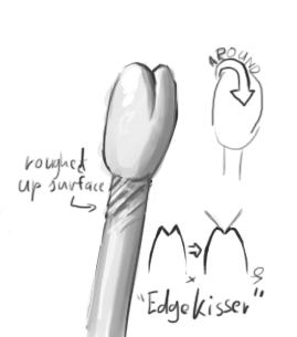
But no, little more like this (sloppy tablet drawing ahoy! it's been a while...):

thekisser.png


The hard edge on the sides would only get in the way and pushed in the mini, resulting in little vertical stamps. And this way you can (with lubricant of your choosing, water or oil) drag it along the edge and hold it at multiple angles. And you'd want the flat areas to be small and curved back (for the same reasons), so you can apply it to edges on curved shapes as well (I don't like making 20+ different tools for different situations, I just try to improve the ones I have). And though I didn't draw it that way, mine's more tapered at the end. But yeah, it's just explanatory so screw proportion.

Another thing, though a lot of people use water to smooth the mini, like myself. You can also use oil, vaseline, petroleum jelly, etc. There's one major advantage to using water and that is that it doesn't evaporate and require frequent re-apllication and the other being that it doesn't pool as much and obscure detail. I never used it, because I'm a cheapskate and one of the drawbacks is that you have to wash the mini with soap before applying new layers or else it won't stick.
 
Last edited:

Arne

New member
Thanks. I made one of those (too big tho), but haven't tried it out yet.

Progress report. Arm pieces have been sculpted, oiled and put into GS. Hopefully it will separate. I mixed in some extra yellow to make the mold half a bit softer.

I've built up the collar, which is pretty rough. I plan to cut/sand it into a more defined shape.

Feet and knee joints done.

sculpting_wip6.jpg


Might do some weapons. Here are a few sketches that I need to clean up.

astroknight_design_wip.jpg
 

Arne

New member
I took the bull by the horns and started defining the design a little more... still unsure about the exact proportions, but the head was way too large. The torso symmetry is off.

I think the legs might be a tiny bit too short. Hard to tell with the crouch.

astroknight_design_wip3.jpg
 

Garshnak

New member
What I've seen some guys do when modelling a character from scratch (I don't, since I partially replicate models at hand, withing a style not my own), is printing it out at the right size/scale and then using that as a more direct reference, so you have to eyeball things less.

Symmetry is always an iffy thing, it helps to define a middle line and reference from that point. But consistency is tricky when you're working so small.

That's some chunky modified human hehe. Legs portion is a teensy bit short yeah, it's the pelvis area though (thigh connection), not the legs. You even got an extra bit in there in the concept, you could be brave and try to saw the legs of and put a bit in between.

edit: think I've never seen a chick with knees that low, is she modified too? Or is that part of your style, can't remember. :p
 
Last edited:

Arne

New member
Well, yeah, I was working with a hand drawn little figure as reference (seen in earlier pics), but it was a bit fuzzy. I should've defined things like I did now, earlier.

The leftmost upper leg is angled almost 45 degree into the pic here, so it should be... uh... I think 100 * sin(48 degrees) = 74.3144825 % of its actual height.

I think the knees on the female are placed right. I also suggested the upper bone of the lower leg.. maybe you misread that as a knee.
 

Garshnak

New member
Ah I indeed misjudged the length of the leg for the lack of dept...should've looked at the previous photo's...that's tricky. So...they're too long?

I think the knees on the female are placed right. I also suggested the upper bone of the lower leg.. maybe you misread that as a knee.

Heh, though this discussion of anatomy is probably beside the real topic of the thread, the upper head of the fibula and the underside of the pattela creates a dent at exactly the middle of the 'leg' (the measured leg portion being from crotch to ankle). The (pronounced) 'knee' bulge, the patella, is centered where the leg curves inwards and this bulge roughly by average 2/3 of the width of the leg at that point and (aiming for ideal proportions) roughly 1.6 times its width in height (though it more often is square).
And the head of the fibula just goes right below it, it's bulge being not very much larger or smaller then the bulge of the patella (varying by type of musculature, proportions and pose).
Now this is by no means an attack on your artwork though, I just love discussing anatomy, it's one of my geek-things.
As I said, it could be your style, since you do exaggerate slight in your style. And there's nothing wrong with that because it's a lovely style.

Knees are tricky though, they can vary quite a bit with all the leg muscles. But I don't think they realistically cause a bulge at the top of your shin, on top of it.
 
Last edited:

Arne

New member
Oh no, the upper legs still might be a tad short. Just not as short as they may look. I've finished them now, and I think they'll work. I might have to lengthen the shoes a bit, but I don't want to do Megaman feet like GW does, I'll take some pics of it next to GW model when it's done. It looks pretty bulky next to an Eldar. It's slightly larger than a Space Marine, but less trunky.

I haven't drawn using length relation in ages. I prefer to draw mostly by feel. Measuring can be helpful for correction (and I often end up having to do it), but if I start by working from rules I often lose some of the flow.

Anyways, I screengrabbed the pose maniacs girl, and surprisingly most features (neck down) line up with my trunky girl... about +-1 pixel. This includes the center of the knee. What's different is that since I'm exaggerating proportions, I drew the main knee bump larger (too large, perhaps), and this pushed down the lower knee bone further than normal (2 pixels) (and whatever muscle attachments are above the knee went up a bit). If she were a skeleton, she would be very big boned, like Miniature skeletons often are.

I might scale down the knee cap a bit, it's pretty large... but my peeve atm. is feet/hand size. Ease of sculpting and comparability with other figures is one concern. On the other hand I don't like 'Goofy' shoes and bell bottom pants, or just trunky (even thick) looking figures, so I don't want to sculpt that of course.
 
Last edited:

Arne

New member
I've attached the body to the legs (might be able to break it off easily later). Sculpting a new head was pretty painless.

sculpting_wip8.jpg


Included some miniatures that I painted long ago, for ref.
 

khavor

New member
I love this project! Very ambitious, and makes me teary eyed for the old rogue trader days. I love your design for the armor. It's neat that you've got some "space samurai" type elements in there.

The new head looks like it fits the body much better, and the sculpt looks a bit more refined as well. I think you are going to have to add more to the feet though. I know you don't want them huge (like the space marine who won't turn around and show his face on camera). But they already looked very thin, and a bit small, in the pic above. Once you added the upper body, which is bulky anyway, it's exaggerated the smallness of the feet. I reckon if you turned the current soles into part of the foot, and added another layer below for a new sole, it'd fix it.

Great work so far though, look forward to seeing more!
 

Arne

New member
The feet and legs are even smaller and more stylized on the concept. I did something in-between of what I want and what's practical.

I've assembled it temporarily with the yellow stuff, so now I'm able to see the whole thing for the first time.

almost_there.jpg
 
Back To Top
Top