Paintscheme assistance required from all you masterful painters - pretty please?

Lemmingspawn

New member
Hi guys and gals, I\'m a little stuck (and a touch overwhelmed) for ideas on what scheme to paint this defiler with. I am considering doing an Iron Warriors type scheme with some modifications, but I can\'t decide 100% on what to do.

My original thoughts were to go with black painted areas of metal, black/yellow chevrons on the armour plates, metallic edges, and then focus on some kind of flesh tones in the centre of the piece since it\'s the daemonhost and it\'s still \"human\" in a way.

As it is though, using those colours is going to lead to a large monochromatic beast.

My other thoughts are to maybe incorporate red into the large surfaces that would be painted IRL if it were such a machine, and then you have loads of metallics on all the blades and chains and stuff as well, but I can\'t really picture it.

Or maybe I just go with the masses of metallics and just work on juicing it and shading it in such a way to create more tone an texture between the metals. There\'s quite a few metallic tones to choose from, and I could maybe make that work too, but I\'d like some ideas as to what you reckon so I can get started on this beasty on monday.

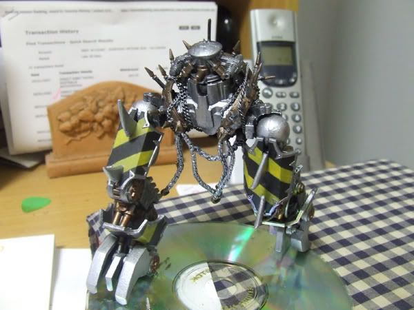
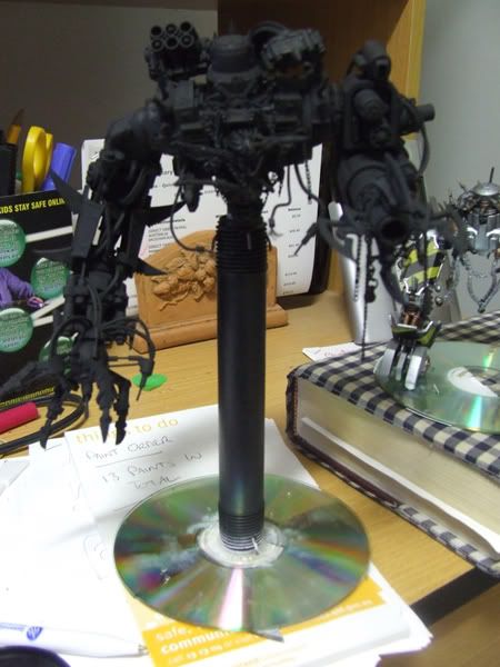
Here\'s a pic of the monster:
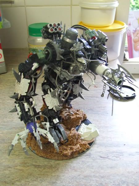
Complete.jpg


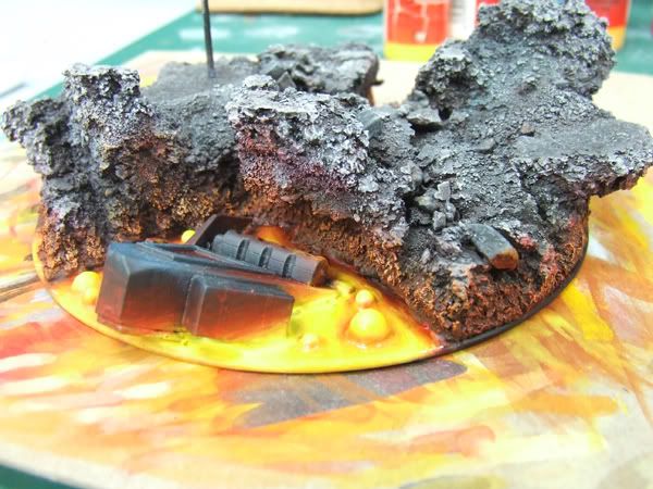
The base is going to be rocks and lava.

Any ideas are welcome, I\'m kinda stuck!
 

OrkyDave

New member
Sorry, can\'t offer much help. I have always liked red and gold for chaos, although that does scream khorne. I think that this certainly looks like an Iron Warrior construct.

Have you searched the galleries here for defilers and seen if theres anything that inspires you?
 

electrolito 77

New member
I take it my ideas are not being taken into consideration... I left you some on the WIP thread...:cussing:..... have a beer!:p:drunk:
 

Lemmingspawn

New member
Hey! Don\'t be like that.... :D I\'m taking your ideas into consideration, I just was hoping to get a few more before I made a final decision.

What I\'m hoping to try and do is to break up the colour a little, but not to stray too far from the iron warriors deal. What I want to try and do is find some extra colours that are going to complement the deal and give it some more interest....call it an artists fetish.... :yes: :yes:

I appreciate your comments, and they are good. Just putting the bait out there in case someone says something that just makes me go \"OH BABY YEAH!\" (not that yours don\'t-actually yours were almost the same as my thoughts!). At the moment, I can\'t really visualise exackery how it\'s gonna work....and I\'d prefer to approach this one with a bit more method....
 

Talion

New member
I think an Iron Warriors scheme won\'t do it justice it\'ll be to dark.

I think a Tzeetchy, Purples and Blues will really bring it too life, plus you can have more fun with it.
 

demonherald

New member
The problem with something that size is sticking to it and finishing itthrough.
It\'s a big complicated beasty.

Iron warriors could be good Variation to break up the colour in the form of The yellow and black chevrons etc as well as plenty of cool weathering effects would help.

Agree with Dave it\'s got the \"I\'m gonna tear of your tiny head and drop daemonic shite down your neckhole\" Khorne look..
Golds Brass Blacks and Reds would work.

Are any of the bits detachable for painting as there are a lot of difficult to get to but visible areas on it...??

Either way post progress and good luck.
 

Lemmingspawn

New member
It breaks into 3 pieces at the moment, can go to 4 easily enough. Even broken down to the smallest constituents, it\'s still pretty complex! :D

I think I\'m just gonna have to start with a basic idea and then just start! :lol: Nothing really grabs me, the only idea that still sorta makes me sit up and go \"That sounds ok\" is the Iron Warriors...who can still have a little Khornate influence....a little.

Oh well. I\'ll just have to start and then go from there.

Thanks for the ideas guys, I\'ll see how I go. It\'s not the easiest model to start since it is so busy. I think using a lot of similar colours and creating variation between them will both assist in reducing the busyness and enhance the whole hellraiser type look, and then help make the important parts stand out, like the claw, the daemonhost and the cannon. I just have to remember to keep those focusses alive and let the rest complement that! :]
 

Onis Lair

New member
I agree with most everyone else. i know little fluff from 40K but looks very much like Khorn and Iron Warriors, so why not go with both idea. Start painting it up as if it was iron Warriors then add some red and gold in the Khorn fashion. Give it that salvaged Iron Warrior beastie now being used by Chaos look.
 

automaton

New member
hey dude - why don\'t you just have lots of sections painted yellow, like that construction yard machinery yellow - the colour bulldozers and diggers and stuff are painted. THen you can have lots of chips and scratches showing the metal underneath the paint, black and white markings and numbers and stuff, the black and yellow chevrons, and some plain metal sections as well with rust and dirt etc. The yellow will give you colour and variety, but won\'t stray from an iron warriors scheme. Plus it will give an added \'machine\' atmosphere, because we are all used to seeing machinery painted that colour in real life.
 

Talonicus

New member
i have to agree with the man above. Yellow would be a great colour for this. If done with plenty of rust, staining chips etc it will still have a chaos look. The yellow will also help clarify the model. Paint it to dark a colour and unless you are up real close all the little details and form of this monster will be lost.

Good luck!
 

Lemmingspawn

New member
Thanks for the ideas guys. I\'m pretty set on a colour scheme now. It\'s funny how when you post something asking for ideas about chaos, almost everyone mentions the scheme of their fav chaos icon! :lol: Not that I mind, it\'s given me cool ideas to work with.

Thanks for the thoughts, Sebastian. I\'ve been looking at pics of Caterpillar machinery all afternoon and the two main things which strike me about the colour scheme are

1- I don\'t really like painting things yellow..... :twisted: yes yes, and now I hear you mumble \"Well get over it sook! Suck it up and do it!\" :twisted:

and 2- I get the feeling that if I paint it with big sections of yellow it\'s gonna end up looking like the dock loader Ripley operates in Aliens. A bit too sterile and .... functional .... it\'s a cool idea but I don\'t think matches the scheme. Then again, maybe I should post it to you and let you paint it.... :twisted::twisted::twisted: jokes, as much as I would LOVE that, I wouldn\'t be able to afford such a prestigious paintjob! I\'ll just have to try and pretend I can do it! :D

I\'ll keep my options open though, guys. If the colours get too monotonous I think I will chuck in a panel or two of yellow or red....we\'ll see how it goes.

I\'ve started the base, I touched up the legs and decided not to mess with them any further, I like them giving it the giant warmachine troll look actually! Anyways, once I have the base worked a bit further, I\'ll post up some pics.
 

Lemmingspawn

New member
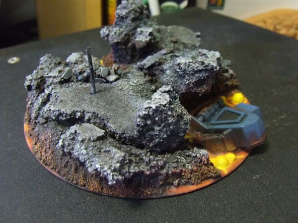
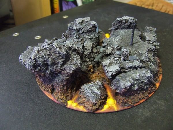
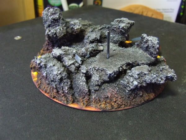
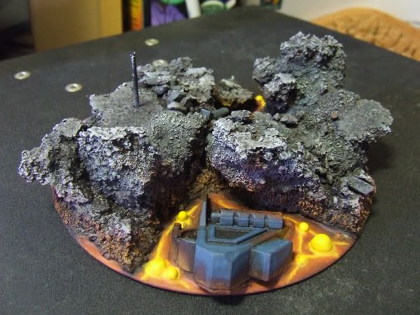
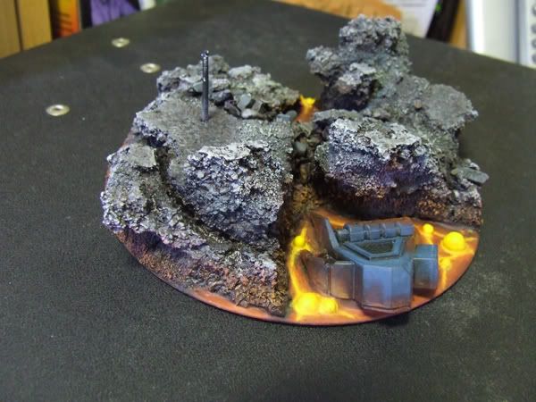
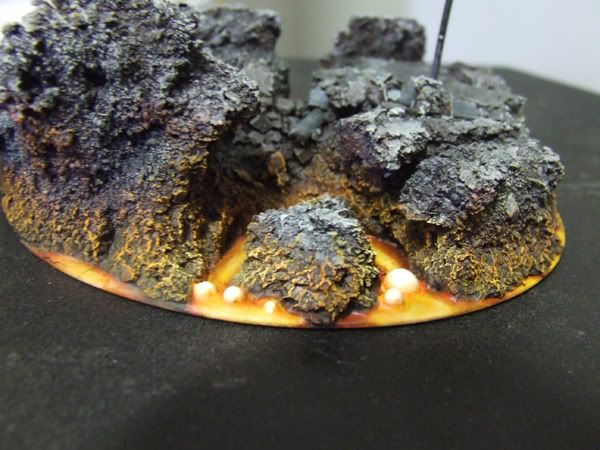
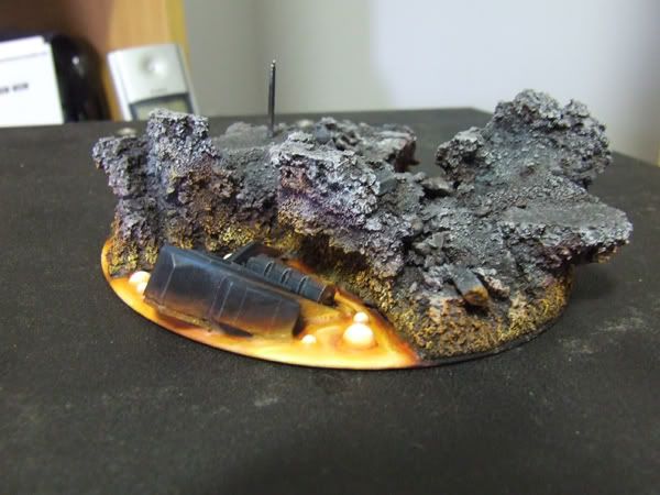
Here are some pics of the base so far. I hope someone can give me some ideas on improvement. It\'s bugging me coz I am having SOOOOO much trouble getting smooth transitions between the black through yellow. Yellow sucks to transition.

I went and got some Jo Sonja Glaze medium this arvo, so tomorrow I\'ll see if that helps me do better!

Base1.jpg

Base2.jpg

Base3.jpg

Base4.jpg

Base5.jpg


I\'m not entirely sure if I like the method I used for the lava. Don\'t know if I should try for a broader colour spread or keep the little \"hotstreak\" look or not. I\'m quite happy with the melting Rhino, but think maybe I could define it better, or if you guys can think of something else I can do to help make it look hot and dissolving?

Time to vote! :D
 

Lemmingspawn

New member
Ok, here is the new improved lava. These pics are after I dropped the #$@^$!^&#@!&$!@#%^!&#*(@ thing but it mostly survived. I just need to touch up some cracked lava and that\'s it.....not too bad considering I dropped it onto bricks!!!!

Newlava2.jpg

NewLava1.jpg
 

electrolito 77

New member
Looks better. I tink the bubbles are a bit too white, just my opinion though. Also the rhino part, it is metal melting in lava, I would try to make it look a bit more like so, right now, with all the black it looks like it is cooling off instead of melting down... make it glow a bit more arond the areas where it touches the lava. Guaranteed to give you a better effect if done right. Looks good man!!!
 

Lemmingspawn

New member
Thanks mate! I\'ve taken the white back to yellow and it looks better. I\'ve also added some more colour to the edges of the rhino...it\'s so hard to know when to stop or continue now....it\'s so close to the edge of \"too much\"....I think I\'ll leave it as it is now....

Thanks for the ideas, though. It\'s all helping me do better than I would\'ve without them!!
 

Lemmingspawn

New member
Rightio - here\'s the latest progress I\'ve had on the defiler. I\'ve started painting the legs, and set up my painting rig for such a large beast.

Legsearly.jpg


Paintinggetup.jpg
 

Lemmingspawn

New member
Ok guys! Time for an update....

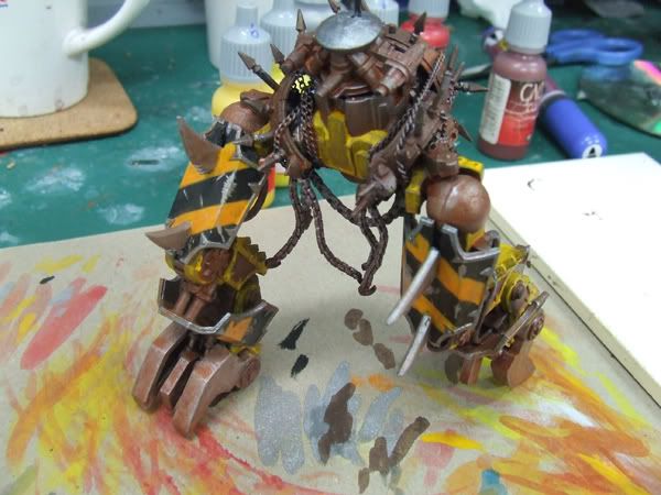
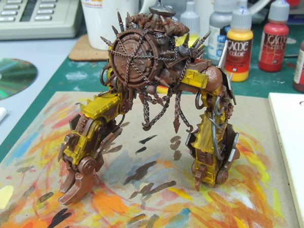
After working on this baby for a while today I succumbed to Sebastians suggestion of adding in some yellow panelling. Still working on in but here are the pics so far. The yellow is going to end up being about the same yellow as in the Chevrons, and much more worn that this. Keep in mind it is WIP....

LegsFront-1.jpg

Legsrear.jpg


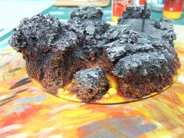
And here is the current base, with added HEAT:

BaseRear.jpg

BaseFront.jpg


Lemme know what you reckon, ideas, comments, suggestions, money welcome!
 
Back To Top
Top