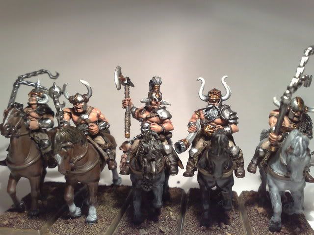
Nightsword\'s excusion into the unknown.

nightsword

New member
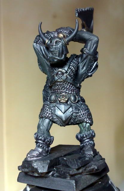
First time posting mini\'s onto CMON and I\'d like to get some feedback, so I\'m going to start with some WIPs of what I\'m up to at the moment.

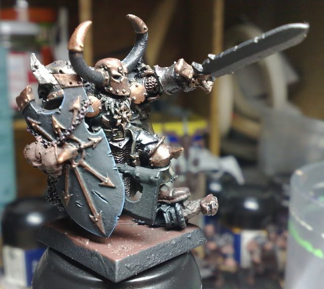
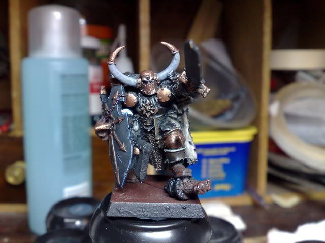
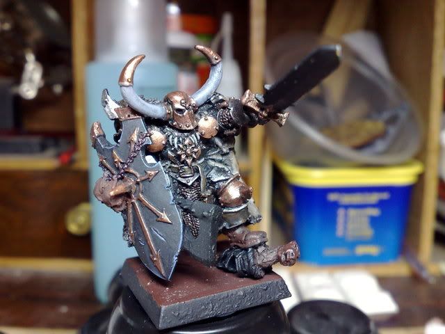
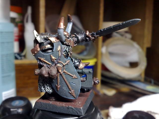
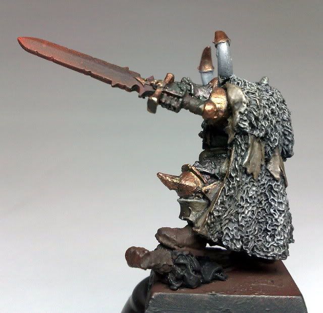
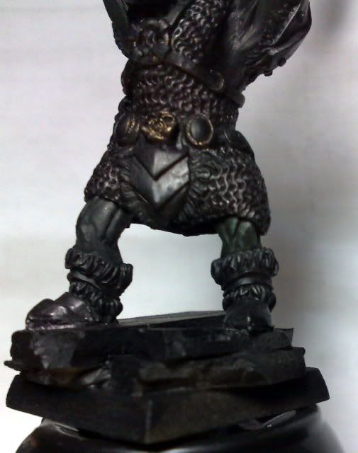
Crom WIP, for the tale of fantasy painters over on warseer:
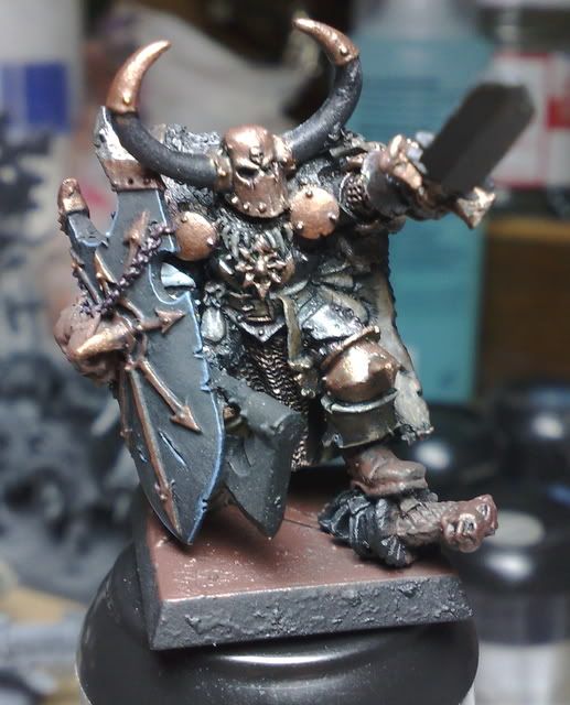
c1.jpg


c2.jpg


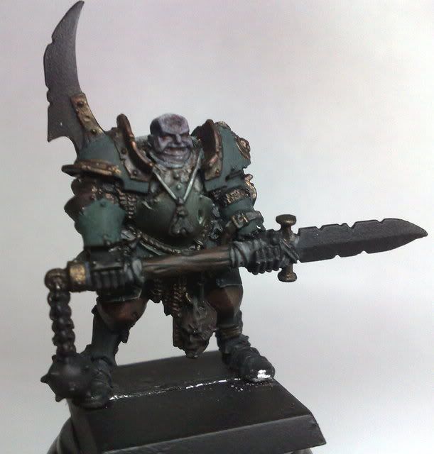
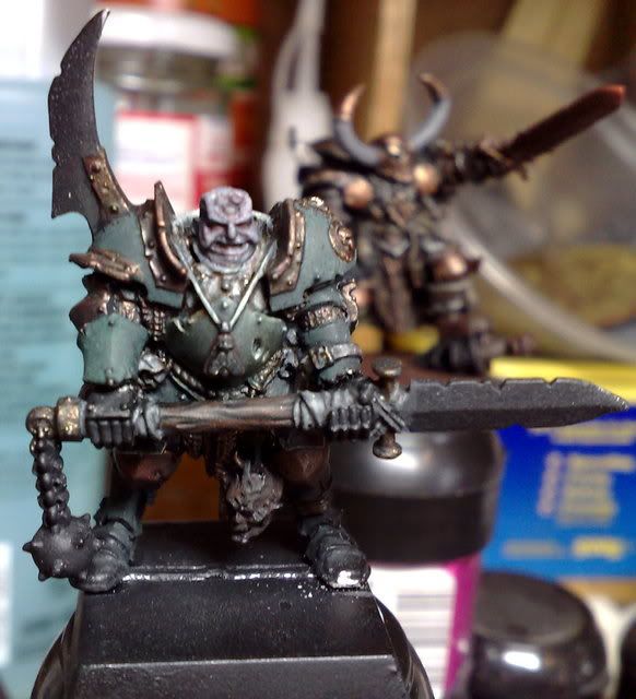
Nurgle champion WIP for my brother\'s birthday next week, to be mounted on a scenic base. The lamp washes some of the colour out. Green is basecoated as is flesh, gold has been based and washed twice:
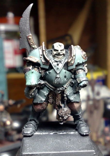
Nurgle.jpg


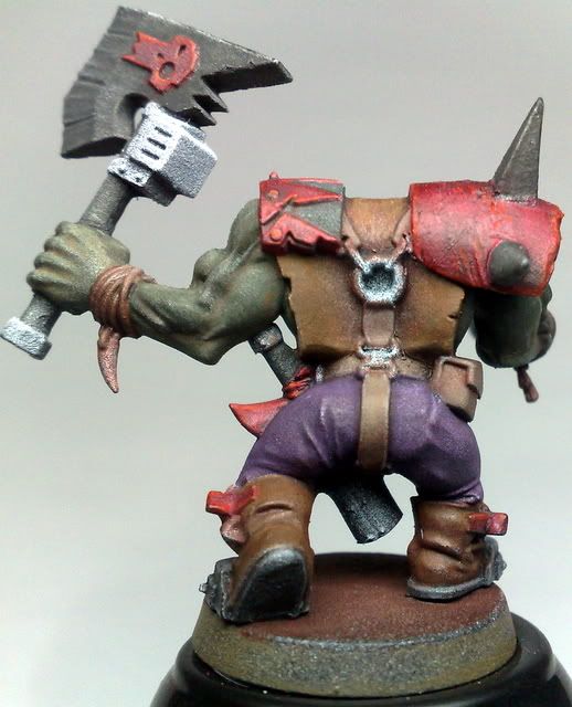
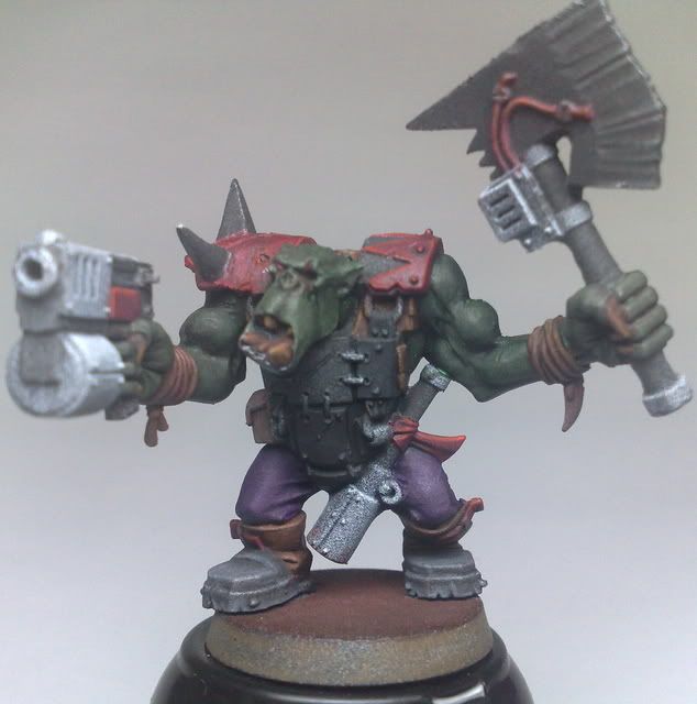
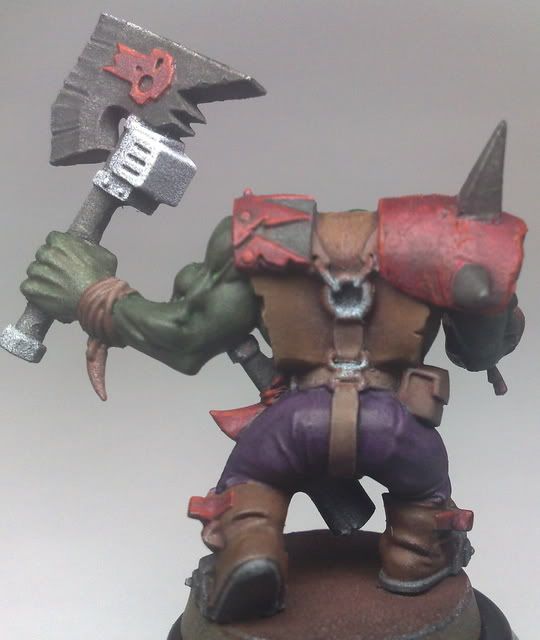
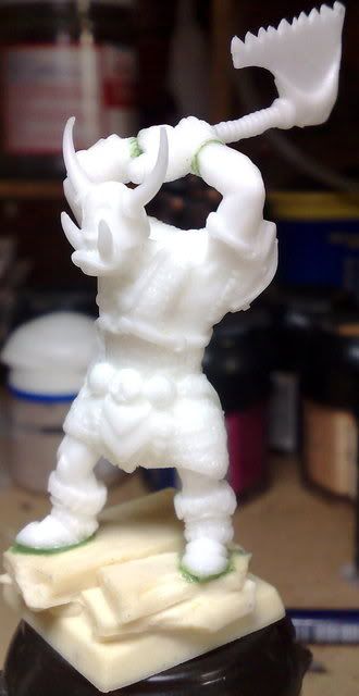
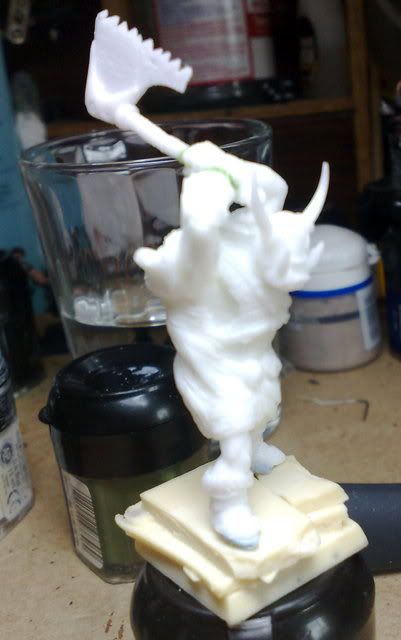
OrK tester WIP. This is both a tester for a planned speed freaks army, and the new Troll Forged Orc Kit. It also features my latest attempt at NMM, which GeOrc offered me advice on over on Warseer. It\'s a different style than normal, and my first attempt at it, hence why there is some graininess on the skin. There was the odd complaint about no having enough contrast, so I decided to take the plunge and wash the skin and trousers. Here\'s the before and after results:

Before:
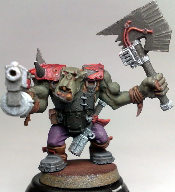
OF.jpg


ob.jpg


After:
ork2.jpg


ork4.jpg


I suppose I should write something about myself too. I live near Bristol, England and wish to enter Golden Demon next year, so am using this year to hone my skills. I welcome all comments, and especially critisms. I need to improve, so please tell me how. The photography will get better too :D

Cheers for reading. :)
 

squig hunter

New member
As far as display painting is concerned, learn the mantra \"More contrast!\" and \"Needs smoothing\" and learn them well, because they are two of the most important things about it. Take the highlights and shades as far as you\'re comfortable, and then a bit more ;)

Ork is looking good, I like the skin, needs more contrast ;) That means highlights and well as shades :p

Nurgle chap is looking good as well, but I\'d take the highlights on the armour up a noch ;)

Krom is looking good as well, the black is nicely done, could use some tidying up in some areas though :)

May the contrast be with you...

Squig
 

nightsword

New member
So I\'m supposed to add contrast right? :D

Thank you very much for your reply.

I\'ve purchase glaze matt medium today to help with smoothing, and having put Crom in with my chaos warriors, can clearly see that he indeed needs more contrast and a good tidy up. I had a few statements of warseer that I needed something to draw the eye towards Crom\'s helmet too, so perhaps paint the skull a different colour. OSL on the eyes was also suggested.

The nurgle chap is only basecoated, so highlights to follow :)

Contrast to come!

Cheers buddy,

N
 

hivetrygon

New member
Two words \"Flow medium\". If you are broke let me know. I\'ll buy some and send it with your orc and troll. Serious, let me know. It makes your paint layer better and blend much, much better. I\'m not the best painter in the world by any means but it made a 100% improvement first time I used it. :yes:
 

nightsword

New member
You\'re a real gent HT, but I\'ve managed to scrap enough together and buy some :) I bought Daler-Rowney Matt Glaze Medium which was recommended by Razza in his interview. Ordered it yesterday, it arrived today! The label says it improved transparency and flow, or produce a fine glaze, so your orc and troll are going to look a million dollars :D

My brother\'s had a party so I\'ll test it out later today after he\'s cleared away all his cans and bottles. Have to find something to test it on...

Cheers friend.
 

generulpoleaxe

New member
if you want to draw attention to kroms head then paint the horns ivory.
it will add colour to that area and instantly give a focal point.
 

nightsword

New member
Thanks for the reply. I was intending on doing the horns like the rest of my chaos army to keep it tied in with the theme, would it have the same effect, or should I try ivory?

Horns:

27052008193.jpg
 

nightsword

New member
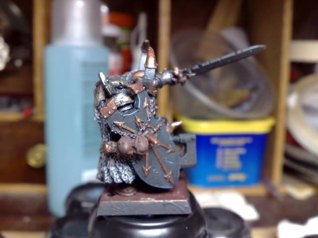
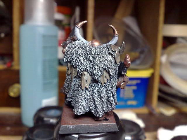
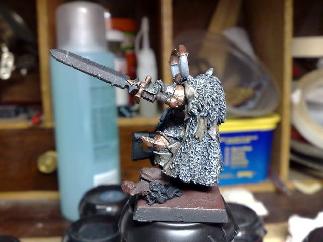
OK, so I had a tube of Daler Rowney Matt Glaze Medium arrive this morning, and I got to test it out this evening. After a poor start, I\'ve started to make progress with it, though I\'m finding it somewhat difficult to use at the moment. Anyway\'s went over Crom a little with it, so it might not seem like a big change, but it has changed ;)

Always one to point out my mistakes, there\'s some stray gold on the shield that\'ll be getting removed and the base edge will get filed flat. There\'s a blob on the horn that\'ll get removed, and the basecoat for the horn\'s will get done up. It is an old mini that is being repainted. Moving on from that, the highlight on the helmet is a little thick, and the gold on the shield need an edging I feel. The shield is also too plain at the moment, so I\'m thinking to try my hand at a freehand pattern. It\'s also blu-taced on.

cr6.jpg


cr2.jpg


Cr1.jpg


cr3.jpg


cr4.jpg


cr5.jpg


As always, C+C is welcomed.
 

hivetrygon

New member
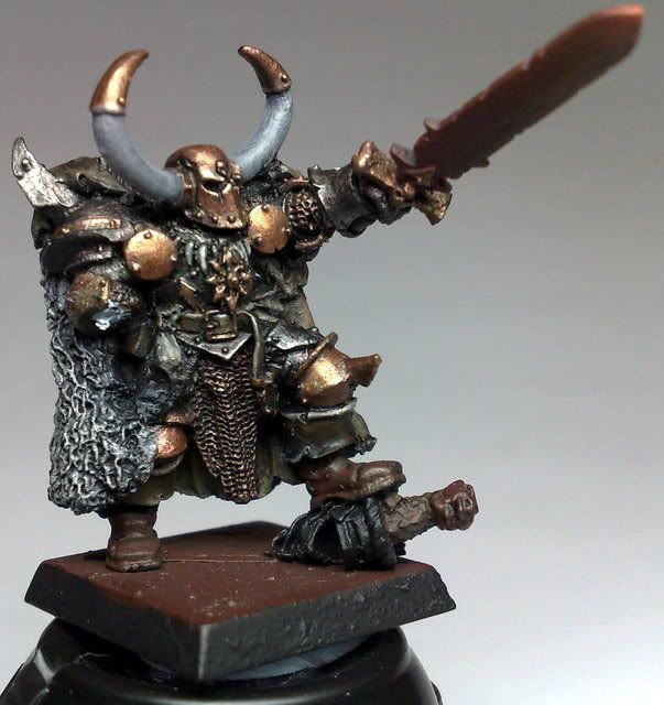
Ok, photo advice. That busy background makes it hard to see what your doing. Get some paper or thin plastic and bend it from a flat surface up against something. It will create a gradient yet neutral background for you to show off your work, much easier to see. Pros do this, get used to it. :beer:
 

nightsword

New member
As requested, Crom with background:

croma2.jpg


croma3.jpg


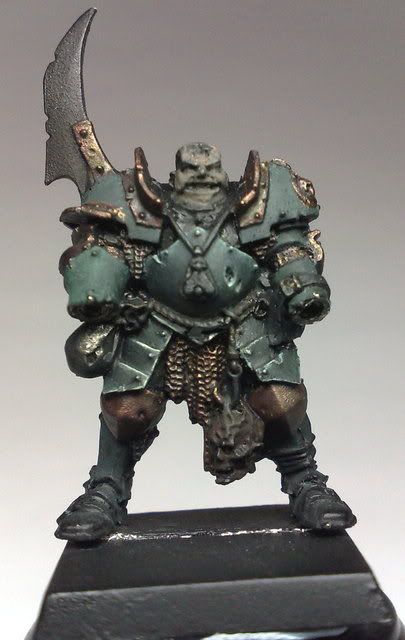
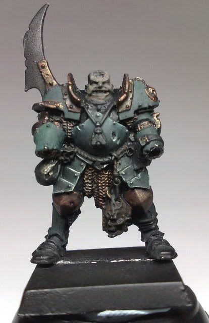
Nurgle champ \"Vrantt\" or \"Vrannt\", or something like that. Suggestions?

Vr1.jpg


Vrantt.jpg


C+C most wanted.
 

squig hunter

New member
The Nurgle chap is looking good, although the extreme edge highlights are a bit stark. I think you might have gone a bit higher with broader highlights first. Maybe tone the extreme edge highlights down with a slight glaze. I\'d also suggest adding some soubtle rust where the plates and stuff meet (I\'d reccomend glazing with vermin brown) to introduce some more colour.

Keep it up:)
Squig
 

nightsword

New member
Ok, that\'s sounds good. I\'ll look for a few reference pictures for the rust.

I was thinking of glazing it with leviathan purple to add a different tone to the armour somewhat. The skin is likely to get a purple tint. One of my biggest problems is shading, so do you (or anyone) think that the shades are deep enough? I can describe the colours used if that helps. I suppose I should add, the armour on his upper chest will be deathwing style bone armour. With a good skin tone against an ivory background, that should make his face stand out quite alot right?

Thank you Squig.

PS: It\'s not often I get too stark a contrast... :D
 

nightsword

New member
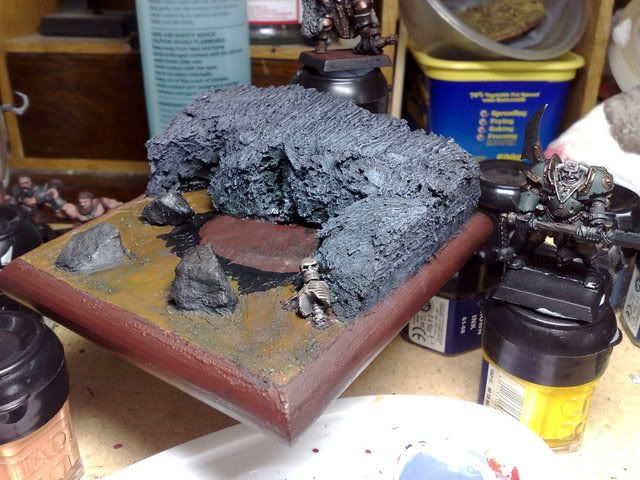
Small update:

Base:
nb.jpg


The brown \"platform\" will be textured with bits of sand and scraggly bushes, the open brown areas hopefully will resemble water :)

And some pics of Vrant at the moment. Had some problems with light:

nb2.jpg


nb3.jpg


C+C appreciated.

I\'m not happy with the bone white on his armour. Suggestions on how to touch it up and smooth it out would be massively appreciated. It has to be finished tonight :(
 

hivetrygon

New member
I love the base, nurgle chap looks better but seems like you still have some highlights yet to do. As for the white, dirty it up, it\'s nurgle, probably not the best choice for him. Why does it have to be done tonight?
 

nightsword

New member
Cheers for the advice HT, congrats again btw ;)

The model had to be finished as it\'s a birthday present for my bro, which is today. I must have bought him that Nurgle Champ 2 years ago, and he always said he\'d paint it one day, but never did. So I decided to turn it into a display for him, but sadly haven\'t finished it due to watching my mate\'s band win their heat at open mic, and having to take some stuff into uni today, and then go to Ikea to buy a desk that didn\'t come a 18th century school, and a chair that didn\'t come from a primary school. Hopefully, I\'ll finish it before I receive the orc and troll.

:cool:
 

nightsword

New member
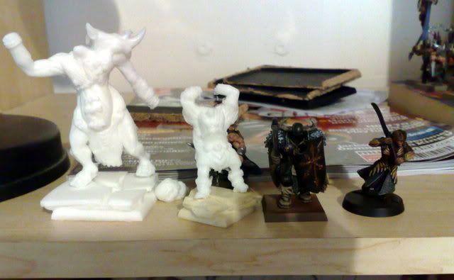
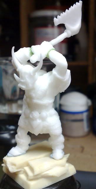
These arrived today:

27092008868.jpg


And the orc assembled:

ork.jpg


ork3-1.jpg


ork2-1.jpg


Is it usually thid quiet on here? I\'d have thought this was the ideal place to get feedback, like on how to improve and stuff. Any comments, whether good or bad is welcome, just let me know what I\'m doing wrong.
 

hivetrygon

New member
Some times it\'s slow, depends upon certain releases at time. Space marines are around the corner so a lot of people are interested in those threads. I\'ll give what little advice I can though. :beer:
 

nightsword

New member
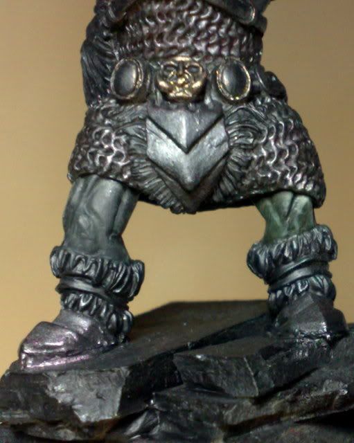
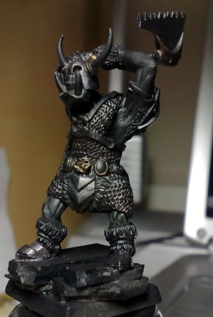
Quick update on stuff, green leg highlighted. Tips to improve welcome:

orc-fr.jpg


And my first ever close-up in focus:

Orc-close.jpg


The highlights for this were inspired by this:

http://www.coolminiornot.com/117768

Don\'t know if it works though. I was rather limited by the fact I only have two greens with me (catachan and rotting flesh, of which I only used catachan. Highlights were applied by lightening Catachan incrementally with Khaki, then bleached).

@HT: Cheers buddy! Perhaps I\'ll get a space marine out and paint that. Though I have ordered the new chaos spearhead ;)

EDIT: Gold isn\'t remotely even basecoated yet, its not finished.
 
Back To Top
Top