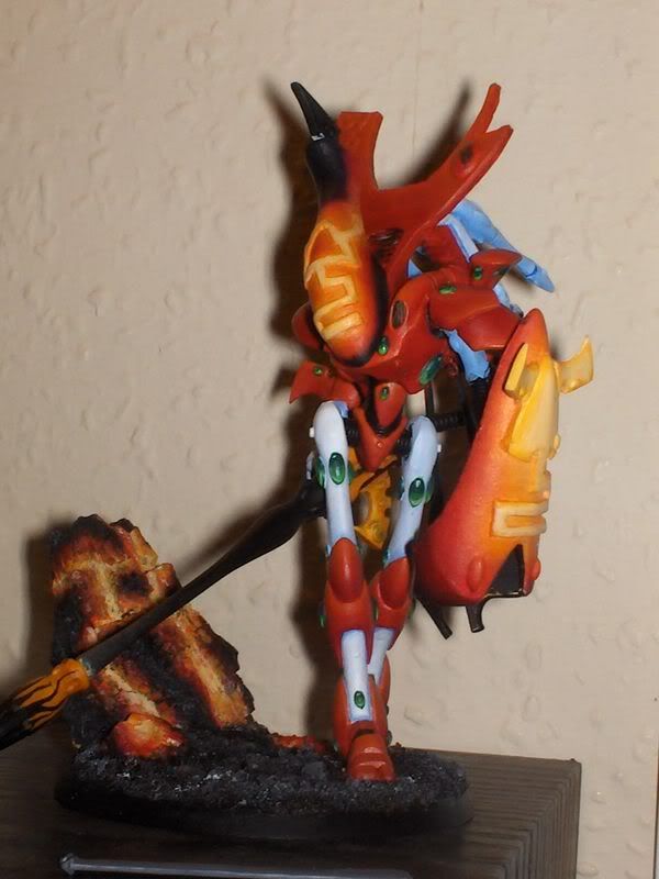
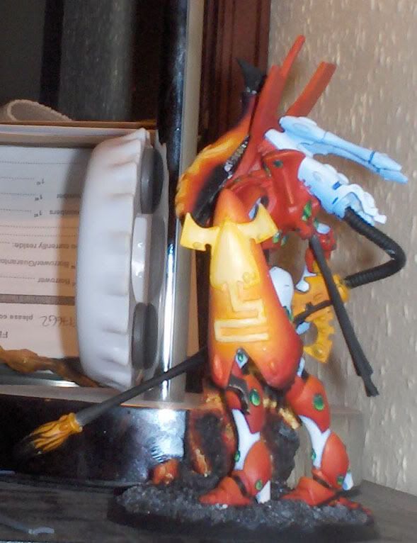
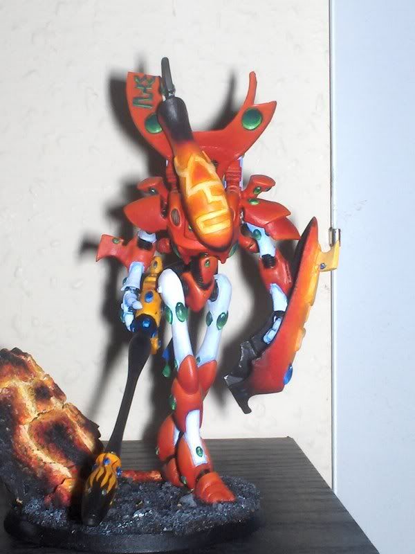
Fire Dragon Wraithlord WIP

stickboy9000

New member
a new head................

Picture.jpg
 

uberdark

New member
what about the legs? they arent going to stay white are they? i feel that would let it down. as for the rock i would push the highlights on it. check out i think its hotlead.com. the guy does some serious lava and fire highlights. help me out here guys am i right on the website. not sure . later on
 

misterjustin

New member
NOW it\'s really coming together. I really like what you did with the head -- it fits the theme of your piece quite well.

The pose is very dynamic and all-in-all I think this is a fantastic piece.

Great work on the gems as well.

I also wonder about the legs though now that the head is no longer white.

Not knowing what a heat shield would look like I\'m afraid I don\'t have a comment there.
 

stickboy9000

New member
yeah, uberdark mentioned the legs too. i\'ll see what happens when the shiel is done. at the moment i like the contrast but we\'ll see.
the shield is made from bits of war walker and odd wraith parts and the front of a jetbike. should be able to finish it tonight and have pics up tomorrow.
 

COG

New member
even with the crap graphics card at work
this looks good.
iteresting us of the jet bike(?) front.
:D
 

Manus

New member
møghund - to use a good danish word, that\'s good, I mean really impresive. Some extremely nasty idears.
Have to agree with some of the other guys about the white legs/parts. I see what you mean about the contrast, but imo it makes it look kind of unfinished and doesn\'t add up to the standard of the other parts. It works OK but I think you\'d be better of getting some darker colors.
 

Edimasta

New member
Nice - but the white legs don\'t fit the colorpattern - try some sort of black with dark red highlights :)

Great job - I\'ll have to update mine... ^^
 

uberdark

New member
i dont know about the shield. i feel it detracts from the rest of the pose. i think if it was a bit smaller i might like it more. just something to consider. the rest is looking great. as for the white dont forget to add some darker colors like manus mentioned i think it will drastically improve the paint job as well.:)
 

stickboy9000

New member
whoop.............entered it into my local gw stores painting competition and won. still needs a lot of touching up and i\'m thinking about going yellow instead of the white. thoughts???

Picture029.jpg
 

Manus

New member
Congrats on the first place

A warm yellow would be better than the white, but I still stink you need to think darker colors.
 

Jericho

Consummate Brushlicker
I say keep the white, it looks very cool and adds just a bit of cool color to the model with the bluish shading. I would try to get a bit of that same blue/white on the head/chest somewhere to break up all the red though. Nowhere big if you can help it, but something.
 

stickboy9000

New member
i\'m becomming a big fan of the white (it looks better when you actually see the model) and yeah, possibly doing that bit in the middle might bring more to it..... got it back now so i\'ll carry on. and post some changes soon.
 
Back To Top
Top