Avatars of War Diorama

Hillbilly Carl

New member
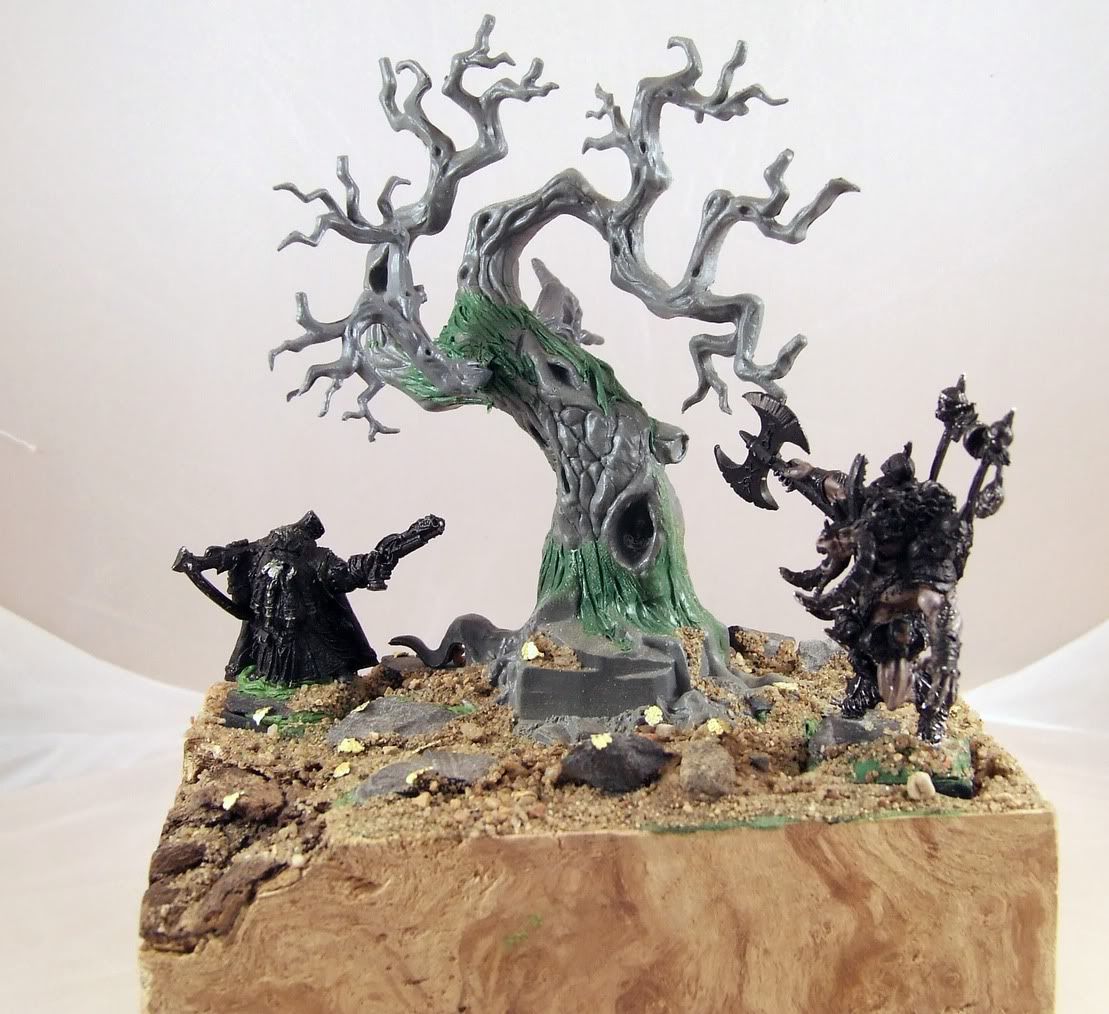
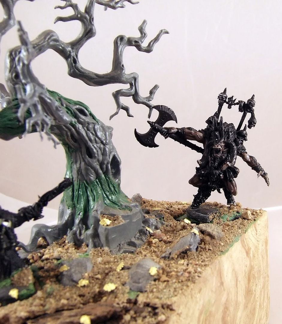
Hi, I'm new to the forums but I've heard that it is a good place to get tips and critiques. I'm working on a diorama for the Little Angels Painting Comp. at WAMP and I want it to be as good as I can possibly make it. Here's what I have so far:
DSCF1845.jpg

DSCF1846.jpg

DSCF1850.jpg

DSCF1855.jpg


Let me know what you think and how I should improve it! Thanks.
 

BPI

New member
Hi Carl, they look to be a nice pair of minis, if a little handled :)

I'm not a diorama builder but am wondering if the dwarf & minotaur should be brought closer & into the foreground a little more, currently the centre of attention is the tree. Perhaps just the dwarf, so that the tip of his pistol is in front of the tree when the whole thing is viewed straight on?

Just a thought, I shall continue to watch with interest. Oh, and good on you for entering the LA comp :good:

Cheers, B.
 

Hillbilly Carl

New member
Thanks for the reply! Your suggestion is a good one, unfortunately I've carved inserts for the bases as well as inset magnets to hold them in. Moving the dwarf forward probably isn't really possible at this point.

I guess I also kinda made the tree the focal point of the diorama for personal reasons. My wife and I lost a baby this past June (hence my interest in the Little Angels charity) and we planted an oak tree in his memory. I used brass etched oak leaves on the base to continue this symbolism.

Sorry, that's pretty heavy subject matter for my second post ever on the forum but I figured I should let people know what my thought process was when I planned it and laid it out.
 

BPI

New member
Hi Carl, on the smoother vertical face of rock at the base of the tree are you going to put in a plaque, translate to Elven runes perhaps? (If you want to hide something personal in there? ).

Ooh, how about a classic Arthurian sword emerging from the top of that bit of rock, nice bit of source lighting from it's magic onto the tree. Sell the central focal point as being the item the Dwarf & Minotaur are fighting over. Dwarf defending it or would they both be after the loot? Or a Minotaur guard I suppose? Match the colour on the mini to the light if they need to be tied together to sell the story?

Anyhow, I must away to bed! Cheers, B.
 

ScottRadom

Shogun of Saskatchewan
That's not a bad idea about the sword there BPI!

I think the flat part of the plastic tree needs some texture or something anyway, the sword idea seems cool to me. So far so good, Good luck amigo!

Hillbilly Carl is actually a buddy of mine from Saskatoon. It's wierd posting here talking to a guy I actually for reals know.
 

Desmosn

New member
hhm to me it looks a bit strange cause the dwarf aims at the beastmen without even looking at him
did u intend that ?
 

Tagamoga

New member
A little bit of additional critism:
The structure of the plastic tree seamy much different from the greenstuff you have made. When you paint this, it will be very obvious.

Greetings, Taggi
 

Onis Lair

New member
BPI has a point, if the tree is the focal point for obvious reasons to you then sell that focal point. Make the tree what the two combatents are fioghting over. In fact you can get little brass leaves, from Hasslefree i think, that you could add to the diaroma tree similer to what you really did. Your making this for a good cause and for a personal reason so why not make the diarama as a tribute. Even if you know it will be in someone else's home there is a story attached that people will appreciate, especially in conjunction to the cause.
 

Hillbilly Carl

New member
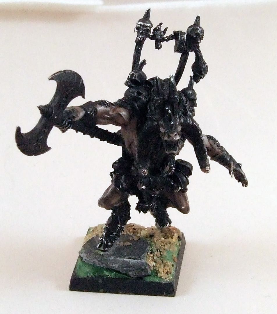
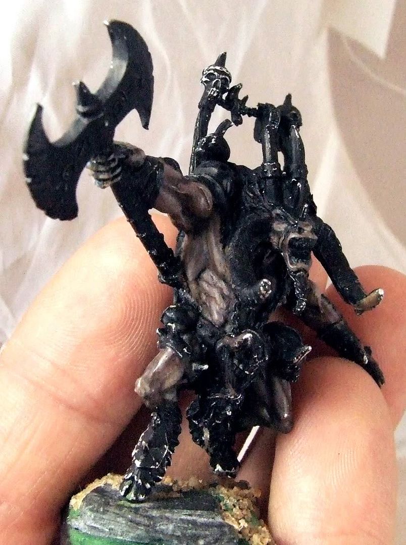
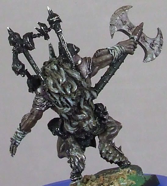
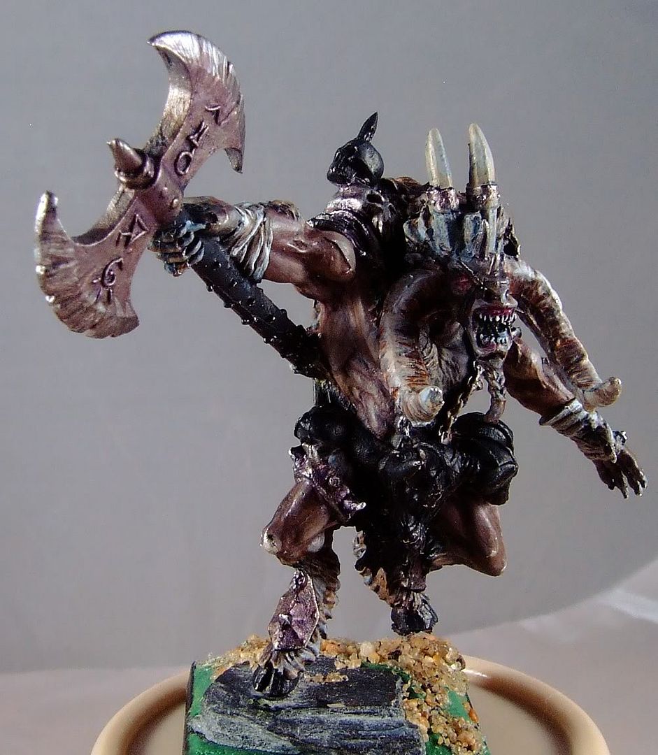
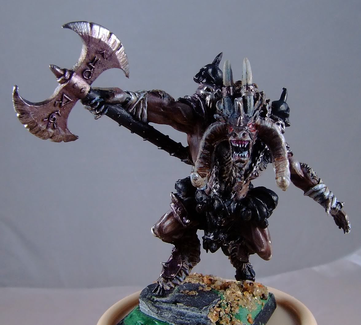
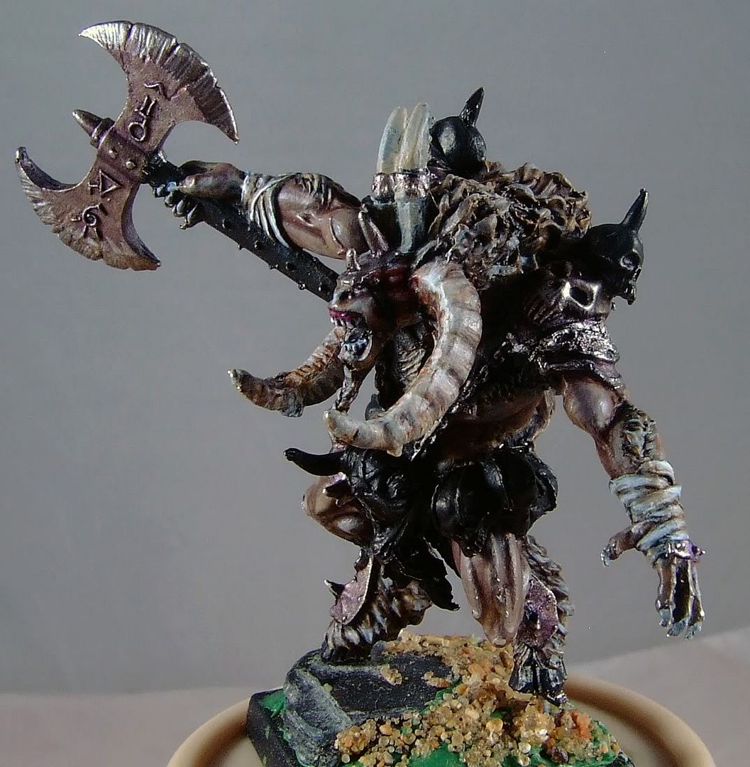
Good points everyone, I'll give the scenic base and tree another going over and try to come up with something really special. In the meantime I've made some progress on the beastlord:

DSCF1900.jpg

DSCF1901.jpg

DSCF1902.jpg

I'm not convinced about the fur/hair on his back. I haven't done any more work on the skin yet but I plan to. Let me know what you all think.

Edit: I think I'm going to cut the banner poles off of his back, I think it will look more natural and work with the diorama better. If anyone has any strong objections speak soon because the cutting happens tonight!
 
Last edited:

BPI

New member
Hi Carl, I like the colour choices on the minotaur, very nice. I think the fur will work coloured as is, just some sharper brushwork to unmuddy it a touch (popping some fine black lines back into some recesses & fine light grays on the tops). I'm having trouble seeing what's top spot white highlight & what's bare metal glinting through though. I'm sure all will become clear as he progresses :) Oh, and nice eyes :good:

Cheers, B.
 

COG

New member
the eyes ...have it. yeah i know
i would define the fur with more shadows
ie some black lining maybe. you can tell what it is but it looks like big chunks of hair
question and i didnt read everything so i may have missed it
but how are you base coating the base?
also i would define the claws a bit more.
good looking dio for a good cause
 

Hillbilly Carl

New member
Thanks for the encouraging comments! I'm really putting my all into this one and I'm glad that it is showing. As for how I'm basecoating the base... I have no idea. Luckily I'm still a long way off from having to worry about it as I'll paint the dwarf before I tackle the base. I did some re-working on the fur and cut off the back trophy banner thing and I think it looks way better. I didn't have time to take pictures last night but I'll try to get some done tonight and post them. The next thing on my list of things to do is to paint the skulls, then the hooves and finish with a few final touch-ups of the skin and other bits.

I may be getting ahead of myself, but does anyone have any suggestions for what color I should paint the dwarf's cloak? I'm going to be painting his armour as light-colored leather and his beard will be either red or black.
 

Hillbilly Carl

New member
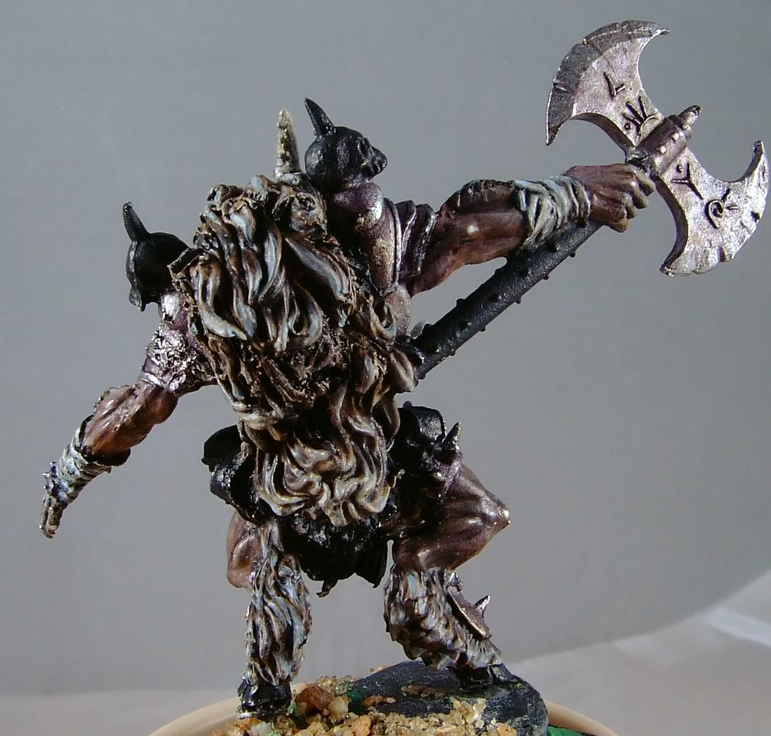
Sorry for the double post, here is the latest progress:

I re-did the fur on the back, tidied up some things and cut off the banner poles.
DSCF1919.jpg

DSCF1916.jpg

DSCF1918.jpg

DSCF1917.jpg
 

COG

New member
IMHO i think that a red cloak would help as the eyes are red and maybe it would tie things together. also if your doing some of the leaves a fall reddish color that might help.
otherwise i would the suggest a tan leatherish look again trying to tie the whole thing together. it also depends on how dirty you want the dwarf to be if hes been around the block i would go brownish or a really subdued red if you want hime to look like hes sport hunting then a rich red. i would take into account what color your best at also. i suck at rich deep reds
 

Hillbilly Carl

New member
Its been a long time since I posted any progress here but I got some work done on the dwarf, the pictures lose some details but the colors are pretty accurate. I still need to add some highlights and shadows to the shoulder armour and I need to decide on how I'm going to finish off the guns.

DSCF2050.JPG

DSCF2052.JPG


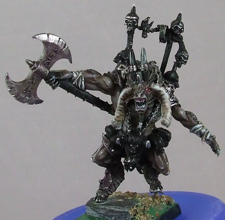
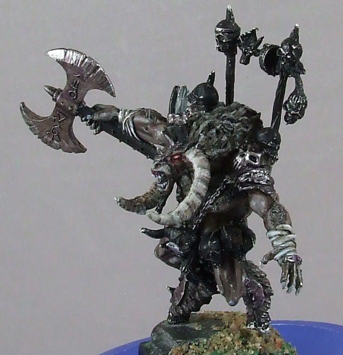
I also finished off the Beastlord:

DSCF2047.JPG

DSCF2049.JPG


I'll go back and give the skulls and stuff some extra attention if I have time. Comments and criticism welcome.
 

cheelfy

New member
I think you need to highlight the face and the skin of the dwarf to add contrast to them compared to the other dark parts of him. Your beastlord is nice but I'd add some blood on the axe.
 

BPI

New member
Hi Hillbilly Carl, nice to see an update :) Until the eyes & lip are put in, the face of the dwarf is going to look odd no matter what but I think cheelfy's right that the brow, nose & cheeks will need a small highlight.

You have a really loose style with the brush and I like :good: your colour choices work well with it. Take care not to make the base to similar in brown shading though or the minis will vanish on it. You might find you need to come back to the figures for some bright colour touches to bring them out regardless, though I suppose that's part of the growth of any diarama?

A touch more work on the Beastlord axe needed I think. The studs on the haft & something on the axe head, if only a black glaze in the notches, top spike & washer. Perhaps pick up a tiny touch of the red from the eyes/gums around the sigils (not a glow effect, just shading them a mite).

I think this is looking to be a really atmospheric piece of work, keep it up :good:

Cheers, B.
 

Tagamoga

New member
I Think your minis need some "focus". I think, that you need a port of the mini, that is lighter than the rest of it. So this game with light focuses the point of view of the observer on that point. So I suggest, to paint the faces, that growl on each other, much lighter, so the observer can look between their faces to bet, who will act first.

Greetings, Taggi
 
Back To Top
Top