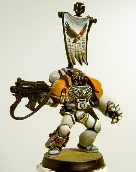
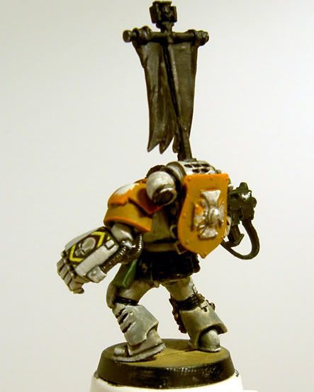
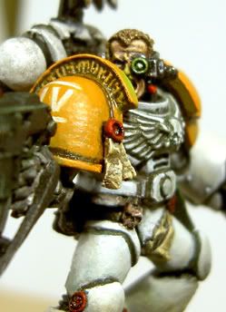
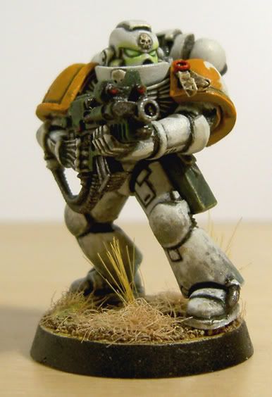
9lives wip (updated 18/4)

nine lives

New member
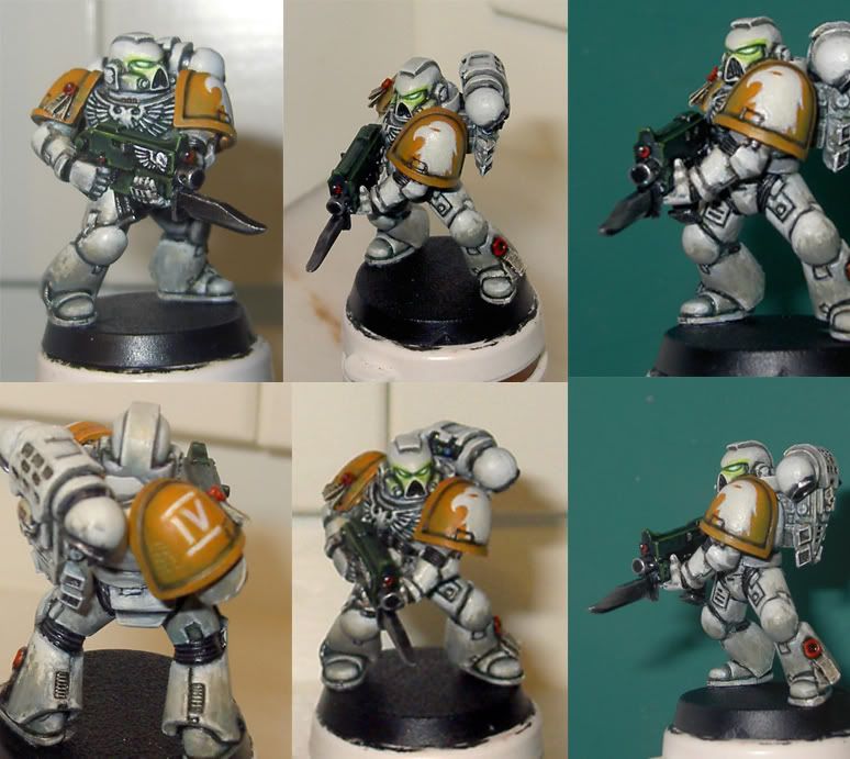
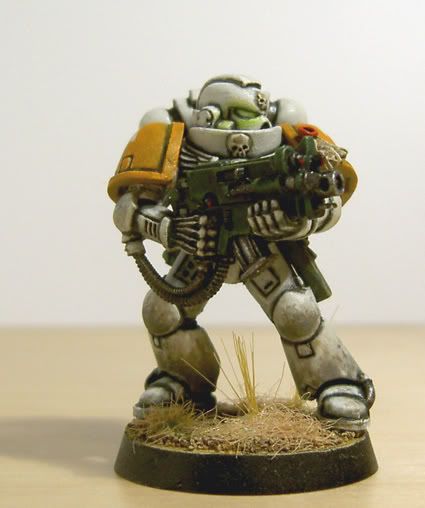
Pretty new to the comunity and started browsing for nice marines. Well, totally fell in love with cyrils marines and decided to have a go at something like that myself. However, I don\'t really think it\'s all in characther for marines to let their armour get all neglected and rusty so i\'ll most likely leave him being only dusty and dirty.

As for the base, really the only thing left to do unless i want/need to go back and rework some areas, I\'m thinking maybe a desert theme would be nice. Or? If so, what way do you think would be best for achieving dunes with \"sandgrains\" in the proper size and feeling for a 28mm? Making some sort of textured paste maybe?

Another option would probobly be an urban warzone-themed base, i guess. Havn\'t decided yet.

Oh well, please, feel free to comment!

main.php


main.php


main.php
 

DaN

New member
actually the pics in the first post WORK for me, but but they don\'t display on the thread itself... ???

Anyhooooo - I quite like it - not sure what chapter he\'s meant to be or how the colour scheme works, but I like actual apint job:

Although some might say the bleding of the white is dirty I think it adds a dirtied appearance to the marine... Although like I said, some may not like that and possibly lower it\'s rating.

EDIT: WELKUM TO DA FWEDZ
 

Ogrebane

New member
OK I tried to show you pics but it didnt work maybe <<<THIS>>> link will.

I like the color scheme and the OSL. Maybe the shoulder pads need another coat of paint but look good so far
 

Highbulp Billy

New member
I like the colour scheme and they seem well painted too - good work. For the bases, I would favour an urban scheme over desert. Personally, I find desert bases are harder to make look effective and you can have a lot of fun with urban bases and the extras you can out on them - much more character.

Also, have you considered drilling out the gun barrels on the marines? This can improve their look considerably.

Keep us posted with your progress and welcome to our world :beer:
 

nine lives

New member
Seems i must be slightly retarded, but i can\'t manage to get them pictures above to work... :~(

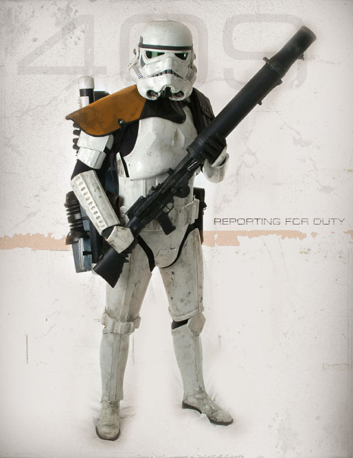
As for the colourscheme u can easily say i was quite influenced with the classic sw stormtroopers, especially the sandtrooper with orange shoulderpads (hence my consideration of a desert theme for the base) Chapterwise i\'d say they are a spin off from the white consuls or the mentors, that\'s the icon used anyway. I\'ll let you know when i figure that out since this is a chapter of my own creation.

troopertk409.jpg


As for the weathering and blending, i don\'t think the photos really shows the colours used. The shoulderpads have a litte more green to them (for that dirty weathered look) than can be seen, but i do agree that they might need a little more work. Irony is a probobly spent most time with the orange in the shoulderpads, considering the size, and am the least satisfied with in the mini.

I\'m however kind of satisfied with the dirty off-white armour. Especially considering this is actually my first attempt at painting something weathered and modern. Been doing really old school stuff untill this mini. Was aiming for painting something that would appear white without ever opening the skull white bottle (and only did so for the reflection in the gems/lenses). The most white areas are instead mainly elf grey (old gw-bottle) which is kind of blue in the tone, mixed with diffrent earthy colours, like dessert yellow, if i wanted a bit warmer white for some areas. Lots of greys and browns in the weathering along with som green washes and some hawk turqoise here and there.

As for drilling out the barrels...yeah, i agree...it really improves the look. It\'s just because i havn\'t bought a drill yet. I\'ve been out of this hobby for, well, close to a decade and only really picked it up again sort of serious since this summer... Which is only like an awfull long time to get hold of a propper drill.:redface:

Thanks for the comments.

edit:added pic from another free-gallerie site. works better.
montage.jpg
 

misterjustin

New member
I really like the simple colour scheme here. You used a very limited pallette to a very crisp end result. I also note that the legs are considerably darker than the head - a nice touch of source lighting on that. In addition the OSL on the eyes is well done and, I think, quite stark.

All in all I think that this shows an excellent model.
 

nine lives

New member
well, thx, appreciate it!

Rosac: As for the white, i said some about it in the post above.

mrjustin: yeah, i have had that in mind, light comming from above, but i also thought it would be reasonable that the legs would collect the most dirt, so thats really more of the reason why the legs are much darker.

Anyway, glueing togheter a few squadmembers for this fella right now... gives me some time to decide what type of base to use.
 

nine lives

New member
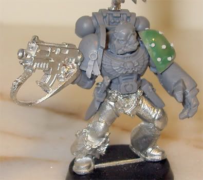
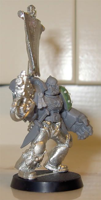
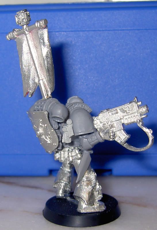
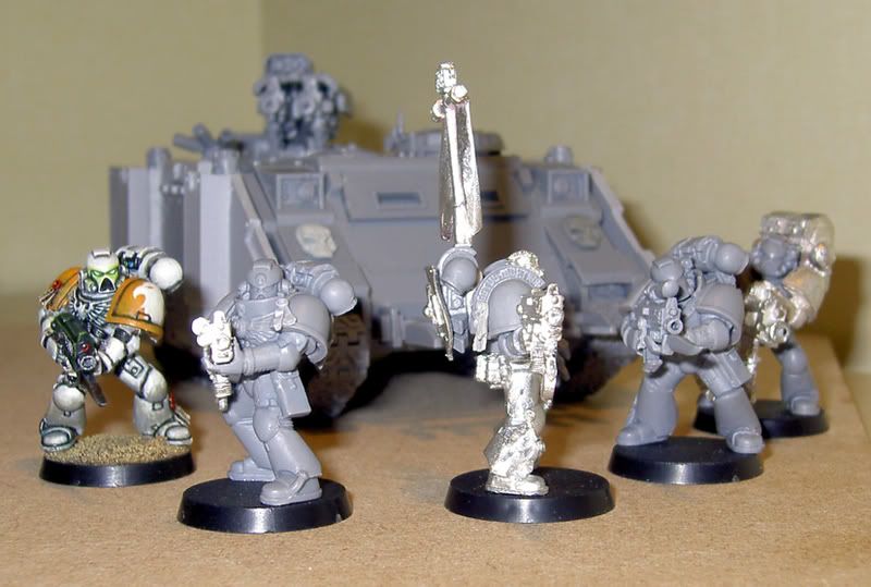
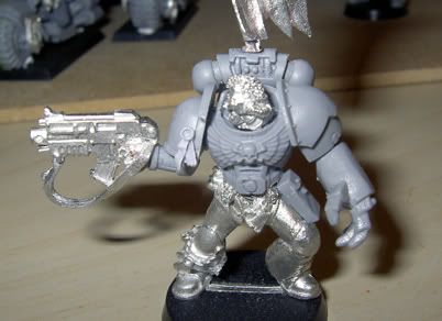
glueing togheter a few squadmembers developed, as always, into me scavenging bitz from everywhere trying to get something cool happen to my minis. As if time ain\'t an issue...:rolleyes: Anyway, heres a few shots of a veteran sergeant to lead the squad. I\'m not in this for the game, so i don\'t mind him losing that extra attack for grabbing a bolter instead of a pistol.

Spotted a few moldlines, or remainders of them anyways, that need to be delt with aswell as i have to fill in some greenstuff under his beltbuckle. Otherwise, my main issue is if i should leave the knife hanging from the belt as it is, remove it, or try to sculpt a holster for it with that damn greenstuff. I Really ain\'t much good with it for anything but the simplest shapes....:(

Nothing is absolutly final with this conversion yet, so any comment on improvment is more than welcome!

wip1.jpg

wip.jpg

wip4.jpg
 

Joff1981

New member
Newb here so take comments with a pinch of salt.

I don\'t think the positioning of the arm/gun is quite right, on the first pic the forearm is angled steeper than the direction of the gun and in the third pic you can see that his wrist isn\'t straight in the vertical plane and it looks like it might be slightly off in the horizontal plane as well (taking his forearm as reference). In the second picture the direction the gun is pointed looks higher than the angle of his vision.
I would reangle the arm so that the forearm is closer to horizontal by cutting at the elbow and filling with green stuff, this should make the arm pose look more natural (it\'s too cramped at the moment IMO) as well as help align the direction of fire with that of his eyeline.

As far as the knife goes it looks like it\'s on the wrong side or facing the wrong direction, try grabbing something on your right hand side with your right hand when it\'s in that position, it\'s not easily accessible. I assume he\'d use the knife in his non-powerfist hand so it should either be on his left in a similar orientation or on his right side with handle back and blade forward.

All that said, I like what you\'ve got so far I just think that those two little things don\'t look quite natural. Good luck with the conversion :)
 

nine lives

New member
Good thing you\'re just a newb so i don\'t have to bother about your crappy opinions!;):D

You\'ve got a good point about the knife. I\'ll probobly just get rid of it, since theres no way it will fit hanging in some other fasion on that leg, with them grenades taking up a lot of space and all. Don\'t know if i\'ll put something else there tough, i\'m sort of afraid it will look like there\'s something missing otherwise...

About the bolter i can agree to some level that it might look a bit cramped as is, and that it might need some slight repositioning. But i don\'t belive it\'s all bad, i kind of like how it looks. Also, the metal bitz doesn\'t translate so well into the picture. I don\'t really agree that the angels are all wrong. The back of his glove, for instance, forms a rather straight line to his arm, but do look kind of funny in the picture. I\'m quite certain it would look more natrual painted. But that\'s perhaps not what you ment? Oh well, i shall try another arm and see if that looks better, i\'m not all that thrilled about using more green stuff than i have to. I\'ll try cutting it diffrent in the shoulders instead, and see if a more horizontal angle will do the model some good.

Anyway, i appriciate the feedback, good stuff.
 

nine lives

New member
The cold weather has kept me from painting minis for a while...don\'t fancy the idea of priming my minis in snow or some chilling degrees peaking at -20c. Begun to consider building some sort of box for indoors priming, but i guess that idea won\'t fare well with the girlfriend. But what she don\'t know of can\'t hurt her, right?

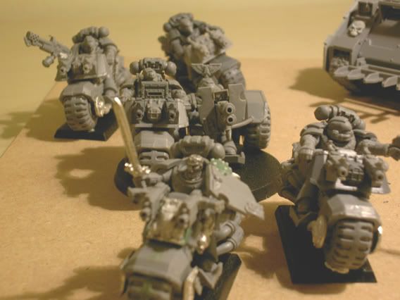
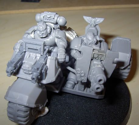
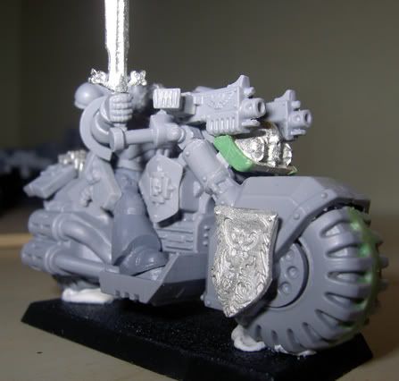
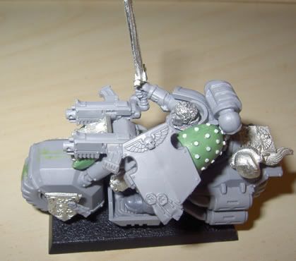
Oh well, been a rather buzy little bee anyway. Here\'s some 400ish points worth of spacemarines. Especially enjoyed pimping those bikes. They\'re at diffrent levels of completion. Some need a few gaps filled with green stuff, others havn\'t had all mold lines removed, but i guess you get the picture anyway. Also, made a few changes to that sergeant, changed the bolterarm and so on.

spacemarine.jpg


spacemarine2.jpg


spacemarine6.jpg


spacemarine3.jpg


spacemarine7.jpg


spacemarine4.jpg


spacemarine5.jpg


I would like to add a banner to the bike sergeant aswell. Tried sculpting one in gs. While it actually looked rather good, i couldn\'t manage to get it stiff enough. Any tips on what to use besides gs? Any other \"clay\" better suited for this?
 

DaN

New member
A lot of people recommend using some sort of foil - but I\'ve never liked it - maybe I\'m just using the wrong stuff - paint doesn;t like to adhere to it.

I suppose Milliput mixed with GS might ive you a suitably stiff.bendy ratio.

I assume you aren\'t making the banner poles and supports ALSO out of GS? As I would suggest wire.

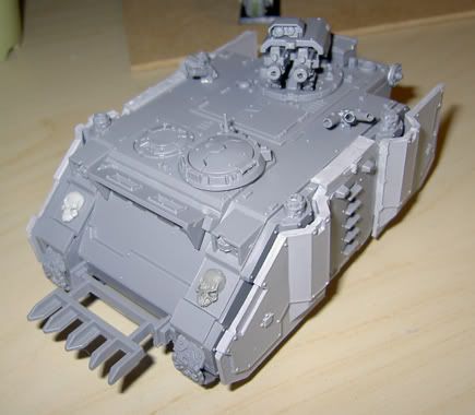
EDIT: Where did you get those skulls for the front of your rhino?
 

nine lives

New member
I\'ll most likely be using the bannerpoles that comes with the bikes, it\'s just the banner itself that\'s got me a bit puzzled. I don\'t se foil (like from a coca-cola can?) will be much stiffer than gs. It will probobly bend just as easily. I\'m afrafid that the paint will crack and fall of, and with the time spent on a banner and all, that will be an issue... Well, i might have to buy a couple of diffrent putties and see what works best, or do it the easy way and leave it out. But i really like banners...:(

The skulls come from the forge world purity seal packs.
 

nine lives

New member
Would appriciate some feedback on this mini. Kind of lost my spirit here, and wouldn\'t mind some second oppinions. Now this is very much still work in progress, lots left to be done or cleaned up. Only thing i won\'t make any changes to is the face...feels like it can only go down hills if a apply more paint to it, and it looks alright right now imho. Unfortunatly the whole mini has got a very slight texture to it due to a poorly shaken primer can, i guess. Decided to paint it up anyway since i\'ve already put lots of work into converting it. And it\'s not that bad, but the paint might come of as thicker than it is, also, this is intended for tabletop... altough i always try to give it my best regardless.

Photos are just quick shots and \"magic\" shift+ctrl+l in photshop, i did my best with the poor light i had to work with. There\'s also another basic marine done. Did decide to go with a sort of desert theme (or whatever it should be called) for the bases after all. Let me know what you think of it.


marines3002.jpg


marines3005.jpg


marines3022.jpg


marines3007.jpg


marines3026.jpg
 

gaspode

New member
Looking nice so far. I really like the deserty bases as well.

The frehand is superb and the weathering works well as well. Keep up the great work!
 

jester of death

New member
hey

they look pretty spiffy.

the bases are cool but they dont match with your idea of the marines leg being dirty, the colours are too different.

your bike sqd looks wicked and i think i ma have to \"borrow\" your ideas on the attack bike for my ravenwing.


JoD
 
Back To Top
Top