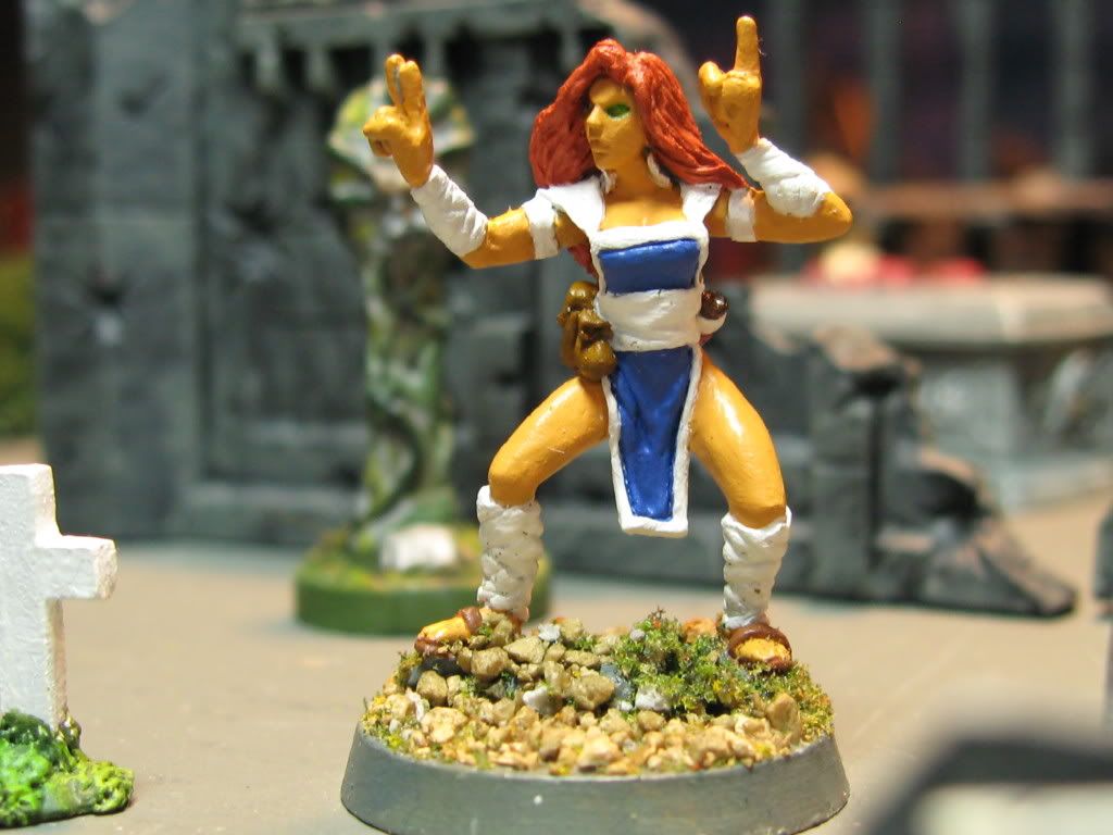
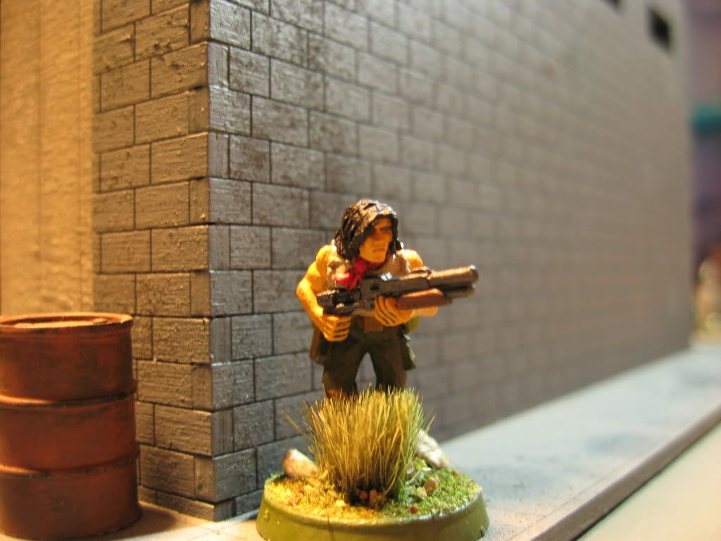
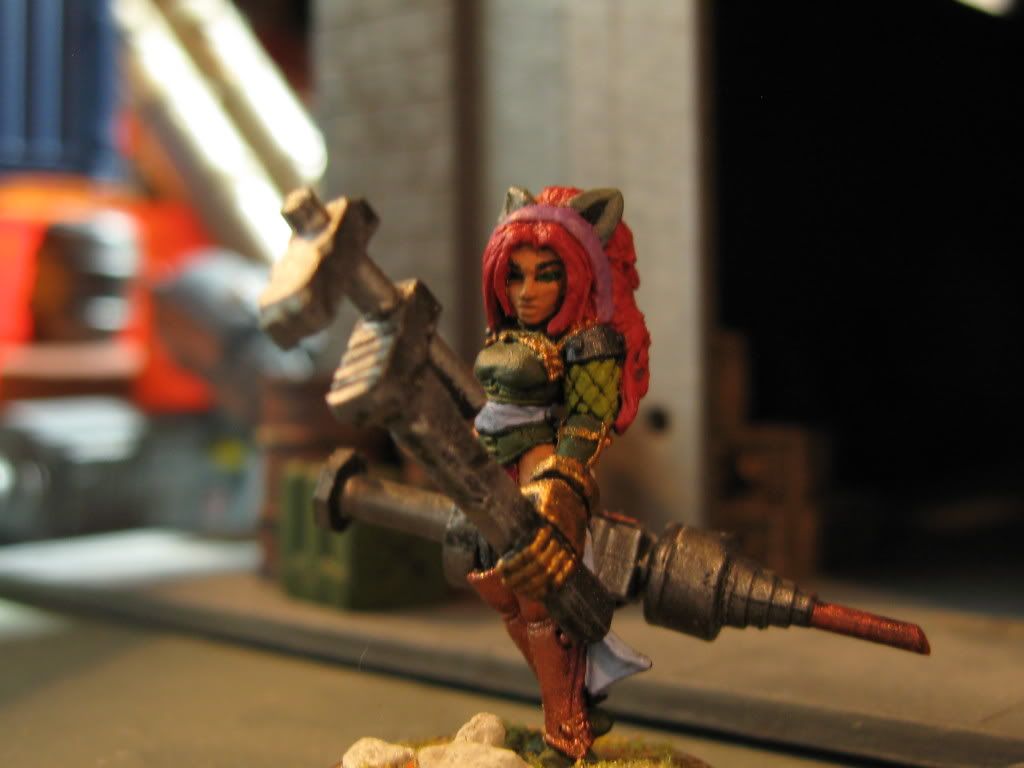
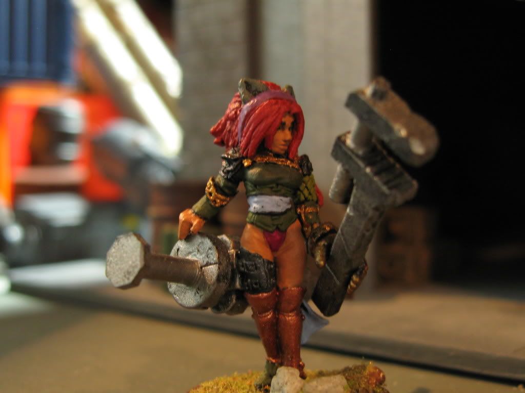
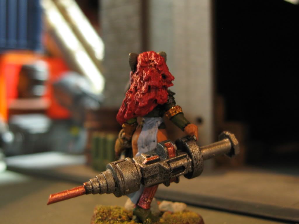
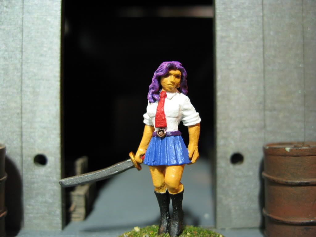
I saw your comment on your warrior monk this morning an though that I would comment on her.
However spotted this thread and had a persusal of the stuff you\'ve painted.
After careful consideration I have to say that I think I\'ve spotted something you are doing which most of us have fallen into the trap of at some time or other.
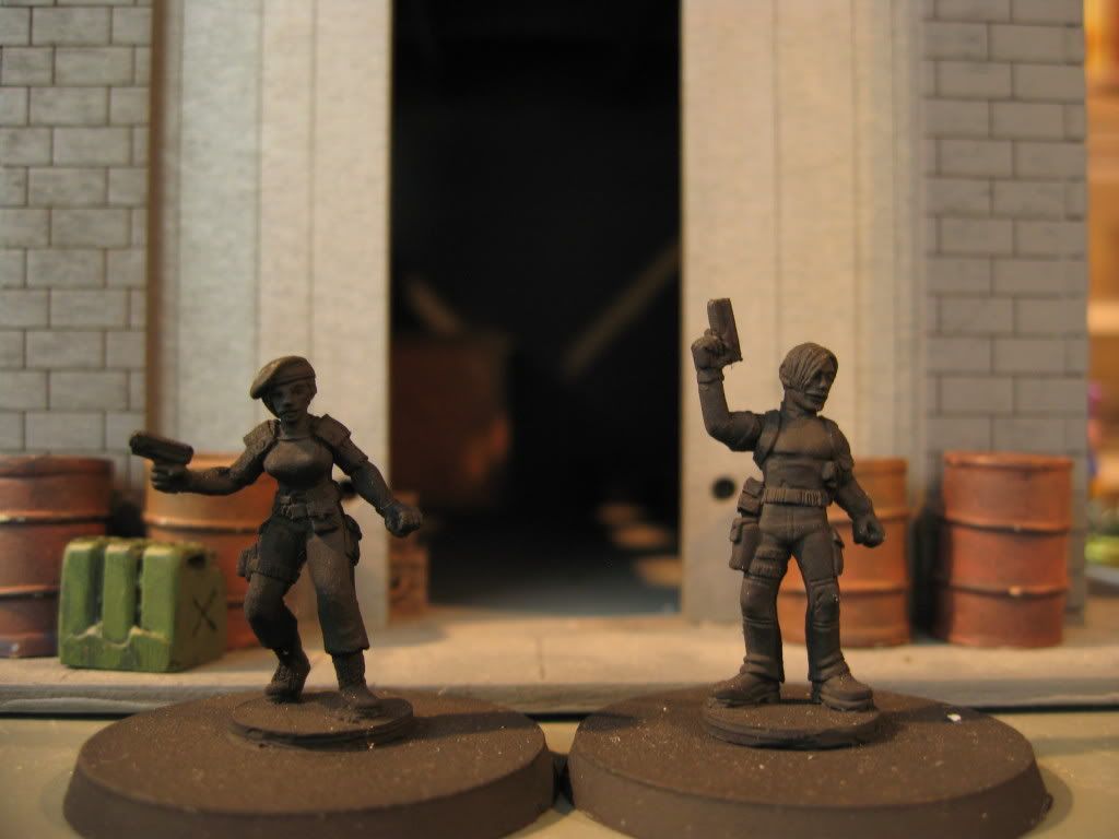
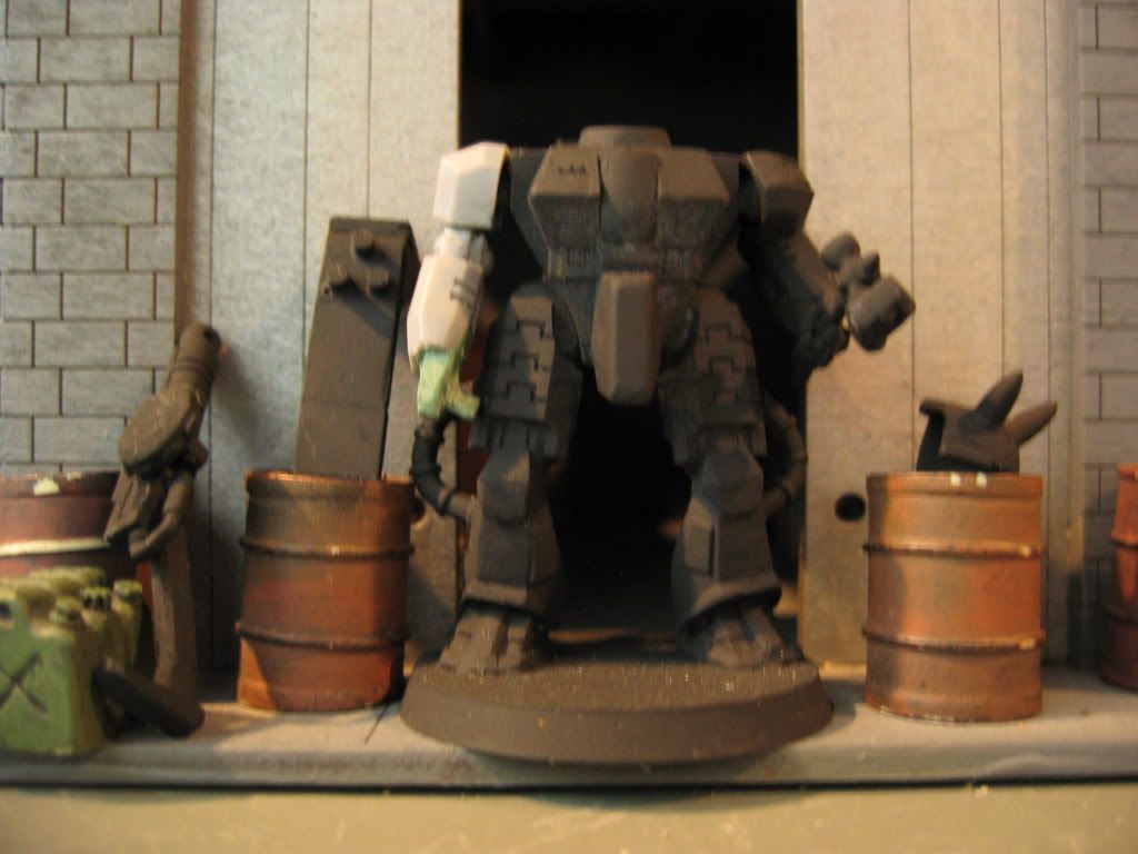
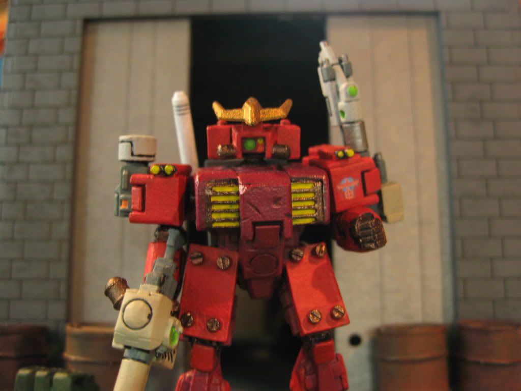
Looking at the close ups has show me that there is a lot of \"texture\" in your primer/undecoat. This generally comes from one of two things, Either spray primer is too close to the miniature or it\'s not aggitated enough.
This is adding to any granulation that occurs in the paint and becomes easily visible as large scale pics. (I\'ll dig my T- shirt on this out later).
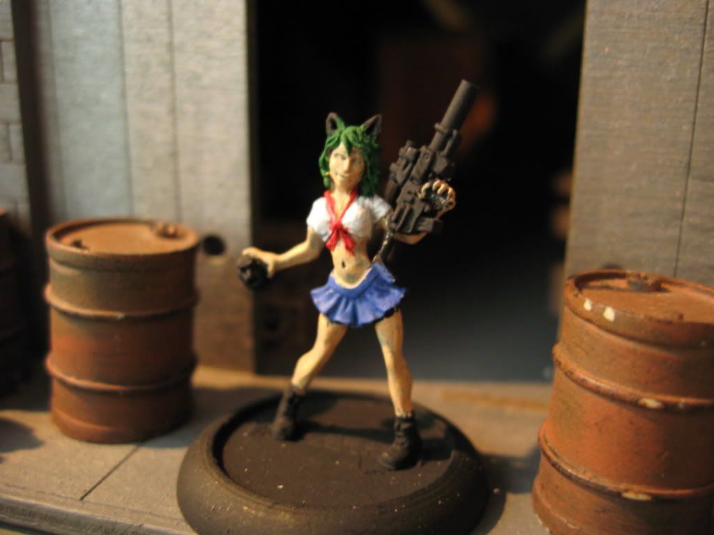
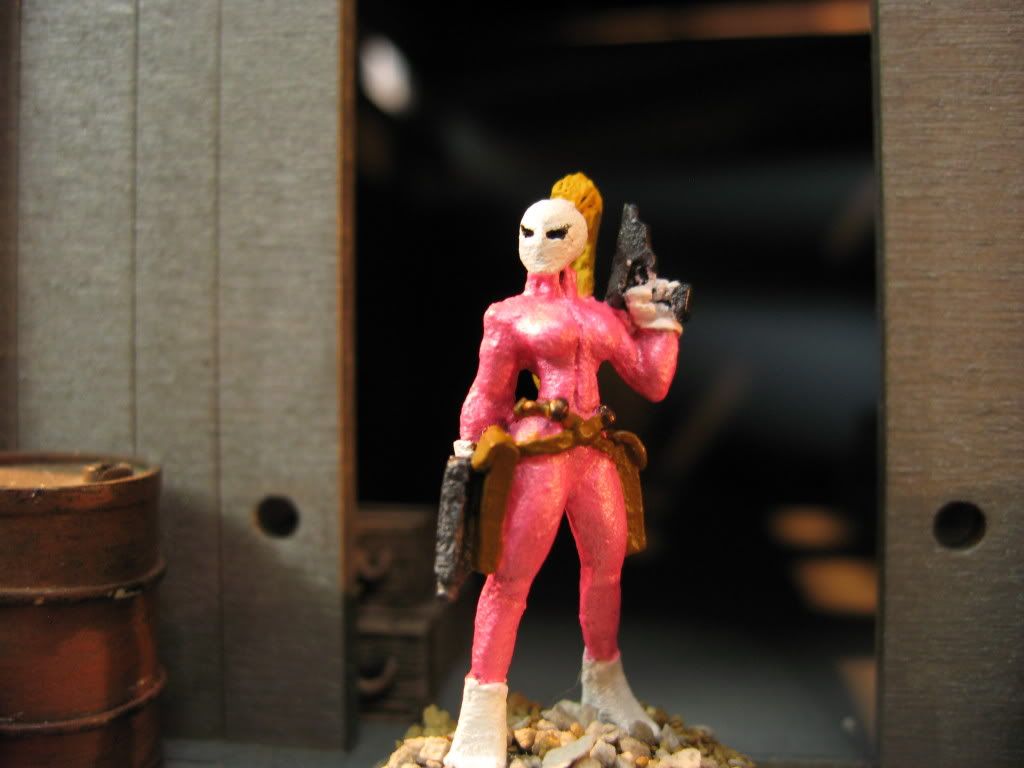
Also I do see an occasional streaky patch especially with skin tones over black. This suggests that you are applying the diiluted paint straight to the figure without touching an absorbent material to remove excess water. Doing this will help you to control the flow of the paint onto the figure and then you can do several thin coats (quick blast with haridryer in between if needed) and get a smoother effect.
Another thing that seems to be in evidence is that you have relied on using the black primer as a shadow effect, especially on the female monk in your gallery, this is coming over as far too harsh a transition and gives a visual impression of being incomplete paint. Black is a rarity in reality and few colours descend into a Black shadow, even in the exaggerated contrast levels we use for 28mm painting.
As a parrallel to the black some of your skintones also lack a strong variation so that they seem to look all the same tone. However Photographing miniatures is such a bugbear that the tonal depth could have been lost. But I\'d suggest that adding a tiny amount of Purple to the base skin colour and then using it to emphasise areas such as the hollows othe cheeks and the temples, inward curves of hips, thighs etc will give a more rounded appearance to minis.
Hope this helps you a bit.
Originally posted by Cmdr. Xail
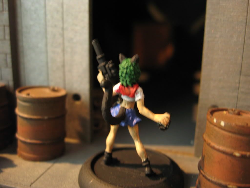
but I don\'t like to screw around with shading... it makes the figure look like there is a permanent light being cast on them. I like to use the natural lighting and shadows to do this. Although I couldn\'t achieve that with the camera (as it sucks and tends to bleach everything out when light comes into the equation.)
but if you were to see the figure in person you\'d definitely be able to see it. But that doesn\'t really help me much right now...
Had to quote this.
A few years ago there was a \"painter \" came on to the site using the same concept only on much larger scale figures (1/6th Anime models) and he railed against the inequalities of his scores because he had no contrast in the painting of his miniatures. He also wouldn\'t take the criticism of people on here who tried to point out that the pictures made his work look flat. Was exceptionally rude and eventually threw his teddy bear out of the pram, left and too down all his pictures. lol
The human brain interprets small things, like our miniatures, with greater ease if they are highly exaggerated in contrast, which is why most of us on here use such vivid techniques such as NMM and ultrahigh contrast highlights to achieve the effects of reproducing a human sized figure in 28mm.
While 2D or canvas artists use tonal regression in their painting, because we paint on a 3D object we have to Force the tonal recession to adhere to the shape of the figure. Which is why so much use of Directional lighting is used to allow the eye to \"accept\" the light/shadow flow.
(Sometimes this is described as \"Zenithal\" lighting, but in truth zenithal lighting would come from directly above the figure, not angled from the side.)
Trying to rely on \"natural lighting\" to show the shadows on your figures will not be as effective as structuring the shadow/highlights because \"Natural Lighting\" changes from viewer to viewer, position to position. Light hitting a miniature from 90 degrees left or right will provide shadows, but hitting a model at 0 degrees (ie straight on) will just make it look flat.
Forced, constructed or exaggerated shadows and highlights give the viewer as fixed point of reference on which to make a comparison between the miniature and the equivalencies to the real world.
>That went on a bit<

