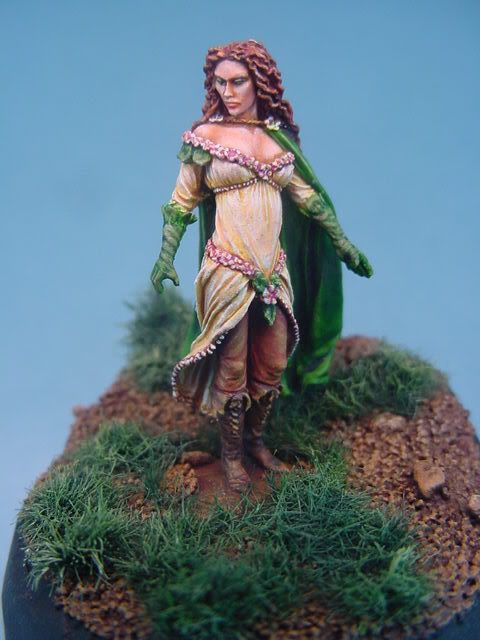
Woodelf Noble in Traveling Clothes Help please

GAR

New member
Howdy, I have been away from CMON for a while, but did get a chance to get a Woodelf figure done up.

I was wondering if you guys could please help me out here. I thought it was a decently done figure but no comments one way or another to help me figure out what is good and what it not so good.

Could you please critque my mini and point out where I could improve.
Thank you very much

GAR

http://www.coolminiornot.com/120163
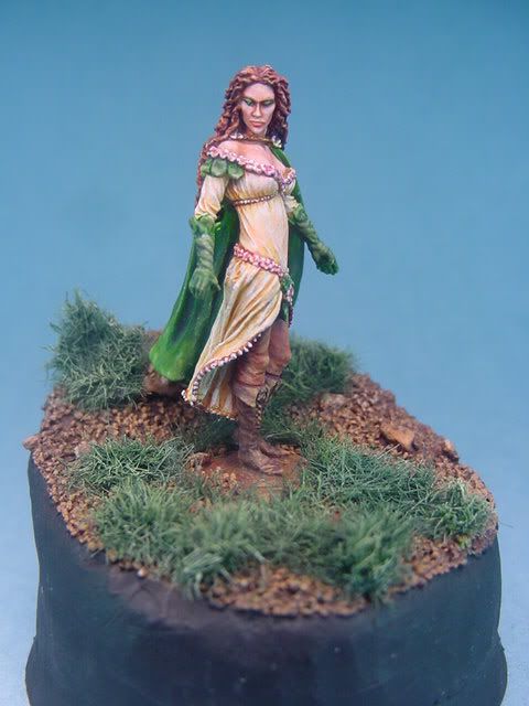

DSC00031.jpg
 

supervike

Super Moderator
Hmm.. I really can\'t add much commentary. This is very nicely done. I like the \'realistic\' tones and colors.

Maybe the dress\' transitions could be a bit smoother in spots.

The glove color matching the cloak is one thing I am not too fond of. I think if the gloves matched the boots, it may give a bit more overall contrast.

Nice solid figure.
 

Ritual

New member
First, let me say that I like this one a lot. I think the realistic look is quite refreshing and suits the sculpt very nicely.

As Jim pointed out, you can work on smoothness a bit. It\'s most evident on the inside of the dress. Also, I don\'t think that a bit of further highlighting would spoil the realistic look, but rather enhance the feeling of an outdoor setting with sunlight illuminating the scene from above. Not too much, but just a little bit in the spots that are most exposed to an overhead light source.

Still, this is very high standard painting. Good work! Keep posting! :)
 

KingM

New member
I also like this more subtle and realistic style. Very well executed

The base could do with a bit more work. Some green and brown washes on the earth parts to make them look less uniform. Same for the grass, some brown washing towards the base of the blades, maybe some yellow-green added to the top of the blades
 

vincegamer

New member
what they said, plus put the balast of the base onto the integral base. Right now it looks like she managed to stand in the one muddy spot in the entire forest. (the integral base is darker and glossy and smooth compared to the surrounding ground).

Wouldn\'t hurt to add something for her to be looking at - maybe a rabbit from the Reaper familiars or the recently released Jackelope.
 

airhead

Coffin Dodger / Keymaster
The boots are fantastic. They look like my old work boots.

The base has been mentioned.

Not much you can do about her face. She looks kinda masculine to me or ticked off.
 

supervike

Super Moderator
Originally posted by airhead


Not much you can do about her face. She looks kinda masculine to me or ticked off.

Thats odd, I had that same impression when I first looked at it....I thought it was someone in drag....Do elves have, you know, cross dressers? Or just by their nature, maybe they swing that way....:cool:
 

DrEvilmonki

New member
All of the above plus the leggings look a little rough to me and the inside of the cloak looks like the paints a bit thicker there.
Good work overall.
 

GAR

New member
Thank you all very much for the comments.

I will take away from this that
1) the base needs a little work. I kinda already knew that as I am not to happy with it anymore, but I will take the comments and apply them to the monuted version of this same figure.

2) The underside of her dress needs a little more highlighting to brighten up the figure and provide the illusion of sunlight

3) The colors may or may not work for everyone. Hmmm, not much I can do about that. I kinda like the colors, and while they limited in pallette, I think they all contribute fairly well together so no one is dominating any other. I may change the color of the gloves to those of the pants or boots next time though.

The face of the figure is very angular, something I really found appealing about this as it is quite different from you run of the mill GW type.

I really wanted something simple out of this, as would fit a individual traveling about. Did I get this across in the figure or is it too much still??

I attached another view for further review, if you would be so kind. Thanks

DSC00046.jpg
 

airhead

Coffin Dodger / Keymaster
I like it.

You could do her base as a bit of rock that she is standing on. Or a bit of texture like the rest and make it blend in.

Her attire is a bit odd to me. Leather leggings and gloves and a cloak suggest it is cold out. Yet she is also wearing a summer sun dress - light and gauzy and spring colors suggesting warmth. Maybe it is just me?
 

vincegamer

New member
I like the clothes.
The pants are because she\'s riding. Bare legs on a horse are not comfy.
Same probably goes for the gloves, but for centuries noble women just always wore gloves outside.
Nothing unSummer to my eyes.
In fact, you might even consider trying a sheer effect on the dress, where you could see the pants ending underneath. Might work because they are darker than the dress.
 

airhead

Coffin Dodger / Keymaster
Vince, now that makes more sense. Thanks.

Gar, if you are up to it, a sheer dress would be WOW.
 
Back To Top
Top