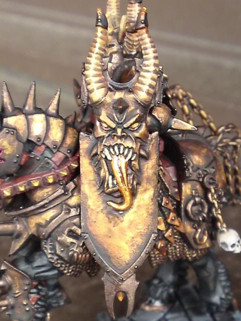
WIP Mounted Chaos Lord Kitbash

tallxiii

New member
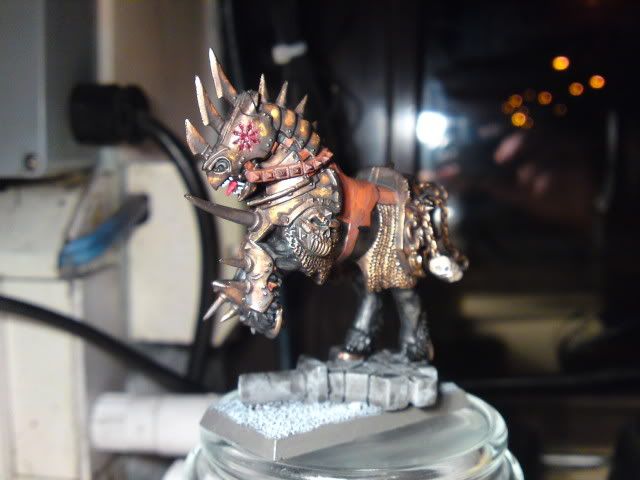
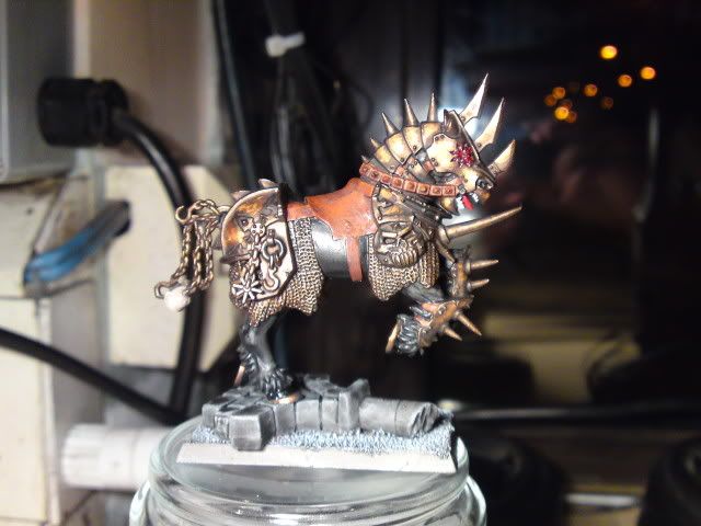
It's been a long while since I posted on here so I thought I'd just stick on my latest Chaos work.
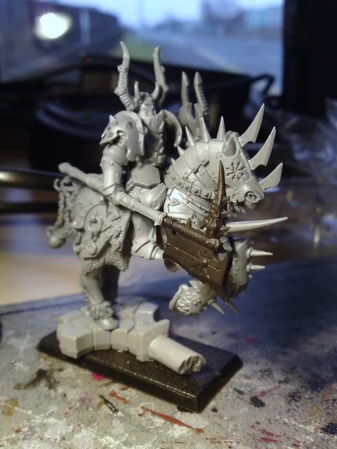
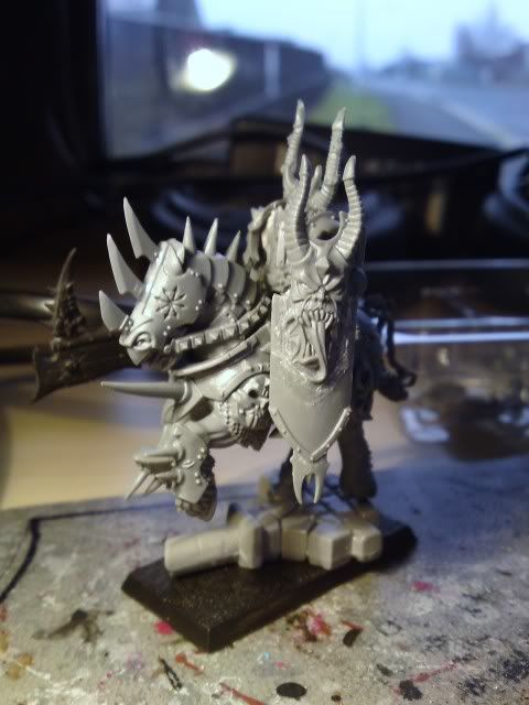
P07-02-10_1152.jpg

P07-02-10_115201.jpg


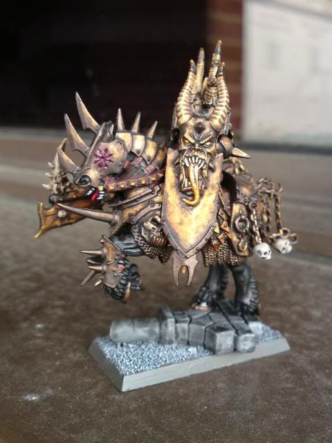
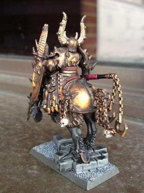
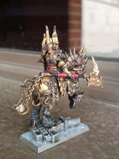
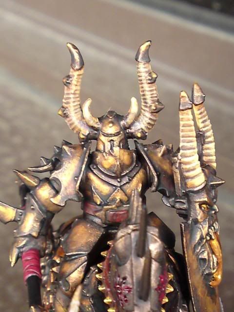
I'm painting him up in some of my now trademark bronze chaos armour, but adding a bit more to the mix to make him stand out a bit from the norm. It's got a sort of mottled/beaten look to it which I think is going well at the minute, but I've not got much done but what do you think?
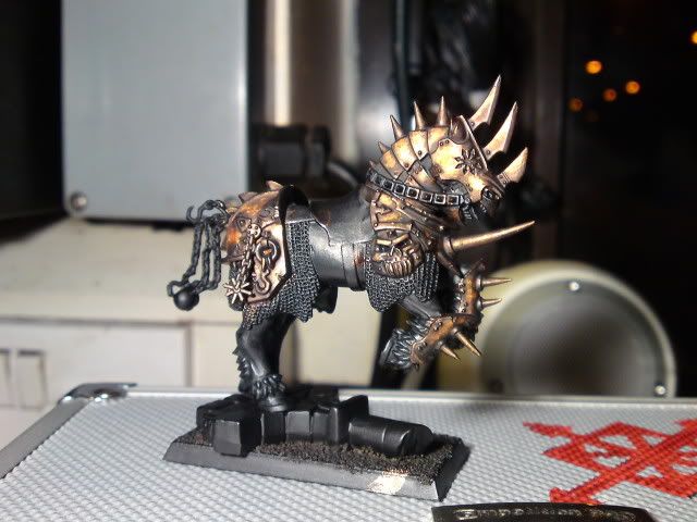
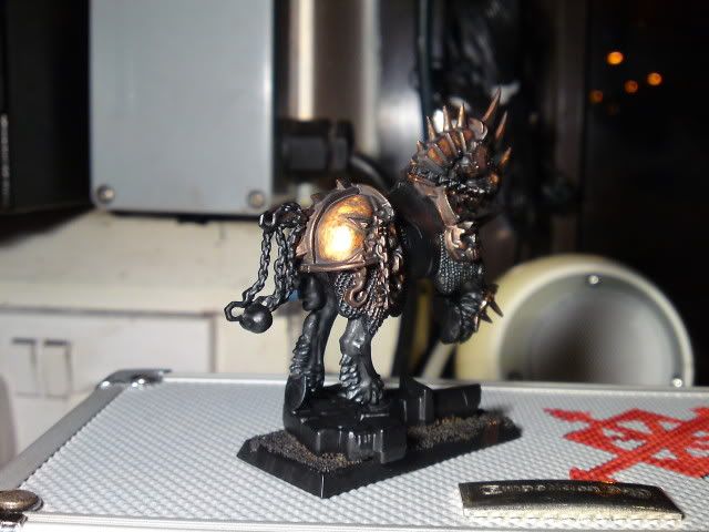
P04-04-10_0409.jpg

P04-04-10_040901.jpg


Here's one with the soon to be "Bronze Knight"
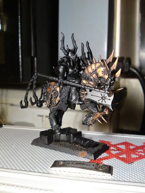
P04-04-10_0410.jpg


As usual all C&C is welcomed, anyway best be off this gatehouse won't clean itself.
Till next time,

EXCELSIOR!!!
 

tallxiii

New member
I think I can pass on the secret, use a base coat of TinBitz, stipple a 2:1 Dwarf Bronze, TinBitz, then pure Dwarf Bronze, then a small dab of Shining Gold finish off with a heavy Devlan wash. Hope that helps.


(It was actually the first time I'd tried it like that, worked out quite well really)

TP
 

Hillbilly Carl

New member
It's looking good, I'm not a fan of the red chaos symbols though, they look a bit too pink and monotone in the pictures. When compared with the brass (which is excellent BTW) it just doesn't work for me. I think it would look better just black actually or maybe add some brighter spots deep in the center of the lines.
 

CrookedEye

Fear the Crooked Eye
I'm loving the brown stuff work on the axe, I just hope that with it held down like that it doesn't lose impact. The bronze is really nice too, it has nice depth and the weathered look you're going for really works.

I'll agree with the post above about the red, it maybe seems a little flat, and the orange saddle sticks out, but most of that should be covered by the knight.

Looks great so far!

Zach
www.crookedeye.net
 

tallxiii

New member
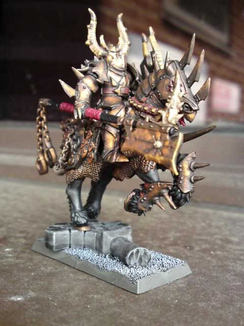
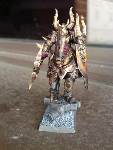
Well here we have the Bronze Knight all done except for some snow on the base.

P11-04-10_1516.jpg

P11-04-10_151601.jpg

P11-04-10_151602.jpg

P11-04-10_151603.jpg

P11-04-10_1517.jpg

P11-04-10_151701.jpg

P11-04-10_1518.jpg


What do you folks think?
 

iwok

New member
Great man!
To me, you could rust the armor with blue and turquoise hawk juice... to create an harmony of color with the yellow and orange color of the armor.
And if you want to go more in details, make shadow in your red with green or turquoise hawk + chaos black to make strongh the harmony of color between the armor, the rust and orther details like red or brown leather...

I.
 

Lyuun

New member
I aggree with iwok, and i think that you should have some more colours. it looks great and i really like your metals (could you post a recipe?) but i think the model like that is too monotone. i think it needs something to contrast with that yellowy and make it stand out even further. this is a special guy in your army, right?

i often think of examples in nature, like a bee or a frog, for the real dangerous guys. that's not saying i compare my characters to bees and frogs, but the psychology (or whatever you could call it) behind the colours of named creatures; what these creatures have in common are their vivid, contrasting colours, and they both utilize these contrasts as a warning signal for hostile creatures to see and be aware of the poison they use.

therefore, i tend to use more striking colours the stronger the guy gets. also, i tend to go darker, overall the stronger he gets.

but don't get me wrong, that stuff is nicely done! these are my opinions. take no heed, unless you think they have a sound message.
 
Last edited:
Back To Top
Top