TokenArtGuy
New member
Hello,
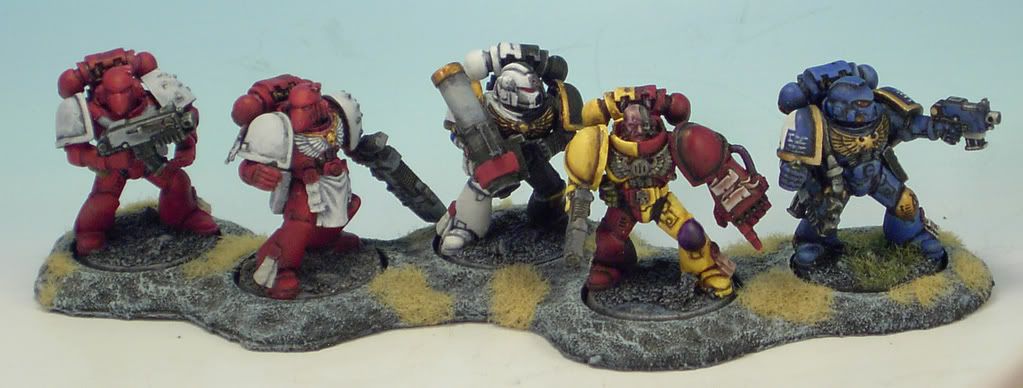
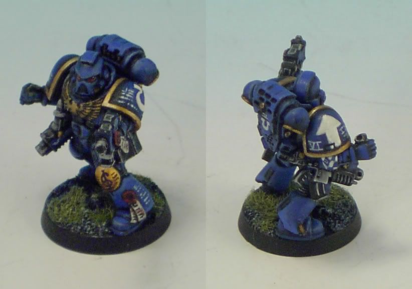
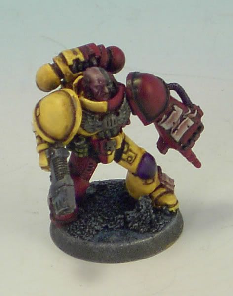
This is my first post here, though I\'ve been snooping around the forums for about 6 years. My 40K gamer buddy finally got me motivated to get off my rear and get some painting done. I decided to go with a space marine army due to the large number of plastics and constant additions to their model range. The idea of an Ultramarines Honor company sounded really good to me, as I often get worn out on painting the same old color scheme. Each squad is donated from a different Ultramarines successor chapter because they can\'t send an entire company to the field. Anyhow, here are some pics of what I\'m working on:

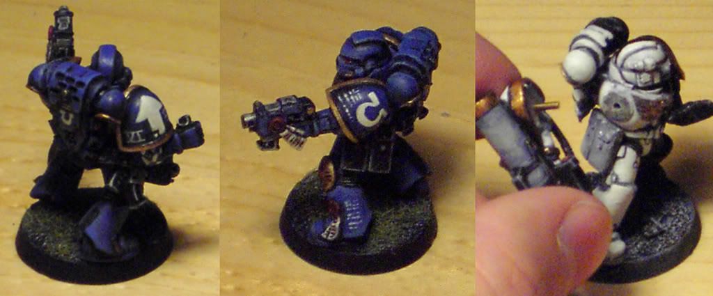
I think that the Ultramarine is close to done for me, I keep seeing things to fix all the time, but then I have to remind myself... he\'s just a basic bolter guy.
The Omega marine on the end is to show that I pin the arms to check posing, and so that I don\'t have a bunch of armless marines running around.
I have a question that I hope someone can answer:
I thin my paints with either the Future Floor wax and the Magic Wash recipe (not at the same time). The floor wax is brutal on my brushes, does anyone know how to keep it from gumming up my brushes? The wax works better for some things.
I\'d also like to apologise for the image quality, I\'m not a fantastic photographer and my camera doesn\'t have any macro settings. Well, and I was too lazy to setup my lightbox for these photos before running off to work. I\'ll try and get a better photography setup soon.
Thanks for any comments and/or suggestions.
-Mark
This is my first post here, though I\'ve been snooping around the forums for about 6 years. My 40K gamer buddy finally got me motivated to get off my rear and get some painting done. I decided to go with a space marine army due to the large number of plastics and constant additions to their model range. The idea of an Ultramarines Honor company sounded really good to me, as I often get worn out on painting the same old color scheme. Each squad is donated from a different Ultramarines successor chapter because they can\'t send an entire company to the field. Anyhow, here are some pics of what I\'m working on:


I think that the Ultramarine is close to done for me, I keep seeing things to fix all the time, but then I have to remind myself... he\'s just a basic bolter guy.
The Omega marine on the end is to show that I pin the arms to check posing, and so that I don\'t have a bunch of armless marines running around.
I have a question that I hope someone can answer:
I thin my paints with either the Future Floor wax and the Magic Wash recipe (not at the same time). The floor wax is brutal on my brushes, does anyone know how to keep it from gumming up my brushes? The wax works better for some things.
I\'d also like to apologise for the image quality, I\'m not a fantastic photographer and my camera doesn\'t have any macro settings. Well, and I was too lazy to setup my lightbox for these photos before running off to work. I\'ll try and get a better photography setup soon.
Thanks for any comments and/or suggestions.
-Mark

