WIP Chaos Terminators with Lord

Erinna

New member
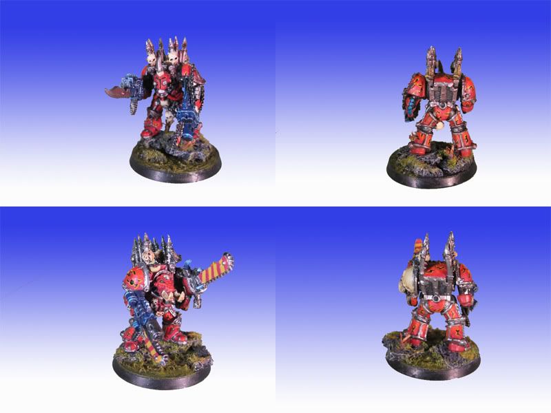
Hello everyone, Im Erinna and I'm new to CMON ;-) I'd like to have some input on my latest work in progress. Im doing this group together with Locutus and we are trying to get this unit above tabletop quality.

The unit will consist of 4 Terminators and the Lord (the 4th is WIP :p). For now they are not posted for scoring yet, we wanted to see some reactions before trying that.
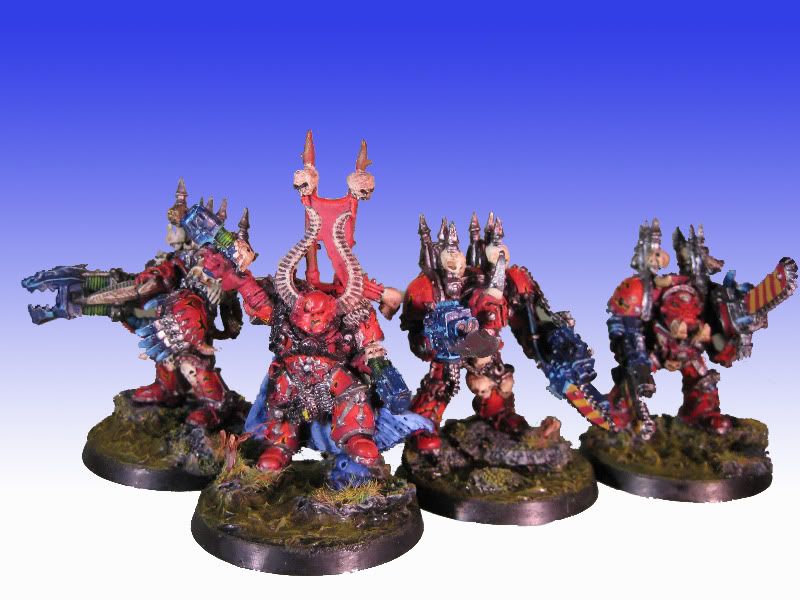
Groep1.jpg


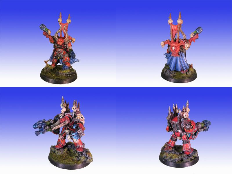
Composiet2klein.jpg


Composiet1klein.jpg


Please tell us what you think, don't spare us for being new :p Thanks in advance, Erinna
 

dogfacedboy uk1

New member
In the smaller photos these models look okay and certainly at around tabletop standard. Looking at the top photo though it is clear that the models need more definition at edges as it looks confusing. I am by no means the greatest painter myself and am still learning as well but others on here may be able to offer better advice on what you need to do to get the paintjob where you want it to be. I would rate them at around 5.5- 6.0 at the moment. Improve the bases, improve the definition of the different areas of the mini and take some slightly larger photos as well - these are a few things to be looking at doing to get better!!

dfb
 

cassar

BALLSCRATCHER
i would agree with dfb re the contrast also on the big picture the edges around the mini's that you've photoshopped are a little ragged which doesnt help. the smaller photo's however are better get in closer though. you might want to try something like photobucket to download your images from they are pretty good. the metalics on the claws are very good. keep up the good works.
 

Erinna

New member
I saw the edit was not good in the 'group picture' and we shall keep that in mind for real posts. I just edited them to fast and sloppy. It's funny you say that about Photobucket, because these pictures are hosted there XD We will keep the hints about the pictures in our head, and thnx for the nice comment ;-)
 

locutus

New member
Want to add a little explanation about the colour use; hoping people can give us more constructive comments/ help.

The armour was done using as base: mecrite and then using zenithal lighting to highlight going from blood red/ orange/ mix orange and yelow (citadel colours).

Cape from the champ. was done with a base ultr marine colour and then mixing in little amounts of skull white trying to feather in the highlights.

the same principal for the lightning claws.

To dogfaced boy: thanks for the comments!!! We can only improve if people take the effort to tell us what's wrong.

You say improve the base and improve the definition of the different areas of the mini; how could the base be improved?? and what erea of the mini('s) could use improvement and in what way??


Taking good pics. of the mini's is something we are still working on; a problem more mini artist seem to find difficult.

Again thanks for the comments!!!!
 

Stewsayer

New member
Hi,

I can agree with dogfacedboy about defining the different areas of the minis better. As an example take the left knee and shin on the lord. The chaos symbol and knee joint dont stand out very well. It is difficult on the eye to pick it out. Some thin glazes of Black (5 or more parts water to 1 paint and then wipe most of the paint off the brush before putting it on the mini) or very dark red into the edge of the red armour plate where it meets the symbol will help it stand out more. You want to end up with a thin dark shadow at the edge of the red. Also some stronger edge highlights (where approriate) on the symbol would help. The banner is another area that i want to metntion the cloth should look separate from the poles. at the moment it is very hard to pick out where it begins and the poles end.

Overall I think deeper shadows and higher highlights will help a lot.

Taking photos that are good and representative is a pain I am working through myself. I would suggest going for much more muted colours in the background you have added. The current one is a little distracting.

Cheers
 
Last edited:

Stewsayer

New member
No worries,

I'm hoping to get some help with my own stuff here too. I dont think I can expect that unless I'm prepared to help others a bit as well. Keep working hard guys.

Cheers
 

Erinna

New member
I'm hoping to get some help with my own stuff here too.
Cheers

Link to posts? Or not yet uploaded? If I can I will return the favor gladly ;-)

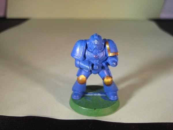
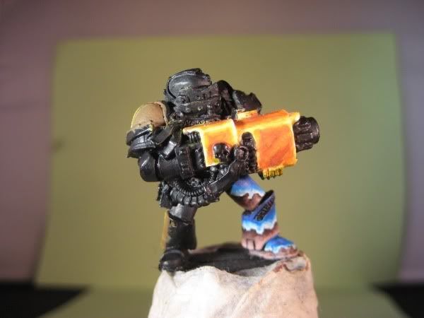
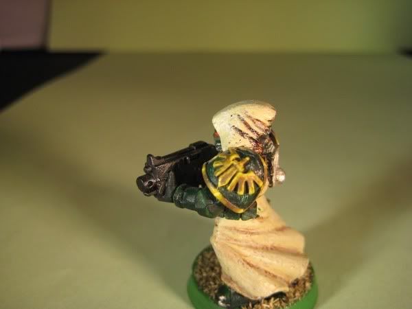
We are experimenting with NNM Gold and our attempts are not satisfactory to us at all really. Some examples of our trying: XD

Please don't look at the rest of these models, they are just attempts at NNM in some area's

nmm6.jpg


nmm5.jpg


nmm5.jpg


nmm3.jpg


nmm2.jpg


nmm1.jpg


What are we doing wrong? Any help will be greatly appreciated :)
 
Last edited:

Stewsayer

New member
Hi Erinna and Locutus.

I'm trying to get a handle on NMM at the moment also. Some of the above look like good efforts to me. Although I've found my own photos to be quite deceptive. The shoulder pad edging ones in particular look very nice.

What I have learned in my quest to make this happen in my own painting is that contrast is the key whether it is gold or silver or steeel or what ever you are after. That is why the shoulder edging in the above is close to working but the gun, the knee pads and the shoulder emblem are not yet. You need to push the darker colours darker still and probably include some spot white and some lighter highlights.

Also the blends between colours are a bit harsh at the moment. The best being the shoulder pad edges in the last two photos. Some glazes of he mid tone over the transition or of mix of the two colours involved would soften these up.

Oh and I've stuck a link in my sig to my blog.

Edit: oops forgot to enable my sig.
My stuff is here (what little there is for the moment).
http://www.coolminiornot.com/forums/showthread.php?38901-Stew-s-WIP-Log

Edit 2:
I just had another look at these on a better monitor (didn't know there was so much difference between the two). I think the colours in the shoulder pad edges are fine (maybe a little darker for the darkest). They need to be smoothly blended and they will start to look better. The emblem and the gun need the darker areas darkened quite a bit and smoother blending.
 
Last edited:

Aureo

New member
If you're wanting to try your hand at NMM....I would recommend you look at Boltmans tutorial about Magmatrax. He did an amazing job at explaining how he does what he does with his golds. It's a good read. He explains the blending process a lot better, and I'm sure it'll help you improve the gradation of your NMM.

http://www.john87.com/warhammer40k/article001.htm
 

Erinna

New member
OK so generaly speaking we are not blending the colors enough and they are to yellow still. I personaly read a lot of guides and many takes on the NNM process but little compares to trying and have an expert advice on the result ;-)
 

locutus

New member
i agree; nothing like doing it and then hearing what went right or wrong and most important is learning how to fix what went wrong.

What I also find difficult is how much space there needs to be before blending it into the next colour.
 

Stewsayer

New member
Just a fellow student here (no expert, no not at all).

Thanks for the comments on my red dude.

With the gold, the colours look good. Its that the divisions between them on the mini are too visible. It breaks the illusion. On the last of your photos the white into yellow is looking pretty good. If you can get the rest of it looking like that, I think it ill start to come together.
 
Back To Top
Top