Ultramarines ancient

Willowwing

New member
to go with my chapter master conversion
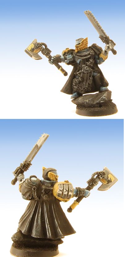
ancient.jpg
 

Arma

New member
Nice work up to now - I would add one more level of highlighting to the face mask along the edge of the feathers just to bring them out a little more.

What colours were used for the chrome/steel?
 

lono

New member
Its interesting to see you trying something a little different with Ultramarines, but I have to be honest, I\'m not sold on the SENMM gold or silver. Something just isn\'t right about it. I think it\'s the various angles of the horizon lines isn\'t quite accurate, but I\'m also no SENMM expert, so hopefully someone who is a bit more practiced can confirm my suspicions that it\'s a little bit iffy or tell me to shut up! It\'s the work on the two weapons in particular that just doesn\'t look right I think.
 

the catman

New member
I think lonos point (I agree) is that even if it is wip I doupt you would do the nmm \"wrong\".
its a very nice mini (I think) but you could
have maybe a bit less crome on the armour.
it makes it seem like your looking at a mirror.
this might be what you want and then its a compliment but if It isnt what you wnat then please take it as constructive critism.
:D

the catman
 

Baz

New member
Looks great so far. I like the axe head, it has a kind of polished copper look to it. I agree with an extra level on the facemask.
 

DaN

New member
I think the most obvious area that lono is picking up on is the edge of the back of the chainsword, where the two horizon lines meet at a very sharp angle - this really doesn\'t look correct.

However, I hope you sort that out as I really like this - I would\'ve have gone with that weapon combo myself, but that\'s just personal taste - the conversion is minty fresh :p
 

hubbabubba

New member
I like the painting so far, very tight, but the fore arm that\'s holding the chainsword is either too long, or the photo makes it seem that way.
And yeah, I think Iono (damn is that an I or an L) was just trying to be helpful/offering an opinion there bud..
 

lono

New member
Originally posted by hubbabubba
And yeah, I think Iono (damn is that an I or an L) was just trying to be helpful/offering an opinion there bud..
Believe it or not, you\'re right. From time to time I do try, hell, sometimes I fear that I may even succeed in being helpful!

And it\'s an L. I really should change it to stop the confusion. But Lono vs Iono. Surely the first is the logical correct one.

If we\'d all just use serif fonts there\'d be no bloody problems (other than the fact that most sans-serif fonts look better).
 

Willowwing

New member
sorry just a lot of people dont look or see WIP and critique like its finished. This is only the very first of the painting. Theres a ton more shading to do. The forearm is longer i can see that it\'s bionic. I left it like that to look a little modified. Yes I made it to look a little chromy extra shiny figured the honor guard would have that like the Marine Honor Guard. I usually paint the realistic damaged corroded look. I felt this was a change. The line on the chainsword I actually held up a sword of mine and looked at it under hte light it actually reflected that way back so I ran with it.
 

COG

New member
Originally posted by Willowwing
The line on the chainsword I actually held up a sword of mine and looked at it under hte light it actually reflected that way back so I ran with it.
So what hes saying is i have swords damn it
it looks good or else.....:D
i actually like the SENMM (?) i think it really fits the mini. the bionic arm does look funky but
not everyone can have the cool luke skywalker hands going for them.
ohh and i have never liked this model cause the helmet looking like a bird hit it,,,,,, but with the senmm it looks elegant.
congrats
:beer:
 

Arma

New member
Originally posted by Willowwing
sorry just a lot of people dont look or see WIP and critique like its finished...

I\'m sorry but posting a picture with a line of text like \"to go with my chapter master conversion\" doesn\'t really make it clear that you don\'t want critique. But tbh, if you post it in a WIP thread what do you actually want people to say? If you\'re going to get super defensive every time someone makes a suggestion then wouldn\'t it be better to post it once it\'s finished?
 

lono

New member
Originally posted by matty1001
Originally posted by lono
...(other than the fact that most sans-serif fonts look better).

Blasphemy! There\'s nothing more aesthetically pleasing than a nicely created serif!
I think this may be a print display vs monitor display clash here. As far as text on screen goes, particularly on websites, it has to be sans-serif.

But I do love messing with designers! I was housemates with an art editor when I worked at Future Publishing. All I had to do was suggest he added one of those printed fake stickers (with the corner partly peeled down and saying something along the lines of \"WOW!\") to whatever he was laying out and it would make him tetchy for the entire day, particularly when everyone else in the office hopped on the bandwagon and the editor started to request it too! lol
 

matty1001

New member
Of course, I wouldn\'t suggest using a serif for blocks of text on the web.

And yea, I hate those fake stickers lol
They just get overused in \'teenage\' magazines and \'flashy\' publications.
Though February\'s Creative Review used them, in an excellently ironic way
:twisted:
 

lono

New member
Originally posted by matty1001
Though February\'s Creative Review used them, in an excellently ironic way
:twisted:
It\'s been way too long since I\'ve checked out Creative Review. It\'s just too expensive for a lazy, unemployed (well self-employed, but the financial situation\'s kinda similar) chap like myself to get every month. Wish I was still doing the art thing at college. So many free and very cool magazines to check out!

Is this the sort of thing you wanted us to chat about in your thread by the way Willowwing? ;)
 

TokenArtGuy

New member
The SENMM is fantastic.

However, the chainsword in the first image looks a little flat and light. I would think that it should be reflecting the ground, and be darker as a result, since it is angled downward on that side.

Keep up the good work, I look forward to seeing another post of the model.
 
Back To Top
Top