Müller
New member
So... I know this is out of the ordinary but since I'm going to take part in a duals tournament with my pal Dennis over at: minisofdeath.blogspot.com very soon at GW Stockholm and my wolves aren't anywhere even remotely close to done (as you all can attest to  ) I will be playing with my tabletop standard Ultramarine army (I painted this army about 10 years back, and I started with Ultras back in the 2nd edition when I was just a juve so don't go bashing on me for having kept with my chapter all this time ;P).
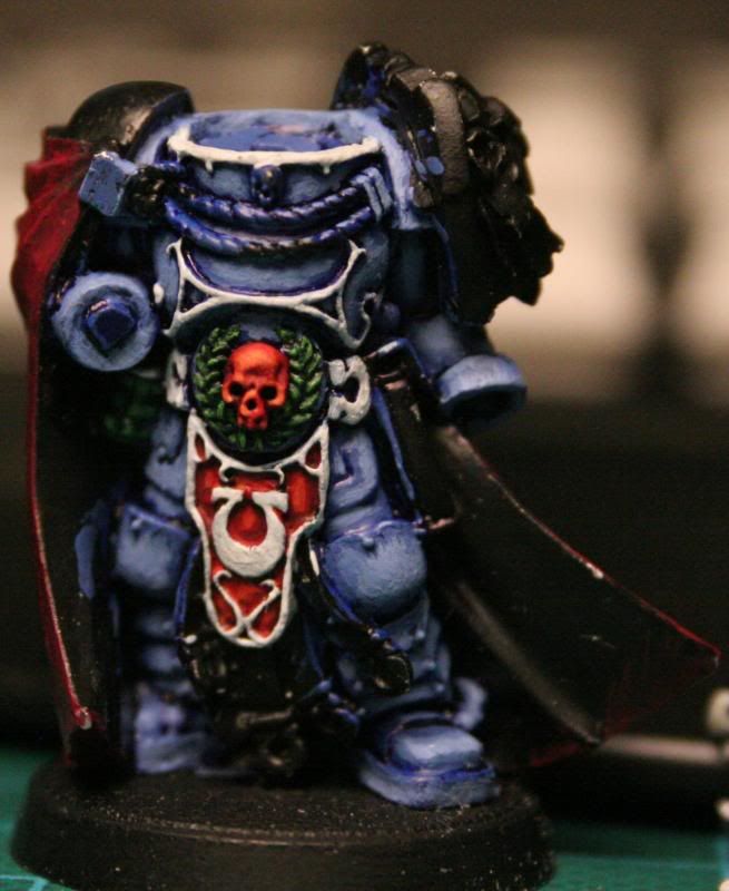
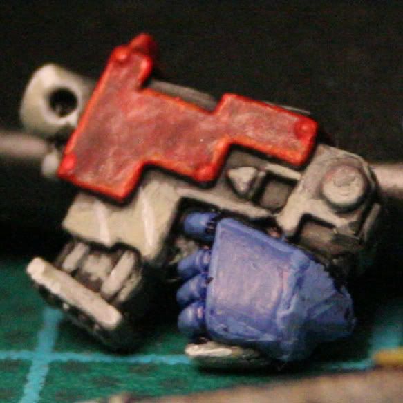
I needed a Chapter Master armed with nothing but a normal CC weapon and a bolt pistol, which none of my HQ's had (I'm not used to playing only 750p games ) I went out and bought Sicarus, because he screams Ultramarines.
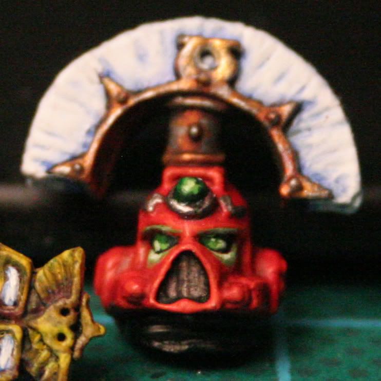
My original plan was to make him tabletop standard, but I failed quite large when I realised I spent quite some time on the head alone, so not the entire model had to be painted to a good standard, but I figured that since GW Stockholm are holding a painting comp. real soon I might as well paint him nice and add him to my line-up of competing models
This was my first go at NMM (Having not read any guides on it either), he will have golden NMM shoulder pads, a crimson red/decorated tan cape and white ropes when done on top of what's painted now. Might also add some freehand on the cape.
Since this is my first NMM model ever, comments and critisism are greatly appreciated on this one.

Cheers!
I needed a Chapter Master armed with nothing but a normal CC weapon and a bolt pistol, which none of my HQ's had (I'm not used to playing only 750p games
My original plan was to make him tabletop standard, but I failed quite large when I realised I spent quite some time on the head alone, so not the entire model had to be painted to a good standard, but I figured that since GW Stockholm are holding a painting comp. real soon I might as well paint him nice and add him to my line-up of competing models
This was my first go at NMM (Having not read any guides on it either), he will have golden NMM shoulder pads, a crimson red/decorated tan cape and white ropes when done on top of what's painted now. Might also add some freehand on the cape.
Since this is my first NMM model ever, comments and critisism are greatly appreciated on this one.


Cheers!


