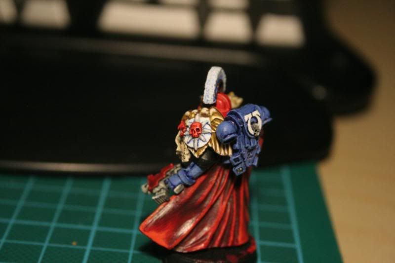
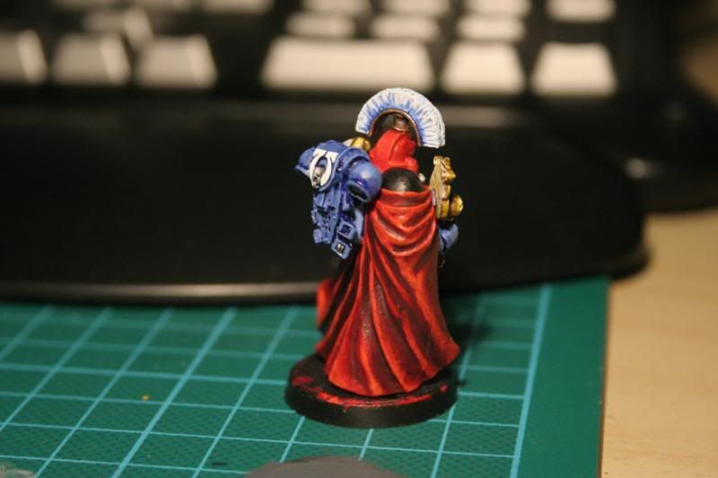
Ultramarine Chapter Master - Feedback appreciated

Müller

New member
Alrighty, I finished him.

His base isn't completed though, and I'm sorry the white skull below his head looks thickly painted; the model came that "blodged up", bad mould I guess and I couldn't be bothered to try and gouge out the eye sockets better when he was almost complete paintwise.
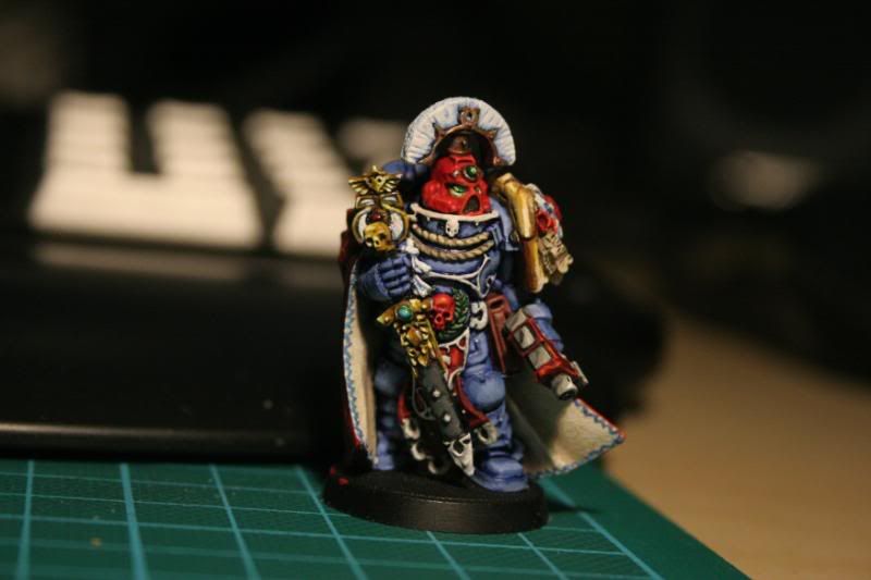
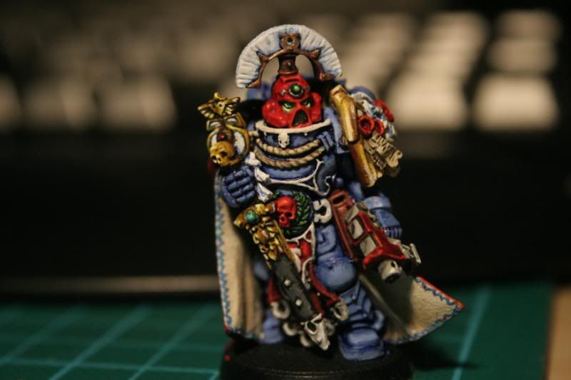
UltramarineChapterMasterFinished001.jpg


UltramarineChapterMasterFinished002.jpg


UltramarineChapterMasterFinished003.jpg


UltramarineChapterMasterFinished004.jpg


Cheers
 

Tagamoga

New member
Hello Müller.

Nice color setting and the Border of the cape. But I think you should work a little on your blendings, so the NMM would be better. The blacklining is a little to big in my opinion...

Greetings, Taggi
 

Pdxpete

New member
I think it looks pretty good. I like the edging on the cape. The red helmet looks odd though, like really thick paint was used. There's no real fdefinition there. Some of the blue blending looks rushed in spots but still a very nice job overall.
 

SkelettetS

New member
in these pictures the red helmet almost doesnt seem to be shaded/highlighted at all, just a red blob of paint (I suppose this is because not-so-good pics) the front of the cape is this minis strong point with the pattern and all, good job there. also i think youre heading the right way with the golden nmm.

like the others already mentioned thinner paint is the key to more smooth painting and better blending.
 

Müller

New member
I know that the helmet looks like a blob of paint, and I hate that i can't get a pic that will do the helmet justice.
It's been highlighted from blood red all the way up to 1:4 blood red blazing oragne.

The blue is a tad rushed, but it's not really meant as blending, more like streaked layering (distorted streaks at the edge of every layer to make it look a bit dirty.

This model was meant to be speed painted first (which I did with the blue) so I am fully aware of how the blue really would need more work to be at the same standard as plenty of other details on the mini.

I will take my time with some Ultramarine Honour Guard minis after this one, employing the same color scheme but taking more time on the armor.

thanks for the input, really appreciated.

EDIT:
About the base, I haven't decided what base to put him on yet :p
Might take the base from the Ancient Helveticus GW Skullz program model.
 
Last edited:

cheelfy

New member
I also agree that the helmet doesn't look highlighted or shaded but if it's the picture it doesn't mind. The cloak is nice but it doesn't look enough realistic to me and I'm also not a fan of the line freehand inside the cloak.
Anyway, it's a nice mini.
 

Beamo

Slowest painter ever
The first thing I noticed was the white armor trim- it doesn't do it for me. (I think it should be gold)

I'll also echo the comments on the helmet.

I do like the cloak though, both inner and outer.


a good effort, keep painting! :)
 

johnkelly

New member
looks good.
i would shade the helmet and maybe the NMM shoulder pad
blue purple for the helm very lightly and a little brown black for the shoulder trim. again very lightly.
Tbh i think that the model lacks definition, but would look very nice in a army.
if you play you dont need GD quality models unless you want them to be.

of course i havent posted any of my minis so. pot meet kettle :p
 

Müller

New member
I only paint minis I will eventually play with. This guy had a very close deadline due to a ladder "tournament" going off yesterday.
Sadly me and my friend lost (we didn't know that it was ok to mix imperial and xenos/traitors/demons so we played with 2 marine armies when he could've used hit nurgle demon host and we would've had kicked butt instead :p)
 

generiUser

New member
from what i see everything is good but it looks like the painting on the bckpack could be a bit smoother. other than that its prty good
 

GeM

New member
The paint is a little bit thick.
Just add a little bit more water to your paint on your palette. ;)
The brush movement on the mini is also important.
But try to add water first and experiment !
 

ScottRadom

Shogun of Saskatchewan
Yep, it's a good way above the standard tabletop painting, a good start that shows it's all going in the right direction. Thinner paint, more steps, more time.
 
Back To Top
Top