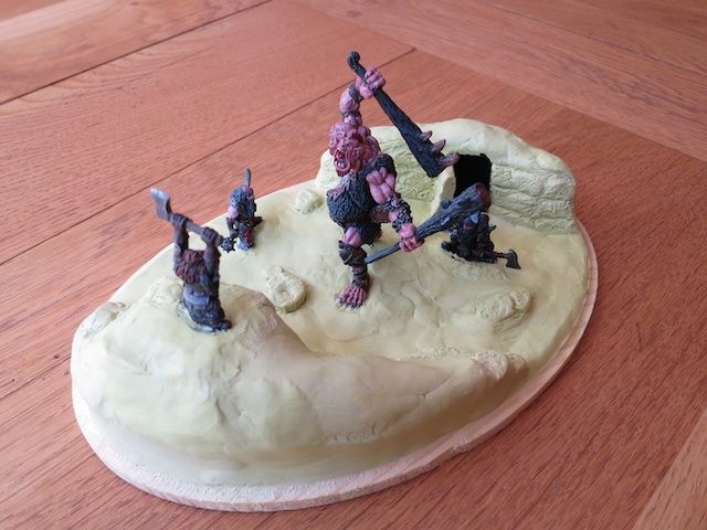
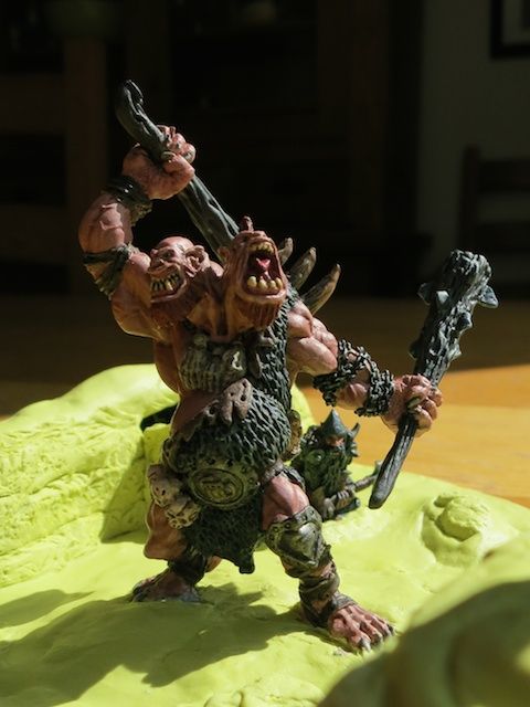
Most of these WIP threads are awesome. Full of mind-blowingly, award-winningly good paint jobs and sculpts. I love following along.
This is not one of those.
I'm a mid-40's guy who used to paint this stuff as a kid, and got back into the hobby a few months ago. This is a log for all of us "average painters" to share and learn from. Feel free to comment, suggest, ask, whatever...
For me, this is a lot of trial and error and "make it up as I go along"; and this is also the results of all those tutorials scattered across the web.
For consolidation:
Here's an earlier thread with some other WIPs.
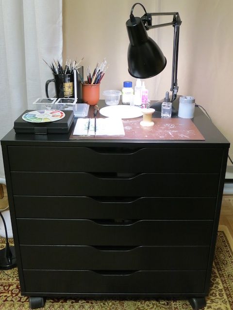
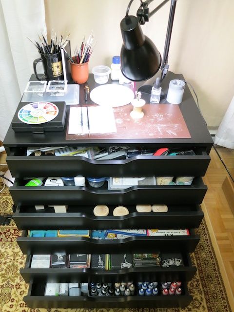
Here's the Ikea lightbox thread
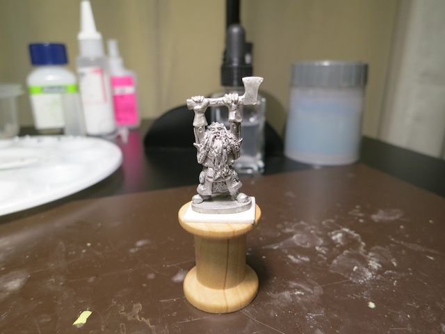
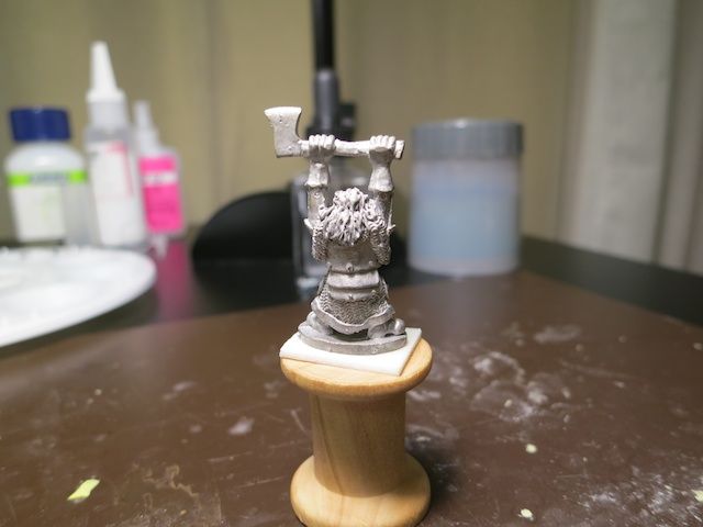
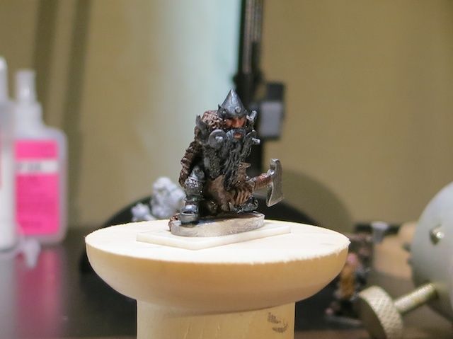
This is a guy I only got to practice on. Everything about him is a study of some sort, getting ready to do This Ranger from DarkSword
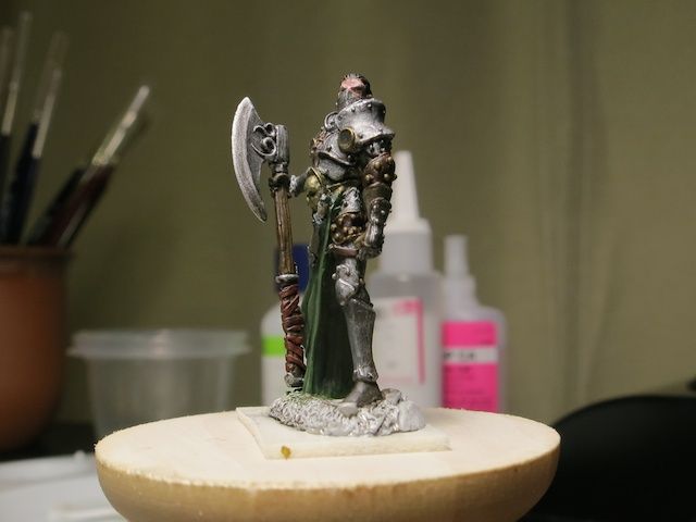
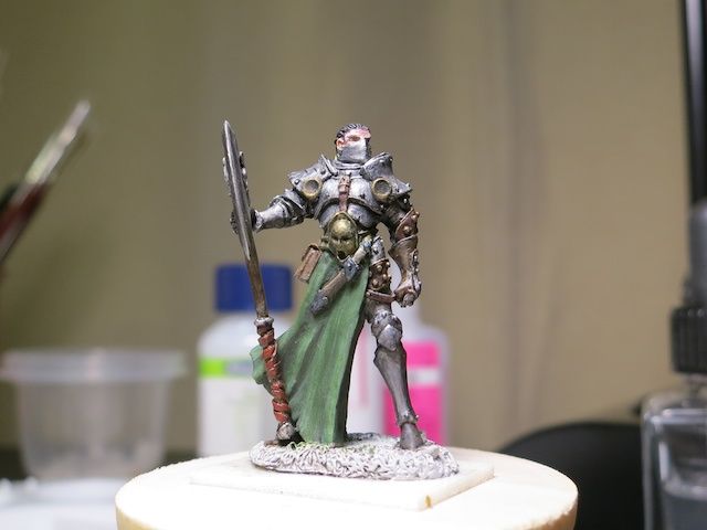
Aside from reinforcing the need for a light box (especially to get a decent shot of metallics), this is really all about the leather bits. Everything is different base and shade. What I liked: The brass studded piece on the left arm, which is Vallejo Flat Brown with a black wash. It'll probably become my go-to recipe for boiled leather armor. I also like the wrapping on the axe, which is Vallejo Cavalry Brown with a black wash. I used black in both cases only to get a strong outline (for the studs on the armor and for the definition of the straps on the axe wrapping). I would have used a dark brown otherwise.
I also discovered that there's no need for 1/2 a dozen different silvers. The armor is Vallejo Model Air Gun Grey and the axe head is Model Air Aluminum. Once you put a black wash on it, it doesn't make any difference what it started as.
This is not one of those.
I'm a mid-40's guy who used to paint this stuff as a kid, and got back into the hobby a few months ago. This is a log for all of us "average painters" to share and learn from. Feel free to comment, suggest, ask, whatever...
For me, this is a lot of trial and error and "make it up as I go along"; and this is also the results of all those tutorials scattered across the web.
For consolidation:
Here's an earlier thread with some other WIPs.
Here's the Ikea lightbox thread
This is a guy I only got to practice on. Everything about him is a study of some sort, getting ready to do This Ranger from DarkSword


Aside from reinforcing the need for a light box (especially to get a decent shot of metallics), this is really all about the leather bits. Everything is different base and shade. What I liked: The brass studded piece on the left arm, which is Vallejo Flat Brown with a black wash. It'll probably become my go-to recipe for boiled leather armor. I also like the wrapping on the axe, which is Vallejo Cavalry Brown with a black wash. I used black in both cases only to get a strong outline (for the studs on the armor and for the definition of the straps on the axe wrapping). I would have used a dark brown otherwise.
I also discovered that there's no need for 1/2 a dozen different silvers. The armor is Vallejo Model Air Gun Grey and the axe head is Model Air Aluminum. Once you put a black wash on it, it doesn't make any difference what it started as.
Last edited by a moderator:

