You are using an out of date browser. It may not display this or other websites correctly.
You should upgrade or use an alternative browser.
You should upgrade or use an alternative browser.
Smurf
- Thread starter hubbabubba
- Start date
sanctuary13
New member
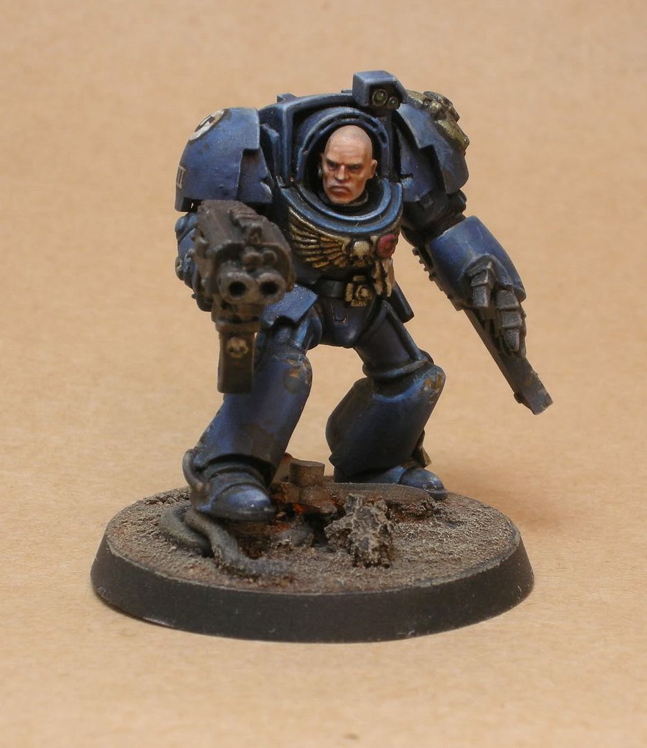
Gorgeous. simply stunning. favorited.
hubbabubba
New member
Thanks for the flattery Santuary. Happy you like it.
Avelorn, I think you\'re right about the bolter, I noticed it myself after posting, I think the same applies to the gold areas. I\'ll definitely try and take it on board for further stuff. thanks for that feed back.
I may have a go at automatons tute on metals, as his always seem top notch.
Here\'s another photo with the sheen eliminated after spraying with Mr Hobby flat.

freakinacage
New member
hes brilliant. the armour is nice, the face is awesome. like the gritty plainness of the base. only part i am not a fan of is his right foot. the way most of it is hovering. it looks better at some angles but i think it would have looked better if the ground was built up a little more
sanctuary13
New member
with the matte finish, it really brings out the dullness of the bolter and gold trim, they are the weak spots. i really like the base and the face looks phenomenal.
fiesta0618
New member
The blue and the face: spot on! But you clearly have freehand ability, so why not add script to your purity seals? That\'s all I\'ve got to say that hasn\'t been said
Face is really good indeed. I have a question though.... Is the general graininess of all surfaces besides face intentional? or is it just the result of extreme magnification or even image postprocessing. For some reason it really sticks out for me and I am not sure I like it.
Gold needs more contrast and it should be different from oath paper - the colors for them are too similar
I like the pose. Very alert and dynamic. Is it stock you repositioned legs?
Gold needs more contrast and it should be different from oath paper - the colors for them are too similar
I like the pose. Very alert and dynamic. Is it stock you repositioned legs?
Overall really nice job.
The face is great, as is the depth of color on the blues.
As avelorn said, the metalics are a bit flat compared to the other parts of the mini.
There does seem to be a grittiness (literaly texture) to the armor that I\'m not sure I\'m wild about... at points it almost looks to have metalics in it. His right hip guard for example.
Over all a great job. I voted.
hubbabubba
New member
@FIAC
I tried to get the impression he\'s carefully maneuvering his bulk over the ruble with his positioning on the base, hence the foot being half positioned over the tubing, with all his weight still being on the other leg.
@ Fiesta
I\'ve put script on the seals before, and never been happy with the result, so now I generally don\'t bother, perhaps I should give it another go.
@Skeeve and Pez, yep, the graininess is there, although I think its only noticeable because that second picture is so big, it may be due to the undercoat, which would explain why it\'s not visible on the head, which was undercoated separately and added later. There are no metallics in the blues, although I can see what you mean, I think that\'ll be dust particles from the spray booth when I dulled him down, oops.
Thanks for the feed back all
Edit: oh yeah, the legs are as they come in the box....
freakinacage
New member
he\'s still great
ScottRadom
Shogun of Saskatchewan
DY-NO-MITE!
hubbabubba
New member
@ Joek
The flesh mix was base coat of VMC cork, washed with GW flesh wash (deleted ink range) highlihted by progressively adding VGC elf flesh to the cork and then VMC ivory to the elf flesh, up to ivory high lights on the highest points.
A VMC dark brown was glazed under the nose, and between the lips, and purple ink from the original citadal ink range (1989?!!!) wasused to glaze around the eyes and on either side of the nose. the whole thing was then given a glaze with chestnut ink, again from the original citadel inks range, which I believe was made by c\'ote d\'arms (or whatever theyre called), perhaps they still do them.
It\'s amazing to think I\'ve had some of my paints for 20 years and I\'m still using them.
Once again thanks for all the feedback.


