Shading with different colors to add realism/depth?

PTS

New member
I was looking at submissions such as this...
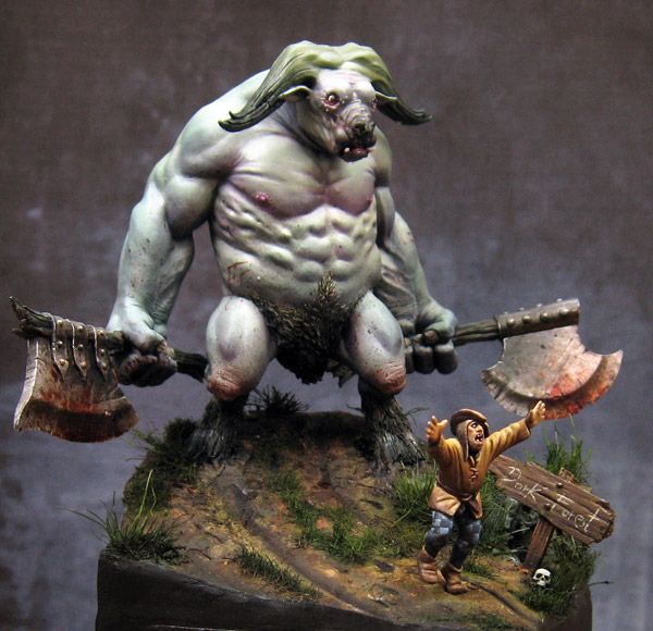


...and marveling at the use of different colors on the minotaur's blue/grey skin. It adds such depth and realism, and I'm wondering if anyone here can explain how this technique can be pulled off effectively? Does thought need to be put into placing the patches of color (especially the yellow/green, the pink seems to be more localized around the chest/face) or can satisfactory results come from random placement, as long as there's symmetry?
 
Last edited:

Bailey03

New member
First the easy answer, the minotaur figure is from Figone
http://www.figone.fr/en/minotaure/

How to use those subtle color variations effectively is a tough subject. It's one I'm still struggling with. I don't think the color placement is random. On the body certain areas like the eyes, nose, mouth, elbows, knees, etc are good spots for a bit of color variation. You've got to pick and choose where you apply the color. I think the variation is important so if it's everywhere it loses its visual impact. You can look at animal images to see real life examples. A bit of pink might show through areas where the fur coat is thinner. You can also play around with reflected color. Some materials can pick up color from the sky or the earth or just whatever is nearby. Glazes are a good way to add this subtle color variations to the shadows and highlights.

There's a project that I'm hopeful will go into these ideas in a bit more detail. Without actually seeing the book I can't say for sure, but the project is all about light and color. The indiegogo project has officially closed but you may still be able to join in (contact the creators). Or just keep an eye out for when it's available for regular purchase.
https://www.indiegogo.com/projects/figopedia#home

Here's one example from my WIP thread. This is on a 90mm scale figure, so the face is a lot larger than the standard 28mm one, but the color ideas are the same. The middle image shows the face with just the basic skin tone paints. Then, in the 3rd image I've gone back over with glazes adding more red to the cheeks, nose tip, a little in the forehead creases and bottom of the ears. I've also applied some purple to the deeper cheek shadows and in the shadows around the eyes. I made some minor tweaks to the shadows around the mouth, but most of the changes in the final picture are just subtle color shifts through glazing.
attachment.php
 

PTS

New member
Very helpful, thanks. Hey, I'm in Los Angeles too - do you offer lessons? My painting is decent but not as good as yours. I'd love to get some tips on washes, blending, etc.

I managed to find the minotaur miniature just before you posted. I also emailed to ask Jeremie if I can buy the Figopedia book from him, he wrote back and said the funding campaign is still active on his end. The good news is the goal was met so if you tell him which package you want, it comes with lot of extra stuff.
 
Last edited:

Bailey03

New member
Nice to meet another LA painter! Have you been to any of the painting groups in the area? The SCAHMS (Southern California Area Historical Miniatures Society) meets on the second Saturday of the month in La Palma. Next month they're doing an all day workshop. There will be a variety of artists leading different tutorials. I'm still trying to figure out my schedule, but if I can make it I'll do one of the tutorials.
https://www.facebook.com/SCAHMS/events

There's also the LAMS group that meets on the first Saturday of the month up in Burbank. They're a bit more broad with a lot of vehicle modelers in addition to figure painters.
http://laminiaturists.com/

The SCAHMS meeting is probably the best place to talk about painting tips. If that doesn't work we can figure something else out.
 
The very fact that you noticed the broad range of colors being utilized and how it adds to the realism of the figure is excellent, and shows that you will pick things up, no problem.

Bailey is a great teacher and really shared a lot of valuable experience on the subject. I can only add that the use of colors is all about pushing a focal point. When we think of contrast, we often default to think of color contrast. But it's more than this. It is also temperature. Many artists seek a warm shadow with a cold mid tone and a warm highlight. Building this contrast is one of several ways to push the viewer toward a focal point.

There is actually a tutorial on here that discusses this subject. It is the perfect answer for your questions.

http://www.coolminiornot.com/articles/1757-urmuth-painting-flesh-and-using-colour
 
Back To Top
Top