Painting Straps - Where to put the highlights?

Olaf the Stout

New member
I am painting a couple of Goblins for my Blood bowl team at the moment. One of the Goblins has some straps on his body.

I\'m not 100% sure where to put the highlights on the straps. I plan to put a sharp highlight on the 2 edges of the strap but I\'m not sure about the flat part of the strap.

On the flat part do I build my highlights up along the middle so the middle of the strap is the lightest part and it gets darker towards the edges (until it gets to the sharp edge highlight).

Or should the middle of the strap be the darkest bit, with the colour getting progressively lighter until it gets to the edge highlight (which would be the lightest highlight)?

Thanks in advance,

Olaf the Stout
 

Gilvan Blight

New member
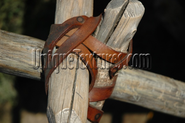
The best thing to do when you don\'t know how to hilight something is to look at the real thing:

backpack_utility_straps.jpg


01265.jpg


EMVT78.jpg


Just some examples.
 

DarkStar

New member
\"Or should the middle of the strap be the darkest bit, with the colour getting progressively lighter until it gets to the edge highlight (which would be the lightest highlight)?\"

That\'s the way I went with the belt on this fig here: Stronghart

Hrm, the belt is kind of hard to see, but I think you can make out that I left the middle part dark and went for highlights on the outside edges, so if you want a visual example for the eye of how that looks.

I tend to paint alot of straps that way come to think of it, but not always. Oh yeah I also hit up the lower edge of the strap with highlights since I just like to define the fact that it\'s \"there\" a little more, even though that may not be the most realistic thing.
 
For any surface, and not just straps, the area where highlights should be placed depends on the position of the light source relative to the object. If we assume the light source to be directly overhead, then the areas that will receive the most light are those that are oriented facing directly up and the areas that receive the least light are those that are facing directly down. In general, however, the area that receives the most light is the one that\'s oriented directly towards the light source. This is a somewhat simplified explanation which is lacking in completeness but as a general principle it\'s something to always have at the forefront of your mind when painting.

Take a look at the second picture submitted by Gilvan Blight. Completely ignoring the shadows, you can tell where the light source is located entirely from the orientation of the surfaces that are receiving the most light, which is somewhere slightly up and to the right (and is probably the camera flash). Another thing to point out from that picture is that leather straps are often somewhat glossy, which means that the areas receiving the most light will also be reflecting more of the original light source unaltered, or at least minimally altered, and will be the color of the light source (white/off white in this case) instead of light brown.

As DarkStar wisely noted, what\'s realistic and what looks good in miniature are two very different things. Completely ignoring the confusing pedantry I wrote above, I generally paint straps with the center being darkest, the top of the strap being lightest and the bottom of the strap somewhere in between the two.


Edit: I\'m dyslexic
 
Back To Top
Top