You are using an out of date browser. It may not display this or other websites correctly.
You should upgrade or use an alternative browser.
You should upgrade or use an alternative browser.
OSL help requested
- Thread starter kirara
- Start date
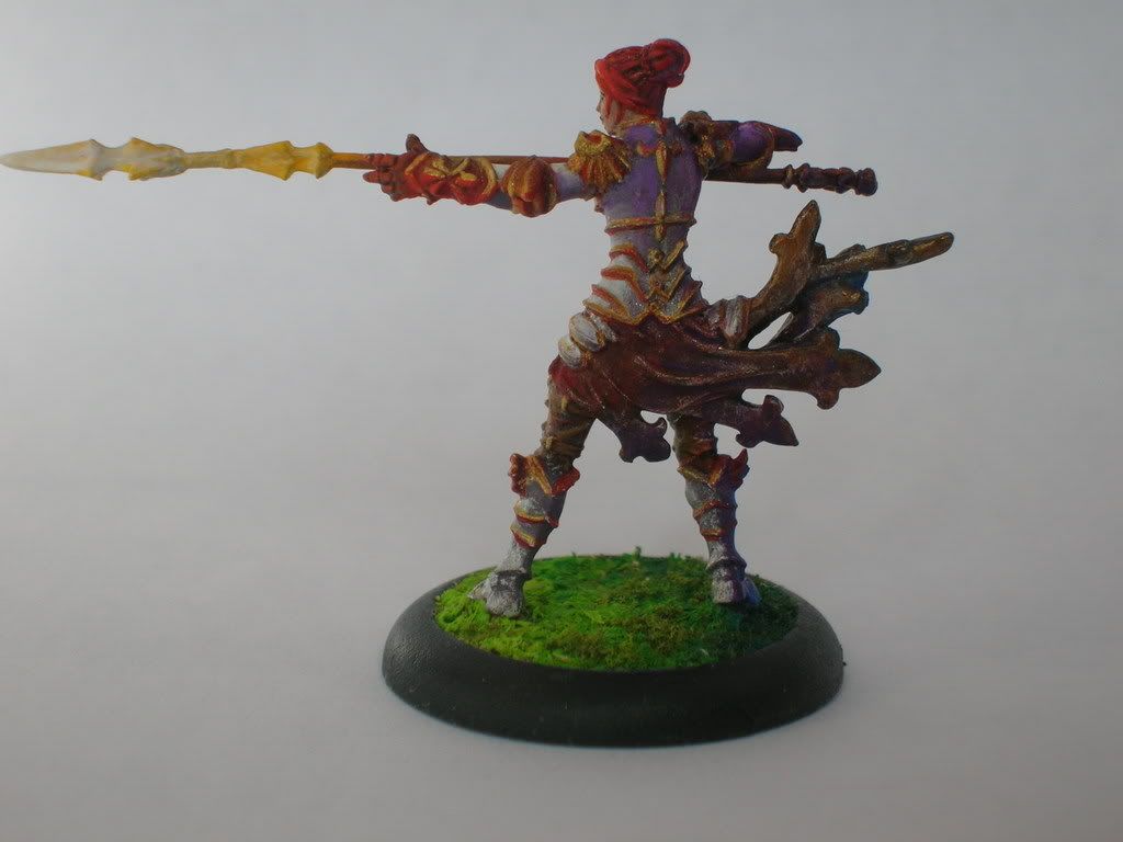
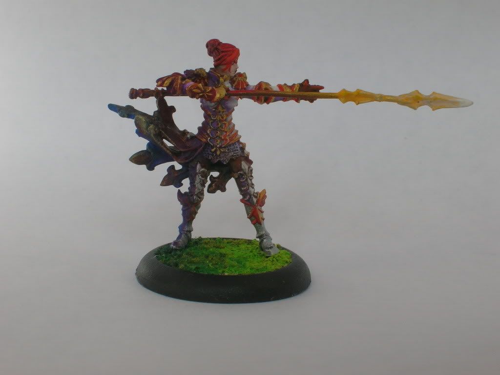
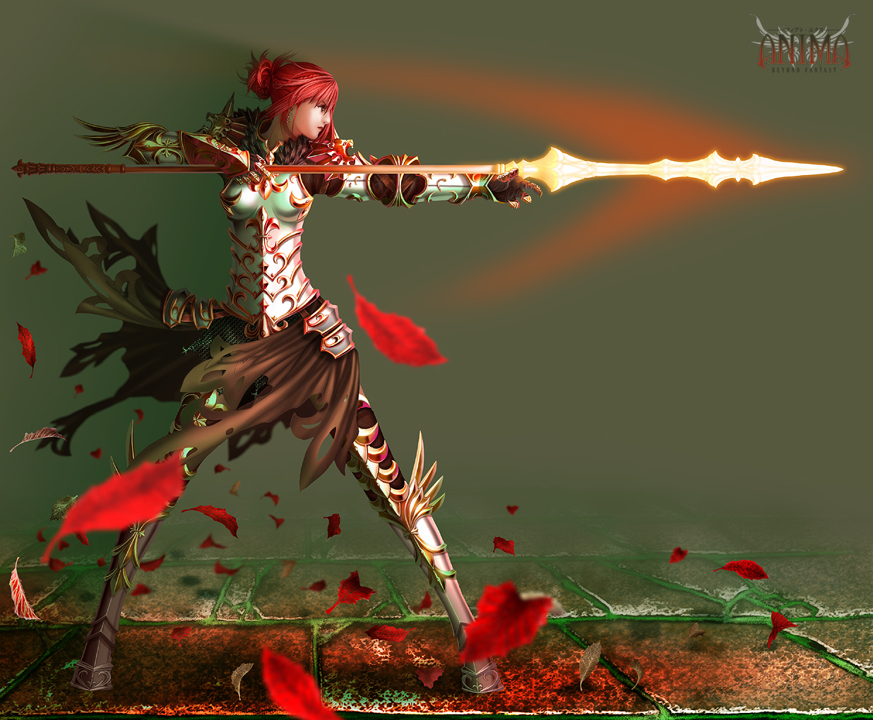
I think you got off to a really good start. I believe that most of the highlights are in the right places, however, the gold tones should be brighter (closer to white). In the image you were duplicating, the gold areas effected by the light were white at their brightest points. Also I think Goin a little darker on her right side (shadowed side) wold help exagerate and further empasize the OSL.
Overally a pretty successful attempt at a very difficult thing to master. I hope this helps a little.

Overally a pretty successful attempt at a very difficult thing to master. I hope this helps a little.
So would you think I should make it mostly white and purple, and leave out the red?
I started out with red and gold, white and grey and it looked miserable so I replaced the grey with purple.
The result: prettier color scheme but incredibly clowny.
If it were you, what color scheme would you use?
I started out with red and gold, white and grey and it looked miserable so I replaced the grey with purple.
The result: prettier color scheme but incredibly clowny.
If it were you, what color scheme would you use?
At this point, I would stick with the purple. I think it brings an interesting feel to the model. (Personally, I tend to stick to a bland palette of colors, something I\'m really trying to improve on)
I think I would start with intensifying the highlights on the gold parts of her armor. Also I noticed that there is a greater contrast between the light and dark tones in the picture than you have used on you model.
Hope this helps.
I think I would start with intensifying the highlights on the gold parts of her armor. Also I noticed that there is a greater contrast between the light and dark tones in the picture than you have used on you model.
Hope this helps.
odinsgrandson
New member
I think you have the basic idea right, now you just have to get your shading right.
1) The idea that the light has to be the same color as the lit areas is a myth. This is one way to do OSL but it isn\'t the only way. What you are doing here works just fine.
2) Shading her dark side more will work nicely to bring out the effect. Often, I have used OSL as the only light on a mini and left the dark side extremely dark. This should make it pop a little more
3) On a similar note, I think the mini needs black lining to make its own details pop. I think this is the source of your problems, moreso than the OSL. With the anime style of this mini (and everything else from the AT range) I think some black lines make it stand out a lot more.
4) I actually think that something that is hurting the composition is the amount of the spear that is at its lightest. In the picture, most of the spear is lit at its brightest, while you have more of a gradation going all the way up. I think that you have placed your Lighting based on this larger lit area, so you need to light the whole area before he\'ll look just right.
I hope I\'ve been helpful. You are doing a really good job, the mini just needs one small something to make it really stand out.
Ok so I lightened the spear and darkened the shadow.... this kind of more what you were thinking?
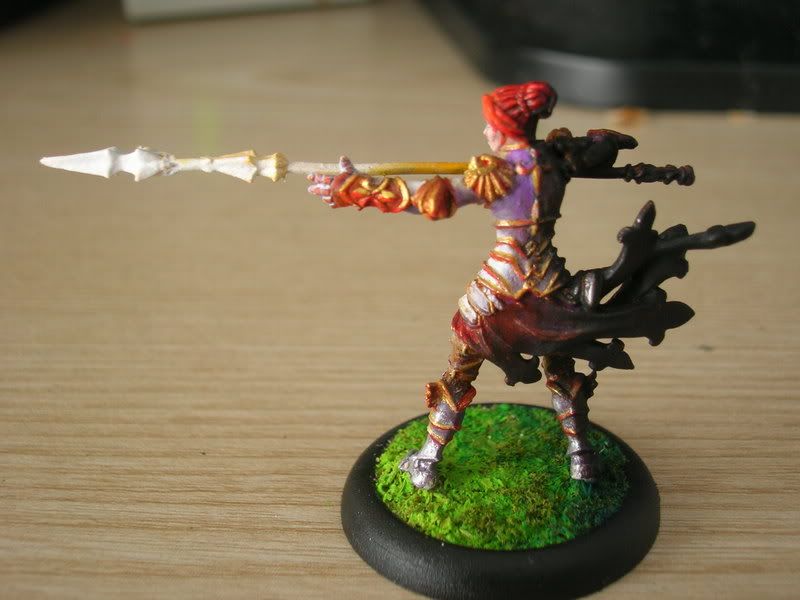
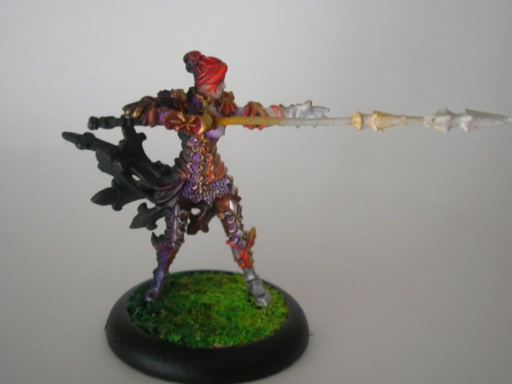
(I should note that I was a bit sloppy about it so please ignore the yellow spikey bits that probably oughta be white, and all that )
)
... Darned thing looks great to me on the backside but I hate the front. Wish I knew what I was doing on the front that was different.


(I should note that I was a bit sloppy about it so please ignore the yellow spikey bits that probably oughta be white, and all that
... Darned thing looks great to me on the backside but I hate the front. Wish I knew what I was doing on the front that was different.
Thunderhawker
New member
One thing that will help you straight away is this: photograph it on a black background. It will get rid of all that \"noise\" from all the light around it and give you a better feel for the lighting effect. Just use a black t-shirt if you have one. My other bit of advice is this: the light source has to be the brightest spot on the whole mini. No matter what that image you are using looks like, (and don\'t get me wrong here I think you\'ve got the gist, just need tweaking) you have to keep that in mind. Check out the articles. Shawn has some fantastic stuff he\'s put together in there.
one: where\'s this model from
two: I watch your use of red as a shaddow. I think that the colorist of that picture was thinking that the gold trim would pick up color from the red leafs in the forground, so go easy on that color
three:maybe bring a little of the purple into the \'bright\' areas, the transistion between the purple to the white seems to extreme.
Oh well just M2C
Shawn R. L.
New member
What you have looks good so far. Simply paint tone for tone, hue for hue. One trick you can use, using the artwork, is to take a piece of white paper and cut a small hole in the center of it. Put the hole over the color/tone you\'re trying to mimic and this will GREATLY reduce the confusion that can occur when trying to pick up what the actual color is. When you view a color \'in context\' with the rest of the painting it can be hard to get what the REAL color is and what I THINK it is. Especially when trying to do a \'trick\' like OSL it can be hard because you\'re eye is fooled into thinking that the blue shirt (or whatever) is blue all over.....that\'s what you KNOW. What the color is REALLY can be WAY different and when combined it will give the illusion of a unified color simply being lit................mmmmm K\'?

