Need help with shading

Shiverix

New member
Hi all,

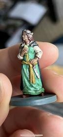
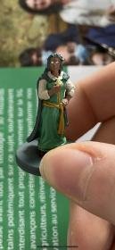
I recently started painting some miniatures for the Lord of the rings: Journeys in middle earth and am still quite the rookie. I was hoping someone could give me some tips on the shading. This is usually my last step as I don’t really have time to finish with highlights etc (for now). However, I find that my shading technique (practically non-existent but I watched some videos), doesn’t work well on brighter colours, mostly when they are larger areas. It gives it a very “dirty” look. I didn’t mind this at first as I was mostly doing villains first, and it kind of looks nice when your orc has this dirt everywhere to give it a bit more of a rough-looking edge. However, on some of the heroes it kind of ruins the idea I had in mind. This Arwen I did recently is a great example and I was hoping someone could give me some tips for future work. Thanks!

The first photo is before I did the shading (note, I fix the eyes at the end). The second one is after shading, and you can see it looks like she’s been rolling around in the dirt like a pig rather than healing the crew… especially noticeable on the dress and white shirt (although for some reason her face also looks melted). Am I just rushing my shading too much? I find that if I don’t add shading to those areas, the contrast is too large as the base colours look very matte, while the shading makes things much more glossy.

Thanks in advance!
Shiv
 

Attachments

  • 67168DA8-E279-404A-95EF-31E6DC607C97.jpg
    67168DA8-E279-404A-95EF-31E6DC607C97.jpg
    7.8 KB · Views: 129
  • DC8964CD-6473-44BD-AA41-7845DE5D90D9.jpg
    DC8964CD-6473-44BD-AA41-7845DE5D90D9.jpg
    7 KB · Views: 135
Last edited:

MAXXxxx

New member
I think before we can really give tips we'd need 3 things:

1. bigger pictures. They are simply too small to see what the problem is
2. what do you use to shade? (paint type, color)
3. how do you use it to shade?

from the text what I can say is :
- having an uncontrolled shade as last definetly won't help in getting a clean paintjob. There is a need to get back to the basecoat and to at least 1 level of highlight
- because the problems on large areas I suspect you flood the whole area with the darker color, you might want to look into doing more controlled shadeing (so not the whole area, but just the recesses or parts pointing down)
- shading looks glossy: altough it will be more glossy than a matt basecoat, but it might mean it's not mixed enough and you use mostly the medium and not the pigment. Also you may or may not use a product, that's not really good for it.
 

CyAniDe

New member
The pictures are really small so it's pretty hard to see details. But from your description I guess with shading you mean using a wash?
The problem with washes or quickshades is, that you'll probably never get a clean finish for cloth with them. The basic rules to apply them are:
1. Be fast
2. Cover the whole area (otherwise the bordes dry and you'll get a stainy edge)
3. Don't let em pool to much in the recesses (also causes stains)

They are usually pretty transparent paints so they won't create opaque paint layers and they are often pretty vibrant and glossy. To see an effect you need a high contrast -> means much darker shade tone then your base layer. But the greater the tone difference the "messier" it looks.
I would recomment to use them as a glace to soften transitions. Means paint your mini with a "classic" layer approach: Shadow/Midtone/Highlight and then use a thinned wash over it to soften the transitions between the layers. You can paint the layers with opaque paints and pull them together with the "glaze-wash". It's still pretty fast but with much more depth and contrast.
For even cleaner results I would cut the washes completly and use more advanced painting techniques. There are a lot of them and some are pretty hard to learn in the beginning. So this would probably lead to far here.
But even with a basic opaque layer approach you can get very good results and learn how to control your brush and how your colors behave. You can try different dilutions, use more layers and mixes like (deepest shadow, shadow, midtone, first highlight, final highlight) and the more tonal steps you mix the smoother the transitions you get.
Back in the early 2000nds this was what was shown in tutorials and guides a lot (like White Dwarf/How to paint citadel miniatures book ...) since GW hadn't had any "technical" paints like Contrast/Shade/Layer ... back then. Only "regular" acrylic paint and some Inks.
It surely is slower then their new beginner approach (basecoat/wash/drybrush) or (White primer/Contrast paint) but with a bit of training the results of "basic layering" are much better and cleaner. The new products are more targeted towards players who want to just somehow paint their minis as fast as possible to get them ready for the table. So for some people they really are a blessing (met a lot of players on tournaments that hated painting their minis^^ )
 
Last edited:

Shiverix

New member
Thanks both for your replies, that's already quite helpful.<br>
I am not sure why the images turn out so small, I am using the "insert picture" in the message lay-out.
I also tried just adding them as attachment but it still appears much smaller than the original files...

I have uploaded them here: https://ibb.co/GsxFfqv & https://ibb.co/8jcjgSc.

Thanks
 

Attachments

  • IMG_1150.jpg
    IMG_1150.jpg
    7 KB · Views: 116
  • IMG_1106.jpg
    IMG_1106.jpg
    7.8 KB · Views: 118

Shiverix

New member
I am using "Citadel Colour Shade Agrax Earthshade" for shading.
I usually add it to an area and then spread it out a bit, pulling it mostly into the recesses and often removing a bit when it pools too much, but I'm often still a bit too slow, or actually too fast and have already started elsewhere, and this still occurs.

I think before we can really give tips we'd need 3 things:

1. bigger pictures. They are simply too small to see what the problem is
2. what do you use to shade? (paint type, color)
3. how do you use it to shade?

from the text what I can say is :
- having an uncontrolled shade as last definetly won't help in getting a clean paintjob. There is a need to get back to the basecoat and to at least 1 level of highlight
- because the problems on large areas I suspect you flood the whole area with the darker color, you might want to look into doing more controlled shadeing (so not the whole area, but just the recesses or parts pointing down)
- shading looks glossy: altough it will be more glossy than a matt basecoat, but it might mean it's not mixed enough and you use mostly the medium and not the pigment. Also you may or may not use a product, that's not really good for it.
 

CyAniDe

New member
To link pictures copy the image link (right click picture->open picture in new tab -> right click picture->copy image link). Then type "
" (without the " " )so it will be shown in the thread.

IMG-1150.png


But yes, with that approach you will always end up with a kinda dirty look especially on light basecolors. The wash is transparent on the raised areas and won't change the tone much but collects in recesses and creates much darker spots there. Like drybrushing it's a fast technique but not necessarily very controled. You can achieve some nice effects with washes and filters but they are usually used for a style that prefers a more weathered look. In scale modeling wash techniques are used a lot in weathering for example.
In the end it's a question of personal preference. I prefer a pretty clean style on my minis and don't use washes at all. Only Inks in rare occasions when I want to boost the vibrancy of certain colors.
So I would recomment to try a classic layer approach like I described above.
 

Shiverix

New member
Ok great, thanks!!

Yes, it depends a lot on the colours and the structure of the mini, in some it works our very well, like in this example below (Dís) where I used the same tools and technique as in the images shown above (Arwen).

87-E7-AD7-B-2-D6-F-45-F3-91-C0-0-E4-D22197-FC8.png
 
Last edited:

Beatnik59

New member
I'd have to agree with what both MAXXxxx and CyAniDe are saying. Fortunately, on that Elf, you seem to have good foundation to shade. And I can see by the color blocking you did on those pieces, your hand for detail is quite good. You've got the hand to do some glazing, which will take your figures to the next level. It's a powerful technique, and you've got a solid foundation on your basecoats to do it well.

Now I don't know what sort of commercial brand you use, but that mint color looks like a mix of two pigments: phthalocyanine green (or phthalo green) and titanium white. Now phthalo green is a dark green pigment with a hint of blue, and it is very transparent by itself, especially when you thin it down slightly. Chances are, you have a paint like that, a deep, dark forest green (the one I'm thinking about is what Citadel calls "Caliban Green"). I'd take a few drops of that and thin it with a few drops of water, and then glaze in those folds, the area under the breast, under the arm, under the belt...basically anywhere the light when seen from above isn't hitting too strongly.

CyAniDe talked a bit about a glaze, and how it differs from a wash. Basically, glazing is the same as painting, but with a translucent paint, so that whatever color that the glaze is painted over still shows through to a varying extent. You'll want to use the natural translucency of that deep phthalo green glaze to shade the cloth, brushing from the area of highest light to lowest light, pulling the glaze, so that the end of your brushstroke ends up at the darkest recesses, where the pigments will settle the most.

Phthalocyanine blue is another pigment that is popular in miniature paints, a kind of bright blue that hints towards the green spectrum. What Citadel calls "Lothern Blue" looks to be a mix of phthalocyanine blue pigment and titanium white, and I think "Caledor Sky" is a more pure phthalocyanine blue. Like the phthalocyanine green, phthalocyanine blue is a very transparent pigment when thinned slightly. I'd use that to glaze in some shade on the white sleeves. Again, you don't want the sleeves blue, obviously. But you want to give the indication of a white cloth outside of the light, and a blue, I think, would accomplish that more than glazing in a black.

The yellow trim can be glazed. A lot of dark browns are pigmented with synthetic burnt umber, which is a rather translucent brown (as opposed to natural burnt umber, which is rather opaque). The best way to test the translucency is to brush your glaze on a sheet of white plastic. Again, you can control the amount of glaze you put down by the brush. You could use the same glaze for the hair.

Now you can glaze those faces too. I find that's where glazing benefits me the most. Some like to glaze in with brown, but that elf and that dwarf seem much more fair skinned than tan, so that might not be the best option. Some like to glaze in fair skin with some shade of red (most reds in acrylic miniature paints are pigmented with cadmium red or madder lake, and both are rather translucent pigments). I like to use some shade of violet for female figures; it tends to make a lot of lighter skintones more rosy than ruddy. Luckily, most of the violet pigments in use today, like cobalt violet and quinacridone violet, are also very translucent, and glaze well.
 
Back To Top
Top