Marines

nosirrahkcaz

New member
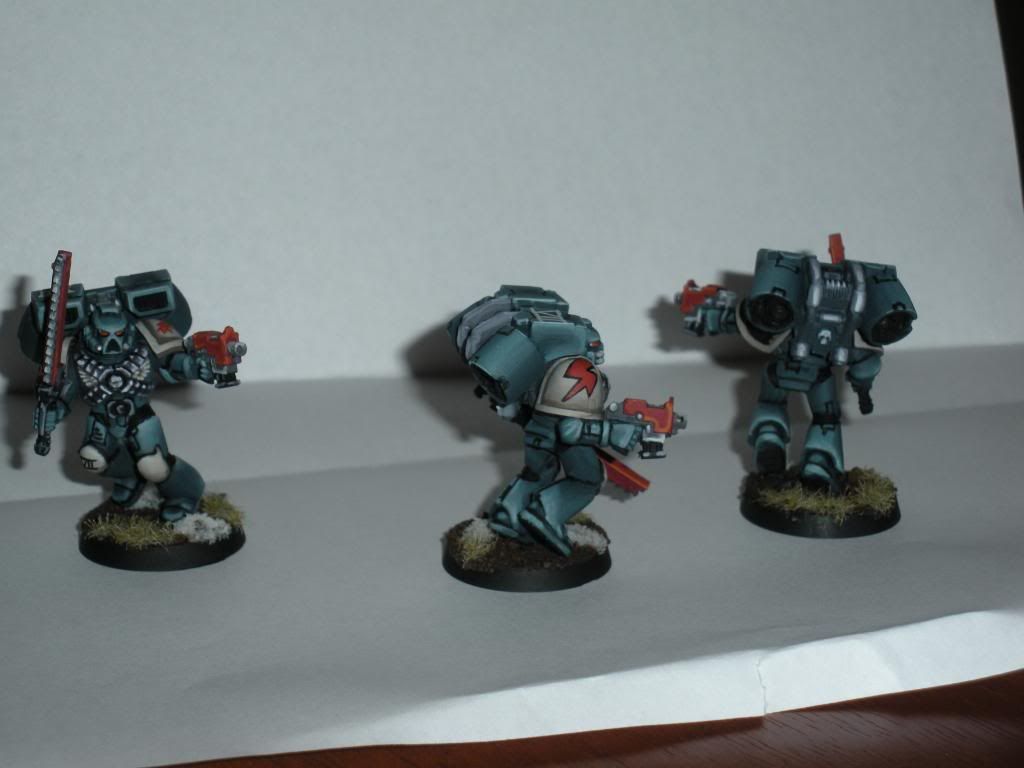
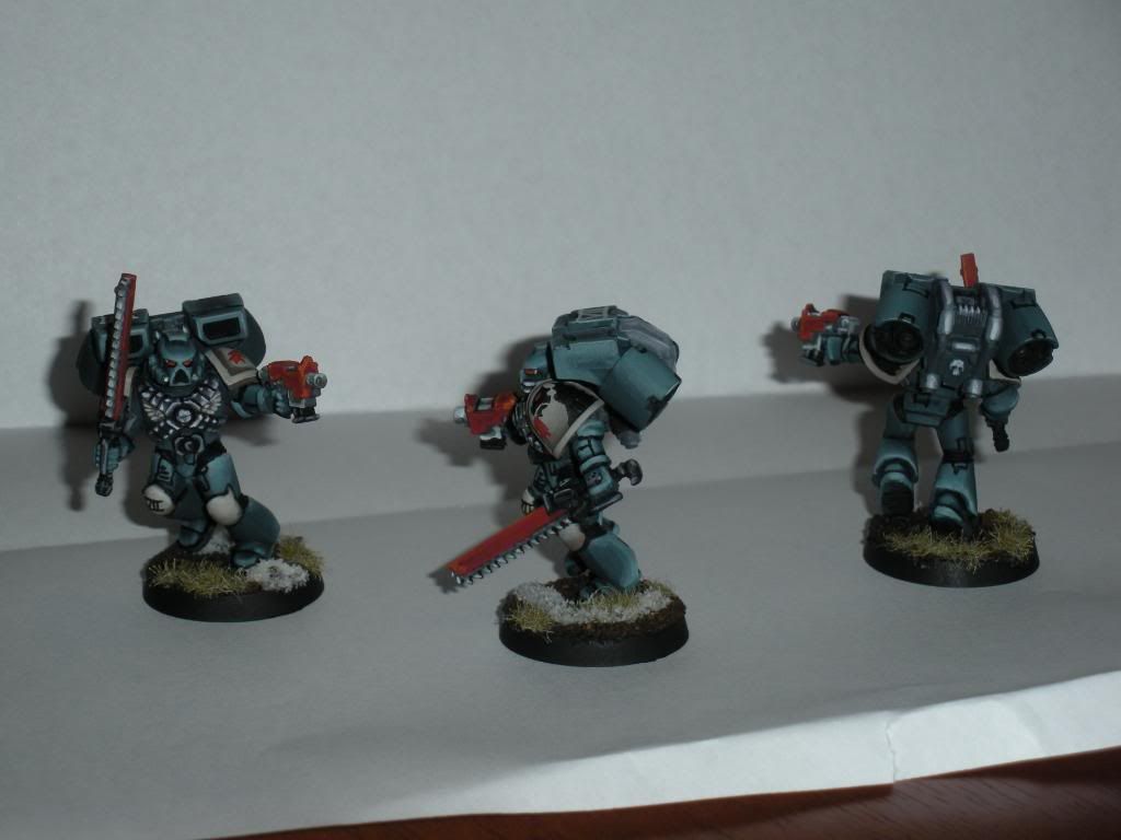
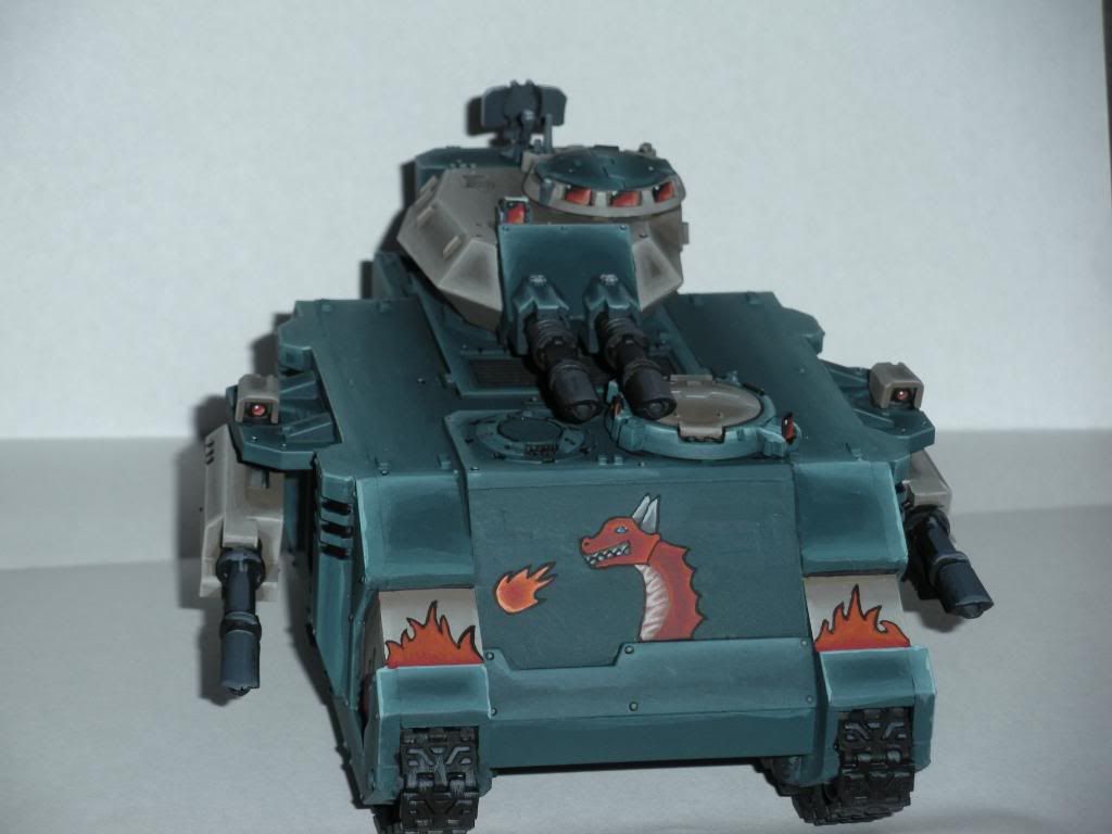
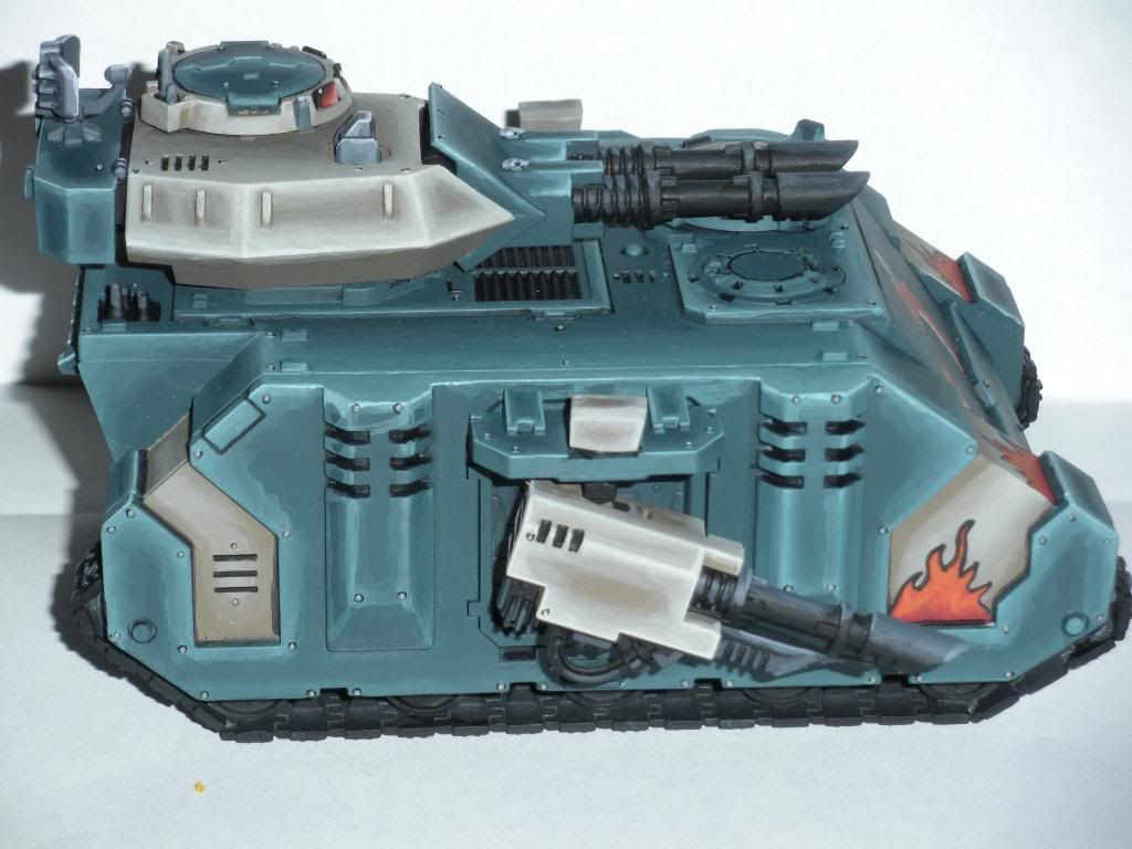
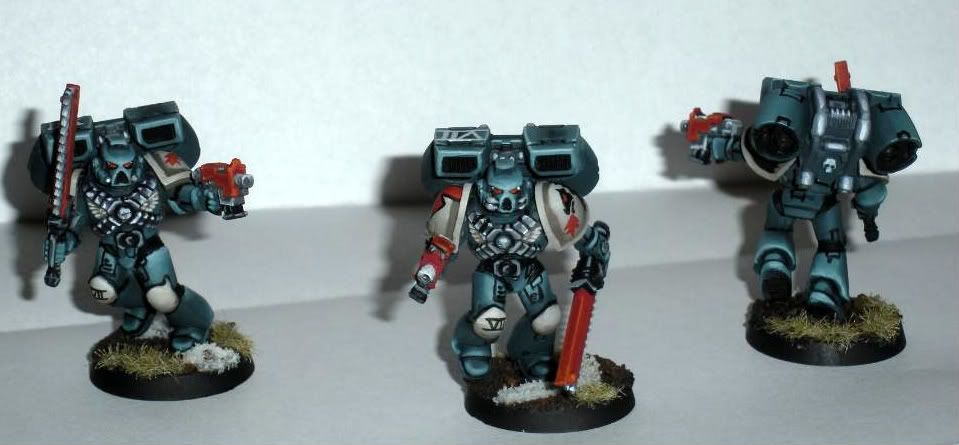
My newest Assault Marines for my army, the Sea Dragons, and their newest heavy weapon a Predator. Let me know what you think and what I can do to improve. Thanks in advance for the help.

frontalassualt.jpg


rsideassualt.jpg


lsassualt.jpg


frontpred.jpg


rspred.jpg
 

cybersquig

Dangerous when wet
nice strong highlighting really make these stand out well on the tabletop (I presume they\'re tabletop rather than display? or at least will be used at some point for gaming). Were I doing this project I would be wary of the red with the aquamarine blue, a warm and a cold colour together with no gradient between them is difficult to swallow. Maybe you could tie the two together on the bases somehow? They could be on a martian landscape (tricky to pull off well), or some other warm marker. As for the freehand, it\'s courageous to give it a go, and the sea monster theme seems to be suited to the marine ethos (not just because of the name!). That said, I\'d look at changing one of two things. Either I\'d give the mural on the front of the predator some depth, or I\'d make him look meaner. the blue eyes and square mouth make him look like a calm and plesant creature who doesn\'t have anything to do with the fireball hanging before him. Maybe yellow eyes, or blue but a different shape, and a downturn in the mouth would work. To link in the fireball I\'d have opened the mouth and extended the stream of the fireball towards it. These are of course entirely personal opinions, you may not want to change these ones now you\'ve worked so hard on them, that\'s more than understandable, but it\'s something to think about in the future maybe?

Love the sharp highlighting, it\'ll make them pop on the tabletop!

Cybersquig
 

Manus

New member
Looks good and have some fine contrating colors. I do miss a little bit of weathering and dirt.
 

Cleezy

New member
A little bit of weathering like manus said would be sweet, make them look more battled and gritty.

I like the sharp highlighting but maybe you could make it a little finer/neater. Because at close range they look a little messy (only on the predator mind)

Nice though from what\'s shown, little more work on the dragon though
 

nels0nmac

New member
I think the blending of the highlighting could be a bit smoother. Some of the transitions are a bit noticeable, especially on the Pred. I like the colour scheme, and personally quite like the contrast of the red with the blue. I second what Cybersquig says about the dragon, it doesn\'t really come across as particulaly fearsome.
The other thing that could be improved is the bases. They come across in the photos as a bit messy, neither one thing or the other with the various coloured bits stuck on. Are the white bits supposed to represent snow?
Those things aside they look good and I bet the whole army looks great on the battlefield.
 

freakinacage

New member
i would personally remove the flames and the dragon.

some of the transitions could be smoother. maybe try a thin wash to tie the layers together?
 

nosirrahkcaz

New member
thanks for the comments and critiques as always there much welcomed and appreciated. This was my first try at any freehand what so every and the first vehicle I had painted so it was quite a learning curve. As far as the marines being super clean, I know they are I kinda like it, but i do agree some dirt and mud would definitely improve the feel of the environment, Im a little tentative to try this as I have never done it before. These indeed are for my table top army and nothing more. I\'ll post more pics as I get more done, which has slowed drastically because of school, and hopefully with everyone\'s ideas here I will continue to improve.
 
Back To Top
Top