Looking for advice on how to advance my painting please

cektopa

New member
Hi, I recently got back into mini painting after many, many years out of the hobby (if you can call the crimes on miniatures that I did when I was 12 painting...) and have been picking up tips from around CMON/ marveling at the awesome paint jobs on here.
Basically, I feel that I have hit a brick wall in my painting, where the minis are not looking any better with each one I do, and was hoping that I could get some C&C from you guys on how I can get them to the next level, as at the moment I am still hitting just tabletop standard.
So as a comparison for you, here is the Lelith model that I finished today, compared with a high elf mage I did about 2 months ago. As far as I can tell, there is no progress in technique.
Any advice is greatly appreciated.

Cektopa
View attachment 6648
View attachment 6647
 
Last edited:

gohkm

New member
Would you mind scaling the pic size up? I'm unable to see anything in the pic resolution you've chosen. The high elf robes seem quite well done, though, and I think you've got some war-paint on Lelith. But that's about all I can make out.
 

gohkm

New member
This resolution is an improvement over the previous one, albeit still a bit tiny - yes, my eyesight is quite shot.

Anyway, from what I can see, Lelith would benefit greatly from a flat-matt spray like Testors Dullcote. She seems very shiny, and while there are certainly situations that call for shininess, perhaps this is not one of them. The edging on her armour plates is very stark - a good thing in terms of photography, for the contrast makes it pop. However, there does not appear to be any highlighting on the turquoise edge, showing it as a single flat band across the armour edge. Taken in conjunction with the flat black of the armour, this makes the paint look sloppy and carelessly applied. Similarly for the skin.

I would suggest that you try further shading and highlighting in order to increase the contrast between the miniature's high points and recesses. For example, rather than painting the armour pure black, try a very dark shade of gray, shaded carefully with a dark brown or dark blue, then further highlighting the turqoise boundary by bringing it all the way up to pure white.

Not an easy thing to do, especially if you're shooting for the subtle colour transitions, but it's quite worth the effort if you make it even only halfway - the contrast really makes the fig pop. Otherwise, you've got a good start.
 

cektopa

New member
Thanks, I will definately try and get some more contrast on my shading/highlights. I get the feeling that Im just not going far enough into the lighter shades of colours on my highlights, as the model in general seems a bit dark. I think I need to thin my paints a bit more as the model gets quite messy in apperance the more i try to do layers, but I guess thats just practice.
Ill give something a bit bigger than Lelith a go, possibly space marine armour and try to push my levels a bit more, and get a few more in.
Thanks again
 

gohkm

New member
Yes, it isn't easy pushing highlights. I think that switching over to a Space Marine would be a mistake, as Marine armour has a lot of flat and curved surfaces, which is a different kettle of fish altogether - albeit the same techniques still apply. Lelith, I reckon, is a good model to start with, since she has a lot of skin, and female skin needs a lot of blending/layering to get it to look good.

If the model appears dark, try priming in white. Admittedly, this seems rather redundant considering that you're doing Lelith's armour in black :).
 

kathrynloch

New member
I have to echo gohkm here but one thing I wanted to suggest is to start a WIP thread and post pics as you go. That way folks can offer critiques on certain elements at a time. It really helps the focus when working on a particular area - say skin for example. You can get exact feedback on that before moving to the robes and so forth. Good job so far tho!
 

GraveRisen

New member
There are 2 gigantic glaring things tat pop right into my head. First off, highlighting. It's not the lack of, nor is it the technique. What I think needs improvement in regards to your highlighting is color choice. Blood red should rarely be used as your final color, and when it is the undertones need to be purely red in most cases, not dark flesh, terracotta, mecharite, etc. I would also work on the color progression on your gold a bit. Also build up MORE levels of color. Your high elf mage is a good example. His hair, cloak, and skin all transition too harshly from black to their current color.

Secondly, thin your paints! A lot! After the basecoat (which should also be thin) your progressing layers should be thin enough that some of the underlying color shows through. Generally melted icecream is a good consistency to look for. I'll often water my paints down to almost a wash when doing certain colors like red or blue.
 

Estragon

New member
Basically, I feel that I have hit a brick wall in my painting, where the minis are not looking any better with each one I do, and was hoping that I could get some C&C from you guys on how I can get them to the next level, as at the moment I am still hitting just tabletop standard.

In any area of life that can be mastered there will be plateaus of development where it seems you make no progress. In my opinion these periods should not be dismissed for the lack of progress is an illusion -- you still are building many valuable skills.

Yes, you must also have correct concepts to work with, like thinning paints and exaggerating contrast, otherwise much of the effort is wasted. But you should not dwell on getting everything right in a short amount of time. Focusing on aspects you enjoy will increase motivation to proceed further with mastery of the hobby.
 

cektopa

New member
Thanks for all of the comments everyone, Im currently flooded at work so not getting much time to paint anything at the moment, but I have a few lined up which I might do a bit of WIP as suggested. I will definately look at my colour choices for highlighting, having a look around the images on this site I can see what you mean. I am still a bit hit and miss with thinning my paints, I tend to either not go far enough, or go far too far and end up with the paint just washing into the crevices, but practice makes perfect!
Estragon, thanks for that, I suppose I get a bit frustrated that I cant see any progress, but you are definately right in what you say.
Time to go pick up my brush I think...
 

TrystanGST

New member
Pushing the highlights can be difficult to get that hang of at first. In person, it looks way overdone, but if you don't push it, then your pics will look flat. All that subtle shading that you see in person tends to get lost on the camera. It's something I learned the hard way.
 

cektopa

New member
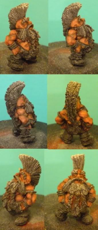
I hunted down the mini I owned with the most skin, to try and take some of the advice on board, and dug out this dwarf/ogre combo. So anyway, I have tried to thin down my paints, and paint on more layers, so here is about layer 4/5, I started with a scorched brown/dark flesh 50/50, then probably a 20/80 mix, dark flesh, dark flesh/ tallarn, and then with a tiny bit of dwarf flesh added. This is probably usually where I would stop with the highlights, but I imagine at the moment I am about half way through the skin on this model. Hopefully it looks a little better, and Im heading in the right directions, but as always, C&C greatly appreciated.
Thanks
Cektopa
dwarfskin1.jpg
 

TrystanGST

New member
Definitely headed in the right direction. I would say you just need a few more layers on the highest surfaces.
 

MightyChad

New member
Definitely headed in the right direction. I would say you just need a few more layers on the highest surfaces.
+1.

Keep going with your highlights, and try to focus on the highest areas. The recesses look very dark, but it is a great effort. Keep it up.
 

cektopa

New member
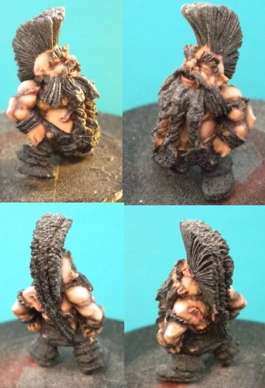
Thanks for the comments I went and highlighted the skin a bit more. I have started a WIP thread here to hopefully keep helping me paint and progress.

Thanks for all of the feedback on here, I really appreciate it!
Here is the second image of the skin, I feel its ok, not sure if it needs anything else. I plan to do some warpaint/tattoos over some of it but not sure if I have a steady enough hand
dwarfskin2.jpg


Cektopa
 

Chern Ann

Only when they're green
Oops, looks like I had thumbnails enabled in the forum by accident. Everything should display at full size now.
 
Back To Top
Top