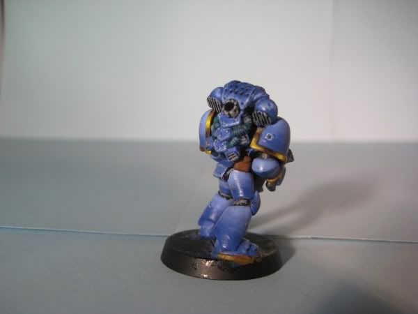
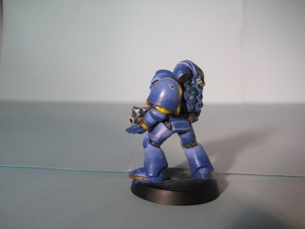
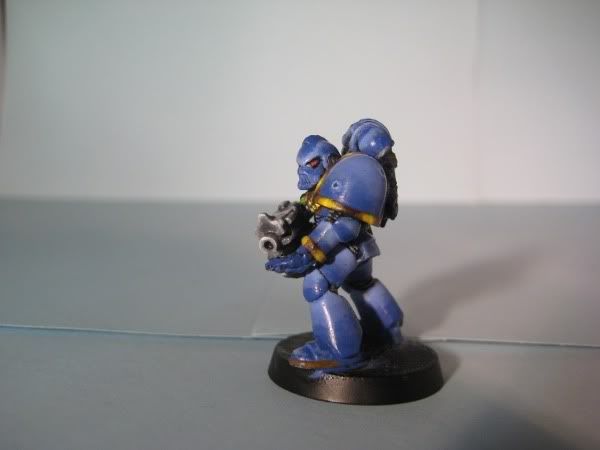
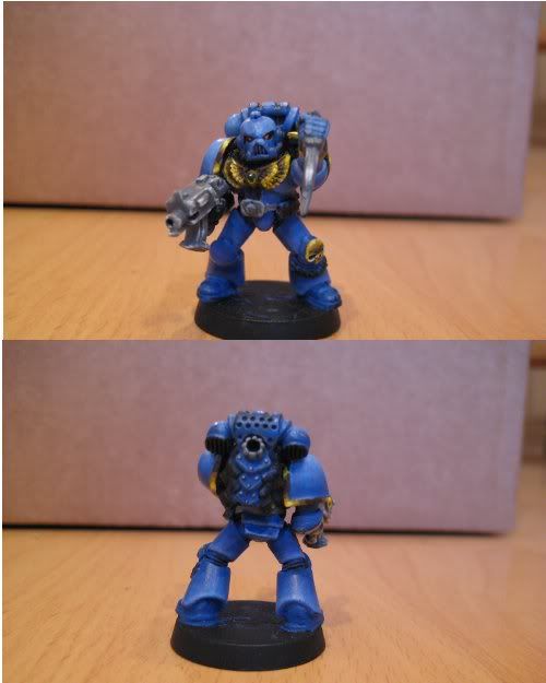
Locutus and Erinna ultramarine army WIP

locutus

New member
Hi fellow mini artist!

Like the tittle says a fellow painting friend and I are beginning to paint a 1500 point ultra marine army.

We would like to paint it to a (very) high tabbletop standard. i have included some pics of the first space marine; 9 more will follow making the first of 8 units.

All help and comments/ suggestions on how to improve would be most welcome.

We would also like to know how you would grade this mini.

The model is not finished yet so i will update this one as soon as its finished.

Thnks for the help on the nmm gold to : Tommie Soule and Stewsayer.
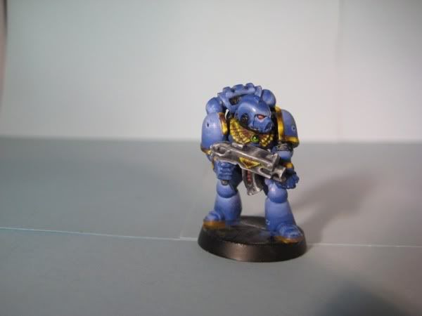
cmon1.jpg


cmon2.jpg


cmon3.jpg


cmon4.jpg
 

cheelfy

New member
That's nice for me but the blending's not perfect so you could improve it. It is too glossy, so I think it should be more matte. A 6 for me.
 

locutus

New member
I think the lamps i used give the glossy effect as for the blending your right it needs improvement.

I'll take some new pics without the lamps and post them.
 
Last edited:

madnos

New member
This is a nice start. However, your highlighting is off and is detracting from the miniature. The highlight color would not just sit at the top of every arm or leg and go completly around perfectly. If you look in the picture you can see the light hitting the mini. The same is true with painting. You want to try to hit where the light will fall on the body. There are some good tutorials on doing this online and on this site.

The color you used to pop out the highlight might be a bit to much. Try using your original color with a 1:1 mix of a lighter blueas an initial highlight color, then slowly start to increase the highlight till you are just using a very small amount of the brighter highlighting color where the light will be hitting with the most effect (top surfaces).

Very nice start though so keep working it and you will have some killer minis to go stomp evil.

Tim
 

khavor

New member
I think the blending looks good. I agree with Madnos. You need to figure out how the light falls on the mini and where the highlights should be. For example, the top of his head is mostly the darker shade of blue. It is the highest point on the mini where the light hits first and should be brightest. The light blue needs to be pulled up so only a tiny line of dark blue is left to separate the top crest from the rest of the helm. Vents on the backpack are also too dark on top, light needs to be on top with dark on bottom as the sphere shape curves around under. Also, anything in a shadow should not be as bright. For example, the top of his leg armor at his waist should not be as bright as the highlight areas because it's shadowed by his arms. You can get an idea of where to put the highlights just by looking at the model from directly overhead (or wherever you want the light to be coming from).

Like Madnos said, you should be able to find some tutorials on highlighting and zenithal lighting that will help a bunch, and I think it will really pay off on your minis.
 

locutus

New member
First of all thanks a lot for all the help were getting, it really makes a difference to have other people look at the mini with different eyes. (sometimes you don't see your own mistakes or how to improve. Strange how that works; don't know if other painters have the same problem??)

I see I have to give a little more explenation; forget when I posted this thread.

We choose to go for zenithal highlighting on the armour going from a base colour ultr mariane blue and highlighting it by adding succesive ammounts of skull white. ( 1e 2 blue/1white 2e 1blue/1white 3e 1blue/2white 4e 1blue/3white)
Also we had a go at nmm silver and gold.


Most tutorials on cmon and other related sites I have seen; were trying to put them into practise now but like a lot of things trial and error seems to be the way.

I'm gonna ask a really noob question now because after 7 yeras of painting I found that most of the techniques i used were either wrong or i used them backwards. Just want to make sure I understand.

Doing the zenithal highlighting i understand that you paint the highlights on the mini as if the ligh source is the same level all away around the model coming from directly above. Shouldn't you then paint the same brightness of blue on all the armour regardless of the position of the armour???
Also isn't zenithal a technique to create the light reflection just as nmm; only with nmm you do try to have a fixed piont were the light is coming from???
Or can the shades of blue be different (creating strong and not so strong shades of dark/light) using zenithal.
Did a model some time ago were the cc I got was that not all the dark colours were of the same level and this should not be the case when doing zenithal.

Again thanks for the help.

ps: how would you grade this mini??
 

obsidianpainting

New member
The idea of zenithal lighting is that the light source is above the mini.

the point that Madnos makes is that you painted each leg and armour plate as though the light was above each armour plate. However.. if you take into consideration the things blocking out light, and shadows and stuff like that. The colour around the WHOLE armour plate would not be the same at the top.

for instance. On the Legs, the light would actually collect near the bottom of the leg, as the arms and shoulder pads are blocking out the light that would the upper part of the leg. Same for the Kneepads.

As mentioned above, if you take a look at how the "gloss" reflects the light, you can see where the ACTUAL highlights would be. (i.e. zenithal lighting)

Hope this helps cheers!
 

locutus

New member
aaaah so in addition to the colours being darker in these areas; the way light reflects is also different. (going from lighter to darker shades of blue opposite from what i,ve been doing now)
Yes, this helps a lot.
I'll go to work on the mini as posted above and trie to do the following: beter blending the colours, taking darker colours blue for the areas that are in the shade; reverse the way how light reflects in these shaded areas.
Does this seem about right or is there more i should focus on??
Again thanks for all the help guys!!!!!
 

cleen X

New member
You should basically paint so that it will be realistic. Which means that the mini will cast shadows unto itself. Also, keep in mind that the feet and bottom part will have light but not in the same intensity as the top! The strength of the light gets less the further down the mini you travel!
 

locutus

New member
just an update

as said before a good friend and miniature artist and I are going to paint an ultra marine army of about 1500/2000 pionts.
We're planning on doing about 8 or 9 units; of which the first 2 will be a (taktical) squad of 10 marines each.
We got a hold of some old marines (1992) and really want to do these models justice.
The first models of the first squad are nearing completion, and we will post additional pics. under this WIP ones there finished.
I've been working on a model that includes all the feedback we got so far (see above) but really like some additional cc on it when i post it. (hoping somewhere next week)

Please feel free to comment on our work; all usefull tips will help us a lot!!

ps: we would like to know how you would grade this (these) mini('s).
 
Last edited:

locutus

New member
eventhough the first squad is still work in progress i wanted to share another one of the members to see if we got the zenithal right. (see comments above)
Still working on the blend but all help/comments are welcome.
ps: still like to hear how people would rate this.

ultra1.jpg
 

Stewsayer

New member
Hi Locutus,

I'd rate the one at the top 4.5 - 5.
The one at the bottom is close to a 6 for me.

Your blending and highlight and shadow placement has improved a lot between the two. Keep working on the blends guys, for me smoother blends (still) would improve the score I would award. The NMM gold is looking effective. Smoother blends would improve ite more. I also think that you have a little too much of the darkest colour in the mix and could improve the look of it by reducing the darkst tone a bit and having a little more mid tone in there. Having said that I wish my NMM would start looking that good, I'll see how it goes on the slayer I'w working on.
 
Back To Top
Top