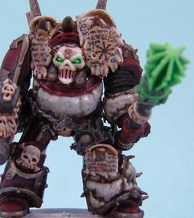
Lightsourcing WIP feedback/tips plz

ManillaRoad

New member
Hi,

I started painting again recently after a 2 year hiatus. Been painting for over 15 year but never really advanced more than tabletop+ quality. Now with all the great stuff on CMON it has given me so much inspiration to go further than that and push myself hard on improving.

Anyways, I decided to have my first go at source lighting today on an old unfinished mini from before my painting hiatus, hehe (I screwed up with the GW undercoat spray as can be seen on the shoulderpad :() and I find it pretty hard. Maybe because the light reflecting surfaces are mainly red -I don\'t know- but I can use some tips/feedback on how to proceed from this point. Please have a look at the pictures below. I hope I made a decent start with my attempt. I\'m kinda stuck on the backside of the lower leg.


cmon-ls1.jpg

cmon-ls2.jpg

cmon-ls3.jpg


Please be critical! This is just the first two shades for the light reflections. The sword could also use some reworking maybe (to make it even more \"illuminating\"). Any tips on that are VERY much appreciated as well.

BTW: I\'m using both Vallejo and GW paints thinned with lots of water. The Vallejo seem to dry up pretty chalky which also make it hard to get a realistic effect.

Thanks a dozen in advance!!!
 

DrEvilmonki

New member
Alright I am going to give some advice but remember when reading it that I have not done this yet so all my ideas may well be wrong!:)

I would make the sword lighter to make it look more \"glowy\". The transition from read to green look way to harsh. Perhaps if you made a really thin wash of your green and tried layering it onto the edge of the transition from red to green. The only other advice that I could think of is make sure the brightest point on your reflected light isn\'t brighter than the original source.
 

quadrille

New member
I\'d say that if the sword is supposed to look like it\'s glowing the brightest highlight should not be at the tip but somewhere near the center (I don\'t know how it would look if you actually shaded the edges instead of hichlighting them, but it kinda makes more sense). Also, the right leg looks stangely unaffected by the light.

darth_sabre_262908.jpg


Btw this site has some decent (though exaggerated) lighting effects:

http://www.miniaturespace.net/illumination_gallery.htm
 

ManillaRoad

New member
Originally posted by quadrille
I\'d say that if the sword is supposed to look like it\'s glowing the brightest highlight should not be at the tip but somewhere near the center (I don\'t know how it would look if you actually shaded the edges instead of hichlighting them, but it kinda makes more sense).

Thanks! That\'s exactly what I needed. I figured something was not quite right with the sword but I couldn\'t put my finger on what... I\'m redoing the sword that way.

Also, the right leg looks stangely unaffected by the light.
Yes, I noticed it myself when taking the pictures. I will do it with the new approach that DrEvilMonki suggested.

@DrEvilMonki :
I guess the green light on red armour is harder to pull off than I thought but I will make the green reflections a lot more subdued. In hindsight I think green light on red armour does asctually not look green but very darkish/black. So I will re-paint with red and start over this time with almost transparant green washes.

I will post more pics tomorrow when I\'ve reworked the mini, if anybody\'s interested in following this along.
 

Einion

New member
Okay, two things immediately come to mind. The colour you\'re using is greenish (nearly a complement to red) so it will tend to mix greyish/dull colours when you blend them, which may be problem straight off. Next, the colour is already fairly dull - as a rule for suggesting light like this you want to use something as chromatic (brilliant) as possible.

Now what you\'ve done already is okay and we can see you\'ve put some thought into the direction of the light, it needs a few more subtle transitions mostly.

There is one obvious flaw in the lighting: the lit portion of the bottom-left limb of the X on his chest is lit incorrectly - the light is coming from below, not above. Also, judging from the photos it\'s possible this area might actually not be lit by the sword much but rather be in shadow from the grenades (?) on his belt.

This is a tricky thing to light this way anyway because of the size of the sword. I\'d much prefer to practice OSL using something where the lightsource is more confined: a torch, or the tip of a sword only.

Einion
 

Shawn R. L.

New member
Paint the sword pure white. This will be almost the only place on your mini where there will be white. lightly drybrush the edges of the sword with a pthalo green mixed with white. Keep the top 1/3 of the sword white and then very evenly fade it to a green toward the hilt. Dont have this be a dark green. For the sword, have the green be a bright somewhat \'candy\' green.

Add a bit more green to the mix and highlight the gun and the parts that are black. The further away you get from the sword the darker and duller the green should get. Dull it by adding just a speck of black. Blending between these shift\'s in color/hue/tone is crucial.

The red is a bit of a trick. As Einion said, the red green mix can come up rather yuckey (technical term). Going from the light area to the dark area I MIGHT simply ignore that the light is green and do the lightsourcing as though the light were white or blue. White, the color would just go from red to purple or reddish brown into a dark, red/grey. Blue light I would go from a magenta to violet to dark grey/red.

This a mabey. If you are going to ignore the green you might (or might not) still be able to get away with keeping the green cast glow on the gun and black parts.

The more I think about it though I think it would be more pleasing and easier if you did the sword in the green and did the rest of the mini as though the light were blue. You just wont end up with such yuck-o color mixtures.

As a final touch put some white dot\'s where there would be a \'gleam/glint\', as you would do with a gem. You just have to guess where it would be in relation where the light is comming from.

Post WIP\'s

Realise this also, this is a tough thing your trying to do so be patient.
 

Tinweasel

New member
I\'m fairly new to painting object light sourcing, but I\'d personally say that the areas you\'ve painted as being \"affected\" by the light from the blade aren\'t nearly large or strong enough.

What I did with my own figure that I \"lit up\" was to pick a radius of distance for the \"light\" from my lit objects. Anything within that area will be affected somehow, and anything outside the area will remain its own natural color.

As folks already mentioned, it\'s probably a safe bet to make sure that the object giving off light is the brightest/purest color on the figure, in order for the effect to look reasonably good.

The way I approached lighting up my figure when painting, given all of the above, was pretty simple - I held it looking from the direction of the \"light source\" in question; anything visible from that vantage point needed to be lightened in some way with a hint of the light\'s color, anything not visible was simply ignored.

Another thing I did personally (and I don\'t really know how others approach it) is that I shaded and highlighted my figure as normal prior to doing the lighting effect, and the actual painted-on lit effect was done with glazes - the color of the light was added to wherever I needed it, but the \"ambient\" lighting was left untouched (i.e. the glaze was translucent.) If, on the other hand, I was going for an effect where it was an ultra-bright light so as to actually cause shadows, then I would\'ve gone and done the reverse and used glazes to darken the appropriate sections somewhat.

The biggest thing in my mind, really, is that you have to approach the entire figure consistently using lines of sight to and from your lit objects, and the lit objects become the center of focus for painting, in precedence over the rest of the figure.

My example pic:

lighting_effects1.jpg


And again, I\'m fairly new to object light sourcing, so maybe take my advice with a grain of salt - I\'d like to think I painted an effective result, though, and these are/were the things I kept in mind going into it.
 

Shawn R. L.

New member
One overall principal with OSL is that in order for the light source to look lit EVERYTHING else must be darker than the light source itself. If not it can look like the light source is not emitting light but spray paint.

WIP\'s WIP\'s WIP\'s!!!!!!
 

Roddo

New member
One idea is to get a dark room and as small a light as you can find and actually see what areas are lit by using the light in the dark. Even better if you can find a light the same color as your light source. You might want to find a color other than green also for your sword, a nice blue or yellow will give a better shadow color.
 

ManillaRoad

New member
Okay, I\'ve re-done the sword. It was hard and I had to start over twice but the end result is much more realistic (thanks, Shawn RL). The paint got a little chalky in the end due to the many layers and starting over even though I did almost transluscent washes.
Anyways, as a basis to start from this is much easier to do the reflections because it looks more real now (the sword). I will start working on the reflections after dinner and post further WIP\'s tonight.

Here\'s the current status (on the actual model you can see a bit more gradual colours in the sword) :


cmon-ls4.jpg

cmon-ls5.jpg

cmon-ls6.jpg
 

Shawn R. L.

New member
Yeessssssss. The sword is now glowing.

You might try, instead of highlighting the red, deepening the shadow side of the red. Remember that the amount of difference between the light side and the dark side (I\'m your father Luke) is what will give the lit object more or less brightness.
 

ManillaRoad

New member
Ok, I repainted all the red and left it untouched for the moment. I concentrated on the bolter/grenades and the black armour. I think it starts looking better now, the effect is more subtle. Too bad I\'m not too proficient at making pics that do justice to the mini.

cmon-ls7.jpg
 
Back To Top
Top