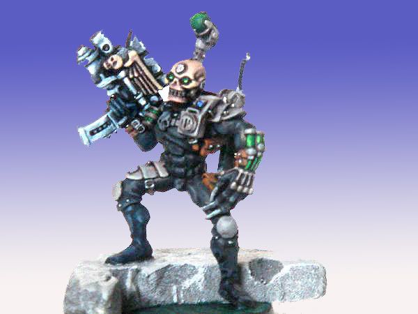
improvement? have a look!

calcipher

New member
I just posted my test mini for the things I have learned in the past few days by reading the forums and listening to advice. Its my third post and Ive \"tried\" NMM and using a wet pallette. Photography is still bad...does everyone use a light cube?
http://www.coolminiornot.com/118898
Thanks
Calcipher
 

Infidel Castro

New member
Well I think it\'s a damn good job, squire. I like the work on the gun. A lttle more highlighting on the extremities of the weapon might swing it further for me, but then again the dark aspect of the figure keeps the gun in perspective. Nice.
 

calcipher

New member
thanks reverend!
is this a better picture?
http://www.coolminiornot.com/118900
which picture is better to keep in the gallery do you think?
Calcipher
 

Infidel Castro

New member
Which one is closer to the original? I like the first one because of the atmosphere the photo creates, but the second one allows us to see more. Not always a good thing mind, because people will pick up on certain faults. Still, it looks good. I\'d say stick with the darker aspect :D
 

airhead

Coffin Dodger / Keymaster
The second one has better lighting, but one of them needs the color adjusted in a major way.

Are you using actual backgrounds or are those p-shoped in? If they are actual, I recommend a darker background. It looks like your camera is averaging the entire area and the light background is causing it to underexpose the mini. (Kinda like someone standing in front of a well lit window - you get a nice siloette.)

Yes, I have used a light cube for a while. My first was similar to the link in my sig. I made it from a window sheer and some scrap. Now, I use one of those collapsible fancy ones that I got on ebay for about twenty bucks - watch shipping and don\'t get wrapped up, more will come out.
 

calcipher

New member
The background is p-shopped. Actually I have no lighting setup at all....just a shelf and the main light in my living room. Not even a lamp!!! I really want to get things set up properly in the near future with 2xlamps and light cube. Ill probably follow your original setup and make one myself to begin with.
@reverend....to be honest the real thing is better than either of those two photos in my opinion..I just cant seem to get it right yet. In my first post (ultra marines) I thimk the camera did me a favour, but this time its detrimental
 

Ogrebane

New member
Theres definitely some good stuff going on there. The NMM is very good. A few bits need some more blending work but overall a very good mini. Somewhere in the 7 - 8 range. Did the vote thing.
 

DrEvilmonki

New member
How does this pic look?
redone.jpg


Thats your original pic put through photshop. You don\'t strictly need a cube but a lamp will improve your photos heaps.
Have you checked out the photography forum.
This thread will improve things for you.
 

calcipher

New member
Thankyou Doctor.
I will read through the photography thread again.....Lighting and focus are both off right?
Thankyou for your help and the pic!
 
M

Marmoset

Guest
Good work calcipher, very nice NMM and cool blending in the colour scheme. For my photos (best example here ) I use natural light and a pale background, with the flash turned off. Natural light (except if you have a light cube) displays the true colours more effectively, and a white windowsill is an unobtrusive background. For someone like me, a 13-year-old who has never used photoshop, it works a treat :innocent:

happy painting :flip:

~Bill
 
Back To Top
Top