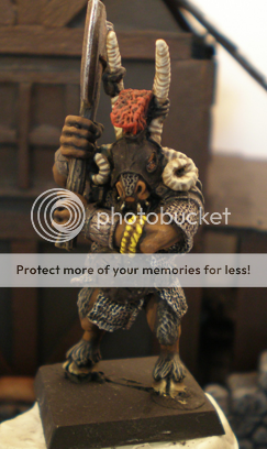
I'd like some C&C on my work

Ordo Septenarius

New member
Hey all,

I have posted a few of my works on the site. There is really a lot of good advice here on the forums, but I was wondering if you could kindly take a look at some of my work and critique what I have done?

My blog is here:

http://mordheimpdx.blogspot.com/

If you have the time, and could pick a few of the works to add some C&C to, that'd be great. There are notes, where relevant, under the works.

My style has been described as "Old School;" I stared painting 1987 and did most of my painting in middle and high school. I started again in 2000 in Japan, and took an 8 year sabbatical, and have been painting a lot recently. One thing to note is that I rarely use washes, because I see them misused so much.

Thanks again.

Ordo
 

supervike

Super Moderator
I can understand the 'Old School' description. But, I'm wondering if that also has something to do with your mini choices as well. They seem very 'old School'.

You are a very solid painter. Good color selection, and a nice 'natural' pallette.

Not sure what to make of your comment about washes. How do you feel they are misused?
 

Ordo Septenarius

New member
Not sure what to make of your comment about washes. How do you feel they are misused?

All-too-often, it seems as if it is used as the end-all to shading/highlighting. I'd like to employ them more, but right now, generally use the only to soften out the gradation in highlights; a prime example of this would be on the chaos hound, where I felt the highlights in the flesh were "popping" too much, and in order to mute them a bit, I used to some Devlan Mud. However, I never use it as a shading implement in itself. I always start dark and work up.

Anyway, thanks for the comments, and looking forward to hearing others' thoughts, too.

Ordo
 

TrystanGST

New member
Definitely solid tabletop+. Colors are where they should be, and blending is nice and consistent. Maybe a little more contrast between lowlights and highlights.

As for washes, I know what you mean. the number of grey knights popping up with tide marks lately is frightening.
BUT - used properly, they can make a huge difference.
 

Kretcher

New member
Well you could try to start with a basecoat that is more light and shade down towards the shadow, also to se some result of "washes" or rather glazes and how to use them for shadows you can look into this WIP, not to many practicall advices there but a good pictures to se the result. http://www.coolminiornot.com/forums/showthread.php?37611-SkelettetS-wip/page19

I myself prefear to make the base coat and use 40 % to highligth and 60% for shadows. Mainly becuse i find it difficult just to use highlight from a dark basecoat and get a to "grainy" result in the highlights. that said there is a lot of diffrent techniques out there and I suggest that you test one or two from time to time to challenge yourself to become better. I myself have a long way still to go until I will reach a figure that rates 8 on this site :) but someday perhaps.

As mentioned by vike above you have a stable hand and good eye for colours, just look around in this and other forums and try some new tecniques and experiment and you will surly improve fast on your already good painting skills.
 
Last edited:

Ordo Septenarius

New member
Thanks for the advice, and the link — SkellettS stuff is sure amazing, and I think I wash-only project like that would be fun. I'll have to try it sometime!
 

Ordo Septenarius

New member
I updated the blog with some more items. Currently, I am working on a Beastman Warband for Mordheim. Here are some samples, and the rest are on the blog:

Picture17.png

Picture18.png

I think I will redo the skin, and I definitely redo the horns. Later, I will do the leather straps on the arms and then the staff. I like the horns of my leader, below:

Picture14.png


And some Gors:
Picture4.png

Picture5.png


There is still a lot to do, as you can see.
 

10 ball

New member
Some really good layer work. As for washes they can be used to great effect to blend the contrast between shadows / highlights.
 
Back To Top
Top