Howdy. I've been away for a while with real life and such.
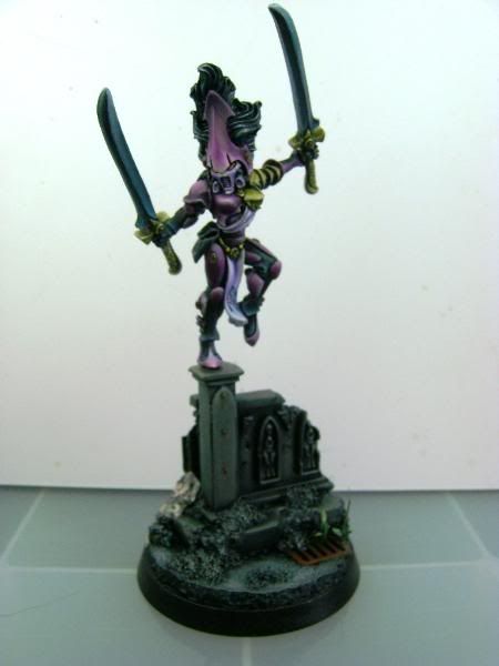
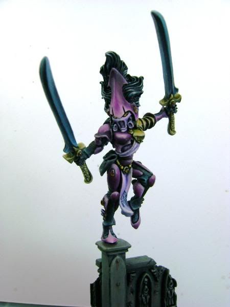
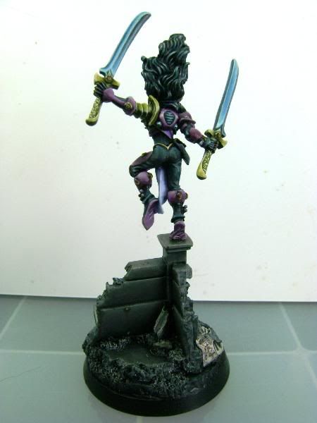
I am posting a figure I did a few years ago, sadly I have not done much of anything since, but am looking to get my muse back and do some serious painting.
I would very much appreciate some feedback and critques of this model.
I entered it in the 2008 LA Golden demon, the last serious contest I entered. It was among the final 5 or 6 for demon contention, but it has a flaw so it was eliminated from contention. I was glad the judges talked to me about and pointed out my error, which is the foot has a small gap between it and the top of the column it stands on. Its very slight, and I didn't even notice it until they pointed it out. FWIW, only one of the judges caught it, so its a very tiny gap, but it is enough.
http://www.coolminiornot.com/287027


Last edited:

