GTTechnics
New member
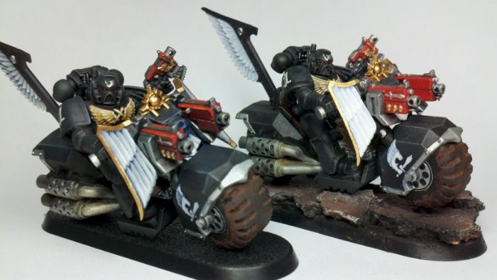
Hey everyone. Since there is no introduction sub-forum on here I figured that this was as good a place as any to introduce myself and hopefully get some constructive criticism on my painting and advice on how to better myself. I just restarted painting around January of this year. Prior to that, I hadn't painted anything for about 15 years, and when I did it was with cheap brushes and paint from the pot. This time around I used the internet as a guide and tried to do it right. That being said, I've been primarily watching Youtube tutorials for technique (Les Bursley and buypainted primarily). While I think I have a pretty good handle on their lessons for tabletop standard, a recent painting competition has inspired me to step up my game. A lot of what I've achieved has been done with airbrushing and oil washes, but I really think I have to get glazing down to get to the next level. View attachment 22860View attachment 22861View attachment 22862View attachment 22863View attachment 22864View attachment 22865View attachment 22866View attachment 22867View attachment 22868View attachment 22869View attachment 22870


