Flames and how I suck.

Dribble Joy

New member
I started a Salamander army a while ago and have been dreading doing the flame motifs.

The FW terminator shoulder pads are easy because the flames are moulded, but I am having issues with freehanded stuff.

Today I quickly did a tactical squad (about an hour for ten), the 5 better ones seen here.
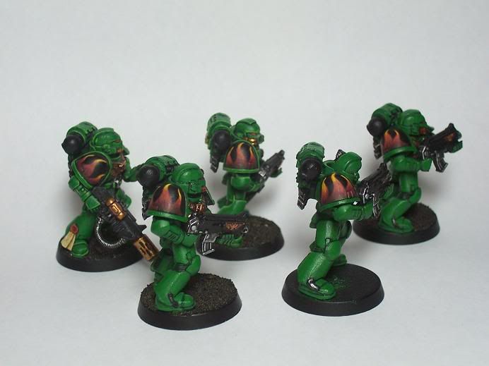
Picture186.jpg


Scorched Brown - Scab Red - Mechrite Red - Macharius Solar Orange - Bad Moon Yellow.

Any CC on technique, design and overall effect would be awesome.
 

L.E.J.

New member
hi - the job looks very nice to me but seeing as you asked, maybe more yellow along all the edges of the flames as opposed to just the tops, IMHO.

seem to be seeing more salamanders recently so maybe check a few of those on the gallery too?
 

demonherald

New member
personally I prefer my flames the \"right way round.... inverted commas because from a lot of GW artwork and paintwork this is the right way round . for mit is the lighter colour towards the bottom where the flame is hotter and darker towards the top ......

colours wise I find starting with scab red first adding blood red then flaming orange the golden yelow (I hatebad moon for some reason) and finally a little bleached bone at the brightest parts works for me for this kind of flame....

other than that though these are nicely done..
 

AllTerrainMonkey

New member
The design of the flames is good, but you have the colors reversed. The hotter part of a flame is brighter and towards the fuel source, so the bottom parts of the flames should be yellow/white changing to red at the tips. I think if you kept the same outline but swapped the colors around the result would look much better :D. [Edit: looks like Demonherald got to it before I did!]
 

Sukigod

New member
I\'m not sure if using hte Foundation paints are really good either as they are quite a bit thicker (even when thinned) than the regular paints. I would think the blend would suffer. I would also second demoneralds color progression, I use this a lot with my ork army which is very red based.

God luck!
 

hestan101

New member
i think your stuff is awesome, and that you need to stop doing yourself down. saw you capatin, how did you do the green armour on him?
 

Shawn R. L.

New member
The actual brushwork is fine. To me, it\'s the tone and the colors that don\'t work.....and that\'s not too far off anyway. Were this mine, I\'d lighten them up a bit and saturate the colors a bit more. Plus, to me, they are a bit fat.

Scott%20Pickens%20Flame%20custom%20Special%20-%20crop.jpg
 
Back To Top
Top