Eldar Falcon

steph

New member
Hey everyone!
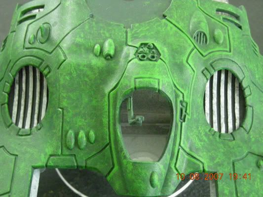
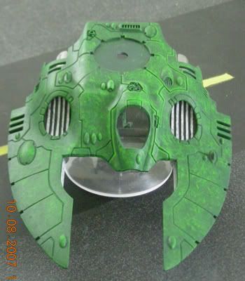
I\'m new here to posting but I\'ve been lurking for awhile. I thought I\'d come out of hiding and post some of my own stuff. So, without further ado....an eldar falcon in Biel Tan camo-ish color scheme.

I\'ve been working on the highlighting on the edges, I think it\'s going to look okay. My biggest thing was on the bottom piece. I\'ve repainted that thing 3 times before just doing the speckle out of frustration. For the fire prism I plan on doing, I want to do a smooth bottom, but I want it to be more like what you see on the boxes...with the moderate shading in there. Does anyone have any hints on how to do that without it looking messy and like the shading doesn\'t belong there?
Picture012.jpg


Picture005.jpg


Picture010.jpg


Thanks. :)
 

Larre

New member
I\'m kinda cloven at this point... I think this can become something good looking for tabletop standard, but I\'m not a big fan of the lighter green \"dotting or drybrushing\" over the mini, and I think you should puch the extreme highlights a bit further so it doesn\'t blend with the light parts of the falcon.

// Larre
 

Avelorn

Sven Jonsson
Nice! but I think it looks slightly more like the beginning of a marble effect rather then camouflage. And if you could pull that off it\'d be rather cool! :) I think you shouldn\'t use the same colour for highlight as you do when doing an effect like this. In this case for example you could have used a less saturated highlight, meaning more white. For example the dark green + bleached bone or even white.

As for your question I\'m not entirely sure what you\'re after. But if you go in a normal eavy metal way and make the innermost parts darker and parts sticking out lighter with some edging I think it\'ll probably look good. What was the problem while painting it?
 

Ekkanus

New member
looks good, i like the stippling effect. perhaps a lighter colour for highlights though so it picks each plate apart?
 

steph

New member
I plan to just use it as a tabletop piece.

I just wasn\'t sure about the highlights. I thought it might be nice to have them be not so bold--when you\'re looking at it in person some of the the highlights blend in with the \"camo\" stippling and some parts actually jump out at you as highlights depending on how you hold it. Maybe I\'ll try a little brighter color; I think you guys are right about it being just a little too close to the others.

Also, should I add some darker green in the recesses between the plates?

As for the bottom, I\'ll probably end up trying to do a wash or something to build up a little bit of shadow in the recesses. It bothers me that is has no variation...overall, just not the stippling itself.

Before, I tried going over the whole thing with astronomicon grey so the shadows weren\'t too dark, then add white to make gradiation, and it just wasn\'t working out. I\'ll probably try it again soon and see if I just got frustrated and quit too early. I also tried washing but that didn\'t do what I wanted like I thought it would, so scrapped that idea. Finally, I just went back and thought it might look okay stippled...and it does for the most part, it just needs some shading to make it pop a little more.
 

Ekkanus

New member
Have you tried Fenris Grey (i think that\'s what it\'s called anyways) for the shadows or would that be too dark?
 
A

Antnol

Guest
Personally I would darken in between the plates a little and bring up the highlights a little more as well. Looks really good so far though and good luck with the bottom. Good to see you are finally working on the Falcon ;)
 

JesterzUSMC

Recovering Megalomaniac
RE: Stipling

IMO:

Stipling seems to work best with at least 3 shades of color. Or 3 complimentary colors (green, brown, gray).
I have two Beil-tann vehicles that I\'ve been wip\'ing...heh,heh...:duh:...for awhile now. (in fact maybe I should post a w.i.p. of my own so you jokers can chew me into working....LOL)
But I usually start with a dark base color and use a few lighter tones, and then add a stage of (either/or/both) shading with ink/wash or a stipling of the base color again. :p
 
Back To Top
Top