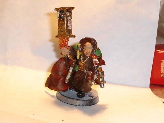
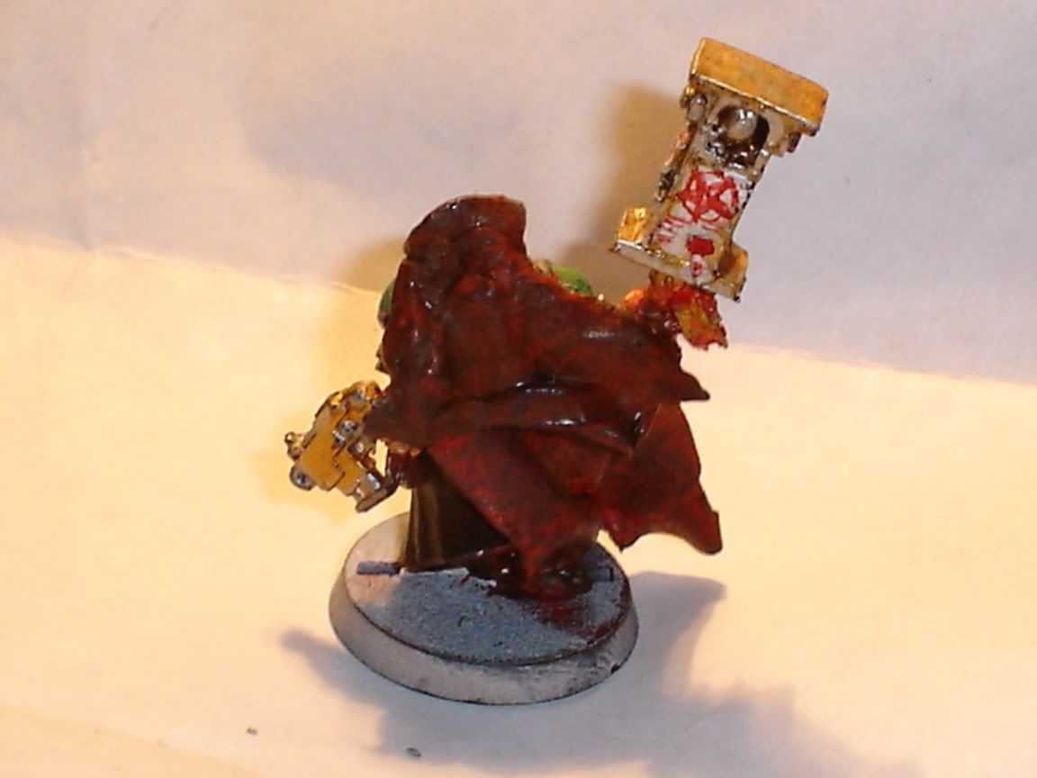
looks more or less like you splashed ink everywhere and didnt really plan your brush strokes and paint placement
on future models i suggets planning where the colours/highlights/shades etc goes
and when using ink thin it down and dont let it pool, this will eliminate the shiny effect that looks awful
as mentioned thin your paints, but this goes side by side with making sure the paint covers the area intended and nothign shows through(i think the face is a good example)
if you want to do outlining try not to do the ENTIRE edge the same shade, and when doing outlining make sure the lines are relatively the same width or it looks bad
hope this helps
Starks


