Dormant Angels (Another W.I.P Project)

Ekkanus

New member
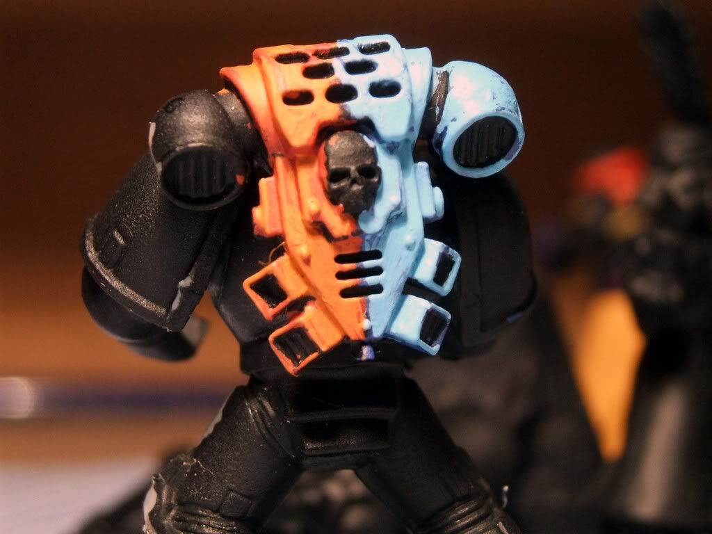
Hey guys, i was looking through my collection of models and came across some loyalist Space Marines, so decided to have a crack at making up my own chapter.
This is the colour scheme i\'ve came up with so far, its a half colour scheme.
I don\'t think i\'m a really good painter, but would like to get some advice from you guys.

DormantAngels.jpg
 

mud duck

New member
dormant angels? going with heraldry definition I\'m guessing.

Codex based chapter or one of those \'others\'?
Whats the chaper symbol going to look like/ be?

Thin the paint and paint the blue first.
 

DaN

New member
stray hair alert!

You might use masking tape on something bigger, but I dunno if it\'d be any use on marines... Not done a halved or quartered scheme before, so ...

Good luck and keep posting progress :)
 

Ekkanus

New member
@mud duck: Not sure about heraldry or anything like that as i haven\'t meddled with my own chapter of Space Marines yet. As for Chapter Symbol/Badge, i\'ve not worked on anything just yet, trying to get the colour scheme sorted first.

@DaN: Thanks Mate and i didn\'t notice the stray hair till i saw the pic! lol

I\'m not too keen on the light blue so i\'m going to try changing it to a light grey (sort of like a Space Wolves colour). I\'ll try it out anyway and post up more pics, plus get more of the orange coloured armour done.
 

nosirrahkcaz

New member
when I first started spliting colors on the marines I found it was easier to take a black line through the object to divide the colors, hope that helps
 

Ekkanus

New member
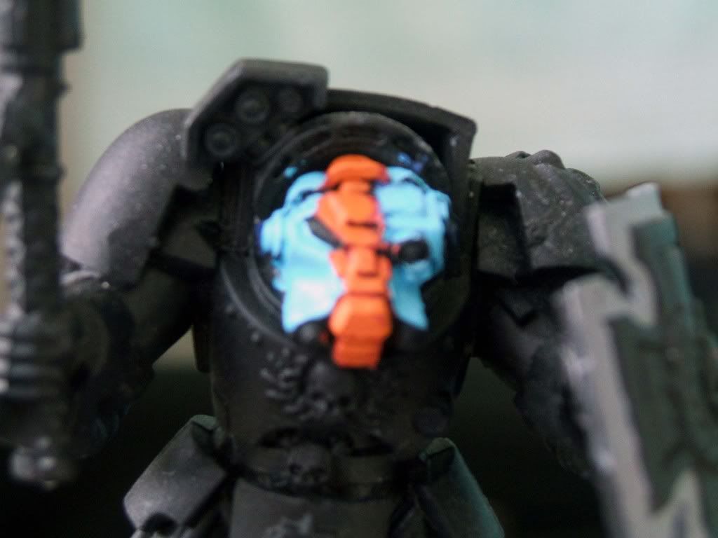
Hey Guys, not had much time to get any painting done but decided to mess about with a little colouring for my Termies. It\'ll be the same colours as above, but the helms will be variated, between the Command, Terminator, Assault and Devastator units. Sorry for the blurry pic, and i haven\'t quite finished it yet, i still need to do some more highlighting on both the orange and blue parts. Any C&C would be greatly appreciated.


DormantAngelsTerminator.jpg
 

Quareni

New member
The contrast between the two colours is okay to me, but it seems like the orange line on the termie is assymetrical - is that on purpose? I would think it would be better if it was in the middle.
What colour are you going to use for the eyes?
 

Cleezy

New member
I like the two chosen colours tbh, it reminds me of the gulf colourway for the original ford gt40 race car.

Agree though the termie would look better if the line was down the middle
 

Ekkanus

New member
Hey guys, thanks for the replies, i\'ll redo the orange bit so its kind of right in the middle. Not entirely sure what colour to do the eyes, any suggestions?
 
Back To Top
Top