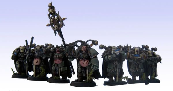
Death Guard Army

Demon Hunter

New member
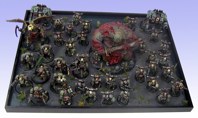
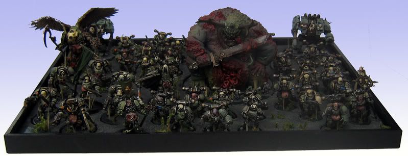
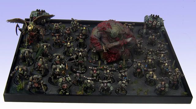
Finally finished my Death Guard army, worked on it on and of for 3 years but it\'s done: Please vote&comment;)

http://www.coolminiornot.com/206497

http://www.coolminiornot.com/206498

And some bigger photo\'s:

Army Shots
DeathGuardArmy1.jpg


DeathGuardArmy2.jpg


DeathGuardArmy3.jpg


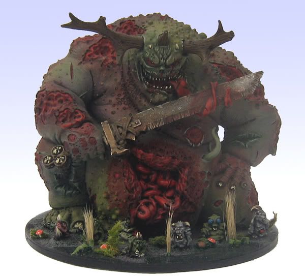
Great Unclean One

DeathGuardGUOFinal.jpg


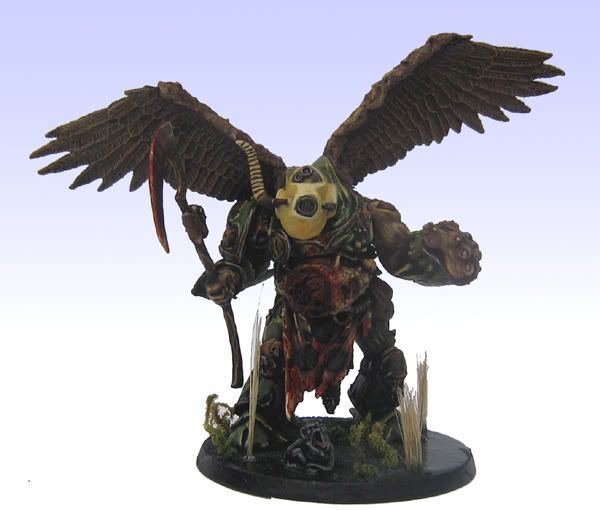
Deamon Prince

DeathGuardDeamonPrinceFinal.jpg


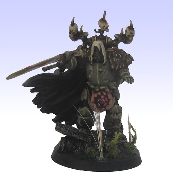
Plague Lord

DeathGuardPlagueLordFinal.jpg


Plague Sorcerer

DeathGuardSorcererFinal.jpg


Plague Terminator Squad

DeathGuardTerminatorSquad.jpg


Plague Marine Squad 1

DeathGuardPMSquad1.jpg


Plague Marine Squad 2

DeathGuardPMSquad2.jpg


Plague Marine Squad 3

DeathGuardPlagueMarineSquad3.jpg


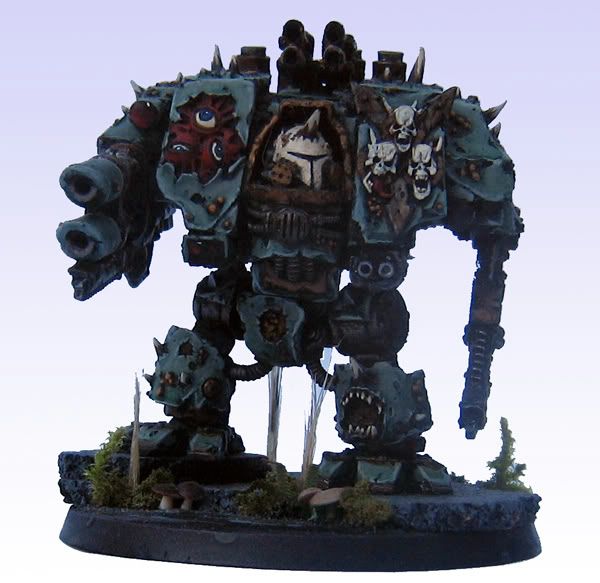
Plague Dreadnought 1

DeathGuardDread1.jpg


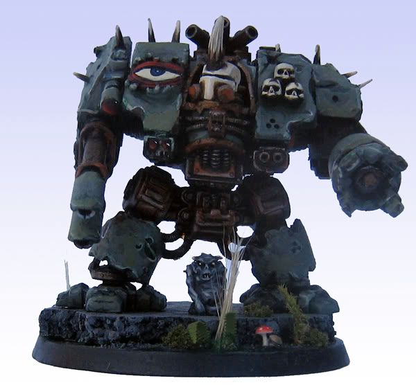
Plague Dreadnought 2

DeathGuardDread2.jpg


Plague Havoc Squad

DeathGuardPlagueHavocs.jpg
 

ScottRadom

Shogun of Saskatchewan
First, I love the army!

Now to be critical I think the weak point is actually the FW Great Unclean One. I have painted one, and they\'re awesome models, but yours looks a little rushed to be honest. I think you should consider taking the time to put more work into his skin and the bruisey/sick areas could be worked a little more. The nurglings on his base look to be painted to a much higher standard then the bad boy himself. I found that a let down, myself.

Still a great looking army that any opponent would be happy to play against. I just think you need to take the FW piece up to the standard of the rest of the army.
 

Bigdennis52

New member
I agree with what was mentioned

As an army, the display board and units fit nicely together. The color choices seem to fit the army well

As individual models there are some things that couple be touched up I guess

The great unclean one seems to be a little plain to me, but that may be the look you are going for

The plague lord as well as the plague sorcerer could use a couple highlights in some places. It looks like you used black primer for the entire army, sometimes it is hard to get the highlights you want from that basecoat

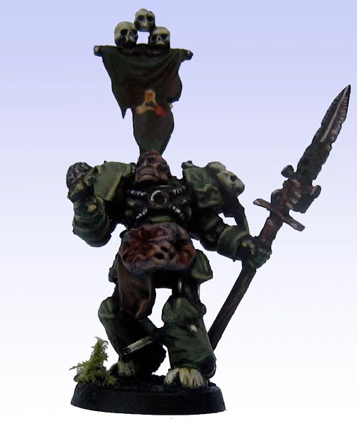
The terminator squad ... is there any way to get a closeup of some of those guys, and is the banner just plain black?

I like dreadnaught 2 more than the first one... maybe it is just because of the guy sitting in between his legs

All in all it is definitely a nice army to be completed

Question: how did you go about making the display board?
- picture frame, polystyrene.... and cut around their individual bases?
 

Spacemunkie

New member
I think the army looks great! I\'d agree that the GUO could use a little more work and it deserves it as the centrepiece of such a great looking army.

Top stuff!:beer:
 
Back To Top
Top