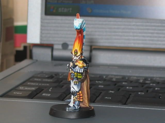
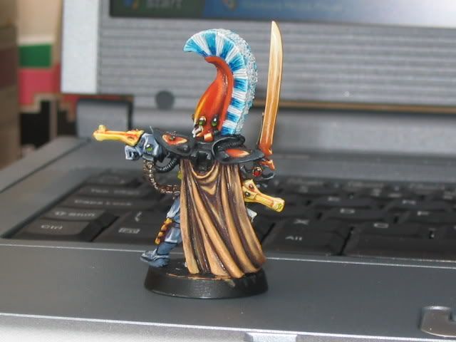
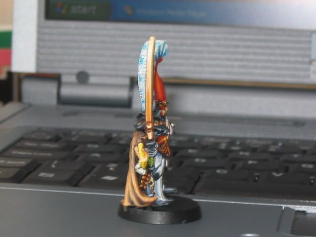
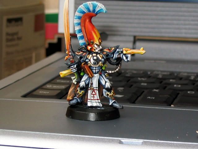
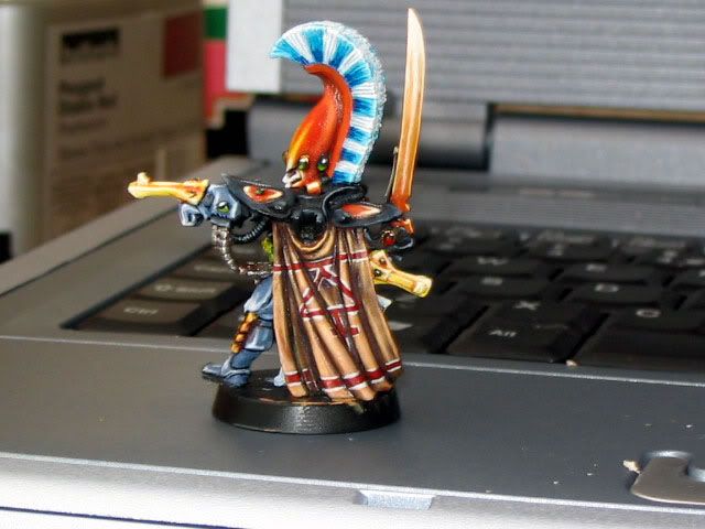
comments anybody?

Propaintjob

New member
Hi guys, I\'ve just reached the \'finishing touches\' stage of this mini, which a commission piece.

I still have the banner pole to paint and a bit of work to do on the feet.

As you\'ll all know, painting a mini for a while sometimes makes you blind to errors/room for improvement etc so I figured I\'d ask you what you think?

I reckon this is some of the best painting I\'ve done so I\'m not really the right person to criticise it.

It\'s a change in style for me because of what the customer asked for, normally I wouldn\'t have so much difference between the lights and darks so it\'s been challenging. Although I think it\'s come out ok, what do you think?

Thanks in advance
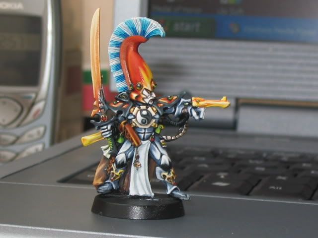

IMG_1257.jpg


IMG_1258.jpg


IMG_1259.jpg


IMG_1260.jpg
 

Dragonsreach

Super Moderator
Propaintjob:
It\'s a change in style for me because of what the customer asked for, normally I wouldn\'t have so much difference between the lights and darks so it\'s been challenging. Although I think it\'s come out ok, what do you think?
Are you saying that the exagerated stages between light and dark shades is what your customer asked for?
If so then I don\'t see a problem. The contrast is Ok and does work on this mini.

My only observation is that the Shuriken weapons look a little \'rough\' in comparison to the rest of the paintwork.

In the end it\'s the customer who\'s opinion counts. Try showing them as WIP shot and get their feedback.
 

ZaPhOd

Super Moderator
I like the blacks or dark greys a lot, but some of the orangy plates like on the shoulders could be smoother IMO. He is very colorful indeed :D

The Ying Yang dealy is my favorite part. Came out tops :)
 

supervike

Super Moderator
I think this maybe a bit overly critical, but seeing how it is just in the forums, not on the voting, I\'ll go ahead with it.

I think the cloak is doing a disservice to the back view of the mini.

While it is well painted, the brown just doesn\'t seem to add to the the dramatic impact the front view of the mini has.

Maybe if the cloak were the same color as the shoulder pad things.

Also maybe just a line of color or some other design on the tabard would add some interest there.

But, now I will gush exuberantly over the rest of the mini. I absolutely love the face. The helm and plume are great, the armor is very well done, and has alot of visual interest to it.
 

Propaintjob

New member
thanks

Thanks for comments guys.

The customer said he wanted it to be the same as in the Eldar Codex, and I pointed out some things I personally thought could be improved; the plumage, armour colouring etc. So far he\'s over the moon with how it looks.

In the pics the brown of the cloak looks a little subdued, in the \'flesh\' it\'s highlighted to almost a graveyard earth colour and I\'m in two minds as to whether I should highlight it further. As it\'s a wip pic I didn\'t set up any lamps or anything but when it comes to actually submitting the image those tones should come out better.

DR, I understand totally mate (joke from another thread :) ) about the shuriken weapons, I\'m beginning to think that black would be a better colour for them so I\'ll run that past the customer.
In terms of painting style, the pic in the codex is highlighted quite sharply which is something I\'ve never thought looks \'real\' so after discussing it with the customer I got the go ahead to try and accomodate the two styles into one. As it now turns out, he\'s given me free reign to do what I like (I love it when that happens) with the mini.

Zaphod, I was trying to get a \'glowing jewel\' effect on the \'orangey bits\', any tips on how I can improve them?

Supervike, be as critical as you like, I prefer people to be critical otherwise there\'d be no point in asking :). You\'ve got me thinking now, maybe ablue-black cloak would suit better.

So many questions to ask the guy who owns the mini...

Thanks for your comments guys
 

tabithatan

New member
exaggerated shading or not, at first glance, this is one stunning mini......

I think however, the orange blade looks a little rough, shadin wise on the back side of the blace... but its jus a little bit... are you going for a hot metal or magic/jedi-resque/laser-word kinda look for it?
 

Propaintjob

New member
I was aiming for a weapon laden with almost magical power. The main thing was for it to look almost as af it was fire, but to still look like a power sword.

Thanks for the comments tabithatan, I\'ve had a go at some freehand on the tabard and the cloak (not my strong point) which I\'m still finishing, so once it\'s done I\'ll put an updated pic on this thread before submitting it to the voters :D
 

tabithatan

New member
hmmmm if ya are goin for the almost fire but not look perhaps ya might wanna make the sword look more glowy with oranges and yellows blending up to white?

anyways...no matter wat ya do... it looks great as is already......

good luck on detailing......
try a long-haired ... really thin brush.... I find that works rather well.....:)
 

Propaintjob

New member
updated pics

Ok, here\'s the new pics. I\'ve tried to address all the points raised by everyone so far.

Had a go at the freehand, man I suck at freeheand, so the big question is has the FH improved it or have I loused it up? ???lol

asurmenfront.jpg


asurmenrear.jpg
 

LavronYor

New member
better

I think the freehand makes it look much better. The cloak looks improved also.

I really liked the Ying Yang dealy LOL, you mean the symbol Yin and Yang, the image that represents perfect harmony, best immortalized by the black and white cookie? Mmmm, cookies....

BTW, how do you quote someone? Boy, don\'t I look stupid.
 
Back To Top
Top