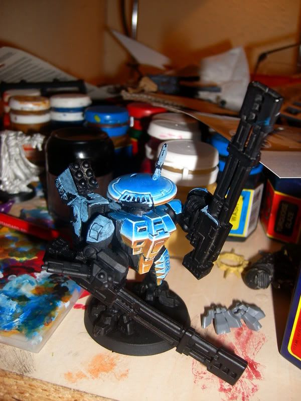
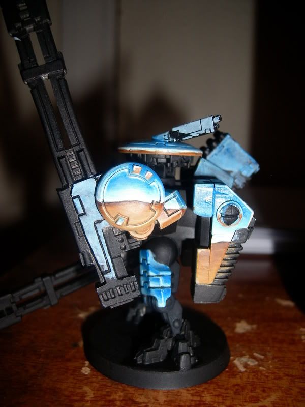
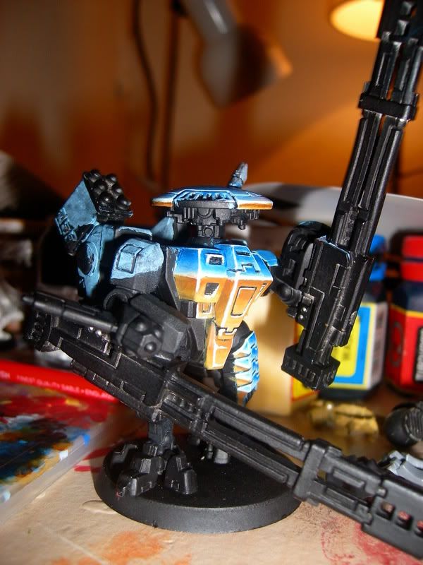
1st try senmm tau broadside

stickboy9000

New member
it needs to go lighter i know, but guide me please,


SANY0251.jpg


SANY0252.jpg


SANY0247.jpg


oh, and so far, apart from the undercoat i\'v only used four colours.
 

stickboy9000

New member
@JOD... skull white, blue glaze, bubonic brown and flesh wash.

i saw the head idea here, someone had made some ninja style battle suits, forget his name tho. sorry mate but a nod in your direction.
 

Mason Storm

New member
All in all, for a first attempt, I think you have done really well here. I guess what suggestions you are looking for depend on whether this is intended to be more of a show piece or a solid tabletop paintjob.

Assuming you want to achieve more of a \"show\" quality, the things you could work on are:

1. Increasing the amount of colors (and therefore the amount of blending). This is always key when doing NMM. Right now you can detect too much of each color, especially for such large, flat areas.

2. I would also try to mute the colors a little bit; especially the blue.

3. Lastly, try and add reflective spots/highlights to the plates that create the illusion of reflection. Kinda hard to explain, but with SENMM you are trying to simulate how light plays off of a highly reflective surface. The reflection of the surrounding landscape (the blues and browns) is one part. The second part is a pure (white) light reflection that hits in different areas depending on the shape of the surface and light source. For example, on his shoulder a curved highlight on along the blue area would suggest a typical overhead light source. I\'m not sure this makes any sense, but it\'s tricky to explain :) Your\'re just trying to make the space look like it\'s a very reflective surface, and not a surface that has a picture of a horizon painted on it.

Keep up the good work. Very ambitious to take on a model like that using SENMM. You have the right idea and you idea of where the horizon lines should go is pretty on.
 

stickboy9000

New member
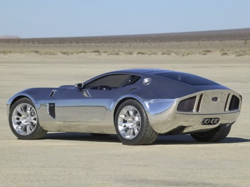
cheers for the advice mason. i\'m trying to work from this..

ford_shelby_GR1_1_concept20800.jpg


but i\'ve got no curved surfaces to work with. but i\'m listening to all everyone, i want to get it right.
 

Mason Storm

New member
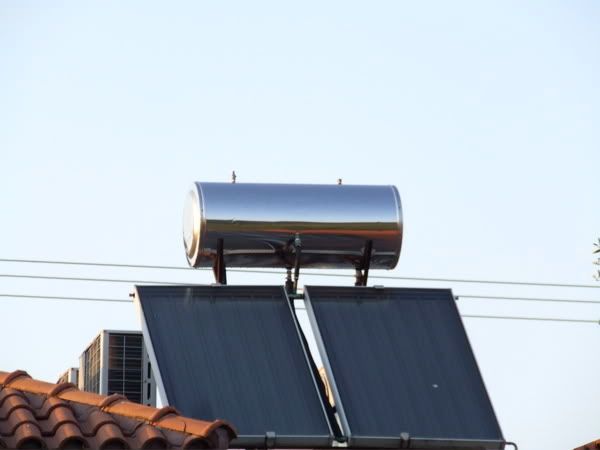
True, most of what you have on this model are flat surfaces (except the drones), so it\'ll work out a bit different. Keep studying both of those pics as they show how the effect works. Also notice how on both pics the blue and brown and very soft, neutral, etc. like I mentioned. These colors tend to be more common in nature and therefore make the SENMM look more realistic than very vivid ones (at least in my opinion). Good luck!
 

Bengoodall

New member
Thats the worst thing fords ever made.

What the hell were they thinking.

Oh, itll sell in the arab states.

Yeah, only cause its faster than a camel.

Hippies.

I think its a bit of a hard mini to paint in senmm, its got no curves on it at all, and that changes your lines of colour change to quickly.
 

stickboy9000

New member
what are you talking about? it\'s an awesome car....... anyways, i\'m thinking about doing an inquisitor scale suit thats a bit more feminin and curved in the same style, usint the gun from the hammerhead tank. what d\'ya think?
 

Dark Seraphim

New member
SNNM is hard...

The shield thing looks really good, but the rest doesn\'t really look like chrome...

You\'ll need to make the edges where it splits, even sharper... more contrast.

Otherwise, it\'s a nice try and for the first time, it\'s awesome :D
 
Back To Top
Top